Tension Report - Where They Diverge4 FINDINGS
Δ is the gap between the two on that spectrum, 0 (identical) to 100 (opposite poles).
Organic feels grown; geometric feels drawn. It is the difference between a form that occurred and one that was decided. Vector Minimalism leans geometric, Glassmorphism stays closer to organic.
Both land at a similar temperature. The difference shows in a side by side and rarely on its own. Vector Minimalism leans warm, Glassmorphism stays closer to cool.
Both point the same way in time. The gap is how far they go. Vector Minimalism leans nostalgic, Glassmorphism stays closer to futuristic.
Both sit at a similar weight. The difference is a shade rather than a mood. Glassmorphism leans light, Vector Minimalism stays closer to dark.
Both lean into these. Expect less friction here than everywhere the report just flagged.
both lean digital - they'd argue about everything else ✦
Glassmorphism vs Vector Minimalism: 93% affinity (Highly compatible)
Where they split: Vector Minimalism leans geometric, Glassmorphism stays closer to organic. Also diverging: Cool vs Warm (Δ20), Futuristic vs Nostalgic (Δ15), Dark vs Light (Δ15). Where they agree: both lean digital, structured, minimal, restrained.
Safe to blend: close enough that mixing Glassmorphism and Vector Minimalism reads as one coherent direction, not two competing ones.
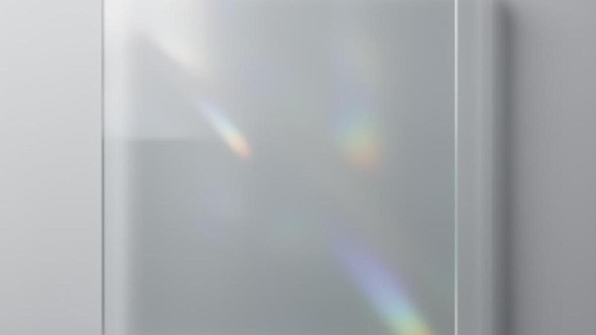
Frosted glass surfaces with backdrop blur and floating transparency
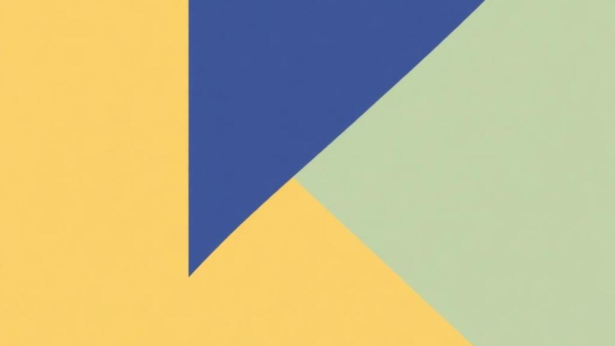
Full style guide →Clean geometric shapes, flat colors, and precisely balanced compositions
Full style guide →