Tension Report - Where They Diverge4 FINDINGS
Δ is the gap between the two on that spectrum, 0 (identical) to 100 (opposite poles).
Light opens a space up; dark gives it weight and drama. This is rarely neutral: it sets the mood before anyone reads a word. Vector Minimalism leans light, Blueprint stays closer to dark.
Warm reads as human and inviting; cool reads as considered and controlled. Few things shift a first impression faster than this one. Vector Minimalism leans warm, Blueprint stays closer to cool.
Futuristic points forward; nostalgic points to a specific remembered moment. One promises what is next, the other that something familiar is still true. Blueprint leans nostalgic, Vector Minimalism stays closer to futuristic.
Both read as made the same way. What differs is how much of the hand survives in the finish. Vector Minimalism leans digital, Blueprint stays closer to analog.
Both lean into these. Expect less friction here than everywhere the report just flagged.
both lean geometric - they'd argue about everything else ✦
Vector Minimalism vs Blueprint: 89% affinity (Highly compatible)
Where they split: Vector Minimalism leans light, Blueprint stays closer to dark. Also diverging: Cool vs Warm (Δ30), Futuristic vs Nostalgic (Δ25), Analog vs Digital (Δ15). Where they agree: both lean geometric, structured, minimal, restrained.
Safe to blend: close enough that mixing Vector Minimalism and Blueprint reads as one coherent direction, not two competing ones.
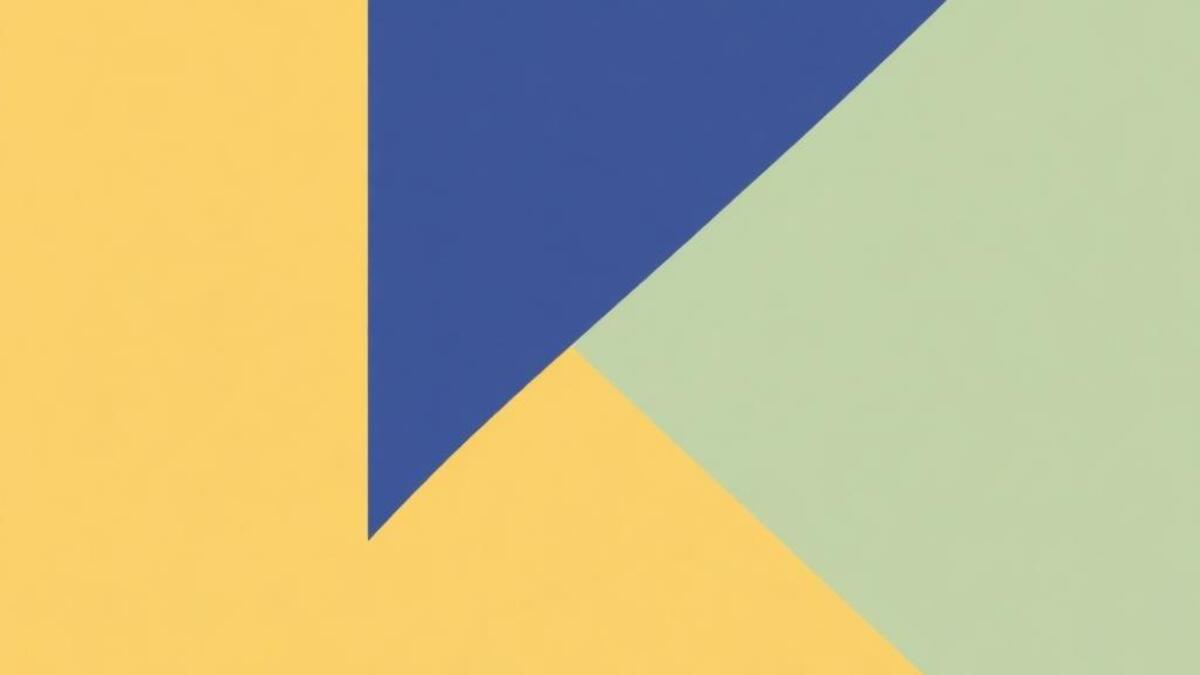
Clean geometric shapes, flat colors, and precisely balanced compositions
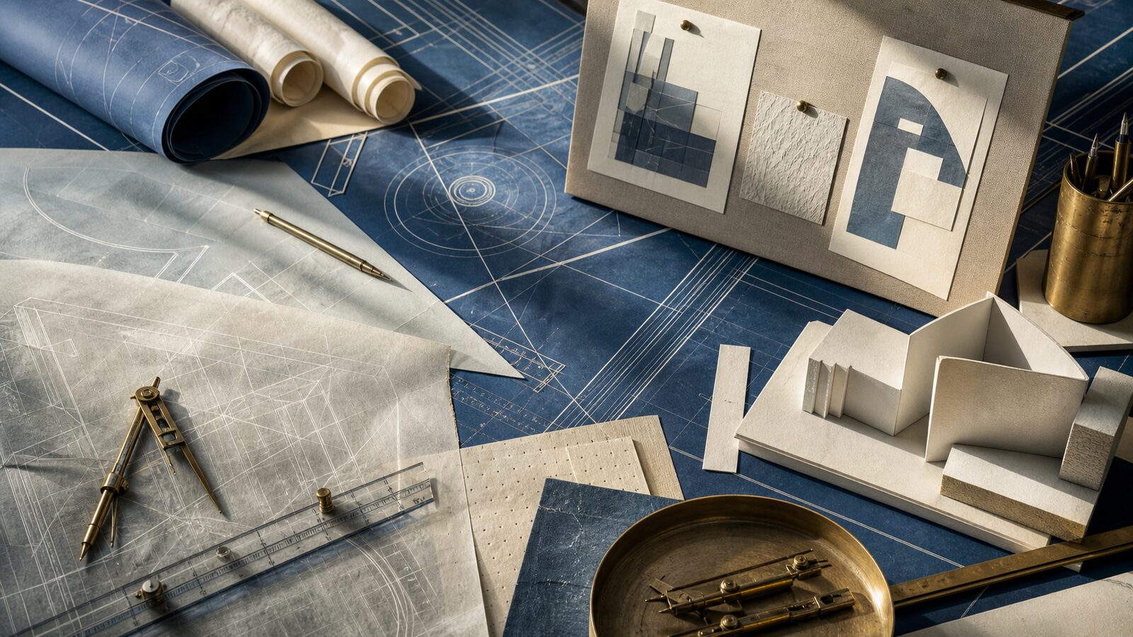
Full style guide →Technical drawings on blue with white lines showing plans and schematics
Full style guide →