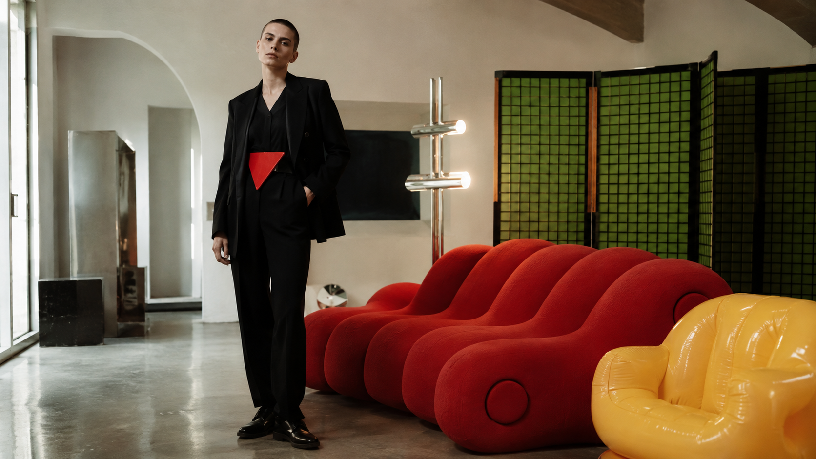
The emotional center of gravity here is urgency, appetite and passion, pulled off-balance by a single black accent that keeps the palette from reading as one-note. A wide value range gives it real contrast; it reads with depth rather than sitting flat, and the saturation stays high throughout, so the whole palette reads as confident and awake.
Bocca Red reads as pure adrenaline: alarm, desire, the color of things that move fast.
Manifesto Black reads as pure authority: sophistication, power, and the visual weight that makes everything placed near it feel more serious.
Quaderna White reads as purity and openness, the color of empty space, clarity, and things left deliberately unresolved.
Cactus Green an emerald or kelly green: vitality turned all the way up, confident and alive.
Olivetti Yellow an electric, high-visibility yellow: caution and euphoria share the same wavelength here.
Florence and Milan, 1966 to 1980: design as argument, with the manifesto printed on the object and the object shaped like a joke
Explore the full Radical Italian Design style guide