When to use it
- Fashion and editorial campaigns that want a world rather than a set
- Beauty and fragrance imagery built on colour and haze
- Automotive and product concept imagery
- Music artwork and cultural posters with a surreal register
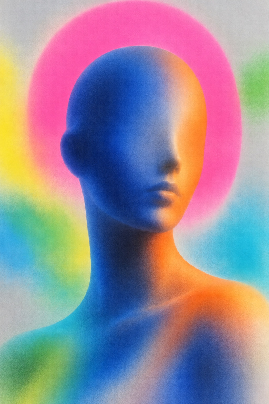
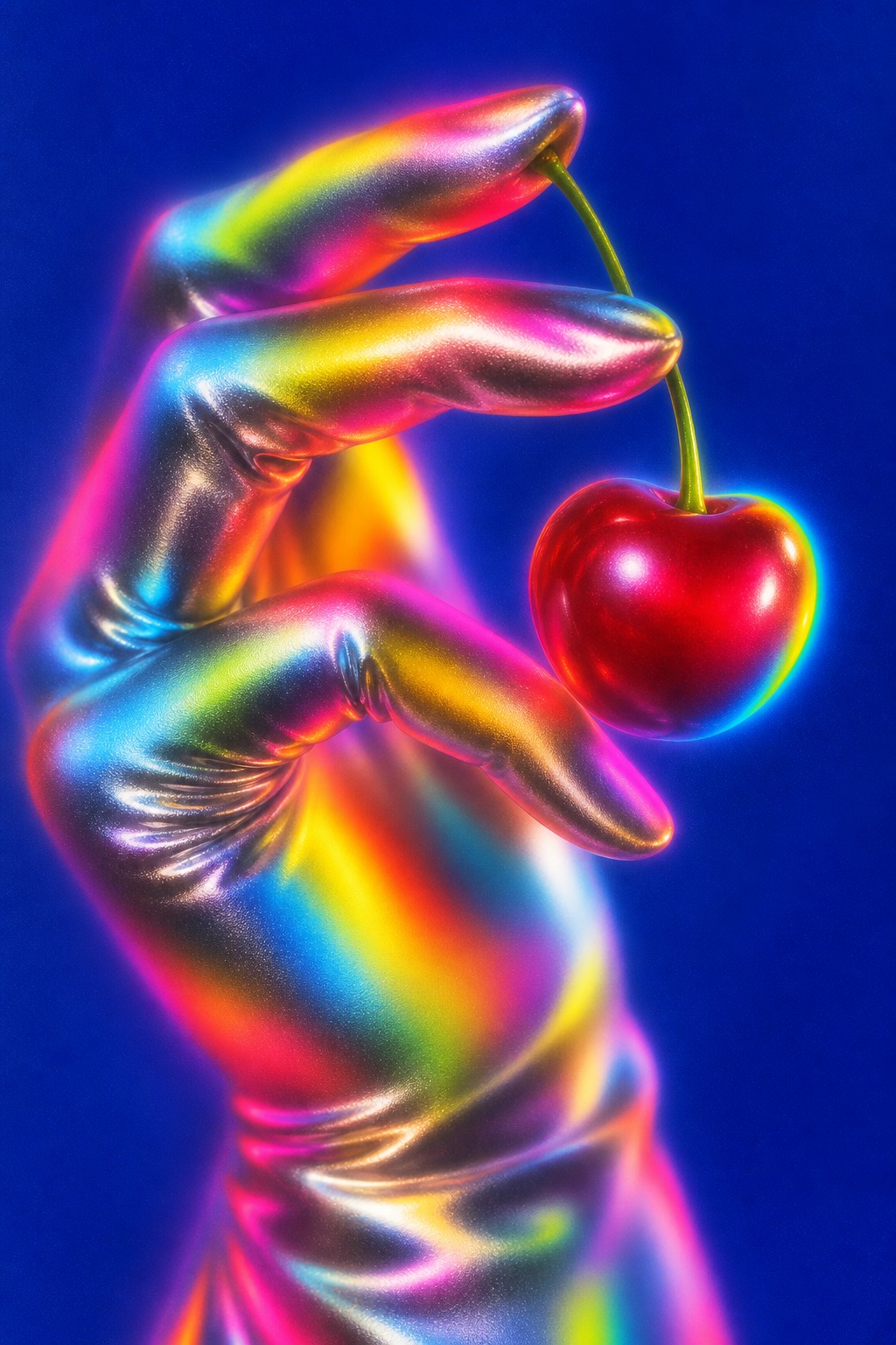
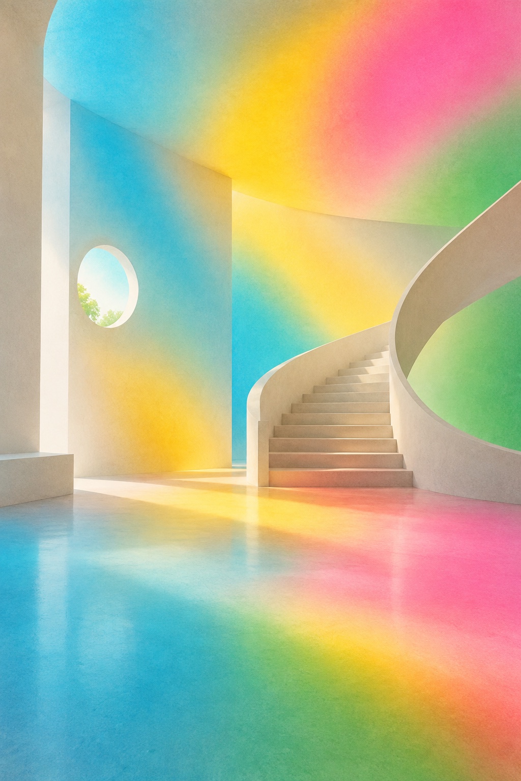
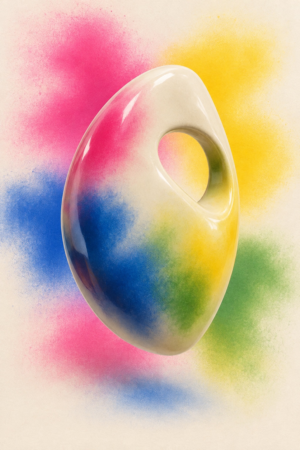
Subjects dissolved into velvety airbrush gradients, coloured haze and impossible studio light: cyan, hot pink, acid green and saffron, soft focus over high gloss, artificial on purpose
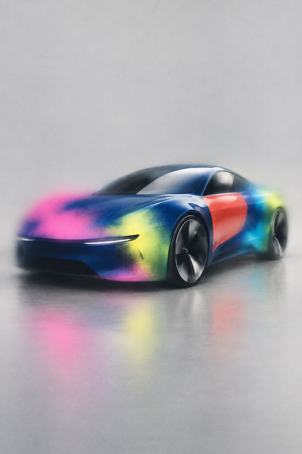
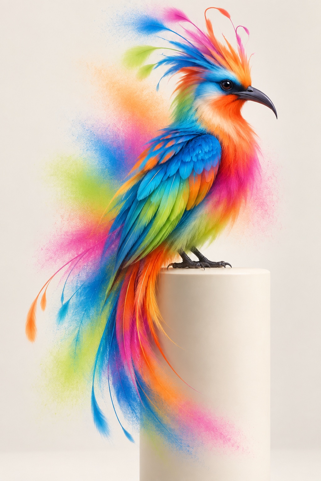
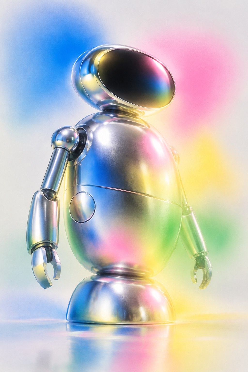
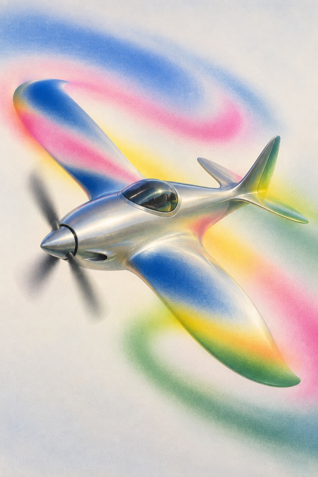
What it is, when it works, who it is for, and where it already exists.
Record 022-CA - when it works, who it is for, what it looks like
Where this aesthetic shows up in the real world · ↗ opens the source site
Where Chromatic Airbrush came from, what makes it recognisable, and the fingerprint it leaves.
2020s to now; roots in 1970s airbrush and late-1990s digital gloss · Fashion and music art direction, from the airbrush studios of Los Angeles and Tokyo to the Photoshop gloss of the late 1990s
The airbrush is a nineteenth-century tool, patented by Francis Edgar Stanley in 1876 and made practical by Abner Peeler's paint distributor in 1879, but its look belongs to the 1970s. In Los Angeles a generation of illustrators, Charles White III among them, made every lip, chrome bumper and palm tree glisten for record covers, magazines and film studios, and in Tokyo Hajime Sorayama's Sexy Robot, published in 1983, turned the airbrushed chrome figure into a signature: hard reflections, soft skin and a light that could not exist.
Software absorbed the technique. Photoshop 1.0, released in 1990, shipped with an airbrush tool, and by the late 1990s editorial imagery had a digital gloss of its own: lens flare, chrome filters, bloom and gradients laid over photographs until the surface felt rendered. It was the house style of Y2K futurism, and it dated fast once the tools became ordinary.
The current form is fashion art direction taking that gloss back on purpose. Contemporary campaigns, beauty and music imagery stage a single subject, a figure, an animal, a machine, an interior, in a featureless studio and dissolve it into velvety gradients, coloured haze and impossible light: cyan against hot pink, acid green against saffron, soft focus over high gloss, a little print grain to keep it from looking like a render. It is artificial and atmospheric by design, and it belongs to the 2020s revival of Y2K without being nostalgic about it.
“Subjects dissolved into velvety gradients, coloured haze and impossible studio light.
The visual DNA: what makes it recognisable
8-channel console with the fingerprint on its display. Save the card, or share the page

The definitive color scheme for this aesthetic
The colour of the styles sitting closest to this one
How to shoot it, how to prompt it, and how to board it.
How to shoot this aesthetic
"Stage one subject in an empty studio under coloured light, then let the edges go"
Shot list
Lighting
Ambient coloured light from large soft sources, cyan, pink, green and saffron, with no hard key. Let colour bloom on gloss and fall into haze at the edges. Retouch toward airbrush overspray and soft focus, and add a little grain so it never reads as a clean render.
Drop this into Studio to generate in this aesthetic
Chromatic airbrush aesthetic, a surreal fashion editorial image, a single isolated subject in a featureless studio, an abstracted figure, animal, vehicle, machine or dreamlike interior rendered as a smooth glossy form, velvety airbrush gradients and overspray, chromatic bloom, fields of cyan, hot pink, acid green and saffron, soft focus over high gloss, ambient coloured studio light with no hard key, subtle print grain, empty studio space, artificial, atmospheric and over-saturated on purpose, slightly uncanny, no readable text, no logos
The record applied to your project. The record's kit is free; your brand, references and plates come with membership
01 · Hero application02 · Material and finish03 · Palette in context04 · Photography directionWhether to use it, what it costs to do properly, and where it stands right now.
Two written calls, seven meters, and when to walk away
Stage one subject in an empty studio under ambient coloured light, then dissolve its edges into haze and let the surfaces bloom, with overspray and a little grain over the gloss. Keep type off the image or small and restrained. A clean render on a gradient with nothing strange in it is a stock visual.
Right when the brand sells atmosphere and polish and can afford to be strange: fashion and editorial, beauty and fragrance, automotive concepts, music and cultural posters. It rewards restraint around one subject, and fails as a render.
A studio, coloured light and retouching time, or a 3D artist; the surface is where the money goes.
Choosing the subject and how far to dissolve it is the whole idea; the tools are ordinary.
The haze has to sit over real gloss, and the uncanny has to be deliberate, which takes an art director and a retoucher who agree.
Without the haze and the strangeness it collapses into stock 3D on a gradient.
Fashion, beauty and music imagery are moving toward it as they leave documentary realism.
It rides the Y2K revival and the appetite for artificial imagery; the surface will date, the staging will last longer.
One well-made image carries a campaign, a cover or a launch; a series needs a consistent retoucher.
A Pro feature: origins, practitioners, and pitfalls
Neighbours, cross-references, blends, and the questions people ask.
Connected across the creative knowledge graph
Where it stands now, and what it costs you to use it
Chromatic Airbrush is where fashion, beauty and music imagery are moving as they turn away from documentary realism: a subject staged in an artificial world of colour and light, polished enough to be product, strange enough to be art direction. It photographs like nothing else on a feed, and it scales from a fragrance bottle to a car.
Its failure mode is the render. A glossy 3D object on a gradient with no haze, no grain and no strangeness is a stock visual. The work that lands keeps the airbrush overspray, the soft focus over the gloss, the slightly uncanny subject and the empty studio around it.
Mix Chromatic Airbrush with any style in the library
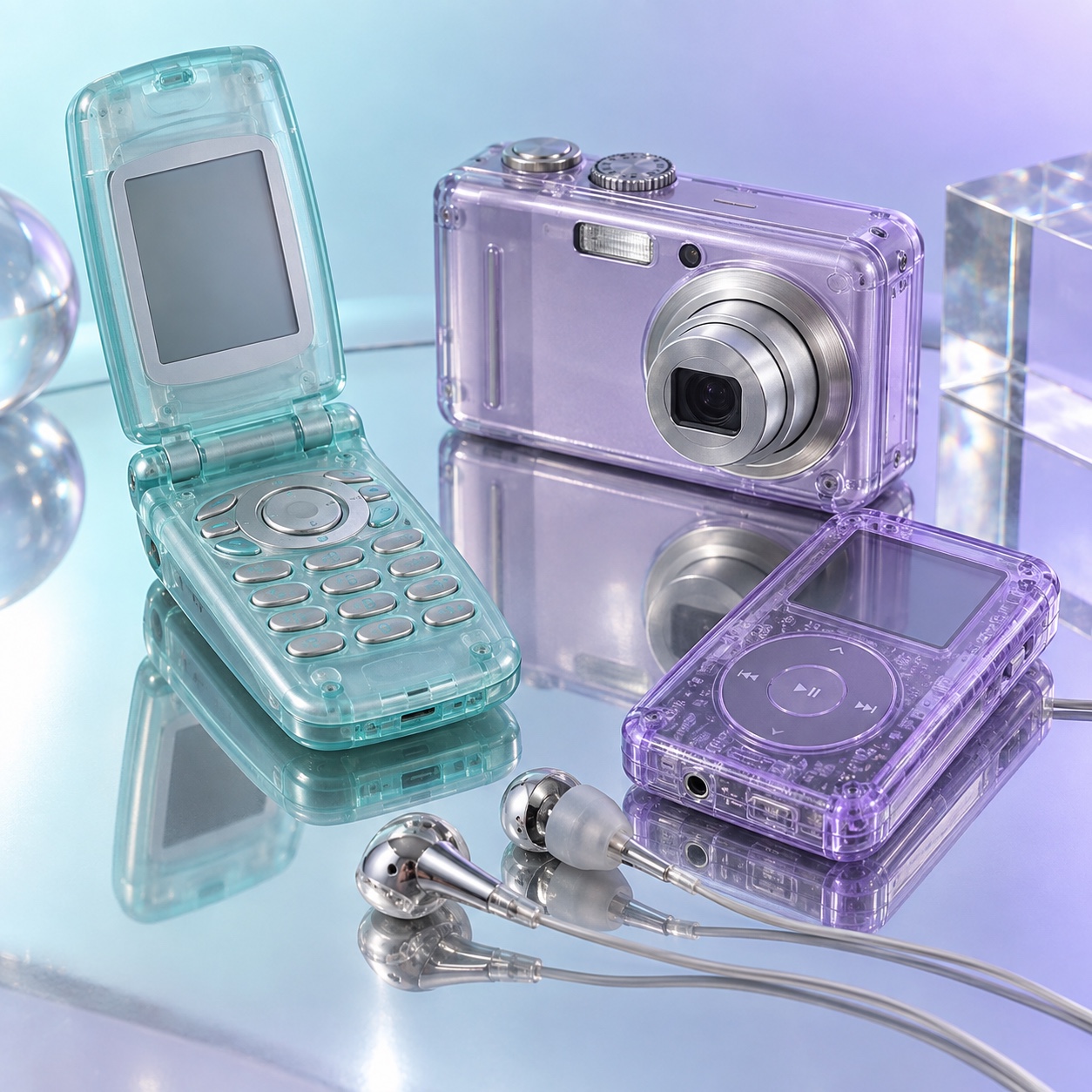 Chromatic Airbrush 50%Y2K 50%
Merged palette
#2DBCD8
#C0D8F0
#FC55A4
#00CCFF
#83C7B8
Leads digital, expressive, maximal
Typography · from Chromatic Airbrush
Cormorant Garamond over Lora
Materials
The calls this blend forces
These two disagree on one thing, and a blend cannot average them: you pick a side. At this mix:
Futuristic or Nostalgic? Chromatic Airbrush is futuristic, Y2K is nostalgic. This mix lands nostalgic.
Use it
Chromatic airbrush aesthetic, a surreal fashion editorial image, a single isolated subject in a featureless studio, an abstracted figure, animal, vehicle, machine or dreamlike interior rendered as a smooth glossy form, velvety airbrush gradients and overspray, chromatic bloom, fields of cyan, hot pink, acid green and saffron, soft focus over high gloss, ambient coloured studio light with no hard key, subtle print grain, empty studio space, artificial, atmospheric and over-saturated on purpose, slightly uncanny, no readable text, no logos (50%), infused with Y2K aesthetic with millennium futurism, Paris Hilton and early Beyoncé-era cultural touchstone, butterfly motifs, bedazzled maximalism, candy-pastel and metallic color mood, color palette strictly #2DBCD8 #C0D8F0 #FC55A4 #00CCFF #83C7B8, leaning futuristic over nostalgic, overall character: digital, expressive, maximal
A surreal editorial image language in which a subject, a figure, an animal, a vehicle, an object or an interior, is dissolved into velvety airbrush gradients, coloured haze and impossible studio light: cyan, hot pink, acid green and saffron, soft focus over high gloss, with a little print grain. It joins late-1990s digital gloss to contemporary fashion-art direction.
From two sources. The airbrush illustration of the 1970s and 1980s, from Los Angeles record covers to Hajime Sorayama's chrome figures, gave it the glossy, impossible surface. Photoshop, from 1990, and the lens-flare gloss of late-1990s editorial gave it the digital haze. Fashion campaigns of the 2020s put the two together on purpose.
Y2K is the period style, with its interfaces, gadgets and optimism; Chromecore is about the chrome surface itself. Chromatic Airbrush is a way of staging a subject: soft focus over gloss, colour fields as light, an empty studio, and a figure or object that is slightly wrong. It is editorial first, and the haze matters as much as the shine.
Isolate one subject in a featureless studio, light it with ambient coloured sources rather than a key, then work the image until the edges blur into haze and the surfaces bloom: airbrush overspray, gradients, a touch of grain. Keep the type off the picture or small and restrained. A clean 3D render on a gradient, with nothing uncanny about it, is a stock visual.
Every style in the library is broken down like this one: the palette, the typography, the materials and the lineage.
Explore the style library →