Registrar's index cards on the platen glass - captured by the scanner
1990–1999 · NYC, Chicago, London underground club scenes; art gallery and film culture
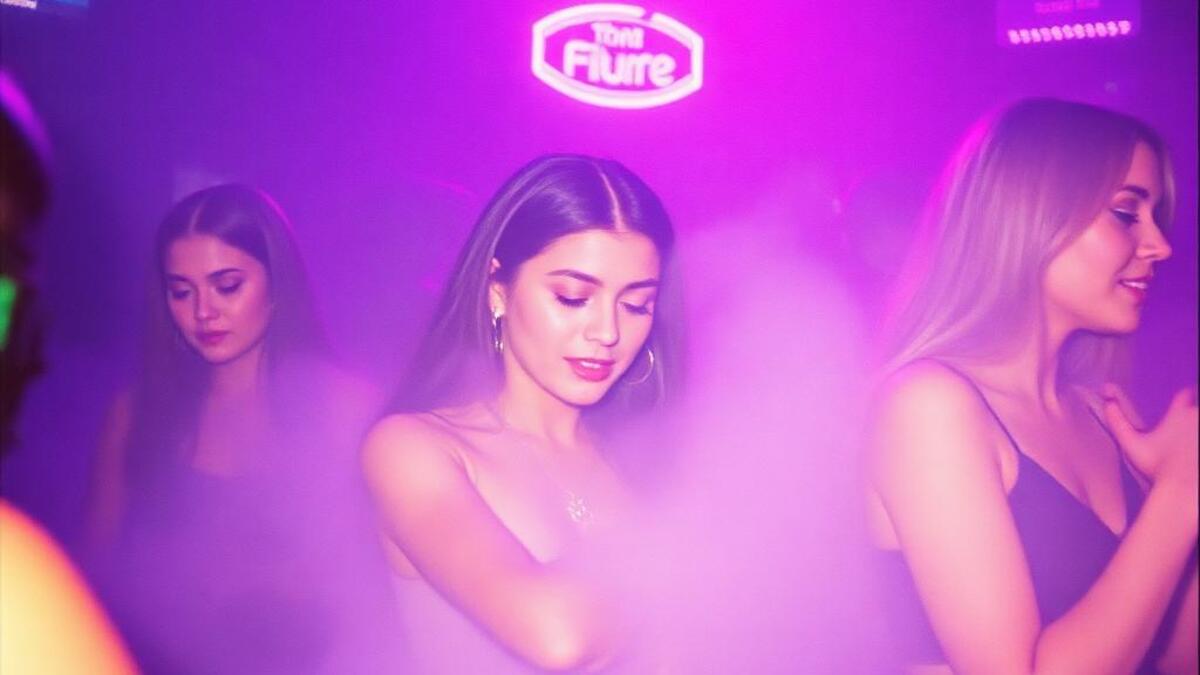
Gen X soft club describes the visual aesthetic of 1990s underground arts, music, and club culture before the internet homogenized creative production: Kinko's-printed flyers, photocopied zines, and the slightly oversaturated photography of cheap 35mm point-and-shoots. The palette is defined by low-lit interiors, cigarette smoke, and the muted, atmospheric colors of places that exist primarily at night.
The references include: Aphex Twin and Warp Records cover art, early Vice magazine (when it was Montreal free zine culture), Harmony Korine film stills, Sofia Coppola's Lost in Translation visual sensibility, and the design of independent bookstores and video rental shops. The connecting thread is an aesthetic of nonchalance: nothing is trying to impress you.
Gen X soft club functions as an antidote to the maximalism and high-saturation of contemporary social-media aesthetics. In contemporary design it appears in premium lifestyle brands that want to signal quiet luxury (as opposed to loud luxury), independent restaurant and bar identities, and music branding for artists who position themselves against algorithmic pop culture.
The visual DNA: what makes it recognisable
- Low-contrast type: slightly lighter than the background, requiring attention
- Institutional serif: Times New Roman, Garamond: without irony
- Very small caps in tight tracking: understated and sophisticated
- Photocopied imperfection: not polished, not rough: approximate
- Lots of white (or cream) space: information spread sparsely
- Off-center, casually composed layouts that feel chosen not engineered
- Film photography grain as texture: the grain of Kodak 400 in low light
- Horizontal bands and ruled lines as understated structural elements
- Smoked blue: #4A6580, #5B7A96: the color of 90s club atmosphere
- Dusty rose: #C49090, #D4A0A0: faded, not fresh
- Warm grey: #9A9090, #A89A9A
- Cream: #F0ECDÉ, #E8E4D8: aged paper, not bright white
- Low-lit, grainy photography in warm shadow
- Cigarette smoke and atmospheric blur
- Film photography artifacts: light leaks, underexposure, grain
- People photographed as if they don't know you're there
8-channel console - dominant channels taped & circled by the registrar
Your aesthetic passport - share the fingerprint
3 color interpretations of this aesthetic
How to shoot this aesthetic
Join waitlist for access
Join the waitlist for full access
Join the waitlistGen-X Soft Club: where the language earns its place
Gen-X Soft Club is most effective when its visual decisions do useful work. Late-night 90s club vibes with soft focus, purple haze, and understated cool
The style gives styling, proportion, and image sequencing a clear point of view rather than treating them as decoration.
It can turn atmosphere, material, and spatial pacing into evidence of a distinct experience before a visitor arrives.
It helps a physical or editorial environment feel authored, which raises attention and perceived care.
They recognize the references, proportion, and restraint that make the language feel intentional.
They respond to visible judgment because it reduces the feeling of interchangeable product.
A coherent aesthetic gives them a usable standard for choosing images, objects, and collaborators.
The cost comes from consistent art direction, suitable locations or materials, and time to edit the details that would otherwise undermine the premise.
The challenge is conceptual. It takes visual literacy and a real point of view to avoid borrowing surface cues without their original logic.
Lighting, casting, type, color, material, and retouching must agree. A single weak choice can make the work feel like an imitation.
Gen-X Soft Club creates its strongest advantage when it gives a brand a standard of judgment, not merely an attractive finish. It fails when recognizable cues are collected without a governing idea. The difference between average and exceptional execution is usually proportion: how much is shown, what is withheld, and whether every element belongs to the same world. The most capable teams pair an exacting art director with specialists who understand the medium, from photographer and stylist to set designer, editor, and typographer.
Should Gen-X Soft Club be the strategic choice?
Surface imitation is easy. The language becomes generic when familiar cues replace proportion, specificity, and a coherent system.
Its visual ingredients appear regularly in contemporary work, but a rigorous execution remains distinguishable from a loose collection of references.
Its strongest principles depend on composition, material, and cultural literacy rather than a short-lived visual effect.
It asks for consistency across photography, typography, motion, environments, and the many details that make a brand feel believable.
Gen-X Soft Club deserves serious consideration from brands and institutions that can articulate a real point of view and protect it through execution. It is less suitable for work that needs immediate instructional clarity, broad visual neutrality, or low-cost production flexibility. Its greatest advantage is differentiation through judgment: it can make a product, place, or editorial proposition feel authored rather than merely packaged. Average executions borrow recognizable signals, then lose coherence when type, casting, copy, or materials fail to agree. Exceptional executions understand the visual language as a system of choices, including what not to show. The largest mistake is treating the style as a finish applied after strategy. Adopt it only when the product and organization can carry the same standard of care the imagery proposes.
Join waitlist for access
Join the waitlist for editorial depth
Join the waitlistConnected across the creative knowledge graph