Registrar's index cards on the platen glass - captured by the scanner
1970s–1990s (peak); influence ongoing · UK and France; Richard Rogers, Norman Foster, Renzo Piano
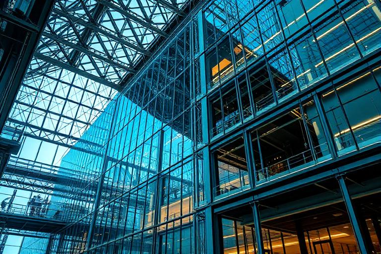
High-tech architecture (also called Structural Expressionism or the Late Modernist movement) emerged in the 1970s from architects who took the Modernist ethic of honesty about materials and pushed it to an extreme: not just exposing structure but celebrating and colorizing it. The Centre Pompidou in Paris (Piano + Rogers, 1977) was the movement's defining statement: a building that turned itself inside out, placing its mechanical systems (HVAC in blue, electrical in yellow, structural in white) on its exterior facade as aesthetic elements.
Norman Foster's Willis Faber & Dumas Building (1975), Lloyd's of London (Rogers, 1986), and the Hong Kong Shanghai Bank (Foster, 1986) developed the vocabulary: structural steel expressed with high precision and finish, glass curtain walls that reveal interior space, and service cores that become architectural features. The aesthetic is the opposite of conventional architecture's tendency to hide its infrastructure.
High-tech architecture's visual language has been highly influential on graphic design, particularly in the tech industry: the revealed-systems aesthetic of developer tool interfaces, the pride in showing how things work (transparent design), and the industrial palette (steel, glass, exposed concrete) of contemporary office design all descend from this tradition. Apple's former Jony Ive aesthetic was explicitly high-tech architectural in sensibility.
The visual DNA: what makes it recognisable
- Industrial sans-serifs: Helvetica, Univers: precise, engineered
- Monospace technical type for measurements and specifications
- White type on dark structural surfaces: legible, functional
- Minimal text: the structure communicates without verbal explanation
- Regular structural module: everything organized by the building's structural bay
- Exposed systems as visual rhythm: pipe spacing, bolt patterns, grid of structure
- Diagonal tension rods and bracing as active compositional elements
- Glass plane creating transparency and revealing interior order
- Industrial grey: #6A7280, #7A8290: steel's natural surface color
- Safety yellow: #FFD700, #F0C000: coded utility systems and caution signals
- Fire red: #CC2200, #B81E00: fire suppression and emergency systems
- Structural white: #F5F5F5: painted steel elements and ceilings
- Exposed structural steel: H-sections, hollow sections, tension cables
- Color-coded mechanical systems: ducts, pipes, and conduits painted by function
- Glass curtain walls that reveal the interior organization
- External stair and escalator systems as architectural features
8-channel console - dominant channels taped & circled by the registrar
Your aesthetic passport - share the fingerprint
4 color interpretations of this aesthetic
Join waitlist for access
Join the waitlist for full access
Join the waitlistHigh-Tech Architecture: where the language earns its place
High-Tech Architecture is most effective when its visual decisions do useful work. Structure and services made visible, celebrated, and colour-coded - the Pompidou Centre turned inside out, Lloyd's of London exposed to its bones
The style gives styling, proportion, and image sequencing a clear point of view rather than treating them as decoration.
It can turn atmosphere, material, and spatial pacing into evidence of a distinct experience before a visitor arrives.
It helps a physical or editorial environment feel authored, which raises attention and perceived care.
They recognize the references, proportion, and restraint that make the language feel intentional.
They respond to visible judgment because it reduces the feeling of interchangeable product.
A coherent aesthetic gives them a usable standard for choosing images, objects, and collaborators.
The cost comes from consistent art direction, suitable locations or materials, and time to edit the details that would otherwise undermine the premise.
The challenge is conceptual. It takes visual literacy and a real point of view to avoid borrowing surface cues without their original logic.
Lighting, casting, type, color, material, and retouching must agree. A single weak choice can make the work feel like an imitation.
High-Tech Architecture creates its strongest advantage when it gives a brand a standard of judgment, not merely an attractive finish. It fails when recognizable cues are collected without a governing idea. The difference between average and exceptional execution is usually proportion: how much is shown, what is withheld, and whether every element belongs to the same world. The most capable teams pair an exacting art director with specialists who understand the medium, from photographer and stylist to set designer, editor, and typographer.
Should High-Tech Architecture be the strategic choice?
Surface imitation is easy. The language becomes generic when familiar cues replace proportion, specificity, and a coherent system.
Its visual ingredients appear regularly in contemporary work, but a rigorous execution remains distinguishable from a loose collection of references.
Its strongest principles depend on composition, material, and cultural literacy rather than a short-lived visual effect.
It asks for consistency across photography, typography, motion, environments, and the many details that make a brand feel believable.
High-Tech Architecture deserves serious consideration from brands and institutions that can articulate a real point of view and protect it through execution. It is less suitable for work that needs immediate instructional clarity, broad visual neutrality, or low-cost production flexibility. Its greatest advantage is differentiation through judgment: it can make a product, place, or editorial proposition feel authored rather than merely packaged. Average executions borrow recognizable signals, then lose coherence when type, casting, copy, or materials fail to agree. Exceptional executions understand the visual language as a system of choices, including what not to show. The largest mistake is treating the style as a finish applied after strategy. Adopt it only when the product and organization can carry the same standard of care the imagery proposes.
Join waitlist for access
Join the waitlist for editorial depth
Join the waitlistConnected across the creative knowledge graph