Registrar's index cards on the platen glass - captured by the scanner
2019–2021 · UI/UX design community; Dribbble and design social media
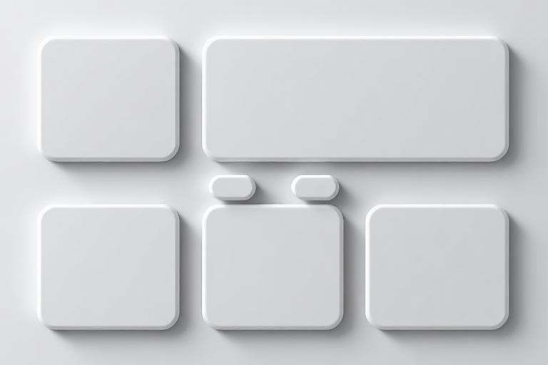
Neumorphism emerged as a named aesthetic in late 2019 after a Dribbble post by designer Alexander Plyuto went viral, showing UI elements rendered with soft paired shadows: one dark shadow below-right, one light shadow above-left: that created the impression of elements extruded from or inset into the background surface. The name combined 'new' + 'skeuomorphism,' acknowledging its descent from the tactile material quality of skeuomorphic design while departing from its literal texture rendering.
The aesthetic produced visually compelling results in portfolios and concept presentations: the soft shadow system creates a plausible physical metaphor (raised elements catch light from above-left, cast shadows below-right) without requiring realistic textures. The palette was constrained to very tight monochromatic ranges: slight variations of a single grey-beige or pastel: which produced a distinctive 'foggy' quality. For a brief period in 2019–2020, neumorphism was the most discussed UI design trend online.
The critical reception was mixed and ultimately damaging. Accessibility advocates noted that neumorphic interfaces failed nearly every contrast test: the low-contrast shadows on near-matching background colors made elements extremely difficult to distinguish for users with visual impairments. Interaction designers pointed out that neumorphism made it difficult to understand which elements were buttons (raised and pressed states are very similar). By 2021, the trend had largely receded to concept design and specific decorative contexts, with its accessibility failures widely cited.
The visual DNA: what makes it recognisable
- Clean, light-weight sans-serifs: heavy type contradicts neumorphism's soft quality
- Type in the same palette as the background: very slightly darker or lighter
- Minimal type: neumorphic UIs prioritize form over information density
- Embossed-quality letterforms that appear part of the surface
- Card-based layouts where each card is a raised or inset neumorphic plane
- Consistent light source direction: shadows always indicate top-left illumination
- Rounded corners on all elements: no hard edges anywhere
- Generous spacing: neumorphic elements need distance to read as 3D
- Base: a specific slightly warm grey or pastel (#E0E5EC, #F0F0F0, #E4EAF2)
- Dark shadow: the base color darkened 15–20% (#B8BEC8, #C8CDD6)
- Light shadow: the base color lightened 15–20% (#FFFFFF or near-white)
- Monochromatic throughout: never a contrasting hue in the shadows
- Raised button with dual shadow creating a convex surface effect
- Inset input field with inverted shadows creating a concave surface effect
- Slider handles with neumorphic ball texture
- Toggle switches with smooth neumorphic pill shape
8-channel console - dominant channels taped & circled by the registrar
Your aesthetic passport - share the fingerprint
4 color interpretations of this aesthetic
How to shoot this aesthetic
Join waitlist for access
Join the waitlist for full access
Join the waitlistNeumorphism: where the language earns its place
Neumorphism is most effective when its visual decisions do useful work. Soft extruded interfaces with subtle shadows creating tactile depth
The style gives styling, proportion, and image sequencing a clear point of view rather than treating them as decoration.
It can turn atmosphere, material, and spatial pacing into evidence of a distinct experience before a visitor arrives.
It helps a physical or editorial environment feel authored, which raises attention and perceived care.
They recognize the references, proportion, and restraint that make the language feel intentional.
They respond to visible judgment because it reduces the feeling of interchangeable product.
A coherent aesthetic gives them a usable standard for choosing images, objects, and collaborators.
The cost comes from consistent art direction, suitable locations or materials, and time to edit the details that would otherwise undermine the premise.
The challenge is conceptual. It takes visual literacy and a real point of view to avoid borrowing surface cues without their original logic.
Lighting, casting, type, color, material, and retouching must agree. A single weak choice can make the work feel like an imitation.
Neumorphism creates its strongest advantage when it gives a brand a standard of judgment, not merely an attractive finish. It fails when recognizable cues are collected without a governing idea. The difference between average and exceptional execution is usually proportion: how much is shown, what is withheld, and whether every element belongs to the same world. The most capable teams pair an exacting art director with specialists who understand the medium, from photographer and stylist to set designer, editor, and typographer.
Should Neumorphism be the strategic choice?
Surface imitation is easy. The language becomes generic when familiar cues replace proportion, specificity, and a coherent system.
Its visual ingredients appear regularly in contemporary work, but a rigorous execution remains distinguishable from a loose collection of references.
Its strongest principles depend on composition, material, and cultural literacy rather than a short-lived visual effect.
It asks for consistency across photography, typography, motion, environments, and the many details that make a brand feel believable.
Neumorphism deserves serious consideration from brands and institutions that can articulate a real point of view and protect it through execution. It is less suitable for work that needs immediate instructional clarity, broad visual neutrality, or low-cost production flexibility. Its greatest advantage is differentiation through judgment: it can make a product, place, or editorial proposition feel authored rather than merely packaged. Average executions borrow recognizable signals, then lose coherence when type, casting, copy, or materials fail to agree. Exceptional executions understand the visual language as a system of choices, including what not to show. The largest mistake is treating the style as a finish applied after strategy. Adopt it only when the product and organization can carry the same standard of care the imagery proposes.
Join waitlist for access
Join the waitlist for editorial depth
Join the waitlistConnected across the creative knowledge graph