Tension Report - Where They Diverge4 FINDINGS
Δ is the gap between the two on that spectrum, 0 (identical) to 100 (opposite poles).
Structure signals a system was designed; chaos signals something was let loose. This axis is usually read as competence versus energy. Impressionism leans chaotic, Pottery / Ceramics stays closer to structured.
Both sit at a similar weight. The difference is a shade rather than a mood. Impressionism leans light, Pottery / Ceramics stays closer to dark.
Both sit on the same side of the restraint question. The gap is how much breathing room each one insists on. Impressionism leans maximal, Pottery / Ceramics stays closer to minimal.
Both hold back a similar amount. The difference is tone rather than volume. Impressionism leans expressive, Pottery / Ceramics stays closer to restrained.
Both lean into these. Expect less friction here than everywhere the report just flagged.
both lean analog - they'd argue about everything else ✦
Impressionism vs Pottery / Ceramics: 95% affinity (Highly compatible)
Where they split: Impressionism leans chaotic, Pottery / Ceramics stays closer to structured. Also diverging: Dark vs Light (Δ20), Minimal vs Maximal (Δ15), Restrained vs Expressive (Δ15). Where they agree: both lean analog, nostalgic, warm, organic.
Safe to blend: close enough that mixing Impressionism and Pottery / Ceramics reads as one coherent direction, not two competing ones.
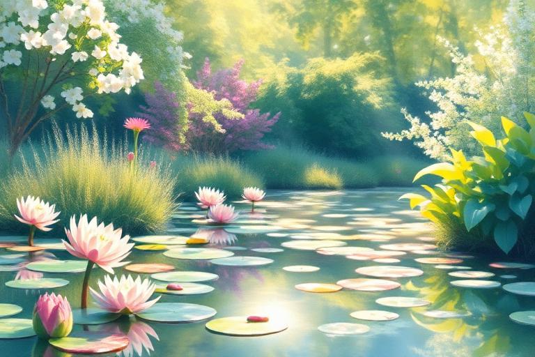
Light-focused art capturing fleeting moments with visible brushstrokes
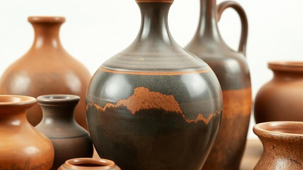
Full style guide →Handcrafted ceramic art and functional pottery
Full style guide →