Pottery / Ceramics

Handcrafted ceramic art and functional pottery

Compare Pottery / Ceramics with another style →
Record035-PO
AestheticPottery / Ceramics
ClassAnalog / Nostalgic
StatusINGESTING
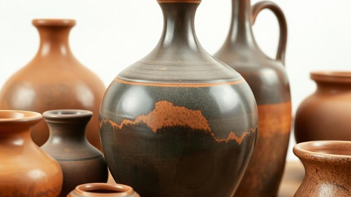
Example of the Pottery / Ceramics aesthetic
Archive platepottery
Source document

Registrar's index cards on the platen glass - captured by the scanner

Omoro Archive - Registrar's OfficePottery / CeramicsFILE 035-PO
When to use it
  • Artisan brand marketing
  • Handmade craft showcases
+2 more in the Style Guide
Perfect for
  • Ceramic artists and studios
  • Artisan home goods
+2 more in the Style Guide
What it looks like
  • Wheel-thrown vessels
  • Glazed ceramics
+2 more in the Style Guide
Omoro Style GuideAll 151 aesthetics, every field on this page, in one PDF.
Get the guide →
History

28,000 BCE–present · Universal; all human cultures; the earliest human craft tradition

Pottery is the art of forming clay and hardening it with fire: a technology developed independently in multiple cultures beginning around 28,000 BCE (Gravettian fired figurines), with utilitarian pottery vessels appearing around 20,000–12,000 BCE. The visual cultures of pottery are enormously diverse: Greek black- and red-figure amphorae, Chinese Song Dynasty celadon, Japanese Edo-period Arita porcelain, Moroccan zellige tile, and contemporary studio pottery all represent radically different aesthetic traditions sharing the common material base of clay and fire.

The modern studio pottery movement emerged in the early 20th century from the Arts and Crafts tradition and received its major theoretical statement in Bernard Leach's A Potter's Book (1940), which integrated Japanese folk pottery (mingei) philosophy: appreciation for honest, utilitarian objects made with care: with Western craft tradition. Leach's influence created a global studio pottery aesthetic: earth-toned, wheel-thrown, with functional form as the primary value.

Contemporary pottery has diversified enormously: the delicate, highly refined work of Edmund de Waal (whose pottery inspired his book The Hare with Amber Eyes), the raw, expressive surfaces of Peter Voulkos's ceramic sculpture, the technically virtuosic porcelain of Ah Leon, and the Instagram-driven craft pottery revival of the 2010s–present, which made the visual language of handmade clay objects enormously visible and commercially viable.

Visual markers

The visual DNA: what makes it recognisable

typography
  • Craft-quality hand lettering on ceramic surfaces: the tradition of inscribed pottery
  • Minimal type for studio pottery presentation: the object communicates
  • Warm serif faces that match pottery's organic warmth in printed materials
  • Potter's mark or monogram: the craft tradition of signed work
grid
  • Object photography: single vessel against neutral cloth or paper background
  • Studio documentation: pottery in process: wet clay, wheel, kiln
  • Collection arrangement: multiple vessels grouped for visual relationship
  • Close crop on surface: glaze texture, throwing rings, finger marks
materials
  • Terracotta: #C25D3A, #B85030: the color of unglazed fired clay
  • Celadon green: #7A9A8A, #8AAA98: the jade-referencing glaze of Chinese tradition
  • Ash glaze white: #E8E4DC, #F0ECE4: the milky white of wood-fire ash glazes
  • Stoneware grey: #908880, #A09890: the natural color of high-fire clay bodies
motifs
  • Throwing rings: the horizontal ridges left by hands on a wheel-thrown vessel
  • Glaze movement: drips, pools, and gradients where glaze melts in the kiln
  • Finger marks and tool impressions: the direct record of making
  • Form-function unity: the vessel shape determined by its use
Aesthetic profile

8-channel console - dominant channels taped & circled by the registrar

Attribute Console - 035-PO 8 CH ACTIVEFIG. 1
CH01Minimal
MaximalL·20
CH02Analog
DigitalL·100
CH03Restrained
ExpressiveR·30
CH04Cool
WarmR·70
CH05Futuristic
NostalgicR·80
CH06Structured
ChaoticL·20
CH07Dark
LightR·20
CH08Organic
GeometricL·60

strongest channels circled - leans analog, nostalgic, warm ✦

Profile card

Your aesthetic passport - share the fingerprint

Aesthetic Profile
Pottery / Ceramics
MinimalAnalogExpressiveWarmNostalgicStructuredLightOrganic
AnalogNostalgicWarm
omoro.io/styles/pottery
Color Palettes

4 color interpretations of this aesthetic

Pottery / Ceramics
Earth and fire - kiln-born color
Celadon
Korean grey-green reduction glaze: the colour of jade and sky
Raku
Naked raku: unpredictable iridescence from sudden flame and smoke
Blue & White
Ming dynasty cobalt on porcelain: precise and eternal
Authenticity
Photo Direction

How to shoot this aesthetic

"Earth, water, fire the ancient conversation between hands and clay"

Shot list

  • Close action shot of hands centering clay on a wheel, water glistening, motion blur in the spinning form
  • Portrait of a potter looking at a finished piece held at arm's length, evaluating glaze and form
  • Kiln open just after a firing, finished work glowing with residual warmth inside

Lighting

Soft window light for portraits and process shots; switch to a single bare light at low angle for finished work to rake across the glaze surface and reveal texture

Mood Board

Join waitlist for access

Join the waitlist for full access

Join the waitlist
Creative Application Analysis

Pottery / Ceramics: where the language earns its place

Pottery / Ceramics is most effective when its visual decisions do useful work. Handcrafted ceramic art and functional pottery

Best industries
Fashion and editorialFIT 9/10

The style gives styling, proportion, and image sequencing a clear point of view rather than treating them as decoration.

Hospitality and real estateFIT 8/10

It can turn atmosphere, material, and spatial pacing into evidence of a distinct experience before a visitor arrives.

Culture and premium retailFIT 8/10

It helps a physical or editorial environment feel authored, which raises attention and perceived care.

Best audiences
Design-literate viewersFIT 9/10

They recognize the references, proportion, and restraint that make the language feel intentional.

Considered buyersFIT 8/10

They respond to visible judgment because it reduces the feeling of interchangeable product.

Creative decision makersFIT 8/10

A coherent aesthetic gives them a usable standard for choosing images, objects, and collaborators.

Best products
Flagship productsA singular object benefits when the visual system concentrates attention rather than dispersing it.
Editorial publicationsThe language can hold a sequence of stories together while leaving room for individual subjects.
Spatial and service experiencesIt extends naturally into materials, signage, lighting, and the rhythm of arrival.
Best campaign types
Brand or product launchA defined visual language gives the first encounter enough conviction to establish a durable frame.
Editorial campaignIt rewards a sequence of related images rather than a single isolated hero shot.
Concept film or lookbookMotion, casting, set detail, and typography can all carry the same underlying logic.
Creative feasibility
Production costMedium

The cost comes from consistent art direction, suitable locations or materials, and time to edit the details that would otherwise undermine the premise.

Creative difficultyHigh

The challenge is conceptual. It takes visual literacy and a real point of view to avoid borrowing surface cues without their original logic.

Execution difficultyHigh

Lighting, casting, type, color, material, and retouching must agree. A single weak choice can make the work feel like an imitation.

Overall creative assessment

Pottery / Ceramics creates its strongest advantage when it gives a brand a standard of judgment, not merely an attractive finish. It fails when recognizable cues are collected without a governing idea. The difference between average and exceptional execution is usually proportion: how much is shown, what is withheld, and whether every element belongs to the same world. The most capable teams pair an exacting art director with specialists who understand the medium, from photographer and stylist to set designer, editor, and typographer.

Strategic Recommendation

Should Pottery / Ceramics be the strategic choice?

Best for
A brand with a real point of viewThe aesthetic works when it can sharpen an existing position, not invent one in its place.
High-consideration launchesA controlled visual system helps make an object, place, or service feel intentional before its details are fully understood.
Editorial, spatial, and experiential workThese formats allow composition, material, pacing, and typography to reinforce one another.
Creative portfolios and institutionsA sustained visual language can demonstrate discernment and make a body of work feel coherent.
Avoid if
The message must be read instantly by everyoneAesthetic nuance can compete with direct instructional clarity when accessibility is the first requirement.
The brand cannot sustain production standardsInconsistent imagery, typography, or material choices expose the gap between the concept and the execution.
The product has no credible relationship to the visual promiseStyling cannot compensate for a story, object, or service that does not support it.
Risk of misuseHigh

Surface imitation is easy. The language becomes generic when familiar cues replace proportion, specificity, and a coherent system.

Contemporary prevalenceCommon

Its visual ingredients appear regularly in contemporary work, but a rigorous execution remains distinguishable from a loose collection of references.

LongevityEnduring

Its strongest principles depend on composition, material, and cultural literacy rather than a short-lived visual effect.

Brand investmentHigh

It asks for consistency across photography, typography, motion, environments, and the many details that make a brand feel believable.

Creative verdict

Pottery / Ceramics deserves serious consideration from brands and institutions that can articulate a real point of view and protect it through execution. It is less suitable for work that needs immediate instructional clarity, broad visual neutrality, or low-cost production flexibility. Its greatest advantage is differentiation through judgment: it can make a product, place, or editorial proposition feel authored rather than merely packaged. Average executions borrow recognizable signals, then lose coherence when type, casting, copy, or materials fail to agree. Exceptional executions understand the visual language as a system of choices, including what not to show. The largest mistake is treating the style as a finish applied after strategy. Adopt it only when the product and organization can carry the same standard of care the imagery proposes.

Editorial Depth

Join waitlist for access

Common Misconception
Historical Context
Brands That Accidentally Use This Style
Brands That Perfectly Represent This Style
Psychological Effect

Join the waitlist for editorial depth

Join the waitlist
Related concepts

Connected across the creative knowledge graph

Cross-references
Wabi-Sabiwabi-sabi philosophy finds its most complete material expression in pottery traditionBiophilic Designpottery's earth materials and natural palette align with biophilic design valuesBronze Agepottery is the other foundational material alongside bronze in ancient visual cultureIllustrationdecorated pottery surfaces are among the oldest illustration traditions
About this aesthetic
What is pottery visual aesthetic?
Pottery aesthetic centers on the visual qualities of hand-formed, fired clay: terracotta (#C25D3A), celadon green (#7A9A8A), ash glaze white (#E8E4DC), and stoneware grey (#908880). Key marks: throwing rings, glaze movement, finger impressions: the direct evidence of making. From Greek black-figure to Japanese wabi-sabi mingei to contemporary studio pottery, the aesthetic values form-function integrity and the visible trace of the maker's hand.
What makes studio pottery different from mass-produced ceramics?
Studio pottery is made by hand (typically wheel-thrown or hand-built) in small quantities by an individual potter who controls every aspect: clay body, forming, surface treatment, glaze, and firing. Each piece is unique in small variations. Mass-produced ceramics (Wedgwood, Ikea) are industrially cast in identical molds, consistently glazed, and fired at scale. The studio pottery value proposition is exactly these variations: the slight irregularity that records human presence.
What is the wabi-sabi relationship to pottery?
Wabi-sabi: the Japanese aesthetic of imperfect, incomplete, and impermanent beauty: finds its most complete physical expression in pottery. The Zen tea ceremony (chanoyu) chose irregular, rustic raku tea bowls (Chōjirō, 16th century) over refined Chinese porcelain precisely because their imperfections encouraged meditative attention. Bernard Leach brought this philosophy West through his friendship with Shoji Hamada and his study of Korean onggi pottery. Contemporary studio pottery that references wabi-sabi values rough texture, asymmetry, and visible process over technical perfection.

Build with the pottery / ceramics aesthetic

Omoro turns aesthetic references into on-brand visuals. Generate, compose and publish from one studio.

Join the waitlist