
Tension Report - Where They Diverge4 FINDINGS
Δ is the gap between the two on that spectrum, 0 (identical) to 100 (opposite poles).
Futuristic points forward; nostalgic points to a specific remembered moment. One promises what is next, the other that something familiar is still true. Swiss / International leans nostalgic, Vector Minimalism stays closer to futuristic.
Analog carries the trace of a hand; digital carries the precision of a system. It is usually the first thing a viewer clocks about how something was made. Vector Minimalism leans digital, Swiss / International stays closer to analog.
Both land at a similar temperature. The difference shows in a side by side and rarely on its own. Vector Minimalism leans warm, Swiss / International stays closer to cool.
Both hold back a similar amount. The difference is tone rather than volume. Vector Minimalism leans expressive, Swiss / International stays closer to restrained.
Both lean into these. Expect less friction here than everywhere the report just flagged.
both lean geometric - they'd argue about everything else ✦
Vector Minimalism vs Swiss / International: 93% affinity (Highly compatible)
Where they split: Swiss / International leans nostalgic, Vector Minimalism stays closer to futuristic. Also diverging: Analog vs Digital (Δ25), Cool vs Warm (Δ20), Restrained vs Expressive (Δ15). Where they agree: both lean geometric, structured, minimal, light.
Safe to blend: close enough that mixing Vector Minimalism and Swiss / International reads as one coherent direction, not two competing ones.
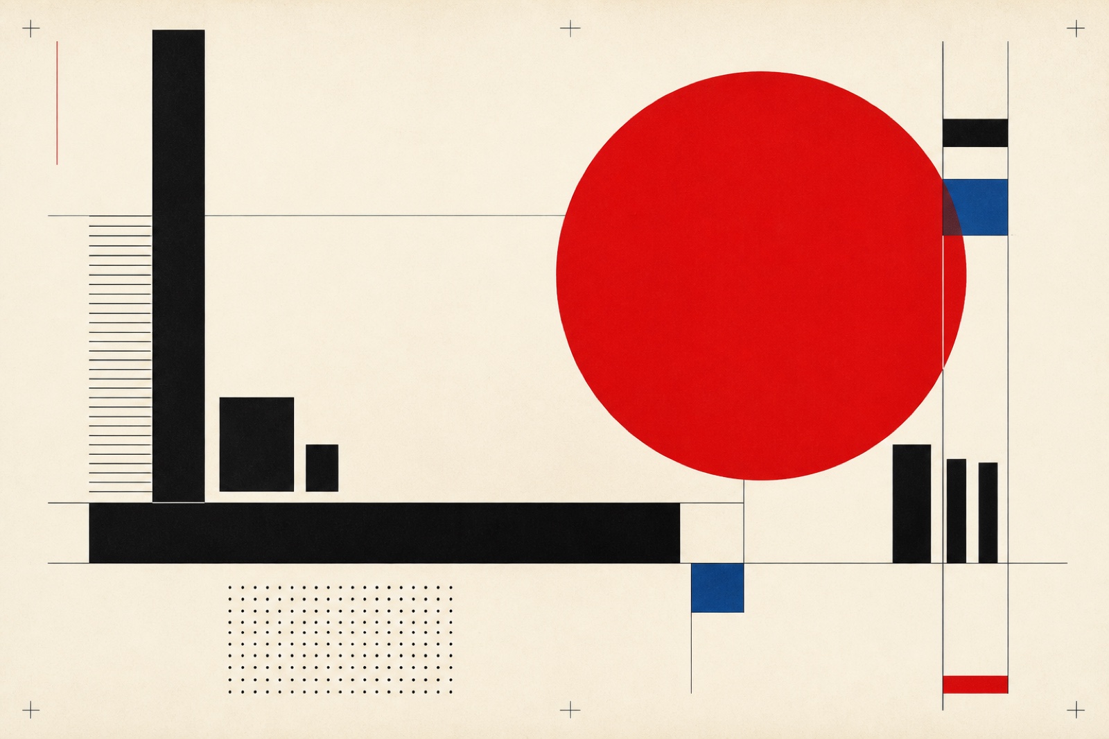
Clean geometric shapes, flat colors, and precisely balanced compositions
Full style guide →International typographic style with grids, sans-serif type, and objective clarity
Full style guide →