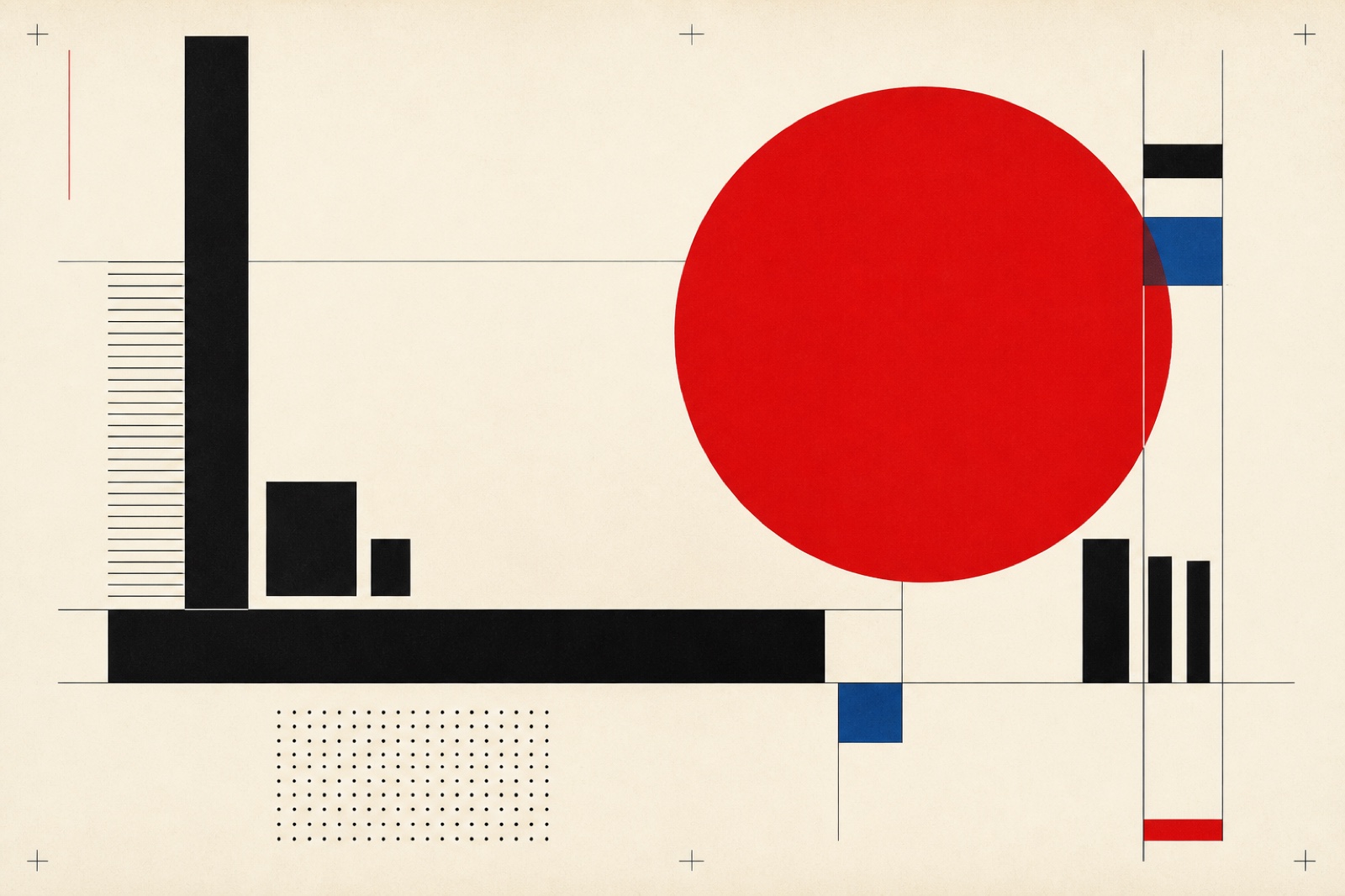
Swiss / International

International typographic style with grids, sans-serif type, and objective clarity

Compare Swiss / International with another style →
Record038-SW
AestheticSwiss / International
ClassStructured / Geometric
StatusINGESTING
Example of the Swiss / International aesthetic
Archive plateswiss
Source document

Registrar's index cards on the platen glass - captured by the scanner

Omoro Archive - Registrar's OfficeSwiss / InternationalFILE 038-SW
When to use it
  • Corporate communications
  • Information design
+2 more in the Style Guide
Perfect for
  • Financial institutions
  • Museums and cultural centers
+2 more in the Style Guide
What it looks like
  • Helvetica typography
  • Strict grid systems
+2 more in the Style Guide
Omoro Style GuideAll 151 aesthetics, every field on this page, in one PDF.
Get the guide →
History

1950s–present · Zurich & Basel, Switzerland

Swiss Design, formally called the International Typographic Style, crystallised in Zurich and Basel between 1950 and 1965. Armin Hofmann at the Basel School of Design and Josef Müller-Brockmann at the Zurich School of Arts codified an approach built on mathematical grids, objective photography, and sans-serif type, primarily Helvetica and Univers, both designed in Switzerland in 1957. The movement rejected ornament not as a stylistic preference but as an ethical stance: clarity was honesty, and complexity was deception.

By the 1960s the style had escaped its Swiss borders. Corporations adopting it, Lufthansa (1963), New York's MTA subway signage (1970), the US Bicentennial identity (1976), proved that a coherent visual system could communicate across languages and cultures. The grid became infrastructure. Armin Hofmann's 1965 textbook 'Graphic Design Manual' remains in print because its principles are structural, not decorative.

Contemporary design constantly reinvents the Swiss vocabulary. Massimo Vignelli called Helvetica 'the typeface of honesty.' Neubrutalism rejects its politeness while still leaning on its grid logic. Corporate tech adopted a simplified version as the default for dashboards and data products. The aesthetic's authority comes from coherence: every element justified by the system, nothing arbitrary.

Visual markers

The visual DNA: what makes it recognisable

typography
  • Helvetica or Univers as primary face, set in weight contrasts rather than style variety
  • Flush-left ragged-right alignment: never justified
  • Large type scale ratios (headline 5–6× the body size)
  • Tight but not touching: tracked capitals at +30–50 units
grid
  • Modular column grid, typically 6 or 12 columns with consistent gutter
  • Baseline grid governs vertical rhythm across all elements
  • Generous white space as active structure, not empty filler
  • Hard-edge geometric shapes aligned to grid intersections
materials
  • Flat unmodulated color: no gradients, no shadows
  • Black, white, and a single accent (red, yellow, or blue)
  • Halftone photography cropped to strict rectangles
  • Offset-print aesthetic: ink on white paper
motifs
  • Diagonal rules cutting across the grid for tension
  • Statistical charts and data as graphic elements
  • Objective documentary photography, not illustrative imagery
  • The period mark or em dash as a compositional device
Aesthetic profile

8-channel console - dominant channels taped & circled by the registrar

Attribute Console - 038-SW 8 CH ACTIVEFIG. 1
CH01Minimal
MaximalL·70
CH02Analog
DigitalR·20
CH03Restrained
ExpressiveL·70
CH04Cool
WarmL·40
CH05Futuristic
NostalgicR·30
CH06Structured
ChaoticL·90
CH07Dark
LightR·30
CH08Organic
GeometricR·90

strongest channels circled - leans structured, geometric, minimal ✦

Profile card

Your aesthetic passport - share the fingerprint

Aesthetic Profile
Swiss / International
MinimalDigitalRestrainedCoolNostalgicStructuredLightGeometric
StructuredGeometricMinimal
omoro.io/styles/swiss
Color Palettes

4 color interpretations of this aesthetic

Swiss / International
International style - grid and clarity
Helvetica
Müller-Brockmann's grid: only what the message requires
International Style
Swiss school with a single cool accent: precision over decoration
Zürich
Warm Swiss neutrals: Zurich banking and clear Alpine air
TrustSophistication
Photo Direction

How to shoot this aesthetic

"Order as aspiration the grid, Helvetica, and the moral philosophy of clarity"

Shot list

  • Clean grid-aligned portrait using the rule of thirds as a literal grid, every element locked to the intersection
  • Typographic still life of objects arranged on a strict geometric axis with significant negative space
  • Portrait of a graphic designer at work on a grid layout, the design visible and clearly structured

Lighting

Pure, neutral, shadowless light a large overhead panel at 5500K rated for photography; the Swiss International Style's allegiance to objectivity requires light that serves information, not mood

Mood Board

Join waitlist for access

Join the waitlist for full access

Join the waitlist
Creative Application Analysis

Swiss / International: where the language earns its place

Swiss / International is most effective when its visual decisions do useful work. International typographic style with grids, sans-serif type, and objective clarity

Best industries
Fashion and editorialFIT 9/10

The style gives styling, proportion, and image sequencing a clear point of view rather than treating them as decoration.

Hospitality and real estateFIT 8/10

It can turn atmosphere, material, and spatial pacing into evidence of a distinct experience before a visitor arrives.

Culture and premium retailFIT 8/10

It helps a physical or editorial environment feel authored, which raises attention and perceived care.

Best audiences
Design-literate viewersFIT 9/10

They recognize the references, proportion, and restraint that make the language feel intentional.

Considered buyersFIT 8/10

They respond to visible judgment because it reduces the feeling of interchangeable product.

Creative decision makersFIT 8/10

A coherent aesthetic gives them a usable standard for choosing images, objects, and collaborators.

Best products
Flagship productsA singular object benefits when the visual system concentrates attention rather than dispersing it.
Editorial publicationsThe language can hold a sequence of stories together while leaving room for individual subjects.
Spatial and service experiencesIt extends naturally into materials, signage, lighting, and the rhythm of arrival.
Best campaign types
Brand or product launchA defined visual language gives the first encounter enough conviction to establish a durable frame.
Editorial campaignIt rewards a sequence of related images rather than a single isolated hero shot.
Concept film or lookbookMotion, casting, set detail, and typography can all carry the same underlying logic.
Creative feasibility
Production costMedium

The cost comes from consistent art direction, suitable locations or materials, and time to edit the details that would otherwise undermine the premise.

Creative difficultyHigh

The challenge is conceptual. It takes visual literacy and a real point of view to avoid borrowing surface cues without their original logic.

Execution difficultyHigh

Lighting, casting, type, color, material, and retouching must agree. A single weak choice can make the work feel like an imitation.

Overall creative assessment

Swiss / International creates its strongest advantage when it gives a brand a standard of judgment, not merely an attractive finish. It fails when recognizable cues are collected without a governing idea. The difference between average and exceptional execution is usually proportion: how much is shown, what is withheld, and whether every element belongs to the same world. The most capable teams pair an exacting art director with specialists who understand the medium, from photographer and stylist to set designer, editor, and typographer.

Strategic Recommendation

Should Swiss / International be the strategic choice?

Best for
A brand with a real point of viewThe aesthetic works when it can sharpen an existing position, not invent one in its place.
High-consideration launchesA controlled visual system helps make an object, place, or service feel intentional before its details are fully understood.
Editorial, spatial, and experiential workThese formats allow composition, material, pacing, and typography to reinforce one another.
Creative portfolios and institutionsA sustained visual language can demonstrate discernment and make a body of work feel coherent.
Avoid if
The message must be read instantly by everyoneAesthetic nuance can compete with direct instructional clarity when accessibility is the first requirement.
The brand cannot sustain production standardsInconsistent imagery, typography, or material choices expose the gap between the concept and the execution.
The product has no credible relationship to the visual promiseStyling cannot compensate for a story, object, or service that does not support it.
Risk of misuseHigh

Surface imitation is easy. The language becomes generic when familiar cues replace proportion, specificity, and a coherent system.

Contemporary prevalenceCommon

Its visual ingredients appear regularly in contemporary work, but a rigorous execution remains distinguishable from a loose collection of references.

LongevityEnduring

Its strongest principles depend on composition, material, and cultural literacy rather than a short-lived visual effect.

Brand investmentHigh

It asks for consistency across photography, typography, motion, environments, and the many details that make a brand feel believable.

Creative verdict

Swiss / International deserves serious consideration from brands and institutions that can articulate a real point of view and protect it through execution. It is less suitable for work that needs immediate instructional clarity, broad visual neutrality, or low-cost production flexibility. Its greatest advantage is differentiation through judgment: it can make a product, place, or editorial proposition feel authored rather than merely packaged. Average executions borrow recognizable signals, then lose coherence when type, casting, copy, or materials fail to agree. Exceptional executions understand the visual language as a system of choices, including what not to show. The largest mistake is treating the style as a finish applied after strategy. Adopt it only when the product and organization can carry the same standard of care the imagery proposes.

Editorial Depth

Join waitlist for access

Common Misconception
Historical Context
Brands That Accidentally Use This Style
Brands That Perfectly Represent This Style
Psychological Effect

Join the waitlist for editorial depth

Join the waitlist
Related concepts

Connected across the creative knowledge graph

Cross-references
Bauhausdirect predecessor, ideological ancestorVector Minimalismcontemporary descendantFlat Designdigital-era simplified derivationNeubrutalismreaction against Swiss politeness
Compare
Swiss / International vs BauhausSwiss / International vs Luxury MinimalSwiss / International vs Neubrutalism
About this aesthetic
What is Swiss Design (International Typographic Style)?
Swiss Design is a graphic design movement that emerged in Switzerland in the 1950s, defined by mathematical grid systems, Helvetica and Univers typefaces, objective photography, and the elimination of ornament. It became the template for corporate identity and publication design worldwide.
What typefaces define the Swiss Design aesthetic?
Helvetica (Max Miedinger, 1957) and Univers (Adrian Frutiger, 1957) are the canonical Swiss typefaces: both designed the same year the style was being codified. Akzidenz-Grotesk, the earlier grotesque that inspired both, is also historically authentic. All share the same neutral, optical-industrial quality.
How is Swiss Design different from Bauhaus?
Bauhaus (1919–1933) was a school exploring the intersection of craft, fine art, and industry, with a more experimental and expressive output. Swiss Design descended from that radicalism but systematized it: where Bauhaus was a laboratory, Swiss Design was a methodology: reproducible, teachable, and internationally deployable.

Build with the swiss / international aesthetic

Omoro turns aesthetic references into on-brand visuals. Generate, compose and publish from one studio.

Join the waitlist