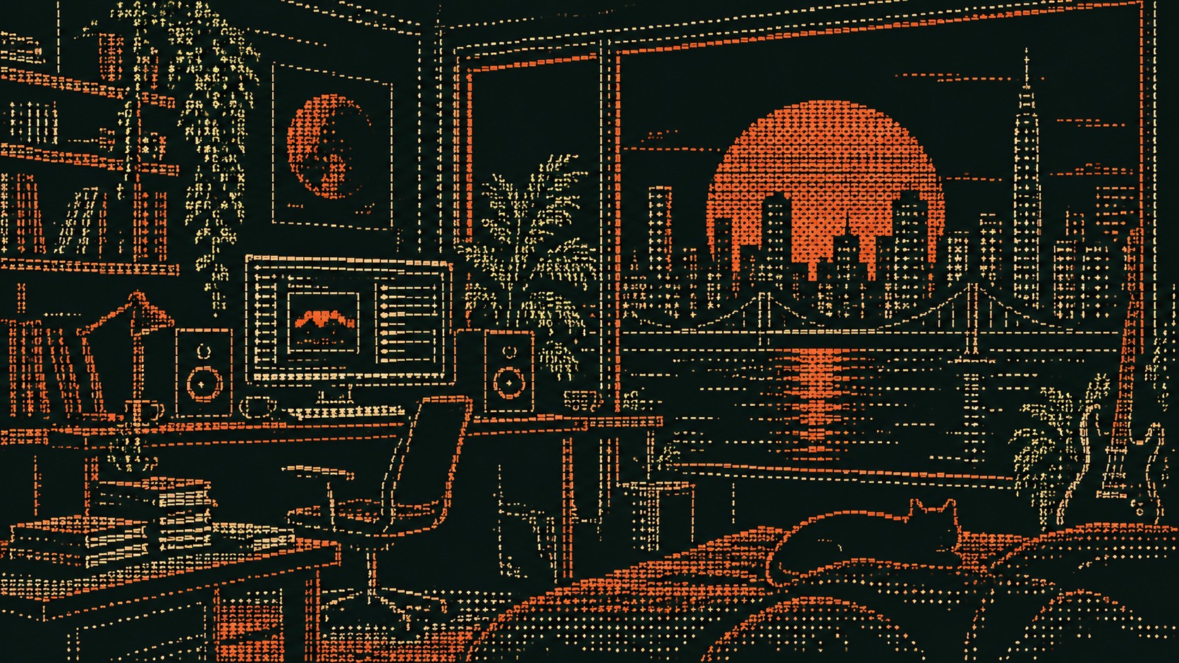
Amber CRT sets the weight of the palette in warmth and creativity, and Terminal Black is the swatch that breaks rank: a single black that stops the set reading as one note. Terminal Black to Paper White spans 89 points of lightness, so the palette can carry its own hierarchy without reaching for a second one. Amber CRT and Paper White are the only chromatic swatches here and both are warm, so the palette leans forward with nothing to pull it back.
Terminal Black reads as pure authority: sophistication, power, and the visual weight that makes everything placed near it feel more serious.
Phosphor Green an emerald or kelly green: vitality turned all the way up, confident and alive.
Amber CRT a citrus-bright orange: enthusiasm, playfulness, an unmistakable call to attention.
Paper White a peach or apricot tint, all the friendliness of orange with none of the volume.
Line-printer Grey is true neutrality, balance and restraint, a color that recedes so the palette's other choices can carry the emotional weight.
Pictures built from keyboard characters on a monospace grid, from Bell Labs in 1966 to terminal banners, BBS art and generative web
Explore the full ASCII Art style guide