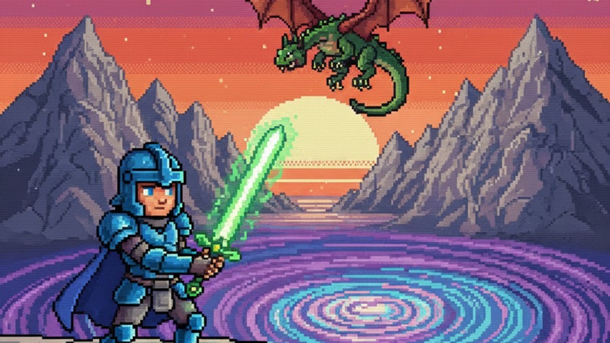
ASCII Art

Pictures built from keyboard characters on a monospace grid, from Bell Labs in 1966 to terminal banners, BBS art and generative web

Compare ASCII Art with another style →See the ASCII Art typefaces →
Record020-AA
AestheticASCII Art
ClassGeometric / Digital
StatusINGESTING
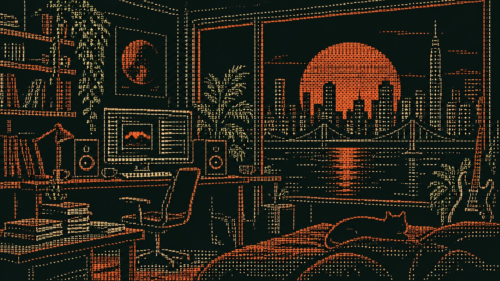
A studio room with a computer, plants and a cat, a city sunset in the window, drawn in orange and green ASCII characters on black.
Archive plate · ASCII Art
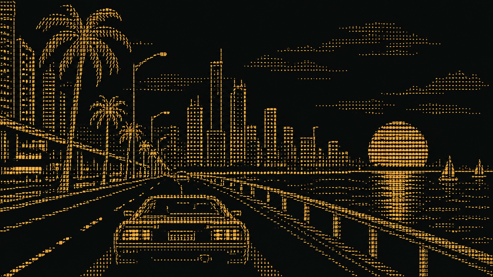
A coastal highway at night with palms, a skyline and a setting sun, drawn in amber ASCII characters on black.
Dossier sceneHighway · 1/4
01
The record

What it is, when it works, who it is for, and where it already exists.

How to use it

Record 020-AA - when it works, who it is for, what it looks like

FIELD 01

When to use it

  • Developer tools, open-source projects and technical brands with a sense of humour
  • Music and club graphics that want a raw, text-only look
  • Websites and motion pieces where the image can be rendered live from text
  • Editorial about computing, hacking and internet history
FIELD 02

Perfect for

  • Developer tools and open-source projects
  • Electronic musicians and labels
  • Creative coders and generative artists
  • Tech publications and newsletters
FIELD 03

What it looks like

  • Ken Knowlton and Leon Harmon, Studies in Perception I, Bell Labs, 1966
  • The ASCII character standard, 1963
  • ANSI art and the BBS art scene, 1990s
  • Vuk Ćosić, ASCII History of Moving Images, 1998

In the wild, ASCII Art aesthetic real-world examples

Where this aesthetic shows up in the real world · ↗ opens the source site

Omoro Style GuideEvery aesthetic, every field on this page, in one PDF.
Get the guide →
02
The anatomy

Where ASCII Art came from, what makes it recognisable, and the fingerprint it leaves.

History, ASCII Art aesthetic history

1966 to now · Bell Labs computer art, terminal and line-printer culture, then BBS art and the web

People made pictures on typewriters long before computers, but the character image as a computer medium starts at Bell Labs in 1966. Ken Knowlton and Leon Harmon scanned a photograph of the dancer Deborah Hay, reduced it to a grid of grey values and replaced each value with a symbol of matching density. The twelve-foot print, Studies in Perception I, better known as Computer Nude, was taken down at Bell Labs after a day, then appeared on the front page of the New York Times in 1967 and at the Museum of Modern Art in 1968.

The ASCII standard of 1963 gave everyone the same set of characters, and the constraint became a craft. Programmers drew banners and logos in code comments and terminal splash screens, line printers produced portraits on tractor-feed paper, and in the 1980s and 1990s the bulletin-board scene turned text art into a competitive medium, with ANSI art adding colour to the same grid.

Net artists and creative coders kept it alive on the web, among them Vuk Ćosić, whose ASCII History of Moving Images of 1998 converted film into scrolling text. Today it turns up in developer tools, music graphics, generative websites and shaders that render live images as characters, because it is at once technical, handmade and instantly legible as computing.

A picture made of the characters on a keyboard.

Omoro dossier · 020-AA

Visual markers, ASCII Art aesthetic visual markers

The visual DNA: what makes it recognisable

typography

See the fonts
  • Monospace everything: the image and the type share one grid
  • Banner lettering built out of characters
  • Box-drawing characters for frames and rules

grid

  • A strict character grid, every cell the same width
  • Density ramps from space to full block to carry tone
  • Images framed by box-drawing characters like a terminal window
  • Coarse grids for legibility, fine grids for near-photographic images

materials

  • Terminal black #0B0C0C with phosphor green #33FF66 or amber #FFB000
  • Paper white #F4F1EA and line-printer grey #8A8F8C for print
  • Terminals, line printers, plain-text files and code comments
  • Scan lines and CRT glow on screen

motifs

  • Portraits and landscapes rendered in characters
  • Terminal splash screens and banners
  • BBS and ANSI art frames
  • Live, generative character rendering on the web

Aesthetic profile

8-channel console with the fingerprint on its display. Save the card, or share the page

Aesthetic Profile
ASCII Art
1966 to now · Bell Labs computer art, terminal and line-printer culture, then BBS art and the web
Attribute console · 020-AA
leans geometric, digital, structured
8 CH
FIG. 1
MinimalMaximalDigitalAnalogRestrainedExpressiveCoolWarmNostalgicFuturisticStructuredChaoticDarkLightGeometricOrganic
01Minimal
Maximal30%
02Analog
Digital80%
03Restrained
Expressive20%
04Cool
Warm30%
05Futuristic
Nostalgic50%
06Structured
Chaotic60%
07Dark
Light60%
08Organic
Geometric90%
GeometricDigitalStructured
Omoro · Attribute console · 020-AA
omoro.io/styles/ascii-art

Color Palettes, ASCII Art color palettes and hex codes

The definitive color scheme for this aesthetic

ASCII Art
#0B0C0C · #33FF66 · #FFB000 · #F4F1EA · #8A8F8C
A terminal at 2am: phosphor green and amber on black, with a line-printer proof beside it
Omoro Palette Pack575 curated palettes across every aesthetic, 5 export formats.
Get the palettes →

Adjacent Palettes, styles related to ASCII Art

The colour of the styles sitting closest to this one

Pixel Art
Web 1.0
Glitch
Cyber Minimalism
03
The direction

How to shoot it, how to prompt it, and how to board it.

Photo Direction

How to shoot this aesthetic

"Shoot for the character grid: strong silhouettes and hard contrast that survive being rebuilt from text"

Shot list

  • A studio room at dusk, a computer on the desk and a city sunset in the window, rendered in orange and green characters on black
  • A coastal highway at night with palms and a low sun, rendered in amber characters like a terminal screen
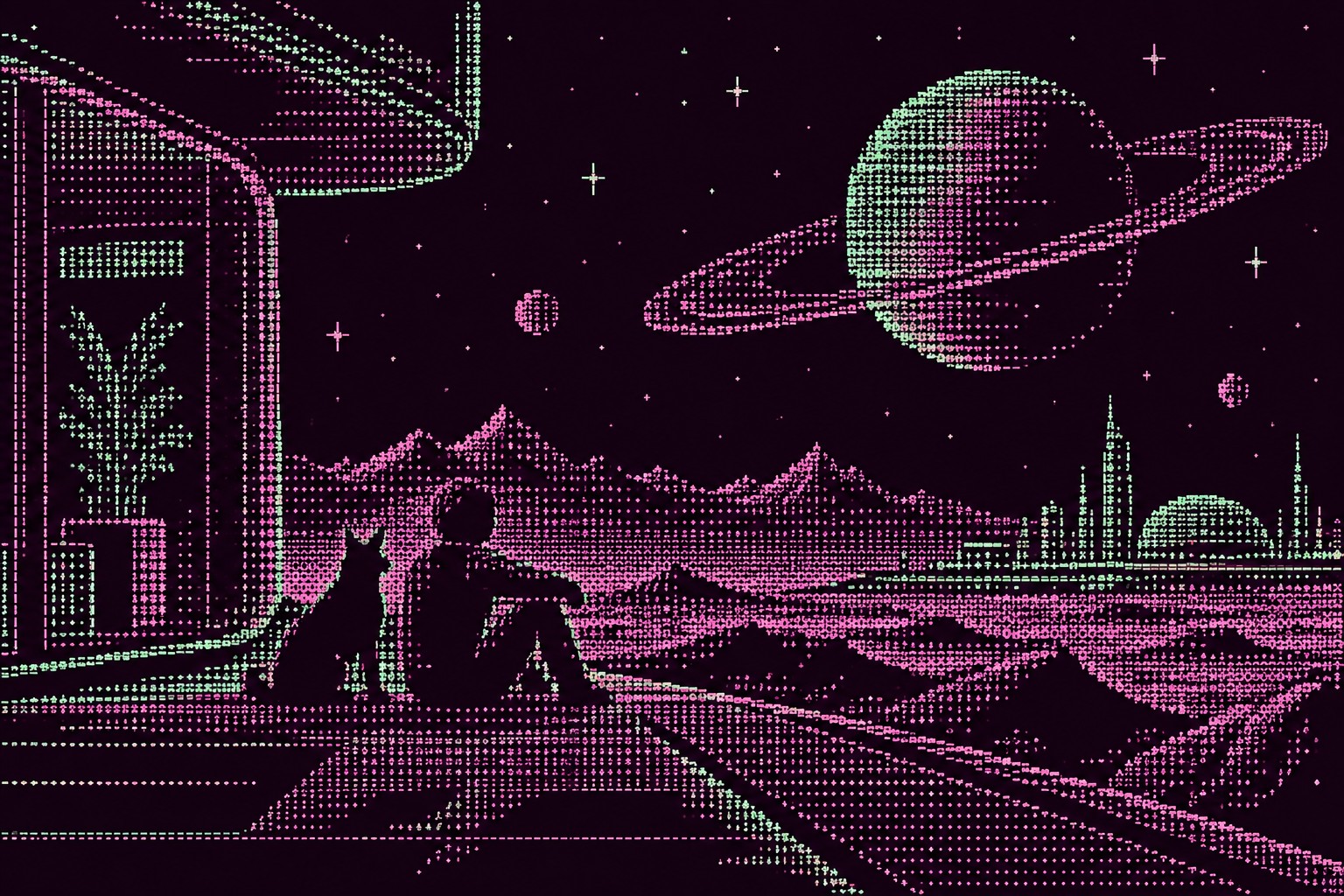
  • A figure and a cat looking out at a ringed planet, rendered in violet characters with one green accent

Lighting

Hard contrast and simple backgrounds. The converter maps brightness to characters, so a strong key light and deep shadows make the image readable; flat light turns into uniform noise.

Omoro Director's Briefs196 photo shot-lists like this one, ready to shoot from.
Get the briefs →

Generative Prompt

Drop this into Studio to generate in this aesthetic

ASCII art aesthetic, an image built entirely from monospace keyboard characters, letters, numbers and punctuation chosen by density, crisp character grid, phosphor green or amber on black or black on white paper, scan lines, terminal or line-printer look, high contrast, legible characters, no photographic texture, no blur

Paste as-is, or append your own subject

Mood Board

The record applied to your project. The record's kit is free; your brand, references and plates come with membership

Mood board
The ASCII Art board
8 frames · 4 selected
FIG. 4
Terminal Black0B0C0CPhosphor Green33FF66Amber CRTFFB000Paper WhiteF4F1EALine-printer Grey8A8F8C
Brand and references
IdleBrand and references open with membership
With membership: the brand's own facts and colours in every prompt, references carried into every frame, and the plates generated.
01 · Hero application
02 · Material and finish
03 · Palette in context
04 · Photography direction
05 · Pattern plate
06 · Object
07 · Environment
08 · Digital presence
Demo kit free, the rest with membershipThe record as a demo kit, free. Name a project and it is written for that
Omoro · Mood board · 020-AA
04
The judgement

Whether to use it, what it costs to do properly, and where it stands right now.

Creative verdict, ASCII Art feasibility and strategic recommendation

Two written calls, seven meters, and when to walk away

Creative verdict
Should ASCII Art be the call?
7 meters
FIG. 2
Assessment

Choose a source with a strong silhouette and high contrast, then keep the grid coarse enough that every character is still legible. Order the characters by ink density and test the ramp on light and dark grounds. Render it as real text where you can: selectable characters are the proof.

Verdict

Right for developer tools, creative coding, electronic music and anything about computing that wants warmth and a wink. It reads as technical and handmade at once. Keep the characters legible, render it as real text where you can, and let one strong silhouette carry the image.

Production cost
Low

A monospace font and a converter, or code that maps brightness to characters.

Creative difficulty
Medium

The character set and the grid size decide the look; the source image decides whether it reads.

Execution difficulty
Medium

Too few columns and the image dissolves; too many and it stops looking like text.

Risk of misuse
Low

It is hard to fake badly for long: either the characters read or the image does not.

Prevalence
Rare

It lives in developer culture, code comments and creative coding, and turns up in music and fashion graphics.

Longevity
Enduring

It has survived every change of screen since 1966, because the keyboard has not changed.

Brand investment
Low

A converter and a monospace font; generated live, it costs nothing to vary.

Avoid if
The image has no strong silhouette
Characters average the detail away; a busy photo turns into noise.
It has to read at very small sizes
Below a certain size the characters blur into grey and the joke is lost.
The audience has never used a terminal
Without the reference it can read as broken text rather than a picture.
Omoro · Creative verdict · 020-AA

Editorial Depth

A Pro feature: origins, practitioners, and pitfalls

Editorial depth
The ASCII Art file
14 sections
FIG. 3
Context02Brands02Perception04Use04Index02
01Common MisconceptionThe principle beneath the surface
02Historical ContextOrigins, cultural moment, and reaction
03Brands That Accidentally Use This StyleNatural alignment, not category claims
04Brands That Perfectly Represent This StyleExceptional execution
05Psychological EffectHow visual decisions change perception
06Visual ChecklistInclude and avoid
07Creative FormulaThe visual system reduced to essentials
08Recognition SignalsHow to recognize it in two seconds
09When To Use This StyleContexts where the language performs
10Common Creative MistakesWhere imitation weakens the signal
11Best Brand ApplicationsIndustries with a natural advantage
12Creative Application AnalysisFit, feasibility, and production reality
13Related StylesClose languages and the key distinction
14Visual DNA SummaryThe sentence to remember
The editorial depth, with membershipOpening soon
Omoro · Editorial depth · 020-AA
05
The index

Neighbours, cross-references, blends, and the questions people ask.

Related concepts

Connected across the creative knowledge graph

Cultural relevance, ASCII Art cultural relevance today

Where it stands now, and what it costs you to use it

ASCII art reads instantly as computing, and at the same time as something made by hand, character by character. That combination makes it useful for developer tools, creative coding, electronic music and anything about the history of the internet.

It is hard to fake badly for long: either the characters stay legible and the image reads, or it becomes noise. The strongest work chooses a source with a clear silhouette, keeps the grid coarse enough to see the characters, and renders them as real, selectable text.

Cross-references

Pixel ArtThe other art of the grid, made of squares instead of charactersWeb 1.0The early web where text art lived in pages and signaturesGlitchComputing made visible through its artefactsCyber MinimalismThe monospace, dark-terminal look it shares a palette with

Blend

Mix ASCII Art with any style in the library

ASCII Art×
50%50%
86% alike
ASCII Art referencePixel Art referenceASCII Art 50%Pixel Art 50%

Merged palette

#0B0C0C

#1565C0

#33FF66

#43A047

#FFB000

Leads geometric, digital, nostalgic

Typography · from ASCII Art

IBM Plex Sans over IBM Plex Mono

Materials

  • Terminal black #0B0C0C with phosphor green #33FF66 or amber #FFB000
  • Paper white #F4F1EA and line-printer grey #8A8F8C for print
  • NES palette: specific 54-color set with bright reds, blues, and greens

The calls this blend forces

These two disagree on one thing, and a blend cannot average them: you pick a side. At this mix:

Dark or Light? ASCII Art is dark, Pixel Art is light. This mix lands dark.

Use it

ASCII art aesthetic, an image built entirely from monospace keyboard characters, letters, numbers and punctuation chosen by density, crisp character grid, phosphor green or amber on black or black on white paper, scan lines, terminal or line-printer look, high contrast, legible characters, no photographic texture, no blur (50%), infused with Pixel art aesthetic with chunky retro video game sprite style, strictly limited color palette of 16 to 32 colors, visible square pixel grid structure, Nintendo NES and SNES and Game Boy era graphic fidelity, dithering patterns for shading and form, crisp aliased edges with zero anti-aliasing, color palette strictly #0B0C0C #1565C0 #33FF66 #43A047 #FFB000, leaning dark over light, overall character: geometric, digital, nostalgic

One-click generation opens with the studio

About this aesthetic

What is ASCII art?

Images built from the printable characters of the ASCII standard, letters, numbers and punctuation, arranged on a monospace grid. Characters are chosen for how much ink they carry, so dense characters make dark areas and sparse ones make light areas.

What was the first ASCII art?

Character images existed on typewriters earlier, but the landmark computer work is Ken Knowlton and Leon Harmon's Studies in Perception I, made at Bell Labs in 1966 and shown at the Museum of Modern Art in 1968.

How is ASCII art different from ANSI art?

ASCII art uses the plain character set, usually in one colour. ANSI art, popular on 1990s bulletin boards, adds colour codes and extended block characters to the same text grid.

Build with the ascii art aesthetic

Every style in the library is broken down like this one: the palette, the typography, the materials and the lineage.

Explore the style library →