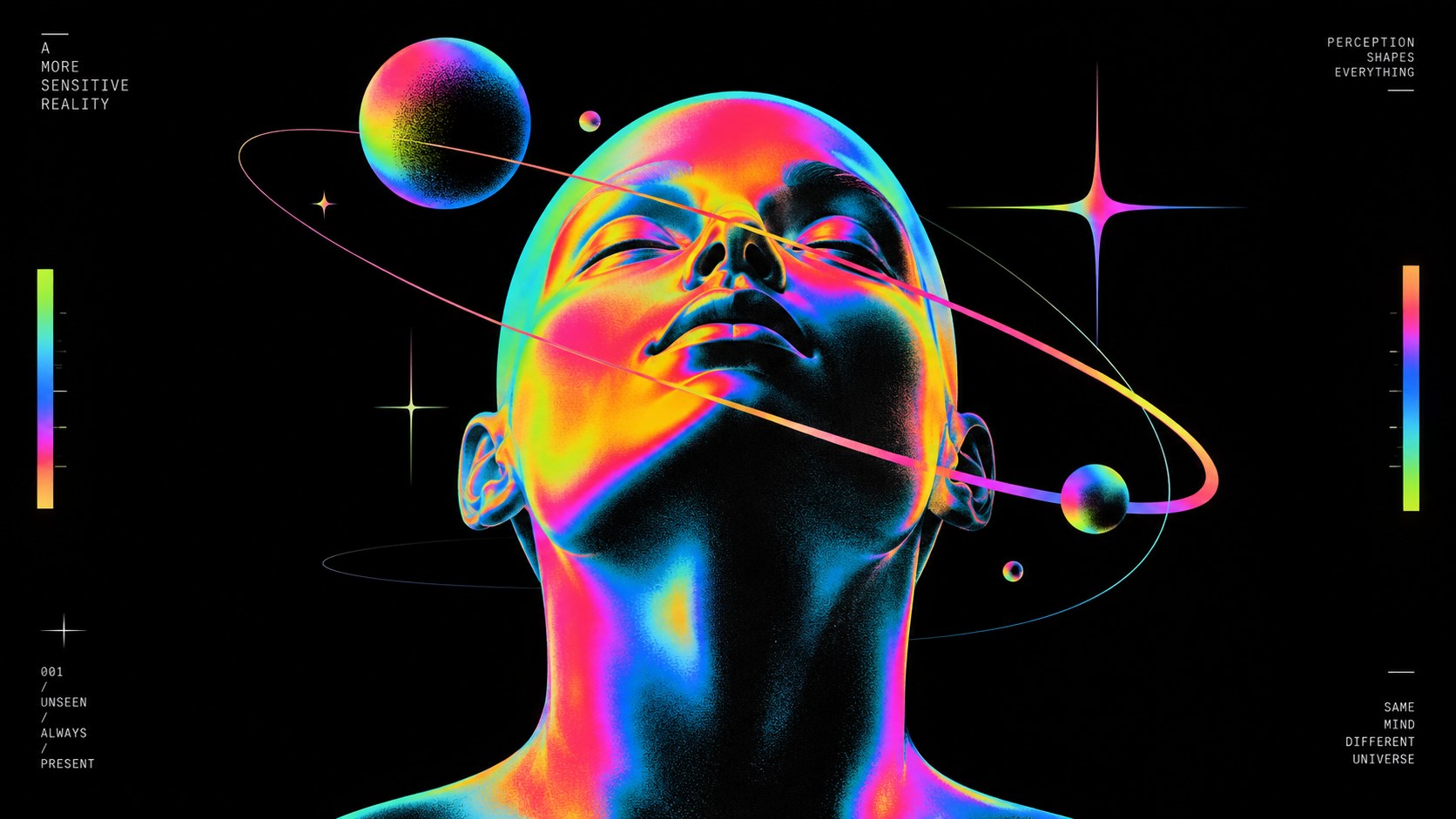
Poster Cream sets the weight of the palette in warmth and creativity, and Hot Coral is the swatch that breaks rank: a single red that stops the set reading as one note. Saturation averages 82 percent with Hot Coral at the top, which is loud enough that the palette will fight anything else on the page. Poster Cream and Electric Blue sit on opposite sides of the temperature line, which is the tension the palette runs on and the pair to hold apart.
Poster Cream a peach or apricot tint, all the friendliness of orange with none of the volume.
Hot Coral reads as pure adrenaline: alarm, desire, the color of things that move fast.
Electric Blue a saturated ultraviolet-blue: intensity with a mystical, slightly electric edge.
Sunset Orange a citrus-bright orange: enthusiasm, playfulness, an unmistakable call to attention.
Deep Violet sits at the edge of blue and violet, introspection, intuition, a color that reads as thoughtful rather than loud.
Bauhaus geometry turned up to euphoria: stacked circles, arches and bars filled with vivid gradients and grain
Explore the full Baugasm style guide