Baugasm

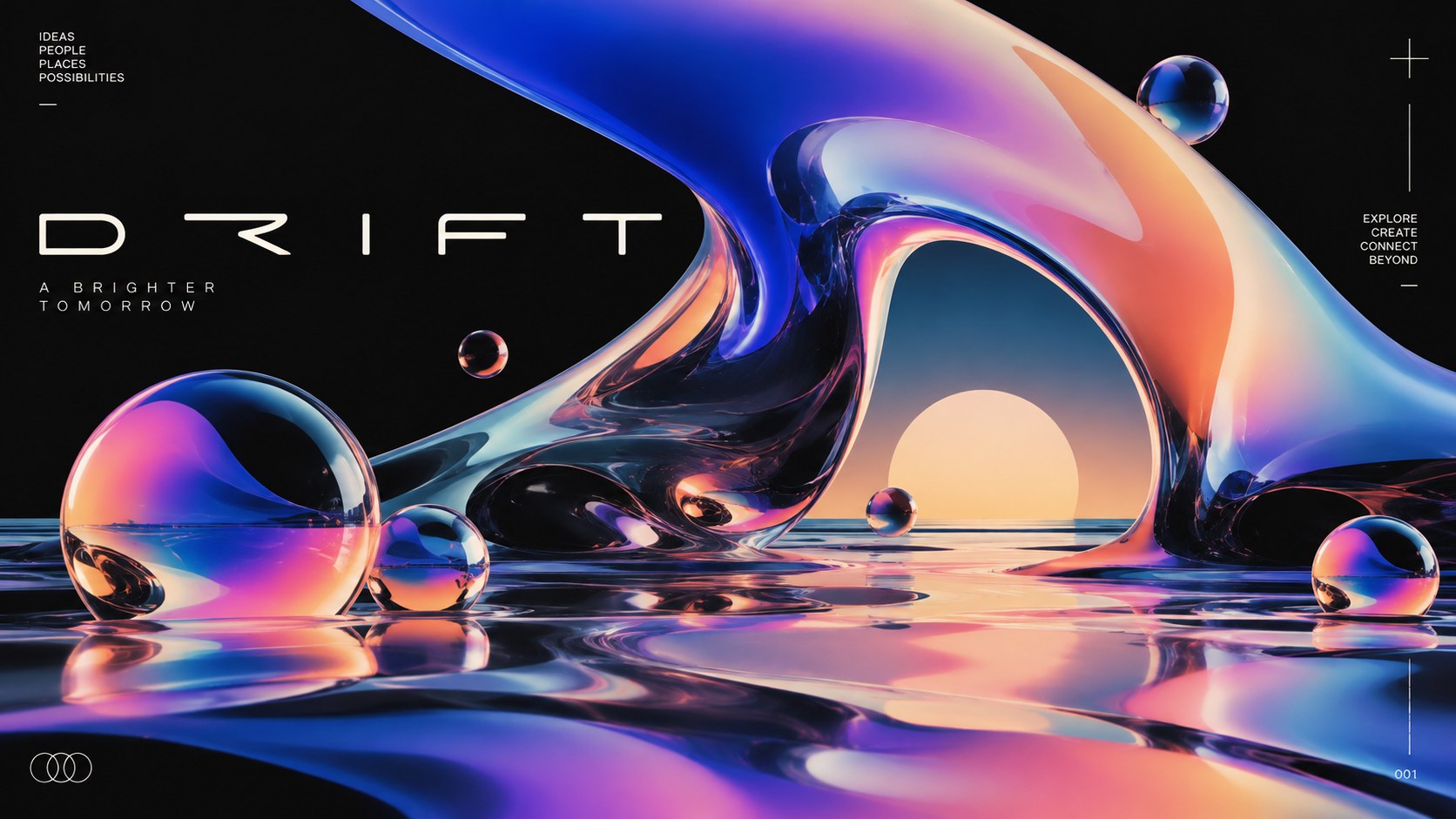
Bauhaus geometry turned up to euphoria: stacked circles, arches and bars filled with vivid gradients and grain

Compare Baugasm with another style →See the Baugasm typefaces →
Record021-BA
AestheticBaugasm
ClassDigital / Expressive
StatusINGESTING
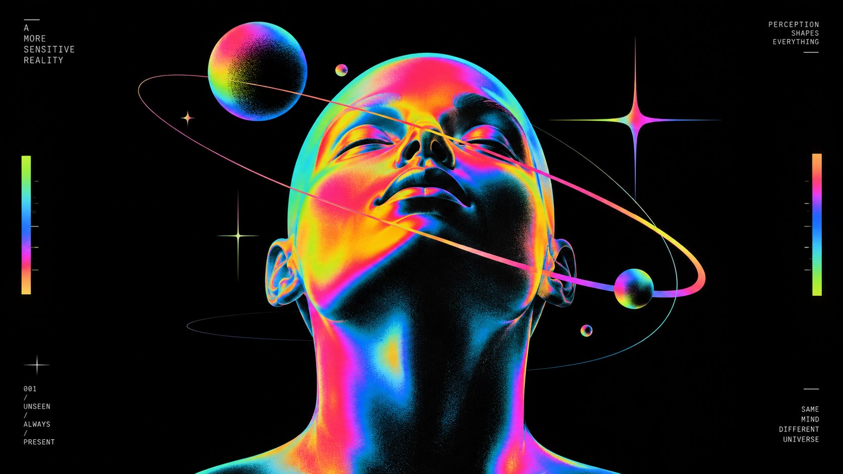
A face tilted upward, lit in rainbow gradients and circled by orbit rings and small glossy planets on black.
Archive plate · Baugasm
A sports car drawn in neon gradient light streaks against black, a gradient planet and orbiting spheres behind it.
Dossier sceneCar · 1/3
01
The record

What it is, when it works, who it is for, and where it already exists.

How to use it

Record 021-BA - when it works, who it is for, what it looks like

FIELD 01

When to use it

  • Posters, event and exhibition graphics that want order and joy at once
  • Music releases and playlists that need a strong square image
  • Tech, fintech and product launches that want warmth without illustration
  • Social templates that must stay recognisable across hundreds of posts
FIELD 02

Perfect for

  • Musicians and labels
  • Design studios and conferences
  • Tech and product brands
  • Galleries, festivals and cultural programmes
FIELD 03

What it looks like

  • Vasjen Katro, Baugasm: 365 Posters, completed 2017
  • Katro's Baugasm classes on experimental gradients and posters
  • The Bauhaus poster tradition of Herbert Bayer and Joost Schmidt
  • The gradient-poster wave across Behance and Instagram, late 2010s

In the wild, Baugasm aesthetic real-world examples

Where this aesthetic shows up in the real world · ↗ opens the source site

Omoro Style GuideEvery aesthetic, every field on this page, in one PDF.
Get the guide →
02
The anatomy

Where Baugasm came from, what makes it recognisable, and the fingerprint it leaves.

History, Baugasm aesthetic history

Late 2010s to now · Vasjen Katro's daily poster project in Tirana, Albania, spread through Behance, Instagram and online classes

Baugasm takes its name and its method from a single project. The visual designer Vasjen Katro, based in Tirana, Albania, set himself the task of making one poster a day for a year and published the results as Baugasm: 365 Posters, completed in 2017. The posters stack circles, arches, bars and occasional 3D forms into balanced compositions and fill them with vivid gradients and fine grain.

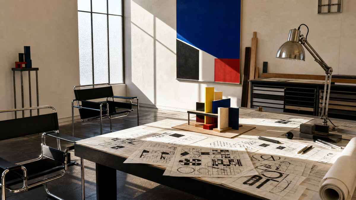
The first half of the name is honest about the source. The Bauhaus poster tradition of the 1920s, Herbert Bayer and Joost Schmidt among others, had already shown that a few geometric shapes on a grid could carry a whole image. What Baugasm added was colour that the Bauhaus could not print: smooth digital gradients, coral into orange, blue into violet, softened with noise so they feel inked rather than rendered.

Katro taught the method in online classes, and the look spread across Behance and Instagram, into music covers, conference graphics, tech launches and social templates. It became one of the recognisable poster languages of the late 2010s, and its core, simple geometry and a disciplined colour pair, still holds when the gradients are handled with care.

Bauhaus shapes, turned up until they glow.

Omoro dossier · 021-BA

Visual markers, Baugasm aesthetic visual markers

The visual DNA: what makes it recognisable

typography

See the fonts
  • A geometric sans used sparingly
  • Small caps or a short caption set in one corner
  • Numbers and dates treated as ornament

grid

  • Three or four shapes stacked on a single axis
  • Balanced asymmetry on a square or portrait poster
  • Generous cream or dark ground around the composition
  • Series of posters sharing one system of shapes

materials

  • Poster cream #F2E8D8 as the ground
  • Hot coral #FF5A4E into sunset orange #FF9A1F for warm gradients
  • Electric blue #2B3BFF into deep violet #3A1C71 for cool ones
  • Fine grain over every gradient, soft shadows, occasional glossy 3D

motifs

  • Gradient circles, semicircles and arches
  • Bars and steps that anchor the stack
  • Glossy 3D spheres and soft shadows
  • Grain and noise that make the colour feel printed

Aesthetic profile

8-channel console with the fingerprint on its display. Save the card, or share the page

Aesthetic Profile
Baugasm
Late 2010s to now · Vasjen Katro's daily poster project in Tirana, Albania, spread through Behance, Instagram and online classes
Attribute console · 021-BA
leans digital, expressive, geometric
8 CH
FIG. 1
MaximalMinimalDigitalAnalogExpressiveRestrainedWarmCoolNostalgicFuturisticStructuredChaoticLightDarkGeometricOrganic
01Minimal
Maximal30%
02Analog
Digital70%
03Restrained
Expressive60%
04Cool
Warm20%
05Futuristic
Nostalgic10%
06Structured
Chaotic20%
07Dark
Light30%
08Organic
Geometric60%
DigitalExpressiveGeometric
Omoro · Attribute console · 021-BA
omoro.io/styles/baugasm

Color Palettes, Baugasm color palettes and hex codes

The definitive color scheme for this aesthetic

Baugasm
#F2E8D8 · #FF5A4E · #2B3BFF · #FF9A1F · #3A1C71
A gradient poster on cream: coral into orange, electric blue into violet
Omoro Palette Pack575 curated palettes across every aesthetic, 5 export formats.
Get the palettes →

Adjacent Palettes, styles related to Baugasm

The colour of the styles sitting closest to this one

Bauhaus
Grainy Gradient Blur
Swiss / International
Memphis
03
The direction

How to shoot it, how to prompt it, and how to board it.

Photo Direction

How to shoot this aesthetic

"Build the image from three shapes and two gradients, then let the grain make it feel printed"

Shot list

  • A face tilted upward on black, lit in rainbow gradients, circled by thin orbit rings and small glossy planets
  • A sports car rendered in neon gradient light streaks, a gradient planet behind it and its reflection on a wet black floor
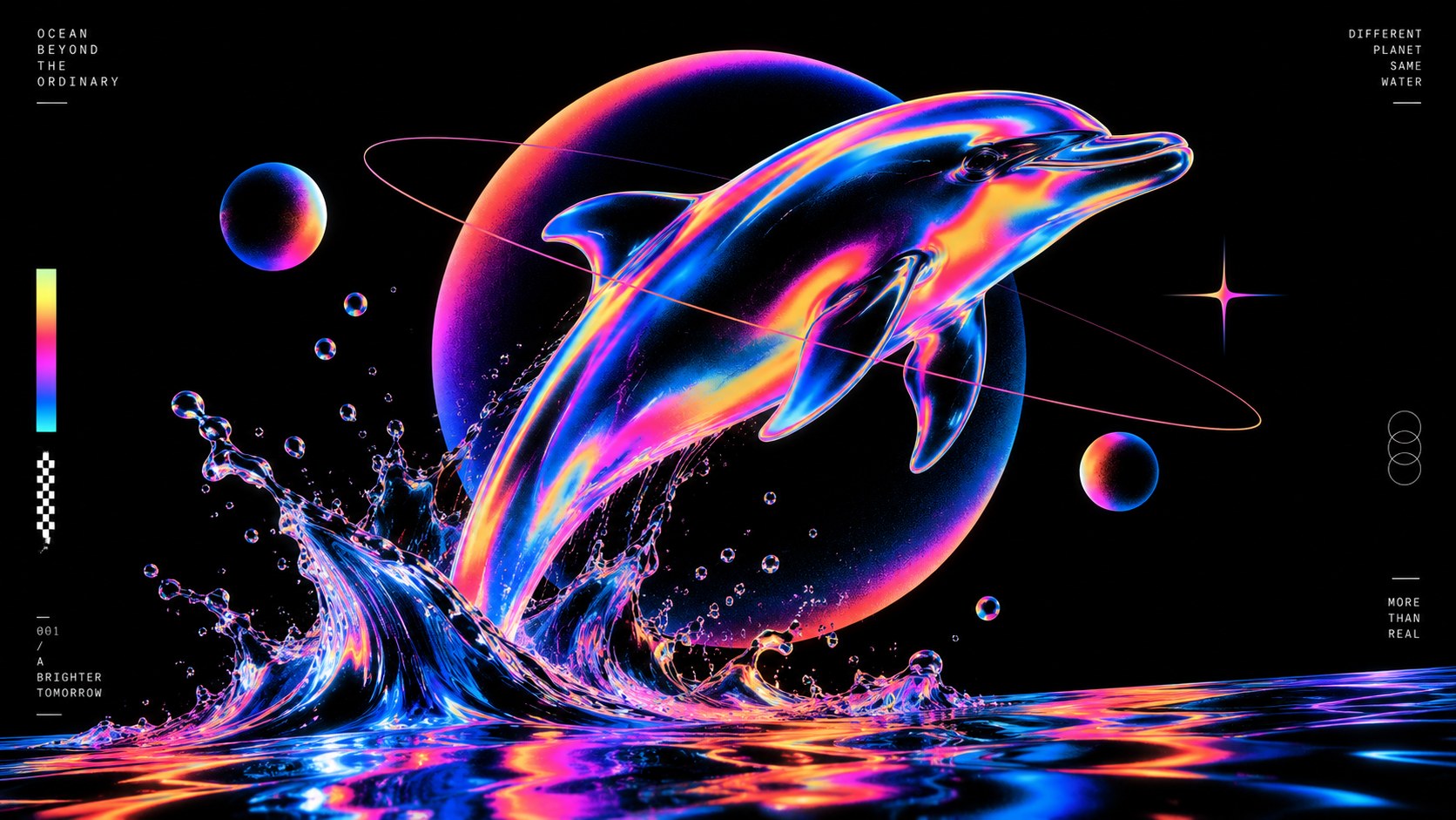
  • A dolphin leaping from a splash, its body an iridescent gradient, a glowing sphere behind it

Lighting

Soft, even light for photographs so the gradients stay clean; one soft shadow is enough. In design files, add grain to every gradient so it never bands.

Omoro Director's Briefs196 photo shot-lists like this one, ready to shoot from.
Get the briefs →

Generative Prompt

Drop this into Studio to generate in this aesthetic

Baugasm poster design, Bauhaus-inspired geometric composition of circles, semicircles, arches and bars, vivid smooth gradients in coral, electric blue, orange and violet on a cream ground, fine grain texture, soft shadows, occasional glossy 3D sphere, balanced asymmetry, contemporary digital poster, no text

Paste as-is, or append your own subject

Mood Board

The record applied to your project. The record's kit is free; your brand, references and plates come with membership

Mood board
The Baugasm board
8 frames · 4 selected
FIG. 4
Poster CreamF2E8D8Hot CoralFF5A4EElectric Blue2B3BFFSunset OrangeFF9A1FDeep Violet3A1C71
Brand and references
IdleBrand and references open with membership
With membership: the brand's own facts and colours in every prompt, references carried into every frame, and the plates generated.
01 · Hero application
02 · Material and finish
03 · Palette in context
04 · Photography direction
05 · Pattern plate
06 · Object
07 · Environment
08 · Digital presence
Demo kit free, the rest with membershipThe record as a demo kit, free. Name a project and it is written for that
Omoro · Mood board · 021-BA
04
The judgement

Whether to use it, what it costs to do properly, and where it stands right now.

Creative verdict, Baugasm feasibility and strategic recommendation

Two written calls, seven meters, and when to walk away

Creative verdict
Should Baugasm be the call?
7 meters
FIG. 2
Assessment

Start with three shapes and one axis. Choose the gradient pairs first and let the shapes be simple: circle, arch, bar. Add fine grain to stop banding and to make it feel printed. One small caption in a corner; the poster is the shapes.

Verdict

Right when a brand needs a recognisable, repeatable image that is joyful but ordered: music, events, conferences, tech and product launches. The geometry carries the identity; the gradients carry the mood. Credit the lineage, keep the shapes simple, and grain the gradients so they never band.

Production cost
Low

A vector tool, a gradient and a grain texture. It was built in daily sessions.

Creative difficulty
Medium

The geometry is simple; the colour pairing and the balance of the stack are where posters succeed or fail.

Execution difficulty
Medium

Gradients band on screen and in print unless they are dithered with grain.

Risk of misuse
Medium

Gradient shapes without a structure look like a stock background.

Prevalence
Common

Taught widely and copied across social templates, music covers and tech launches since the late 2010s.

Longevity
Enduring

The Bauhaus geometry underneath is a century old; the gradients will date first.

Brand investment
Low

A small system of shapes and gradient pairs produces hundreds of consistent images.

Avoid if
The brand already uses gradients heavily
Gradient on gradient loses the geometry that holds the style together.
The work needs photography to carry it
It is a shape-and-colour language; a photograph inside it fights the forms.
Print will be cheap and uncalibrated
Smooth gradients band and shift on cheap stock unless they are grained and proofed.
Omoro · Creative verdict · 021-BA

Editorial Depth

A Pro feature: origins, practitioners, and pitfalls

Editorial depth
The Baugasm file
14 sections
FIG. 3
Context02Brands02Perception04Use04Index02
01Common MisconceptionThe principle beneath the surface
02Historical ContextOrigins, cultural moment, and reaction
03Brands That Accidentally Use This StyleNatural alignment, not category claims
04Brands That Perfectly Represent This StyleExceptional execution
05Psychological EffectHow visual decisions change perception
06Visual ChecklistInclude and avoid
07Creative FormulaThe visual system reduced to essentials
08Recognition SignalsHow to recognize it in two seconds
09When To Use This StyleContexts where the language performs
10Common Creative MistakesWhere imitation weakens the signal
11Best Brand ApplicationsIndustries with a natural advantage
12Creative Application AnalysisFit, feasibility, and production reality
13Related StylesClose languages and the key distinction
14Visual DNA SummaryThe sentence to remember
The editorial depth, with membershipOpening soon
Omoro · Editorial depth · 021-BA
05
The index

Neighbours, cross-references, blends, and the questions people ask.

Related concepts

Connected across the creative knowledge graph

Cultural relevance, Baugasm cultural relevance today

Where it stands now, and what it costs you to use it

Baugasm gives a brand a repeatable image that is joyful and ordered at once. Because the geometry is simple, a small system of shapes and gradient pairs can produce hundreds of consistent posts, covers and posters, which is why it spread so quickly through music and tech.

The risk is the stock background: gradient blobs with no structure. The work that holds up keeps the Bauhaus discipline underneath, a clear axis and a few shapes, grains the gradients so they never band, and credits where the method came from.

Cross-references

BauhausThe geometry and the poster tradition it is named afterGrainy Gradient BlurThe softer gradient-and-grain look it shares a toolkit withSwiss / InternationalThe grid discipline that keeps the shapes in orderMemphisAnother playful, colourful take on simple geometry

Blend

Mix Baugasm with any style in the library

Baugasm×
50%50%
52% alike
Baugasm referenceBauhaus referenceBaugasm 50%Bauhaus 50%

Merged palette

#F2E8D8

#000000

#FF5A4E

#E8291C

#2B3BFF

Leads geometric, structured, nostalgic

Typography · from Baugasm

Space Grotesk over Inter

Materials

  • Poster cream #F2E8D8 as the ground
  • Hot coral #FF5A4E into sunset orange #FF9A1F for warm gradients
  • Red, yellow, blue as pure hue: the color triad of the Itten color wheel

The calls this blend forces

These two disagree on 3 things, and a blend cannot average them: you pick a side. At this mix:

Expressive or Restrained? Baugasm is expressive, Bauhaus is restrained. This mix lands expressive.

Digital or Analog? Baugasm is digital, Bauhaus is analog. This mix lands digital.

Maximal or Minimal? Baugasm is maximal, Bauhaus is minimal. This mix lands minimal.

Use it

Baugasm poster design, Bauhaus-inspired geometric composition of circles, semicircles, arches and bars, vivid smooth gradients in coral, electric blue, orange and violet on a cream ground, fine grain texture, soft shadows, occasional glossy 3D sphere, balanced asymmetry, contemporary digital poster, no text (50%), infused with Bauhaus design aesthetic with bold primary-color contrast, geometric shapes, functional art principles, Kandinsky-influenced composition, color palette strictly #F2E8D8 #000000 #FF5A4E #E8291C #2B3BFF, leaning expressive over restrained, digital over analog, maximal over minimal, overall character: geometric, structured, nostalgic

One-click generation opens with the studio

About this aesthetic

What is Baugasm?

A contemporary poster style of Bauhaus-inspired geometric shapes filled with vivid gradients and grain, named after Vasjen Katro's project Baugasm: 365 Posters, completed in 2017.

How is Baugasm different from Bauhaus?

Bauhaus posters used flat primary colours and strict typography within the limits of 1920s printing. Baugasm keeps the geometry and replaces the flat colour with smooth digital gradients, grain and occasional 3D.

How do you stop gradients banding?

Add fine grain or noise over the gradient, work in a wide colour space, and proof in print. Grain breaks up the visible steps and also makes the colour feel inked.

Build with the baugasm aesthetic

Every style in the library is broken down like this one: the palette, the typography, the materials and the lineage.

Explore the style library →