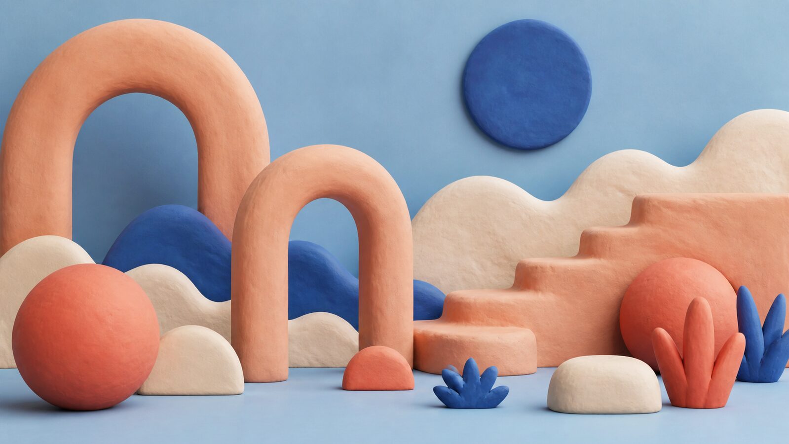
The emotional center of gravity here is warmth, creativity and approachability, pulled off-balance by a single red accent that keeps the palette from reading as one-note. A wide value range gives it real contrast; it reads with depth rather than sitting flat, and the saturation stays high throughout, so the whole palette reads as confident and awake.
Terracotta Clay reads as pure adrenaline: alarm, desire, the color of things that move fast.
Warm Bisque a citrus-bright orange: enthusiasm, playfulness, an unmistakable call to attention.
Soft Blush a peach or apricot tint, all the friendliness of orange with none of the volume.
Slip Blue a dusty or steel blue, trust read as quiet reliability rather than corporate polish.
Kiln Shadow a dusty taupe-brown, quiet and unassuming.
Soft extruded 3D forms with rounded edges and matte, unlit surfaces, as if pressed from modelling clay
Explore the full Clay Style style guide