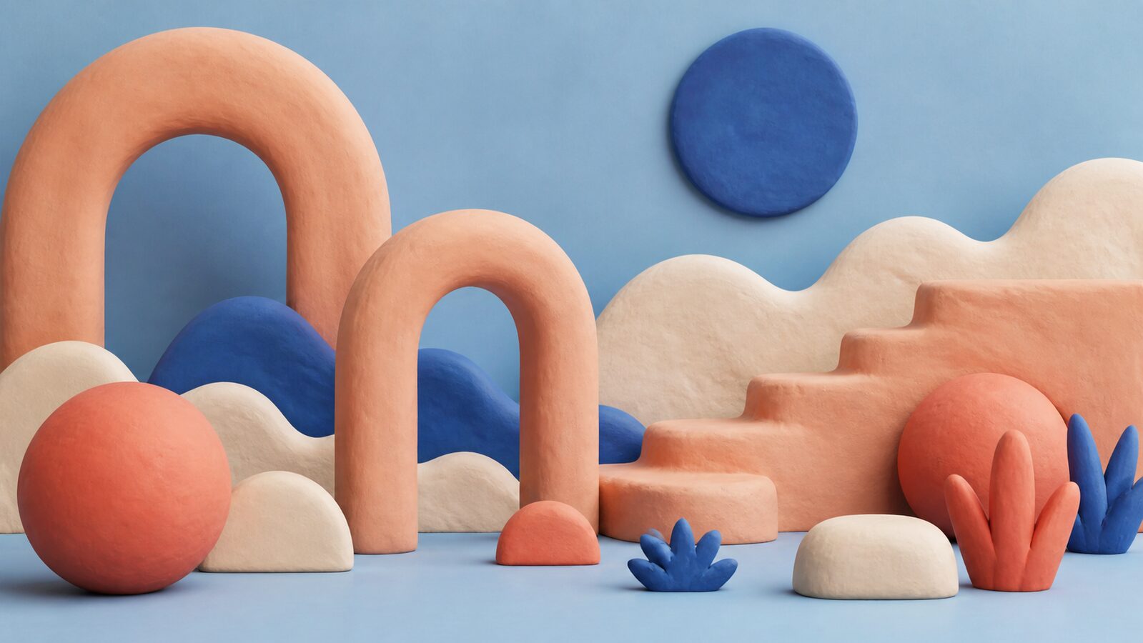
Claymorphism arrived as a correction. Neumorphism had spent 2019 and 2020 proving that soft shadows on a single-colour ground looked wonderful in a dribbble shot and failed in use: a button and a hole in the wall were rendered identically, and nobody could tell which was which. Clay kept the softness and threw out the ambiguity.
The move was to stop simulating a lit surface and start simulating a material. Clay forms are extruded, thick and unmistakably solid, with edges rounded far past anything a real manufacturing process would allow. Crucially the surface is matte: no specular highlight, no reflection, no suggestion of glass or metal. Colour reads as pigment mixed into the body rather than light falling on it.
It spread fastest through app icons and onboarding illustration, where flat vector had begun to feel thin and photography felt too heavy. Fintech and health products adopted it hardest, for the obvious reason: it makes a technical instrument look like something safe to touch.