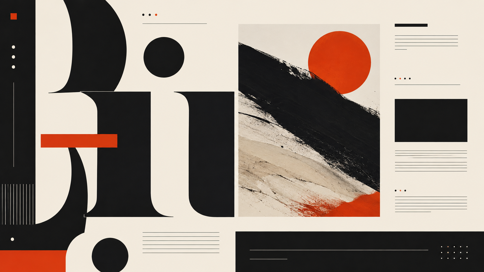
The emotional center of gravity here is authority, restraint and sophistication, pulled off-balance by a single red accent that keeps the palette from reading as one-note. A wide value range gives it real contrast; it reads with depth rather than sitting flat, and the saturation stays low across the board, giving it a deliberately restrained, muted character.
Headline Black is black's softer relative, still authoritative, but with enough warmth to feel considered rather than severe.
Column Grey is black's softer relative, still authoritative, but with enough warmth to feel considered rather than severe.
Restrained Sienna carries urgency and appetite, the color the eye finds first.
Warm Newsprint a peach or apricot tint, all the friendliness of orange with none of the volume.
Page White a pale butter yellow, gentle brightness, comfort more than alarm.
Magazine-inspired digital design with serif headlines, columnar text blocks, generous whitespace, and a restrained palette that lets typography lead
Explore the full Editorial Interface style guide