When to use it
- Long-form content platforms and digital publications
- Brand sites that need authority and reading comfort
- Portfolio and case-study presentations
- Cultural commentary, journalism, and essay-driven products
Magazine-inspired digital design with serif headlines, columnar text blocks, generous whitespace, and a restrained palette that lets typography lead
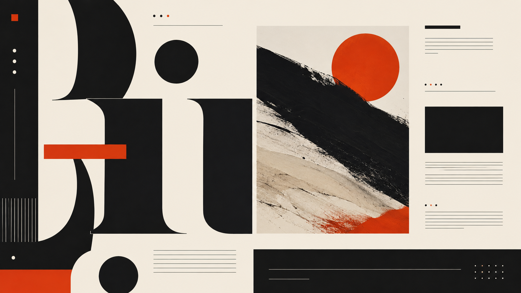
Record 024-EI - when it works, who it is for, what it looks like
2019-present · Digital product design
Editorial interface emerged around 2019 as a reaction to the homogeneity of SaaS design. A decade of Material Design, Bootstrap defaults and geometric sans-serifs had made most software look interchangeable. Designers began borrowing from magazine and newspaper layout: serif headlines, columnar text, visible baseline grids and generous whitespace. The reference point was not retro nostalgia but the proven information architecture of print editorial, refined over centuries for readability and hierarchy.
Stripe led the shift in commercial product design, introducing serif type and editorial pacing to a developer-tools brand. Medium had arrived earlier with a reading experience modelled on long-form print. Apple News, The Outline (before its closure) and later Substack brought editorial formatting into digital content platforms. The pattern then migrated into SaaS dashboards, documentation sites and portfolio templates, where it signalled thoughtfulness and editorial authority.
The style works because typographic hierarchy is a more durable organising principle than colour coding or iconography. A well-set serif headline, a clear size scale and generous leading can structure a page without any decorative element at all. This makes editorial interface unusually resilient across contexts: it scales from a blog post to a data dashboard to a marketing page without losing coherence, because the system is built on type rather than ornament.
The visual DNA: what makes it recognisable
The definitive color scheme for this aesthetic
How to shoot this aesthetic
"A screen that reads like a broadsheet, where typography does the work color refuses to"
Shot list
Lighting
Warm, steady, and slightly dim, like a reading lamp in a well-appointed study. The screen itself provides most of the illumination. No color temperature surprises.
Drop this into Studio to generate in this aesthetic
Magazine-and-newspaper-derived UI, visible column grid, serif headline hierarchy, old-style numerals, hairline rules and small caps, generous whitespace as structural element, typographic contrast doing the work that color usually does, broadsheet-page spatial rhythm
Join waitlist for access
Join the waitlist for full access
Join the waitlistEditorial Interface is most effective when its visual decisions do useful work. Magazine-inspired digital design with serif headlines, columnar text blocks, generous whitespace, and a restrained palette that lets typography lead
Budget goes into art direction and casting, not the toolkit.
Anyone can spot the references. A real system out of them is the hard part.
One wrong prop or one off color reads as costume instead of conviction.
Editorial Interface earns its keep when it gives a brand a standard of judgment, not just a finish. It falls apart the moment recognizable cues get collected without a point of view behind them. The tell is always proportion: what's shown, what's held back, and whether every choice belongs to the same world.
The surface is easy to copy. What separates the real thing from a knockoff is the system underneath.
The ingredients are everywhere right now. A disciplined execution is still the minority.
This holds up because it's built on composition and material, not a filter that ages out.
It only works if every touchpoint agrees. Cut a corner anywhere and the whole thing shows it.
Use Editorial Interface when the brand can back a real point of view and protect it through execution. Not when the goal is broad, neutral, or cheap to produce. The advantage is differentiation through judgment: the work reads as authored, not packaged. Average executions borrow the signals and lose the coherence. The best ones treat the visual language as a system of choices, including what they leave out.
Join waitlist for access
Join the waitlist for editorial depth
Join the waitlistConnected across the creative knowledge graph
Where it stands now, and what it costs you to use it
Editorial interface is one of the few digital design patterns that gets better with content. Most UI systems are optimised for empty states and short labels; editorial interface assumes there is something worth reading and builds the hierarchy to support sustained attention. This makes it genuinely useful for content-heavy products.
The risk is preciousness. When the editorial conventions become decorative rather than functional, when the serif headline is there for tone rather than hierarchy, the style becomes a costume. The best implementations use print-editorial principles because they solve real information-architecture problems, not because they look sophisticated.
Editorial interface borrows layout principles from magazine and newspaper design: serif headlines, columnar grids, visible typographic hierarchy and generous whitespace. Type and spacing do the organisational work that colour, icons and decorative elements handle in most UI systems.
Serifs provide instant typographic hierarchy and editorial authority. A serif headline paired with a sans-serif body creates a clear visual distinction between levels without relying on colour or weight alone. The pairing also signals that the content is meant to be read, not just scanned.
No. The pattern works in SaaS dashboards, documentation, portfolios and marketing pages. Anywhere that typographic hierarchy can replace colour coding or iconography as the primary organising principle, editorial interface is a viable approach. It scales well because type systems are inherently hierarchical.
Brutalist web design strips away polish to expose raw structure. Editorial interface is polished and refined, drawing on centuries of print craft. Both reject decorative UI conventions, but editorial interface replaces them with typographic elegance while brutalism replaces them with nothing.
Omoro turns aesthetic references into on-brand visuals. Generate, compose and publish from one studio.
Join the waitlist