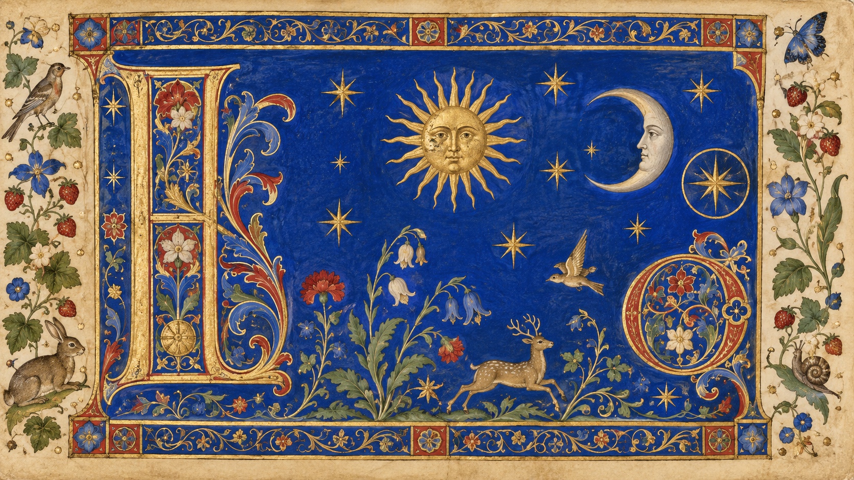
Gold Leaf sets the weight of the palette in warmth and creativity, and Vermilion is the swatch that breaks rank: a single red that stops the set reading as one note. Saturation averages 66 percent with Lapis at the top, which is loud enough that the palette will fight anything else on the page. Lapis and Vellum sit 61 points of lightness apart, enough to separate a foreground from a background without forcing it.
Gold Leaf a citrus-bright orange: enthusiasm, playfulness, an unmistakable call to attention.
Vermilion reads as pure adrenaline: alarm, desire, the color of things that move fast.
Lapis a deep navy or midnight blue, trust deepened into authority and gravity.
Verdigris blends green's calm with blue's clarity, a color that reads as clean, modern, and trustworthy.
Vellum a peach or apricot tint, all the friendliness of orange with none of the volume.
Gold leaf, dense borders, decorated initials and creatures in the margins: the medieval hand-made book, revived by William Morris and again now
Explore the full Illuminated Manuscript style guide