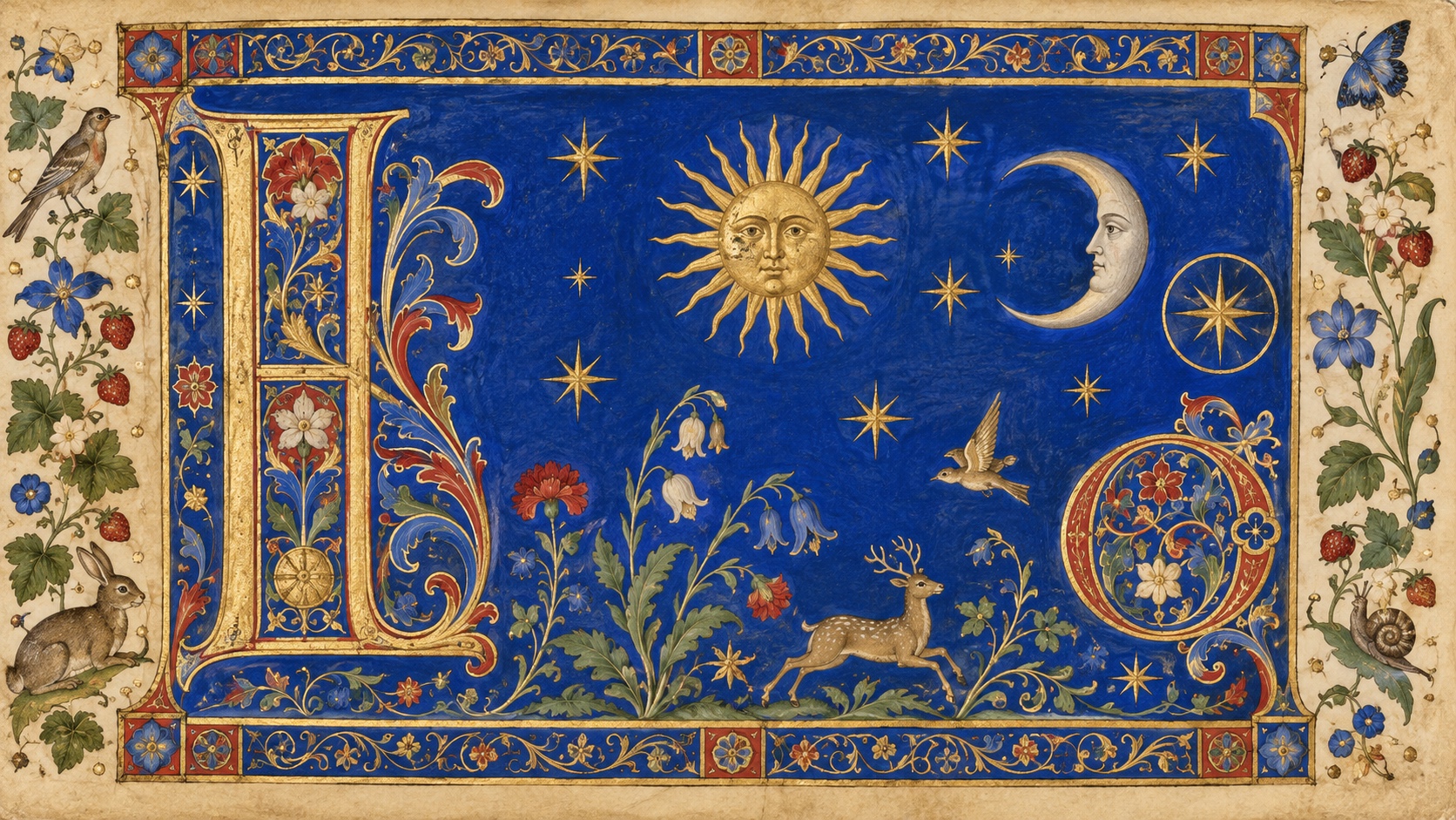
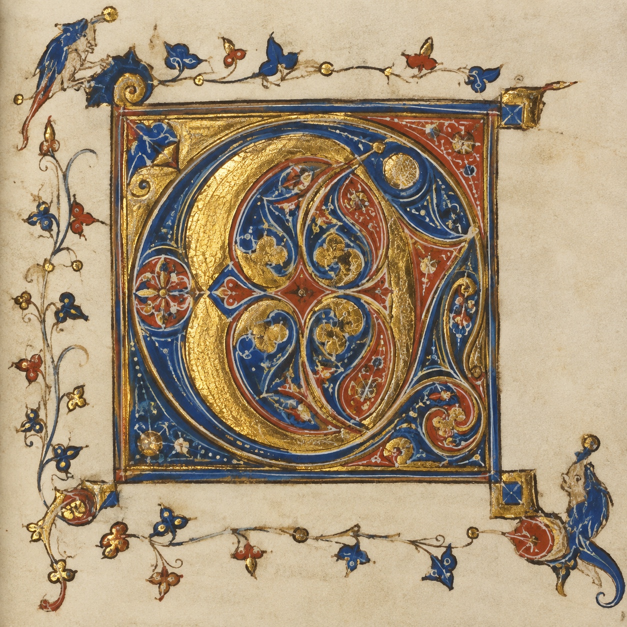
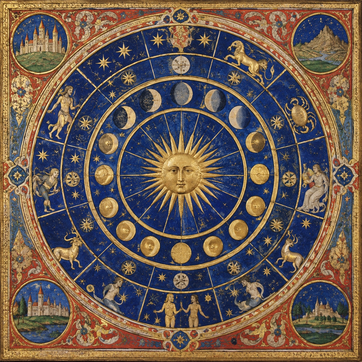
The illuminated manuscript was the book before print: written and painted by hand on vellum, with gold and silver that lit the page, which is what illumination means. The Lindisfarne Gospels, made in a Northumbrian monastery around 715 to 720, and the Book of Kells, from around 800, set the insular style of knotwork, carpet pages and huge decorated initials; the Très Riches Heures du Duc de Berry, painted by the Limbourg brothers between 1412 and 1416, set the late-medieval one, with calendar pages of castles, fields and lapis skies.
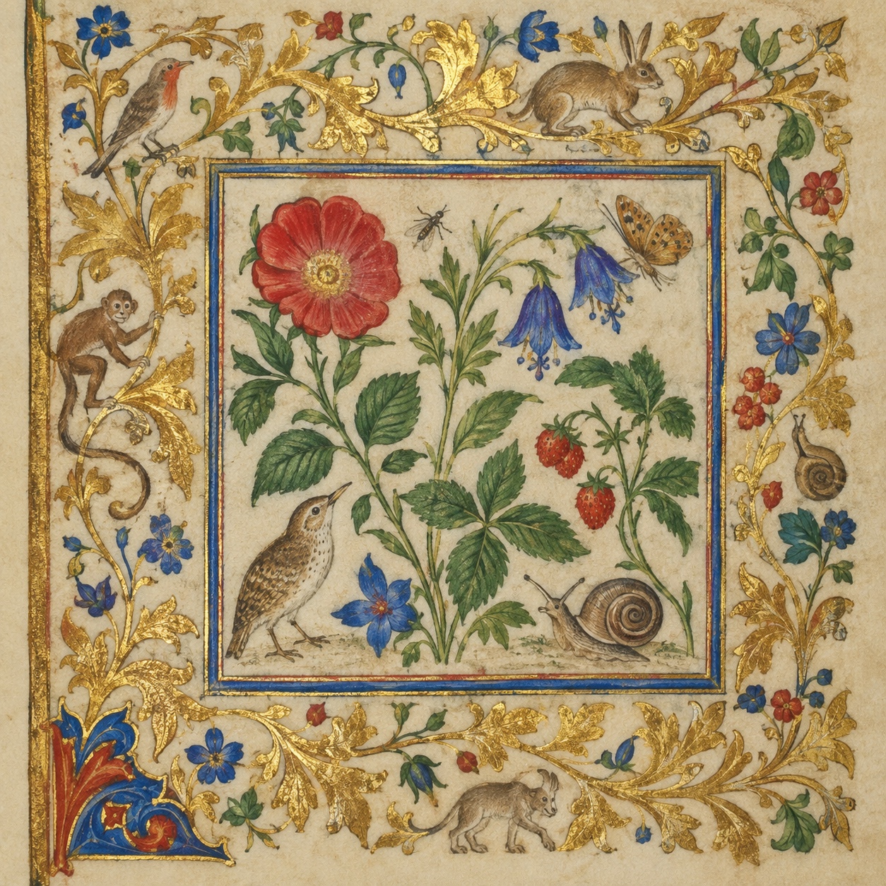
The margins were where the strangeness lived. Around the sacred text, scribes and illuminators drew vines, birds, hybrid creatures, jokes and small dramas, marginalia that modern readers find funnier than the text. Print ended the tradition in the sixteenth century, but William Morris brought it back on purpose: his Kelmscott Press, and its Chaucer of 1896 with borders, initials and Edward Burne-Jones's illustrations, was a printed book made to look and feel like a manuscript.
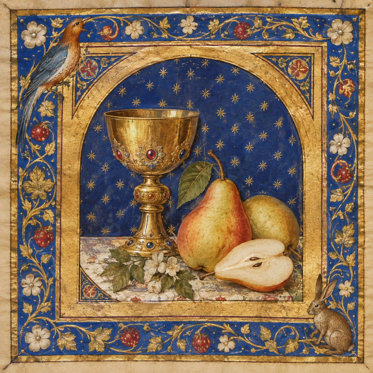
It is coming back a third time through screens. Medieval imagery, manuscript creatures and gilded borders run through social media, games, fantasy publishing and fashion, usually without a design vocabulary behind them. The current version keeps the structure, a text block held by a dense border, a decorated initial, gold as a material and something odd in the margin, and applies it to covers, labels, jewellery and campaigns.