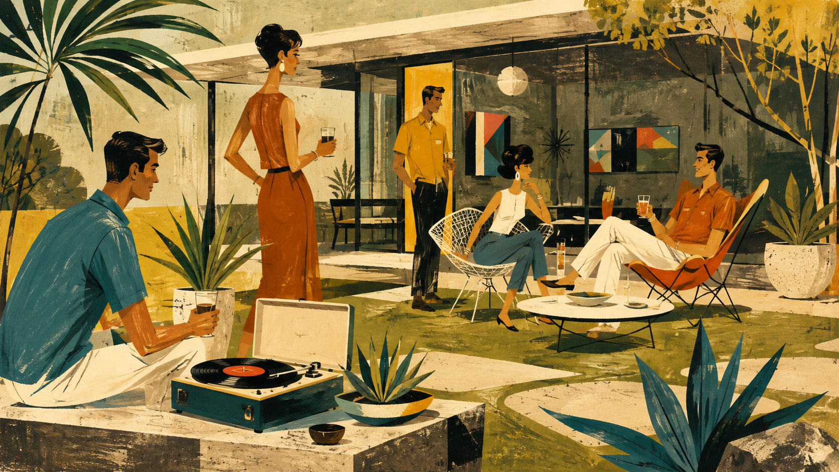
Mid-Century Illustration

Optimism printed on warm stock: sun-faded primaries, quiet charcoal, and one perfect atomic starburst

Omoro Spectrolab · Color Analysis Sampling Live
PaletteMid-Century Illustration
Batch032-MC
Pigments0 / 5 Sampled
MoodOptimism printed on wa
Drawdown Recordtap a pull to copy hex
Omoro Color Laboratory - Drawdown Record032-MC / 5 PULLS

optimism printed on warm stock: sun-faded primaries, quiet charcoal, and one perfect atomic starburst

Sampled Pigment- - - - - -
Awaiting SampleRGB - · - · -
● SENSOR OKHEX COPIED ✓
Export Tray - Digitized SwatchesEMPTY
SLOT 01
SLOT 02
SLOT 03
SLOT 04
SLOT 05
Mid-Century Illustration aesthetic example
In usemid century illustration
Hex Reference
#D6A21DSunburst Ochre
#B95032Tomato Red
#2E6460Teal Ink
#66744CAvocado
#F1E7D1Paper Cream
Color Psychology

The emotional center of gravity here is optimism, clarity and attention, pulled off-balance by a single red accent that keeps the palette from reading as one-note. A wide value range gives it real contrast; it reads with depth rather than sitting flat, and the saturation sits in a comfortable middle register, present, not shouting.

optimismclarityattentioncheerurgencyappetite
Sunburst Ochre#D6A21D

Sunburst Ochre an electric, high-visibility yellow: caution and euphoria share the same wavelength here.

Tomato Red#B95032

Tomato Red carries urgency and appetite, the color the eye finds first.

Teal Ink#2E6460

Teal Ink blends green's calm with blue's clarity, a color that reads as clean, modern, and trustworthy.

Avocado#66744C

Avocado a soft moss-yellow, novelty settled into something more natural.

Paper Cream#F1E7D1

Paper Cream a peach or apricot tint, all the friendliness of orange with none of the volume.

The Aesthetic

Postwar optimism translated into flat gouache shapes, atomic motifs, expressive linework and the tactile grain of ink on paper

Explore the full Mid-Century Illustration style guide
Related Palettes
Illustration
Mid-Century Modern
Risograph
Pop Art
Build a Brand Kit with Mid-Century Illustration
Not quite the palette you need? Generate your ownExtract from an image or build from a color wheel. Free
About This Palette
What colors are in the Mid-Century Illustration color palette?

5 colors, calibrated to work as one system.

The swatches

  1. Sunburst Ochre: #D6A21D
  2. Tomato Red: #B95032
  3. Teal Ink: #2E6460
  4. Avocado: #66744C
  5. Paper Cream: #F1E7D1
What mood does the Mid-Century Illustration color palette convey?

Optimism printed on warm stock: sun-faded primaries, quiet charcoal, and one perfect atomic starburst

How do I use the Mid-Century Illustration color palette?

Best applied to

  1. Publishers, museums and cultural programming
  2. Food, beverage and hospitality brands
  3. Record labels, book covers and editorial features
What are the hex codes for the Mid-Century Illustration palette?

Hex codes

  1. #D6A21D
  2. #B95032
  3. #2E6460
  4. #66744C
  5. #F1E7D1

Generate images in the mid-century illustration palette

Omoro reads your visual references and generates in your world. Drop in images with this palette and it extracts the DNA automatically.

Join the waitlist