History, Mid-Century Illustration aesthetic history
1945–1969, with an active contemporary revival · Postwar publishing, advertising and animation in the United States and Europe
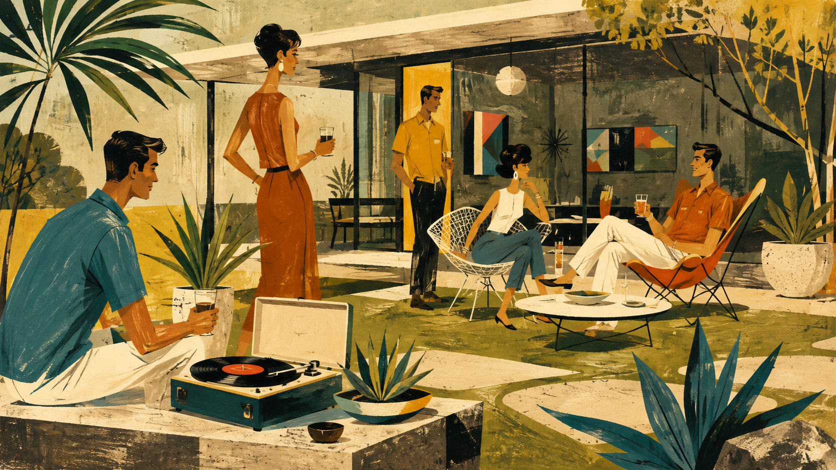
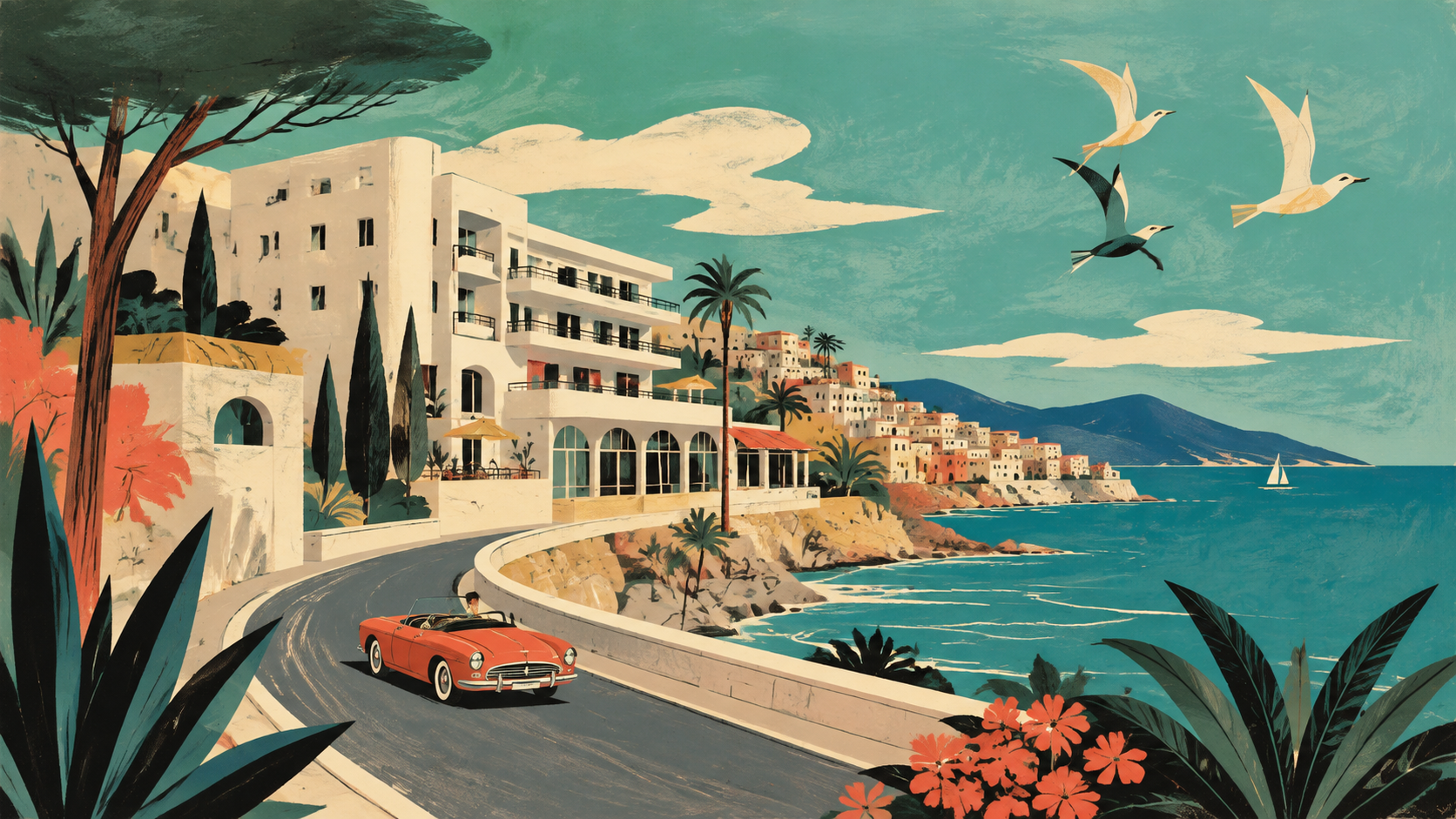
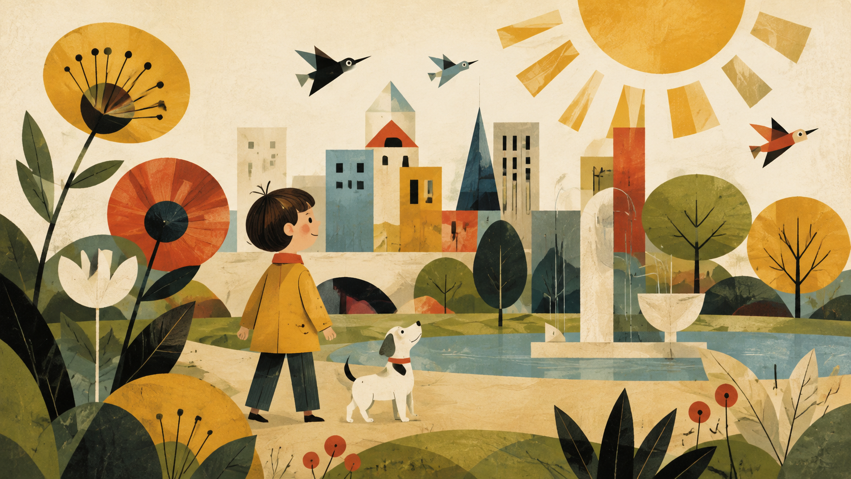
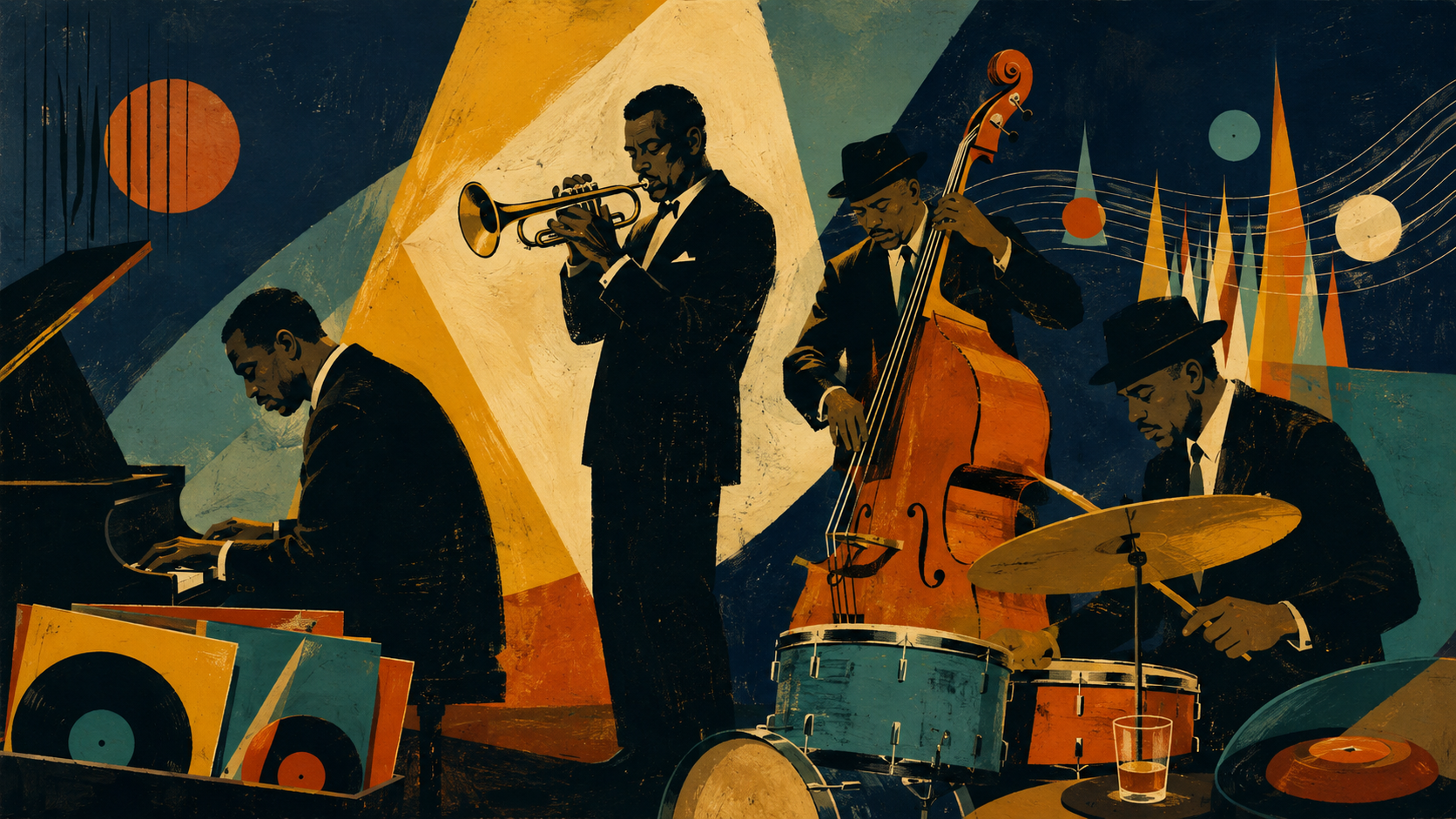
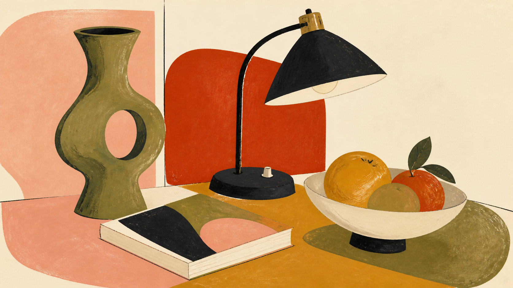
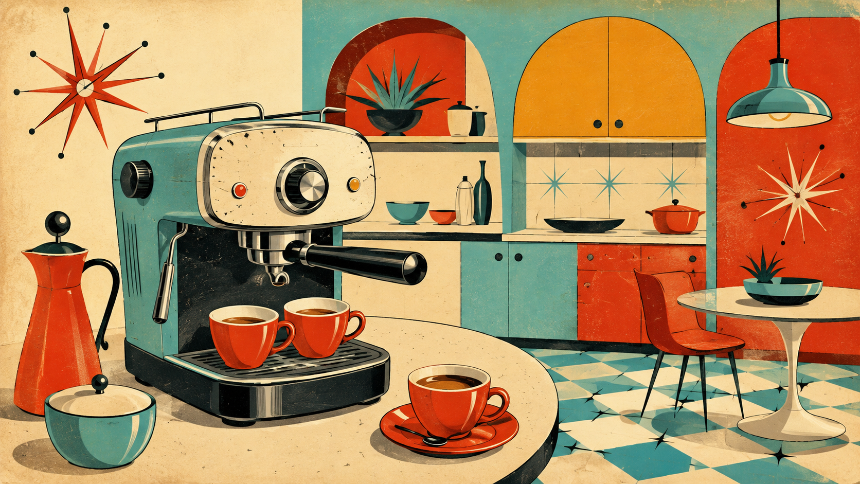
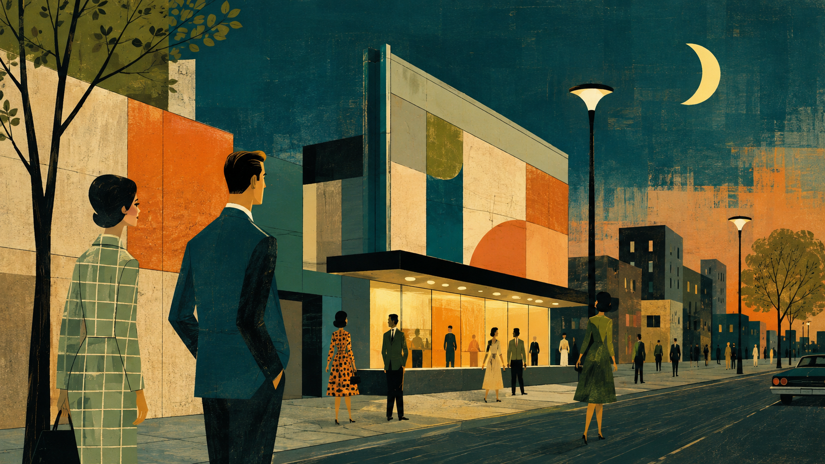
Mid-century illustration developed after World War II, when magazines, children's books, travel advertising and corporate identity needed a visual language that could feel modern without becoming cold. Artists reduced scenes to flat planes of colour, expressive silhouettes and a handful of carefully chosen details. The approach was shaped by modernist abstraction, inexpensive offset printing and the new optimism of a consumer culture that imagined design as part of daily life.
Mary Blair brought daring colour and simplified forms to animation and children's publishing; Charley Harper made wildlife read through improbable but exact geometric reductions; Miroslav Sasek used the travel book as a modern city portrait. In graphic design, Saul Bass and Paul Rand translated the same economy into film titles, posters and corporate systems. These were not one uniform school, but they shared a belief that a single flat shape could carry a lot of feeling.
The contemporary revival often collapses the style into atomic furniture and beige nostalgia. Its stronger use is editorial: a compact palette, an intelligent crop, and enough irregularity to prove a person made it. The point is not to recreate 1958; it is to borrow the period's confidence that commercial art can still be graceful, funny and precise.