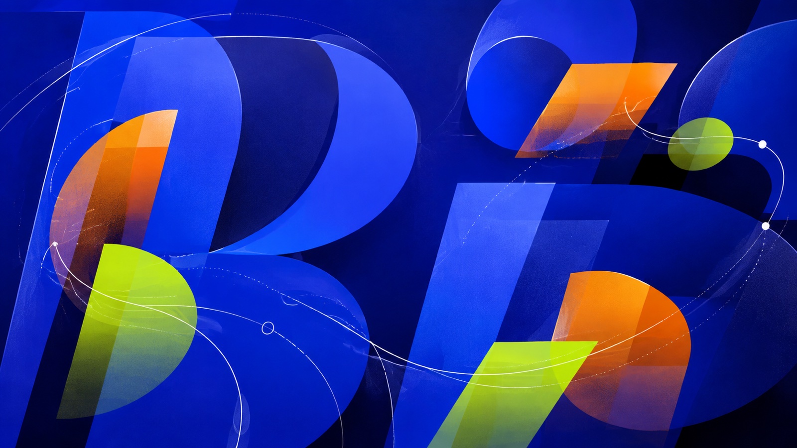
The emotional center of gravity here is warmth, creativity and approachability, pulled off-balance by a single blue accent that keeps the palette from reading as one-note. A wide value range gives it real contrast; it reads with depth rather than sitting flat, and the saturation stays high throughout, so the whole palette reads as confident and awake.
Signal Cobalt an electric or cobalt blue: trust with real conviction, confident rather than passive.
Cue Orange a citrus-bright orange: enthusiasm, playfulness, an unmistakable call to attention.
Guide Lime an acid, almost radioactive yellow-green: synthetic, energetic, hard to look away from.
Void a near-black indigo, depth, focus, the color of late-night thought.
Title Cream a peach or apricot tint, all the friendliness of orange with none of the volume.
Design that uses time, rhythm, movement and transition as core visual materials: title sequences, idents, kinetic type, product films and loops
Explore the full Motion Design style guide