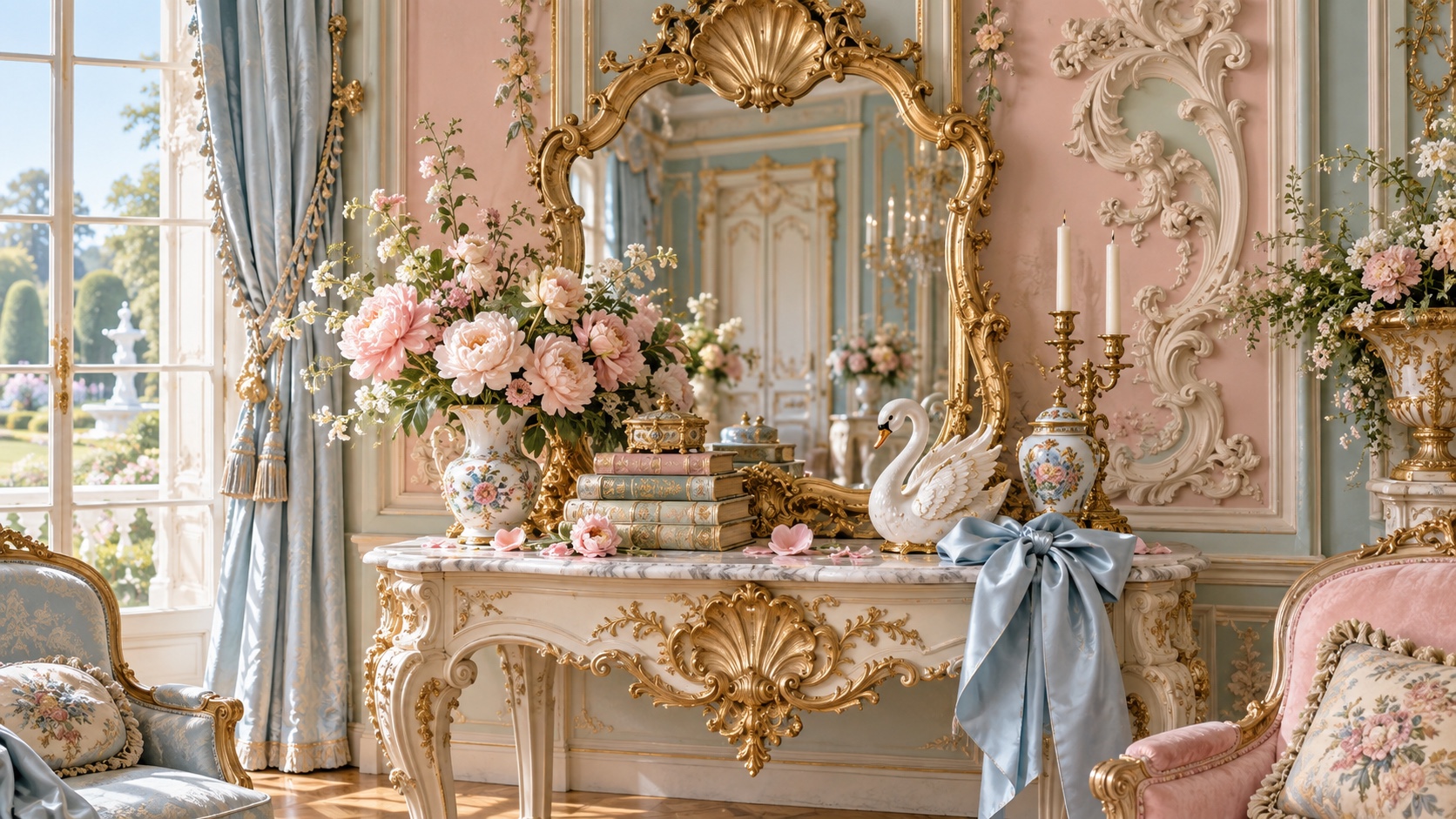
Gilt sets the weight of the palette in warmth and creativity, and Powder Pink is the swatch that breaks rank: a single red that stops the set reading as one note. Powder Pink and Hydrangea Blue sit on opposite sides of the temperature line, which is the tension the palette runs on and the pair to hold apart. Gilt and Ivory sit 31 points of lightness apart, enough to separate a foreground from a background without forcing it.
Powder Pink carries urgency and appetite, the color the eye finds first.
Pistachio a soft moss-yellow, novelty settled into something more natural.
Hydrangea Blue a dusty or steel blue, trust read as quiet reliability rather than corporate polish.
Gilt signals warmth, approachability, and creative energy, friendlier than red, louder than yellow.
Ivory a peach or apricot tint, all the friendliness of orange with none of the volume.
Shell-scroll ornament, pale gilt, powder pastels, mirrors and ribbons: the playful, sensuous style of the 1730s Paris salon, back through bows and coquette fashion
Explore the full Rococo style guide