Rococo

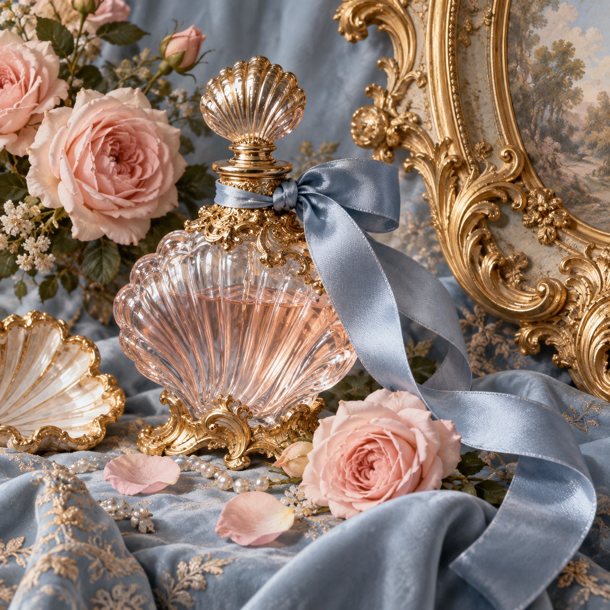
Shell-scroll ornament, pale gilt, powder pastels, mirrors and ribbons: the playful, sensuous style of the 1730s Paris salon, back through bows and coquette fashion

Compare Rococo with another style →See the Rococo typefaces →
Record037-RO
AestheticRococo
ClassNostalgic / Analog
StatusINGESTING
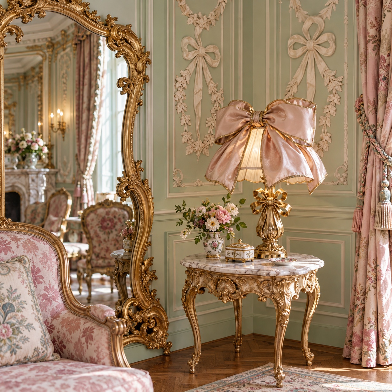
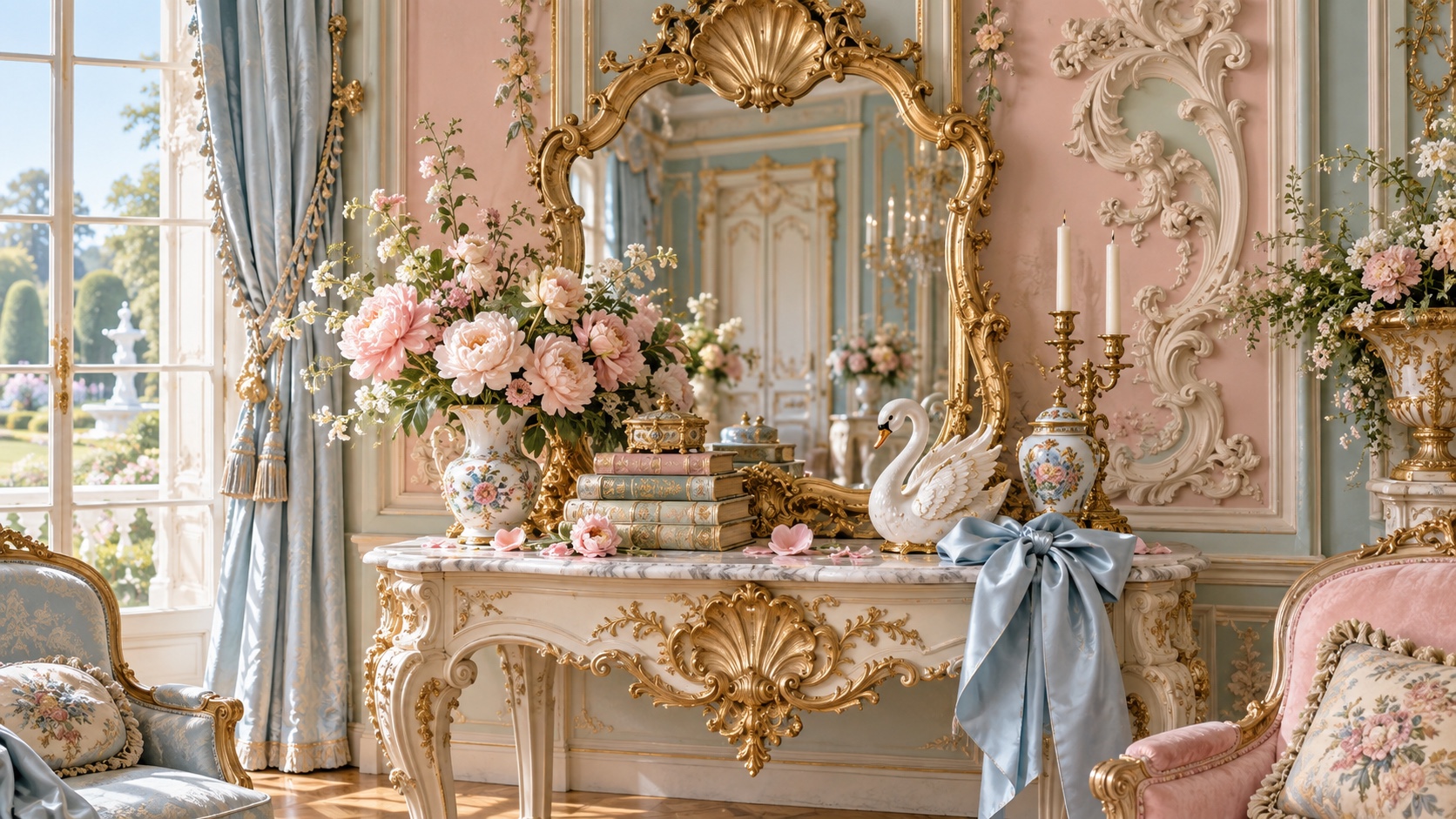
A pistachio and pink salon with a gilded console, mirror, candlesticks and roses, and a blue satin bow on a chair.
Archive plate · Rococo
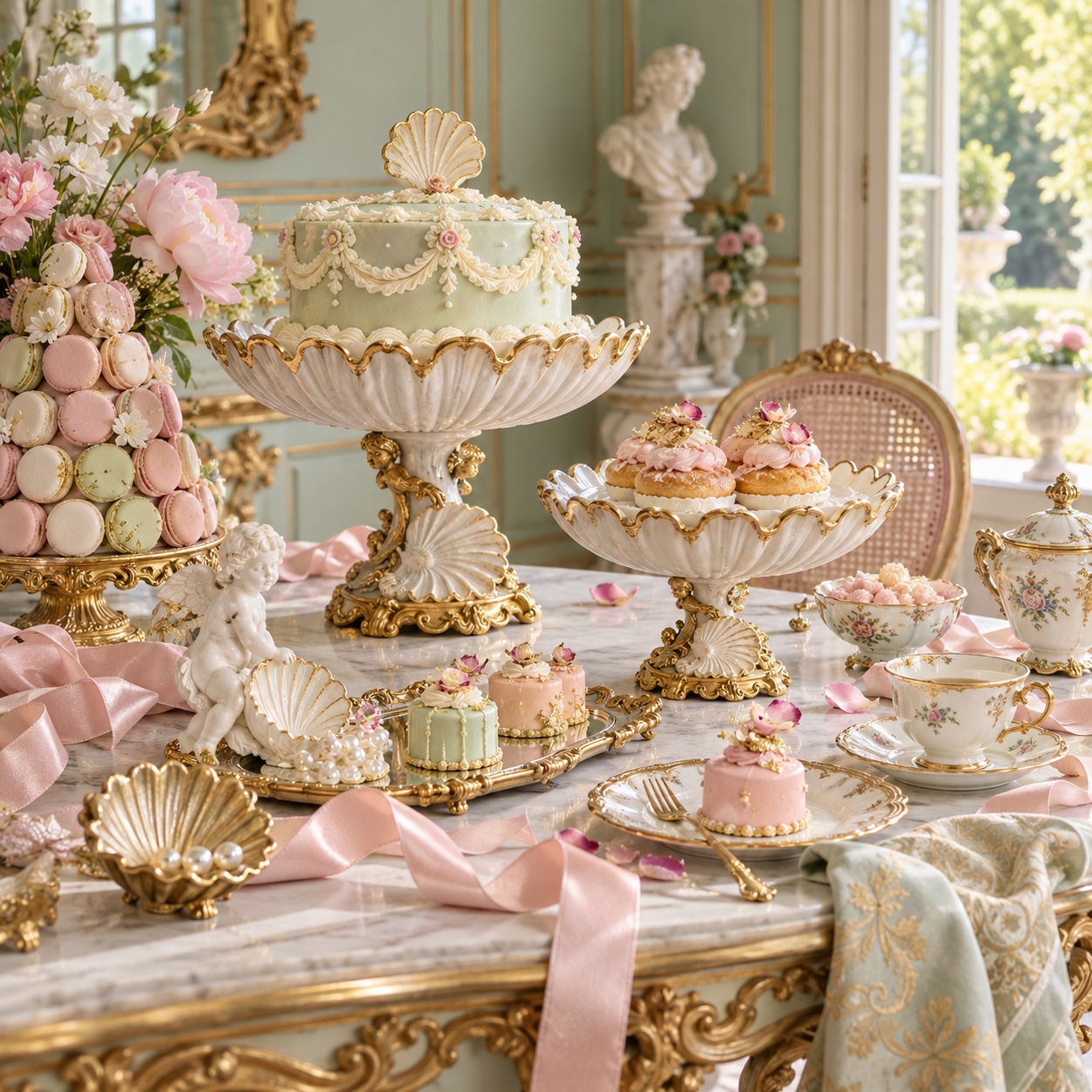
A tiered cake, macarons and pastel patisserie on gilded stands and shell dishes, with pink ribbon on a marble table.
Dossier sceneDessert · 1/5
01
The record

What it is, when it works, who it is for, and where it already exists.

How to use it

Record 037-RO - when it works, who it is for, what it looks like

FIELD 01

When to use it

  • Beauty, fragrance and confectionery brands that want softness with wit
  • Fashion and bridal work in the bow-and-ribbon register
  • Hospitality and interiors turning ornamental after a decade of beige
  • Editorial and packaging that plays with excess without heaviness
FIELD 02

Perfect for

  • Beauty and fragrance houses
  • Patisserie, chocolate and tea
  • Bridal, lingerie and occasion wear
  • Hotels, salons and tearooms
FIELD 03

What it looks like

  • Germain Boffrand's Salon de la Princesse at the Hôtel de Soubise, Paris, 1735 to 1740
  • François Boucher's pastel mythologies for Madame de Pompadour, 1750s
  • Jean-Honoré Fragonard, The Swing, 1767
  • Sofia Coppola's Marie Antoinette, 2006, the modern route back in

In the wild, Rococo aesthetic real-world examples

Where this aesthetic shows up in the real world · ↗ opens the source site

Omoro Style GuideEvery aesthetic, every field on this page, in one PDF.
Get the guide →
02
The anatomy

Where Rococo came from, what makes it recognisable, and the fingerprint it leaves.

History, Rococo aesthetic history

1730s-1780s; revived in fashion from 2023 · Paris, the salons of the 1730s

Rococo began in Paris in the 1730s as a reaction against the grand geometry of Louis XIV's court. The name came later and as an insult, from rocaille, the pebble-and-shell work of garden grottoes, whose curling forms became the vocabulary of the Paris town house: asymmetric scrolls, gilded plaster, mirrors between painted panels, and rooms scaled for conversation rather than ceremony. Germain Boffrand's Salon de la Princesse at the Hôtel de Soubise, decorated between 1735 and 1740, is the model.

Painting followed the rooms. François Boucher gave the style its pastel mythologies and its patron, Madame de Pompadour; Jean-Honoré Fragonard's The Swing, from 1767, is its most quoted image, a slipper flying through a garden. Porcelain from Meissen and Sèvres, silk, ribbon and shellwork carried the taste across Europe, and in Bavaria and Austria it became architecture: whole churches in white and gold.

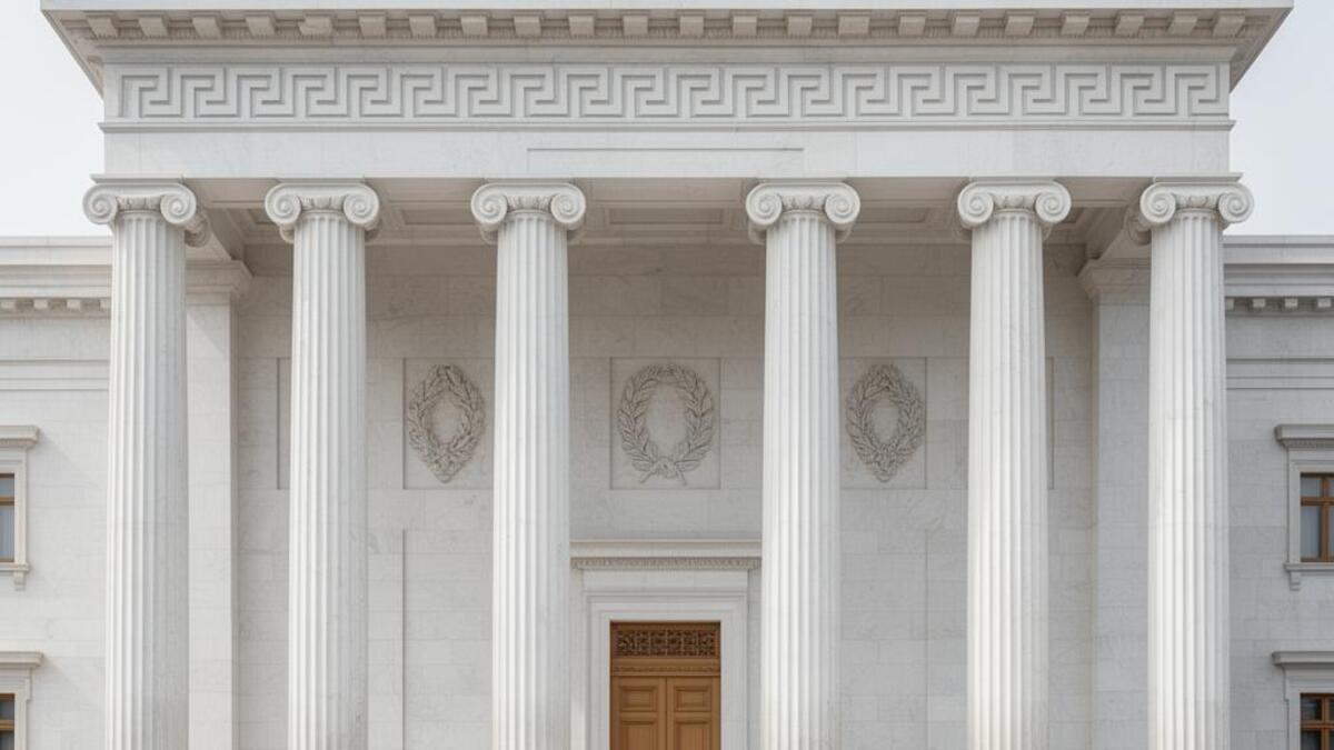
It ended in moral disgrace. By the 1780s Rococo read as the frivolity of a class about to fall, and Neoclassicism, sober and Roman, replaced it in the years before the Revolution. Its returns have been as fashion rather than architecture: the bows, ribbons and pastels of the coquette wardrobe from 2023, the ornamental turn in interiors after a decade of beige, and a beauty industry that has rediscovered the gilded compact. The current version keeps the lightness and the joke, and drops the weight.

Ornament that curls, gilt that stays light, and a room built for the joke.

Omoro dossier · 037-RO

Visual markers, Rococo aesthetic visual markers

The visual DNA: what makes it recognisable

typography

See the fonts
  • Swash italics and engraved scripts
  • High-contrast Didones with fine hairlines
  • Ornamental cartouches around short texts
  • Gold or pale ink on ivory rather than black

grid

  • Asymmetric compositions that curl rather than align
  • Panels, frames and cartouches as the layout unit
  • Mirrors and repetition that double a space
  • Small scale and intimacy over monumental symmetry

materials

  • Powder pink #EBB7B9, pistachio #B7C3A4 and hydrangea blue #A9B4CC as the pastels
  • Gilt #BB8D54 on ivory #E9D6C4
  • Giltwood, stucco, porcelain, silk taffeta, ribbon and mirror

motifs

  • Shell, pebble and acanthus scrollwork
  • Bows, ribbons and garlands
  • Cherubs, swings and garden follies
  • Gilded frames around pastel scenes

Aesthetic profile

8-channel console with the fingerprint on its display. Save the card, or share the page

Aesthetic Profile
Rococo
1730s-1780s; revived in fashion from 2023 · Paris, the salons of the 1730s
Attribute console · 037-RO
leans nostalgic, analog, organic
8 CH
FIG. 1
MaximalMinimalAnalogDigitalExpressiveRestrainedWarmCoolNostalgicFuturisticChaoticStructuredLightDarkOrganicGeometric
01Minimal
Maximal70%
02Analog
Digital80%
03Restrained
Expressive50%
04Cool
Warm40%
05Futuristic
Nostalgic90%
06Structured
Chaotic30%
07Dark
Light70%
08Organic
Geometric80%
NostalgicAnalogOrganic
Omoro · Attribute console · 037-RO
omoro.io/styles/rococo

Color Palettes, Rococo color palettes and hex codes

The definitive color scheme for this aesthetic

Rococo
#EBB7B9 · #B7C3A4 · #A9B4CC · #BB8D54 · #E9D6C4
A Paris salon at candle-hour: powder pink, pistachio and hydrangea blue in gilded frames on ivory
Omoro Palette Pack575 curated palettes across every aesthetic, 5 export formats.
Get the palettes →

Adjacent Palettes, styles related to Rococo

The colour of the styles sitting closest to this one

Neoclassical
Maximalism
Romantasy
Kitsch
03
The direction

How to shoot it, how to prompt it, and how to board it.

Photo Direction

How to shoot this aesthetic

"Shoot pastel, gilt and ribbon in soft candle-toned light, with the wit intact"

Shot list

  • A model in a bow-trimmed pastel dress on a giltwood chair, mirrors doubling the room
  • A tray of pastel macarons and a gilded compact on marble, shot from above
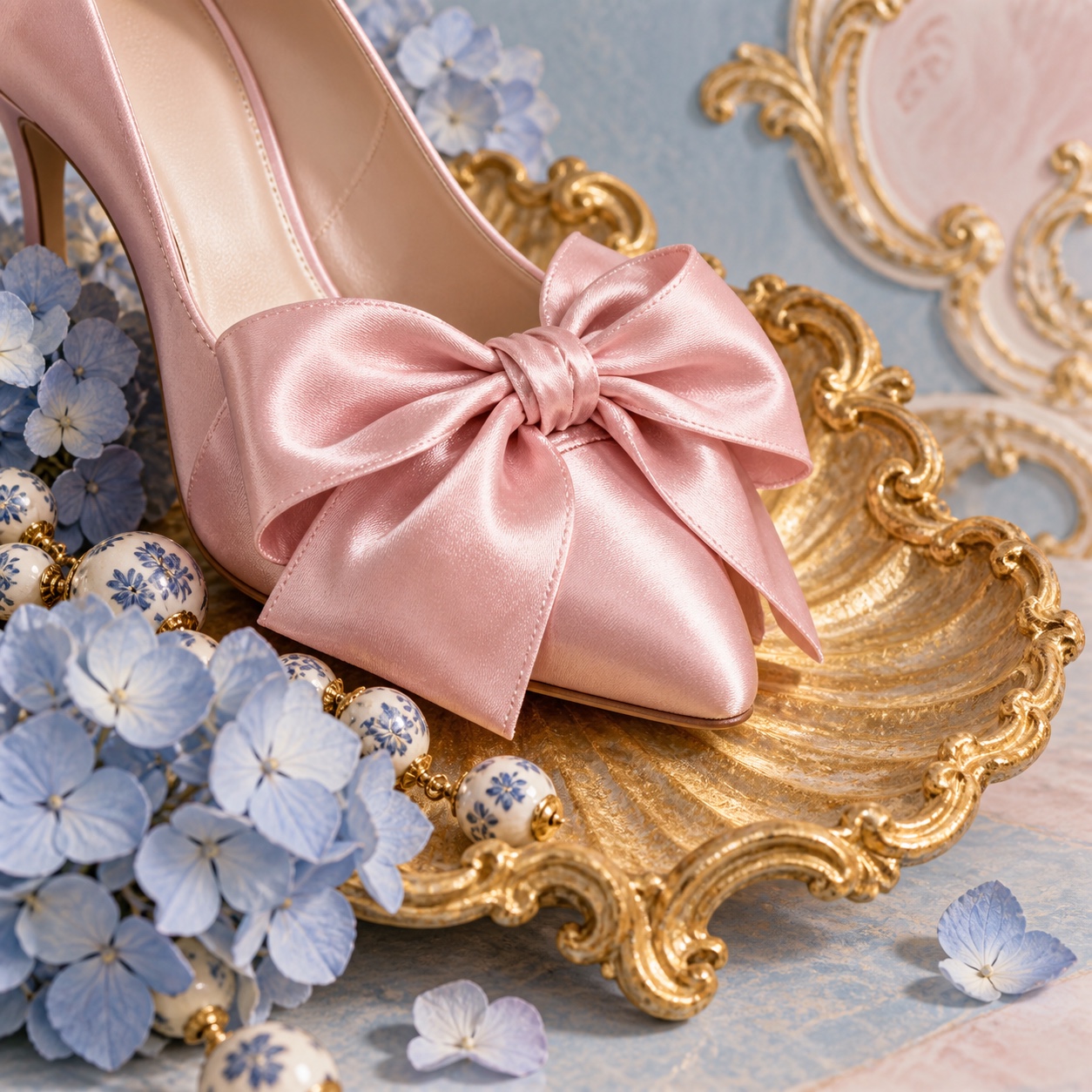
  • A curl of pink ribbon and a porcelain figure on a mirrored table

Lighting

Soft, warm and diffused: candlelight, north windows through sheer curtains, or a large softbox warmed toward gold. Pastels must stay pale, so avoid heavy contrast and let highlights bloom.

Omoro Director's Briefs212 photo shot-lists like this one, ready to shoot from.
Get the briefs →

Generative Prompt

Drop this into Studio to generate in this aesthetic

Rococo aesthetic, an intimate Paris salon of the 1730s, curling shell and pebble scrollwork, gilded plaster panels and mirrors, powder pink, pistachio and sky blue pastels with pale gilt on ivory, silk taffeta, bows and ribbons, porcelain, soft candle-toned light, playful and sensuous, ornament curling around empty space, no heavy gold surfaces, no readable text

Paste as-is, or append your own subject

Mood Board

The record applied to your project. The record's kit is free; your brand, references and plates come with membership

Mood board
The Rococo board
8 frames · 4 selected
FIG. 4
Powder PinkEBB7B9PistachioB7C3A4Hydrangea BlueA9B4CCGiltBB8D54IvoryE9D6C4
Brand and references
IdleBrand and references open with membership
With membership: the brand's own facts and colours in every prompt, references carried into every frame, and the plates generated.
01 · Hero application
02 · Material and finish
03 · Palette in context
04 · Photography direction
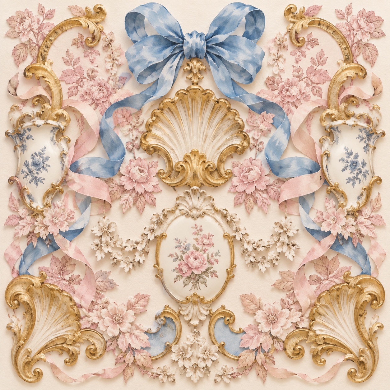
05 · Pattern plate
06 · Object
07 · Environment
08 · Digital presence
Demo kit free, the rest with membershipThe record as a demo kit, free. Name a project and it is written for that
Omoro · Mood board · 037-RO
04
The judgement

Whether to use it, what it costs to do properly, and where it stands right now.

Creative verdict, Rococo feasibility and strategic recommendation

Two written calls, seven meters, and when to walk away

Creative verdict
Should Rococo be the call?
7 meters
FIG. 2
Assessment

Draw the ornament by hand or from period engravings, never from a clip-art border, and let it curl around empty ivory rather than fill it. Keep gilt to lines and edges, pastels pale and the tone playful. Wall-to-wall gold, saturated pinks and cherubs in every corner tip it into wedding-cake pastiche.

Verdict

Right when the brand sells indulgence and wants it to feel light: beauty, fragrance, confectionery, bridal, tearooms and hotels. It rewards restraint inside the excess, and exposes anything heavy or literal.

Production cost
Medium

Gilt, silk and porcelain photograph well but cost money to source; ornament drawn by hand costs time.

Creative difficulty
Medium

The vocabulary is fixed and well documented; the design decision is how much to leave out.

Execution difficulty
High

Ornament that curls convincingly, gilt that reads as leaf rather than yellow, and pastels that stay pale in print all take skill.

Risk of misuse
Medium

Ornament without wit reads as kitsch, and a literal copy of a palace reads as a theme.

Prevalence
Emerging

Bows, pastels and gilt are moving from fashion into beauty, confectionery and hospitality.

Longevity
Timeless

It has returned every few decades since the 1780s; the pastel-and-gilt register outlives each revival.

Brand investment
Medium

Hand-drawn ornament and real materials cost up front and then carry a whole identity.

Avoid if
The brand needs to feel serious, minimal or technical
Curling ornament and pastel gilt pull the other way; it reads as decoration first.
Nobody can draw ornament by hand
Stock scroll borders and gold foil templates are the pastiche version, and readers know it.
The audience reads pastel and gilt as girlish
It can be coded as frivolous; without wit and quality it confirms the reading.
Omoro · Creative verdict · 037-RO

Editorial Depth

A Pro feature: origins, practitioners, and pitfalls

Editorial depth
The Rococo file
14 sections
FIG. 3
Context02Brands02Perception04Use04Index02
01Common MisconceptionThe principle beneath the surface
02Historical ContextOrigins, cultural moment, and reaction
03Brands That Accidentally Use This StyleNatural alignment, not category claims
04Brands That Perfectly Represent This StyleExceptional execution
05Psychological EffectHow visual decisions change perception
06Visual ChecklistInclude and avoid
07Creative FormulaThe visual system reduced to essentials
08Recognition SignalsHow to recognize it in two seconds
09When To Use This StyleContexts where the language performs
10Common Creative MistakesWhere imitation weakens the signal
11Best Brand ApplicationsIndustries with a natural advantage
12Creative Application AnalysisFit, feasibility, and production reality
13Related StylesClose languages and the key distinction
14Visual DNA SummaryThe sentence to remember
The editorial depth, with membershipOpening soon
Omoro · Editorial depth · 037-RO
05
The index

Neighbours, cross-references, blends, and the questions people ask.

Related concepts

Connected across the creative knowledge graph

Cultural relevance, Rococo cultural relevance today

Where it stands now, and what it costs you to use it

Rococo is back as a mood before it is back as a style: the bow on everything, the pastel gilt compact, the tearoom with mirrored panels. Beauty, confectionery and bridal brands are already using it, and hospitality is following as interiors turn ornamental again.

Its failure mode is heaviness. The originals were light, witty and scaled to a conversation; a room or a brand that piles on gilt without the joke slides into kitsch or wedding-cake pastiche. The work that lands keeps the palette pale, the ornament curling and the tone playful.

Cross-references

NeoclassicalThe sober style that ended it in the 1780sMaximalismThe wider appetite for more that it belongs toRomantasyThe current fantasy register that borrows its gilt and pastelKitschWhat it becomes when the wit is lost

Blend

Mix Rococo with any style in the library

Rococo×
50%50%
60% alike
Rococo referenceNeoclassical referenceRococo 50%Neoclassical 50%

Merged palette

#EBB7B9

#546E7A

#B7C3A4

#90A4AE

#A9B4CC

Leads nostalgic, analog, light

Typography · from Rococo

Lobster over Libre Baskerville

Materials

  • Powder pink #EBB7B9, pistachio #B7C3A4 and hydrangea blue #A9B4CC as the pastels
  • Gilt #BB8D54 on ivory #E9D6C4
  • Marble white: #F5F2EE, #EDE8E0: pure Carrara marble and its warm undertone

The calls this blend forces

These two disagree on 3 things, and a blend cannot average them: you pick a side. At this mix:

Organic or Geometric? Rococo is organic, Neoclassical is geometric. This mix lands geometric.

Chaotic or Structured? Rococo is chaotic, Neoclassical is structured. This mix lands structured.

Maximal or Minimal? Rococo is maximal, Neoclassical is minimal. This mix lands maximal.

Use it

Rococo aesthetic, an intimate Paris salon of the 1730s, curling shell and pebble scrollwork, gilded plaster panels and mirrors, powder pink, pistachio and sky blue pastels with pale gilt on ivory, silk taffeta, bows and ribbons, porcelain, soft candle-toned light, playful and sensuous, ornament curling around empty space, no heavy gold surfaces, no readable text (50%), infused with Neoclassical aesthetic with Greek and Roman revival, toga-draped classical figures and mythology scenes, cool cameo-relief color restraint, rigidly symmetrical composition and golden proportion, Jacques-Louis David painting influence, color palette strictly #EBB7B9 #546E7A #B7C3A4 #90A4AE #A9B4CC, leaning organic over geometric, chaotic over structured, maximal over minimal, overall character: nostalgic, analog, light

One-click generation opens with the studio

About this aesthetic

What is Rococo?

The playful, ornamental style that emerged in the Paris salons of the 1730s: curling shell-and-pebble scrollwork, pale gilt, powder pastels, mirrors and painted panels, scaled to intimate rooms. Its painters were Boucher and Fragonard, and it ended in the 1780s when Neoclassicism replaced it.

Why is Rococo coming back now?

Fashion got there first, through the bows, ribbons and pastels of the coquette wardrobe from 2023, and interiors are turning ornamental after ten years of neutral minimalism. Beauty, confectionery and hospitality brands are using its lightness to feel indulgent without feeling heavy.

How is it different from Baroque?

Baroque is grand, dark and dramatic, built for church and state; Rococo is its lighter, private successor: pastel instead of deep colour, curling asymmetry instead of monumental symmetry, wit instead of awe, and rooms made for conversation rather than ceremony.

How do you use Rococo without it turning to kitsch?

Keep the palette pale, use gilt as a line rather than a surface, let ornament curl around empty space, and keep the tone light. The originals were witty and scaled to a person; weight and literal reproduction are what tip it into pastiche.

Build with the rococo aesthetic

Every style in the library is broken down like this one: the palette, the typography, the materials and the lineage.

Explore the style library →