Print Paper sets the weight of the palette in warmth and creativity, and Marker Black is the swatch that breaks rank: a single black that stops the set reading as one note. Marker Black to Print Paper spans 75 points of lightness, so the palette can carry its own hierarchy without reaching for a second one. Print Paper and Marker Blue sit on opposite sides of the temperature line, which is the tension the palette runs on and the pair to hold apart.
Print Paper a peach or apricot tint, all the friendliness of orange with none of the volume.
Marker Black reads as pure authority: sophistication, power, and the visual weight that makes everything placed near it feel more serious.
Marker Blue an electric or cobalt blue: trust with real conviction, confident rather than passive.
Correction Red reads as pure adrenaline: alarm, desire, the color of things that move fast.
Highlighter Pink a hot, saturated pink: playful, confident, deliberately unserious.
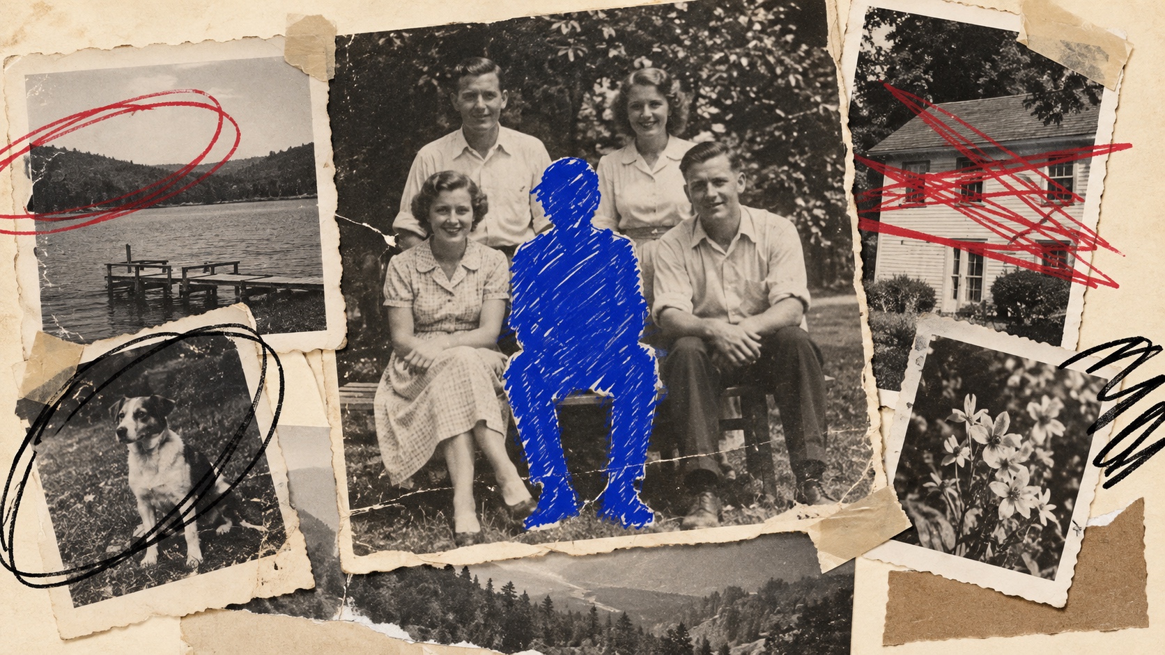
Clean images, found prints and layouts interrupted by aggressive marker edits: figures blanked out, crossings-out, censor bars, loops, underlines, arrows and blunt notes
Explore the full Scribbled Out style guide