Scribbled Out

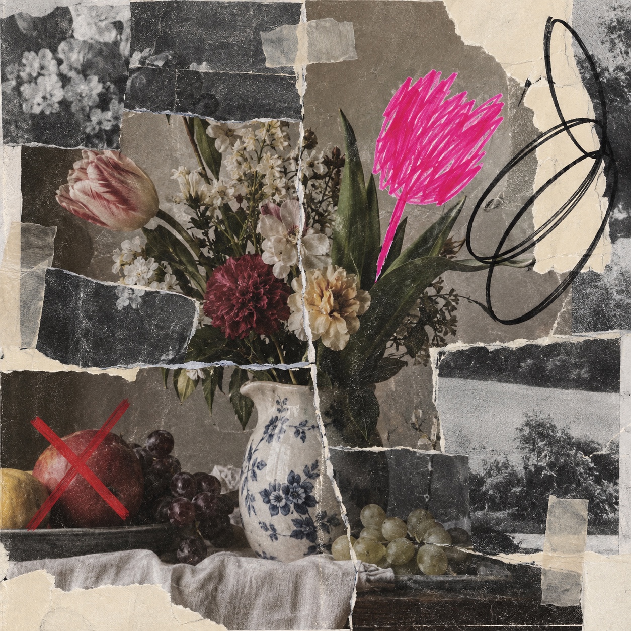
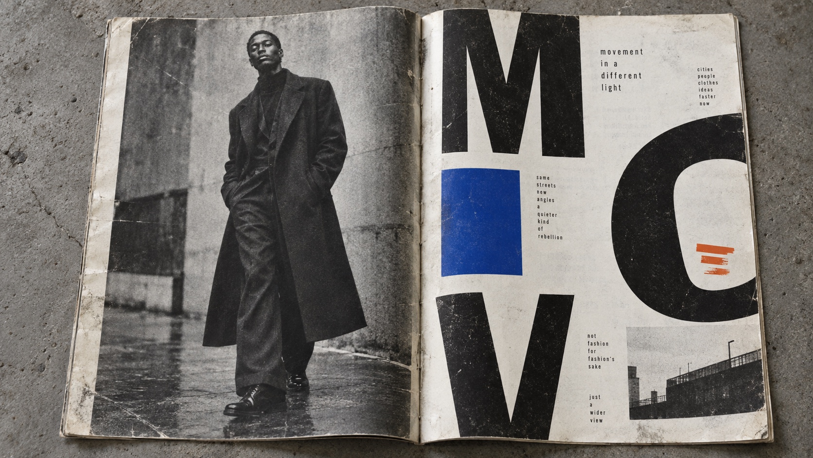
Clean images, found prints and layouts interrupted by aggressive marker edits: figures blanked out, crossings-out, censor bars, loops, underlines, arrows and blunt notes

Compare Scribbled Out with another style →See the Scribbled Out typefaces →
Record038-SO
AestheticScribbled Out
ClassExpressive / Chaotic
StatusINGESTING
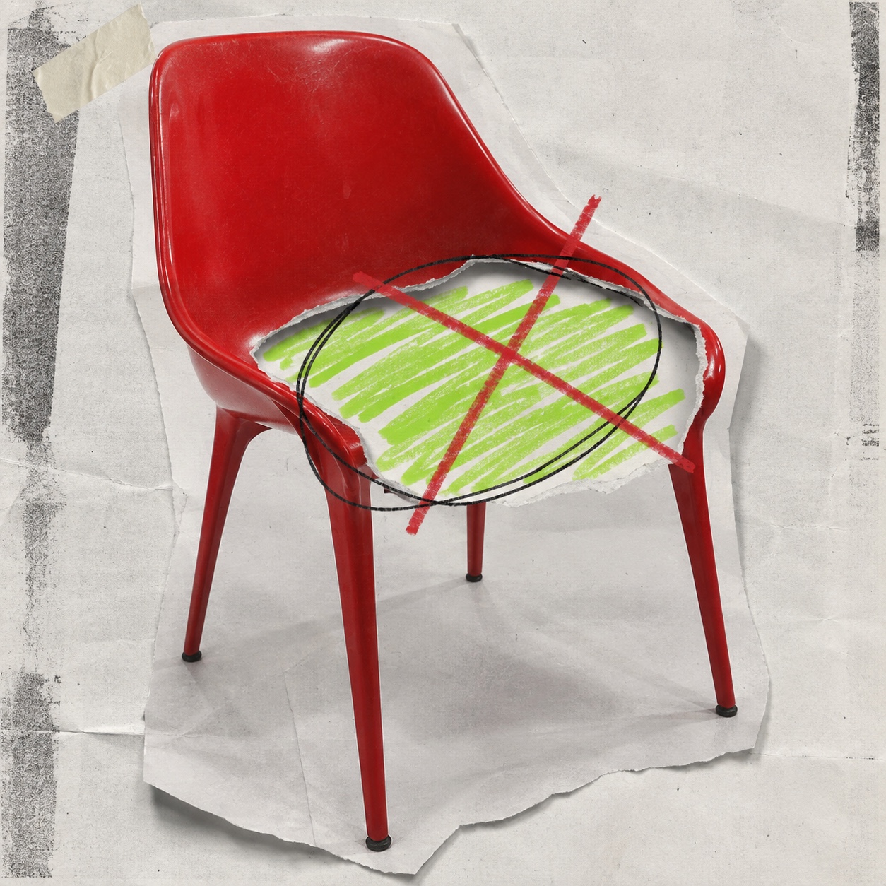
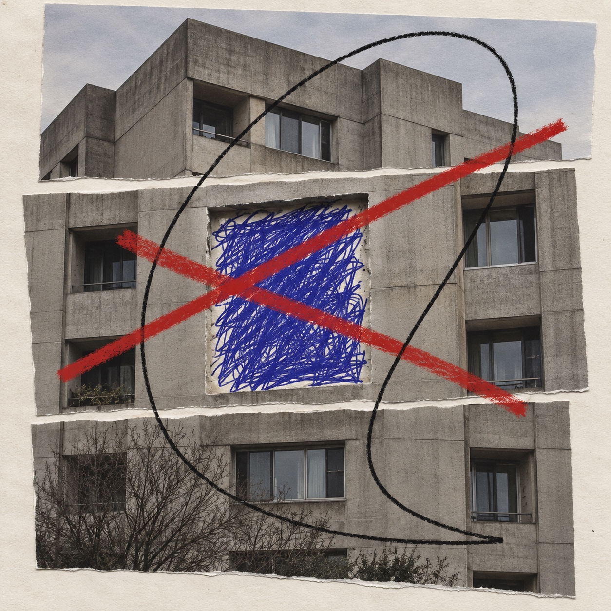
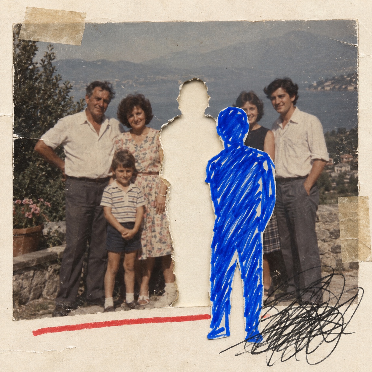
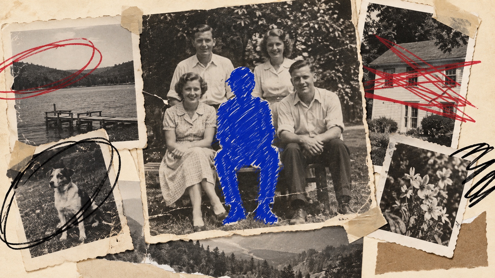
Vintage snapshots on torn paper: a family portrait with one figure blanked out in blue marker, a dog circled in black and a house struck through in red.
Archive plate · Scribbled Out
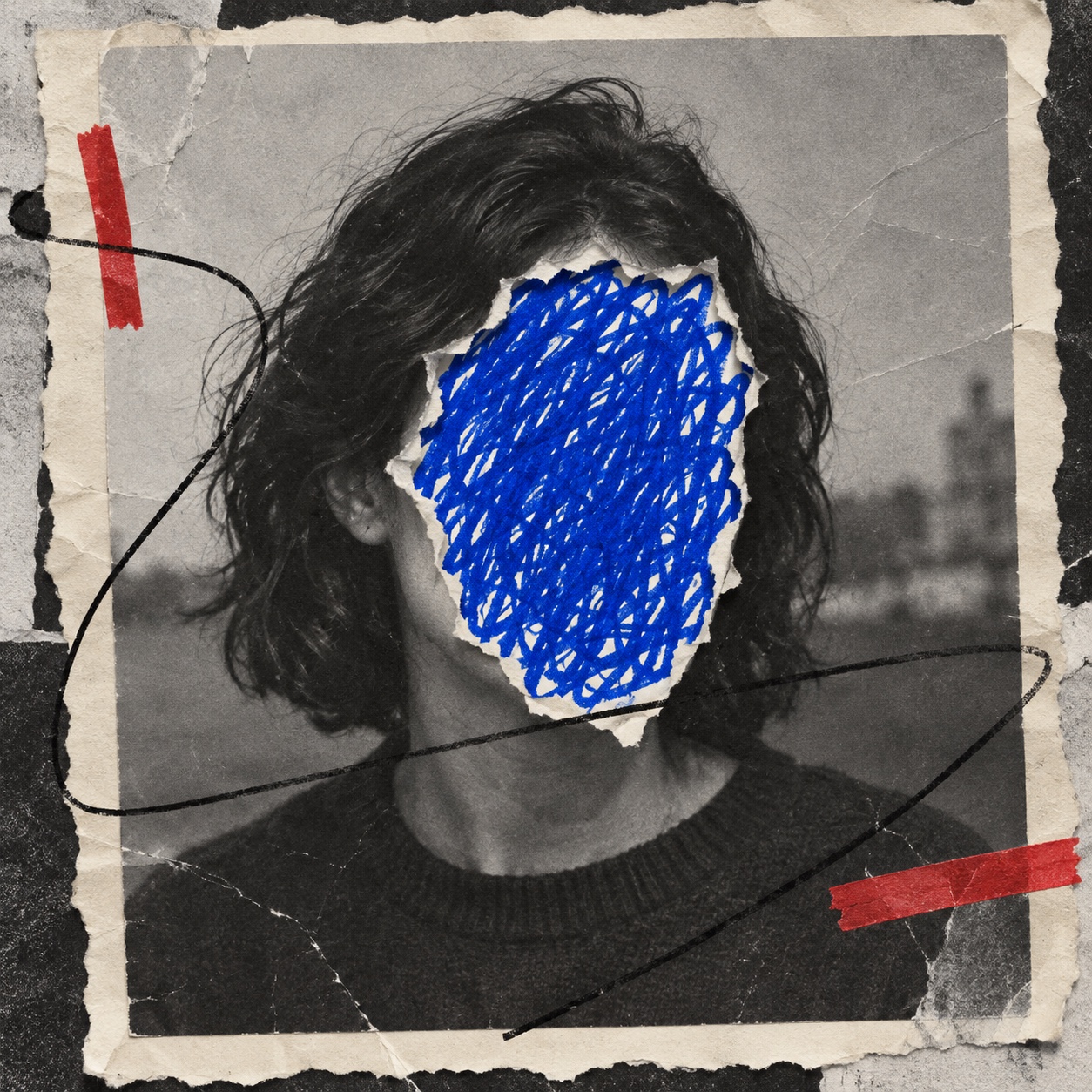
A black-and-white portrait with the face scribbled out in blue marker, red strokes and a black loop across torn paper.
Dossier scenePortrait · 1/5
01
The record

What it is, when it works, who it is for, and where it already exists.

How to use it

Record 038-SO - when it works, who it is for, what it looks like

FIELD 01

When to use it

  • Campaigns that need to sound opinionated and self-aware
  • Editorial and magazine work that argues with its own content
  • Launches and rebrands that show the old version being corrected
  • Music, fashion and culture brands with a young, sceptical audience
FIELD 02

Perfect for

  • Independent magazines and publishers
  • Fashion and streetwear campaigns
  • Musicians, labels and tour posters
  • Agencies and brands with a sharp, conversational voice
FIELD 03

What it looks like

  • Marcel Duchamp, L.H.O.O.Q., 1919, a moustache drawn on a Mona Lisa postcard
  • Arnulf Rainer's overpaintings, from 1952, dense marks over photographs
  • Robert Rauschenberg, Erased de Kooning Drawing, 1953
  • Tom Phillips, A Humument, begun 1966, a Victorian novel painted over page by page

In the wild, Scribbled Out aesthetic real-world examples

Where this aesthetic shows up in the real world · ↗ opens the source site

Omoro Style GuideEvery aesthetic, every field on this page, in one PDF.
Get the guide →
02
The anatomy

Where Scribbled Out came from, what makes it recognisable, and the fingerprint it leaves.

History, Scribbled Out aesthetic history

1919 to now · Artists' overdrawing and the editor's markup, carried into fashion, music and social media

Drawing over a finished image is an old form of disagreement. In 1919 Marcel Duchamp pencilled a moustache and goatee onto a postcard of the Mona Lisa and titled it L.H.O.O.Q., and the joke made a serious point: a mark added to an image can say more than the image. After the war the Austrian painter Arnulf Rainer began his Übermalungen, or overpaintings, in 1952, burying photographs and self-portraits under dense gestural marks, and in 1953 Robert Rauschenberg asked Willem de Kooning for a drawing so that he could erase it.

The edit then became a literary and graphic form. From 1966 Tom Phillips drew and painted over every page of a forgotten Victorian novel, leaving a few words showing through to tell a new story in A Humument. Jean-Michel Basquiat crossed words out in his paintings and said he did it so that people would see them more, because a word that is obscured is a word you want to read. The editor's markup on a proof, the circle, the strike and the note in the margin, became a visual language of its own, and Austin Kleon's Newspaper Blackout in 2010 made the marker redaction a popular format.

Now it is the voice of brands and publications that want to sound like a person with an opinion. Fashion campaigns, music posters, magazines and social content take a clean, expensive photograph and mark it up by hand, circling, striking and annotating, so the image arrives with its own commentary. What matters is intent: the marks correct, censor or argue with something specific. Without that it slides into graffiti or doodling, which are different languages with different jobs.

The finished image, argued with in marker.

Omoro dossier · 038-SO

Visual markers, Scribbled Out aesthetic visual markers

The visual DNA: what makes it recognisable

typography

See the fonts
  • A clean grotesk set first, then struck through by hand
  • Blunt handwritten annotations in marker capitals
  • Crossed-out words left legible beneath the strike
  • Underlines, circles, arrows and question marks as punctuation

grid

  • A finished, professional layout or photograph as the base
  • Marks that cut across the grid rather than respecting it
  • Annotations in margins, gutters and the empty parts of the frame
  • One or two decisive interventions rather than a covered surface

materials

  • Print paper #E4D6C2 and marker black #141414
  • Marker blue #0E3FBB to blank out, correction red #BE1D1E to strike
  • Highlighter pink #D7317C and lime #ABD056 used sparingly for emphasis
  • Glossy prints, magazine proofs, felt-tip markers, paint pens and correction tape

motifs

  • A face or a figure filled in solid with blue marker
  • Thick crossings-out through a headline or an object
  • Censor bars and redaction blocks over one detail
  • A loop around one element with an arrow to a note
  • Hard underlines, check marks and one-word verdicts

Aesthetic profile

8-channel console with the fingerprint on its display. Save the card, or share the page

Aesthetic Profile
Scribbled Out
1919 to now · Artists' overdrawing and the editor's markup, carried into fashion, music and social media
Attribute console · 038-SO
leans expressive, chaotic, analog
8 CH
FIG. 1
MaximalMinimalAnalogDigitalExpressiveRestrainedWarmCoolNostalgicFuturisticChaoticStructuredLightDarkOrganicGeometric
01Minimal
Maximal30%
02Analog
Digital50%
03Restrained
Expressive90%
04Cool
Warm10%
05Futuristic
Nostalgic10%
06Structured
Chaotic60%
07Dark
Light50%
08Organic
Geometric20%
ExpressiveChaoticAnalog
Omoro · Attribute console · 038-SO
omoro.io/styles/scribbled-out

Color Palettes, Scribbled Out color palettes and hex codes

The definitive color scheme for this aesthetic

Scribbled Out
#E4D6C2 · #141414 · #0E3FBB · #BE1D1E · #D7317C
A photograph after the edit: aged print paper, a figure blanked out in cobalt marker, a red strike and a black loop
Omoro Palette Pack575 curated palettes across every aesthetic, 5 export formats.
Get the palettes →

Adjacent Palettes, styles related to Scribbled Out

The colour of the styles sitting closest to this one

90s Editorial
Dada
Punk
Hand-drawn Doodles
03
The direction

How to shoot it, how to prompt it, and how to board it.

Photo Direction

How to shoot this aesthetic

"Shoot it clean, then mark it up: the photograph has to be good enough to argue with"

Shot list

  • A clean studio portrait, printed and marked with a black marker loop around the eyes and a blunt note in the margin
  • A product on seamless white with its label crossed out in red and a handwritten correction beside it
  • A modernist facade with one window circled and an arrow running to a scrawled comment

Lighting

Clean, even and professional: studio strobe or bright overcast daylight. The polish of the photograph is what the marks push against, so keep it sharp, neutral and well exposed.

Omoro Director's Briefs200 photo shot-lists like this one, ready to shoot from.
Get the briefs →

Generative Prompt

Drop this into Studio to generate in this aesthetic

Scribbled out aesthetic, a clean photograph, found print or layout interrupted by aggressive hand-drawn marker edits, a face or figure blanked out in solid cobalt-blue marker, thick red crossings-out, black loops, a censor bar over one detail, loops circling an element, hard underlines and arrows, blunt handwritten annotations, clean grotesk typography partly struck through, editorial and irreverent, marker streaks and dry-brush stroke ends, scanned paper grain, no graffiti tags, no cartoon doodles, no real logos

Paste as-is, or append your own subject

Mood Board

The record applied to your project. The record's kit is free; your brand, references and plates come with membership

Mood board
The Scribbled Out board
8 frames · 4 selected
FIG. 4
Print PaperE4D6C2Marker Black141414Marker Blue0E3FBBCorrection RedBE1D1EHighlighter PinkD7317C
Brand and references
IdleBrand and references open with membership
With membership: the brand's own facts and colours in every prompt, references carried into every frame, and the plates generated.
01 · Hero application
02 · Material and finish
03 · Palette in context
04 · Photography direction
05 · Pattern plate
06 · Object
07 · Environment
08 · Digital presence
Demo kit free, the rest with membershipThe record as a demo kit, free. Name a project and it is written for that
Omoro · Mood board · 038-SO
04
The judgement

Whether to use it, what it costs to do properly, and where it stands right now.

Creative verdict, Scribbled Out feasibility and strategic recommendation

Two written calls, seven meters, and when to walk away

Creative verdict
Should Scribbled Out be the call?
7 meters
FIG. 2
Assessment

Start with an image clean enough to be worth defacing, then mark it by hand with real marker on a print and scan it. Every mark should carry a point of view: strike the claim, circle the detail, write the blunt correction, in black and one or two colours. Random scribbles with nothing to say read as graffiti or doodling, and the style disappears.

Verdict

Right when the brand has something to say and can afford to be blunt: magazines, fashion, music and launches that correct their category. It rewards writing as much as drawing, and falls flat as decoration.

Production cost
Low

A marker, a printer and a scanner. The clean image underneath is the only real cost.

Creative difficulty
High

The marks have to say something: which detail to strike, what to write and where is the whole idea.

Execution difficulty
Medium

Real marker on a real print scans with pressure, streaks and dry ends that a digital brush rarely matches.

Risk of misuse
High

Without a point of view the marks read as vandalism or filler, and digital brush strokes look cheap at once.

Prevalence
Common

Marker edits run through fashion, music and social content, and many brands now annotate their own work.

Longevity
Enduring

Artists have drawn over images for a century, from Duchamp to Rainer; the gesture outlives each wave of use.

Brand investment
Low

A marker and a scanner, applied to images the brand already owns.

Avoid if
The brand needs to feel calm, premium or reassuring
The marks are confrontational by design; they read as argument, not polish.
Nobody can write the annotations
The style depends on the words and on choosing what to cross out; empty scribbles become noise.
The images are not strong enough to deface
Scribbling over a weak photograph only draws attention to it.
Omoro · Creative verdict · 038-SO

Editorial Depth

A Pro feature: origins, practitioners, and pitfalls

Editorial depth
The Scribbled Out file
14 sections
FIG. 3
Context02Brands02Perception04Use04Index02
01Common MisconceptionThe principle beneath the surface
02Historical ContextOrigins, cultural moment, and reaction
03Brands That Accidentally Use This StyleNatural alignment, not category claims
04Brands That Perfectly Represent This StyleExceptional execution
05Psychological EffectHow visual decisions change perception
06Visual ChecklistInclude and avoid
07Creative FormulaThe visual system reduced to essentials
08Recognition SignalsHow to recognize it in two seconds
09When To Use This StyleContexts where the language performs
10Common Creative MistakesWhere imitation weakens the signal
11Best Brand ApplicationsIndustries with a natural advantage
12Creative Application AnalysisFit, feasibility, and production reality
13Related StylesClose languages and the key distinction
14Visual DNA SummaryThe sentence to remember
The editorial depth, with membershipOpening soon
Omoro · Editorial depth · 038-SO
05
The index

Neighbours, cross-references, blends, and the questions people ask.

Related concepts

Connected across the creative knowledge graph

Cultural relevance, Scribbled Out cultural relevance today

Where it stands now, and what it costs you to use it

Scribbled Out is how a brand shows it has an opinion. In a feed of polished, interchangeable images, the hand-marked edit reads as a person talking, and the marks tell the viewer exactly where to look. It runs through fashion and music campaigns, independent magazines and the social content of brands that annotate their own work.

Its failure mode is the empty scribble. Marks with nothing to say read as vandalism or filler, and digital brush strokes laid over a render look cheap at once. The work that lands starts with a photograph worth defacing, marks it by hand with real marker, and makes every strike, circle and note carry a point.

Cross-references

90s EditorialThe deconstructed magazine it shares its irreverence withDadaDuchamp's moustache on the Mona Lisa is its founding gesturePunkThe defaced, cut-up graphics of the late 1970sHand-drawn DoodlesThe friendly hand-drawn style it is not

Blend

Mix Scribbled Out with any style in the library

Scribbled Out×
50%50%
88% alike
Scribbled Out reference90s Editorial referenceScribbled Out 50%90s Editorial 50%

Merged palette

#E4D6C2

#37474F

#141414

#6D4C41

#0E3FBB

Leads expressive, chaotic, analog

Typography · from Scribbled Out

IBM Plex Sans over IBM Plex Mono

Materials

  • Print paper #E4D6C2 and marker black #141414
  • Marker blue #0E3FBB to blank out, correction red #BE1D1E to strike
  • Desaturated and slightly washed-out: the documentary editorial palette

The calls this blend forces

These two disagree on one thing, and a blend cannot average them: you pick a side. At this mix:

Light or Dark? Scribbled Out is light, 90s Editorial is dark. This mix lands light.

Use it

Scribbled out aesthetic, a clean photograph, found print or layout interrupted by aggressive hand-drawn marker edits, a face or figure blanked out in solid cobalt-blue marker, thick red crossings-out, black loops, a censor bar over one detail, loops circling an element, hard underlines and arrows, blunt handwritten annotations, clean grotesk typography partly struck through, editorial and irreverent, marker streaks and dry-brush stroke ends, scanned paper grain, no graffiti tags, no cartoon doodles, no real logos (50%), infused with 1990s editorial design with David Carson and Raygun magazine influence, deconstructed grunge typography layered at oblique angles, distressed photocopy and fax-machine texture, anti-grid chaos as intentional design decision, color palette strictly #E4D6C2 #37474F #141414 #6D4C41 #0E3FBB, leaning light over dark, overall character: expressive, chaotic, analog

One-click generation opens with the studio

About this aesthetic

What is the scribbled out aesthetic?

Clean photographs, found prints and designed surfaces interrupted by aggressive hand-drawn marker edits: figures blanked out, crossings-out, censor bars, loops, underlines, arrows and blunt annotations. It reads like an art director's markup on a proof, opinionated and irreverent, with the finished image still visible underneath.

Is it the same as graffiti or doodle art?

No. Graffiti claims a surface and doodling fills space; scribbled out edits a finished image. The marks cross out, censor, circle and annotate something specific, the way an editor marks a proof, so the clean image underneath matters as much as the marker on top.

Why does it work on people?

A crossed-out word or a censored detail creates curiosity: people want to read what has been hidden, which is exactly why Basquiat said he crossed words out. The hand-drawn mark also signals a person with a view rather than a corporate voice, so the image feels candid and the brand more direct.

How is it made well?

Start with a clean, well-made photograph or layout, print it, mark it by hand with real felt-tip marker and scan the result. Limit the marks to black and one or two colours, blue to blank out and red to strike, decide what each mark says before drawing it, and keep a few decisive interventions rather than covering the whole surface.

Build with the scribbled out aesthetic

Every style in the library is broken down like this one: the palette, the typography, the materials and the lineage.

Explore the style library →