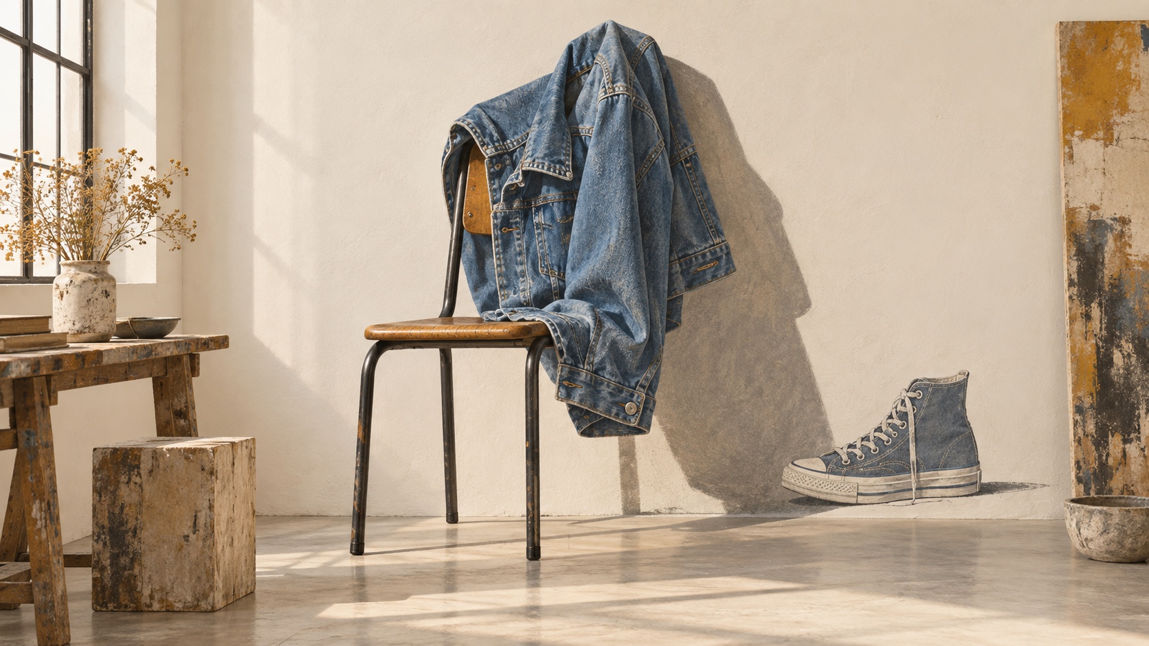
Plaster sets the weight of the palette in warmth and creativity, and Terracotta is the swatch that breaks rank: a single brown that stops the set reading as one note. Plaster and Stripe Blue sit on opposite sides of the temperature line, which is the tension the palette runs on and the pair to hold apart. Saturation averages 42 percent, present without shouting, with Lemon carrying most of it.
Plaster a burnt or terracotta orange, warmth read through a rustic, sun-worn filter.
Terracotta grounds a palette: stability, reliability, the color of wood, soil, and things built to last.
Peach Wall signals warmth, approachability, and creative energy, friendlier than red, louder than yellow.
Stripe Blue a dusty or steel blue, trust read as quiet reliability rather than corporate polish.
Lemon an electric, high-visibility yellow: caution and euphoria share the same wavelength here.
The image that pretends to be the thing: painted bows, printed folds, fake doorways and false shadows, an illusion played straight and admitted with a wink
Explore the full Trompe-l'œil style guide