When to use it
- Fashion that wants a joke you have to look twice at
- Interiors, murals and retail that need architecture they cannot build
- Packaging and product that play with what is real
- Campaigns for brands with wit and craft to prove
The image that pretends to be the thing: painted bows, printed folds, fake doorways and false shadows, an illusion played straight and admitted with a wink
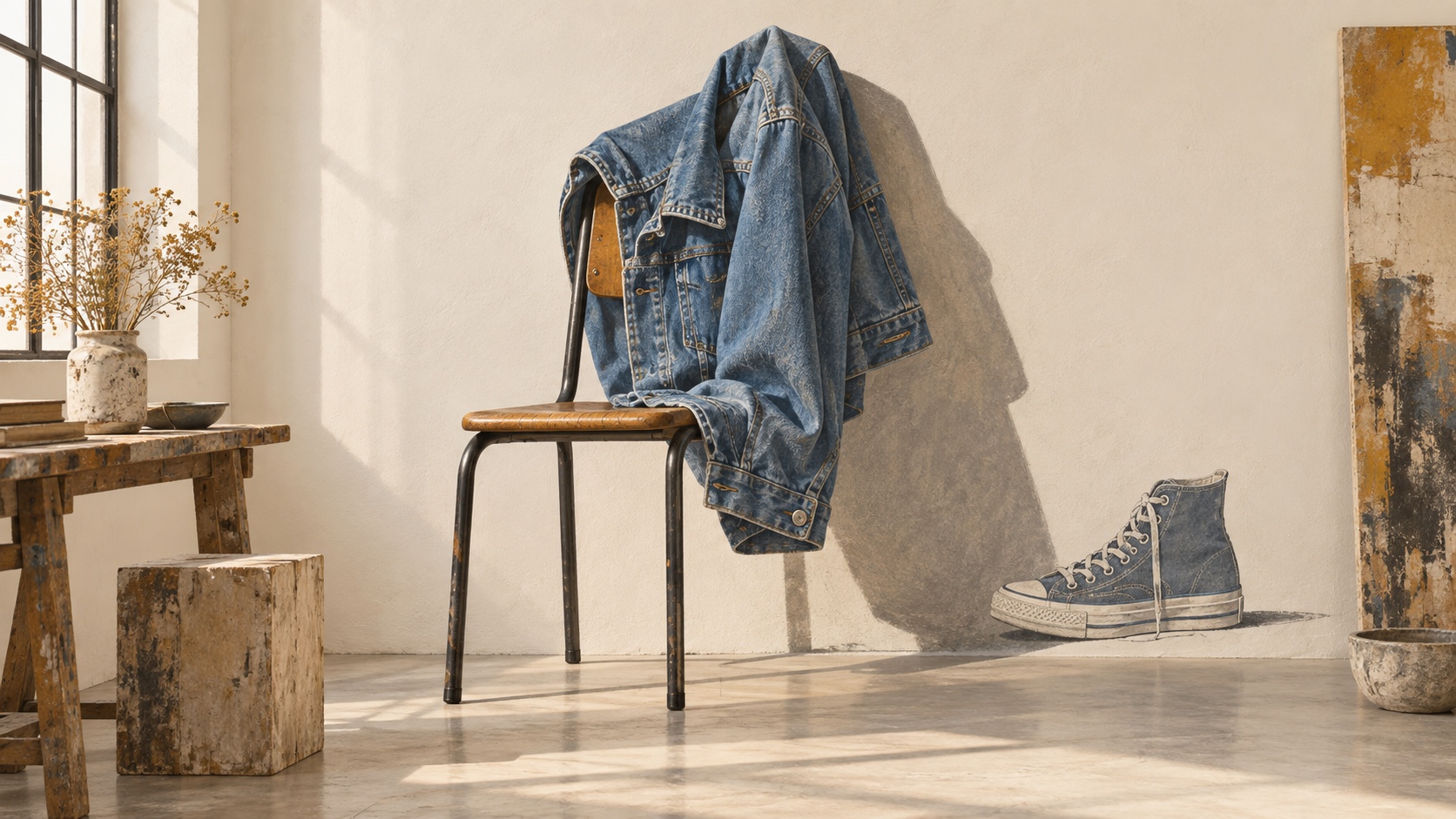
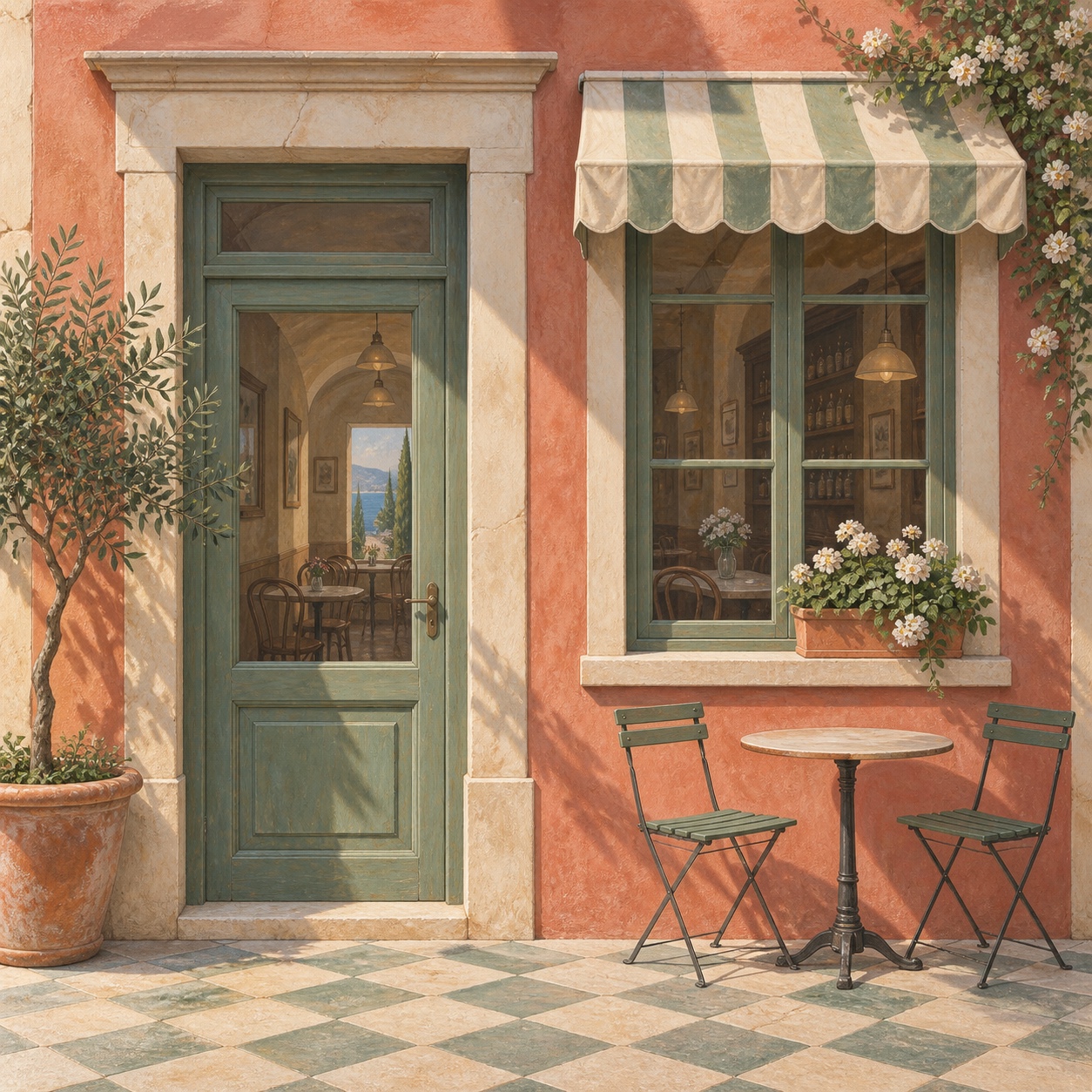
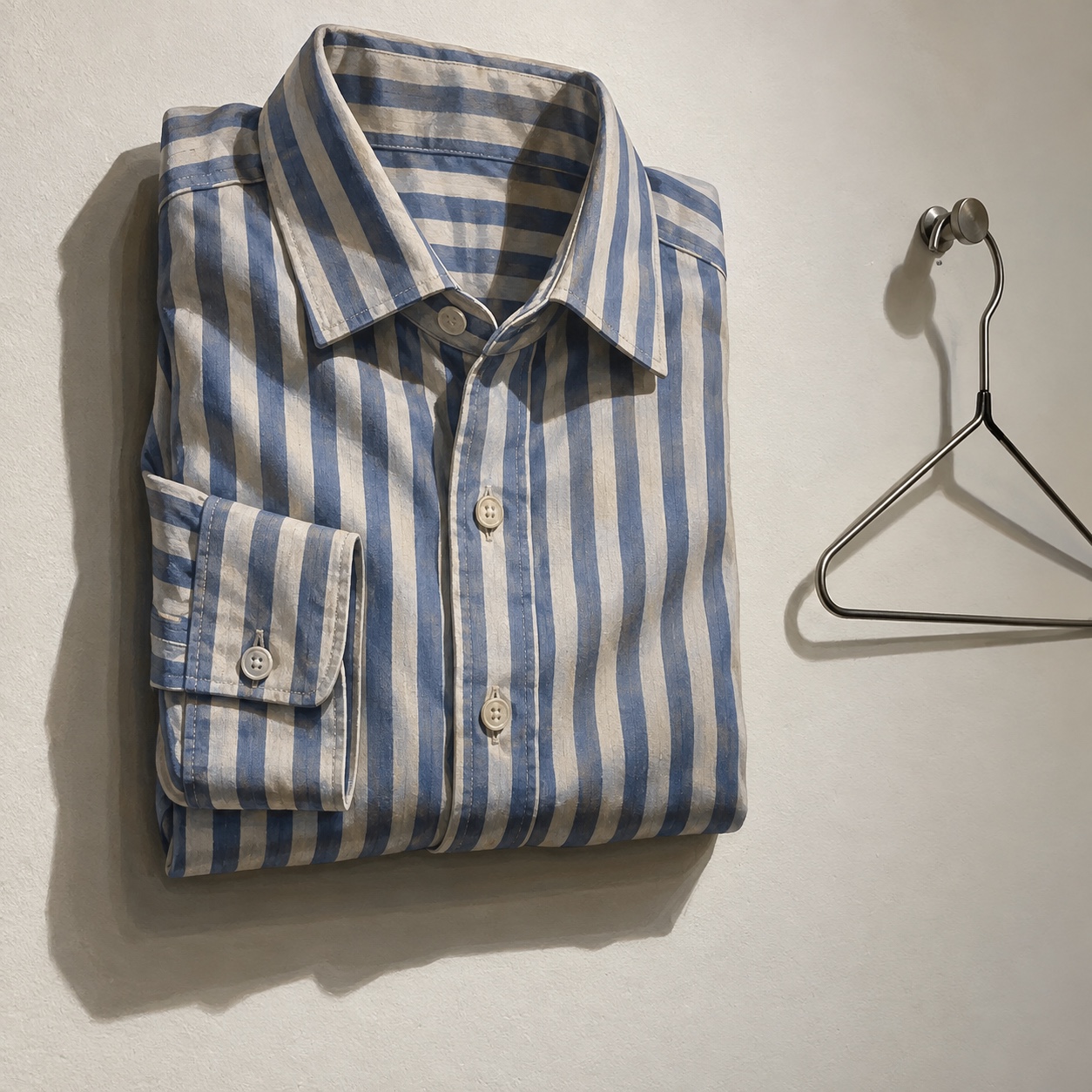
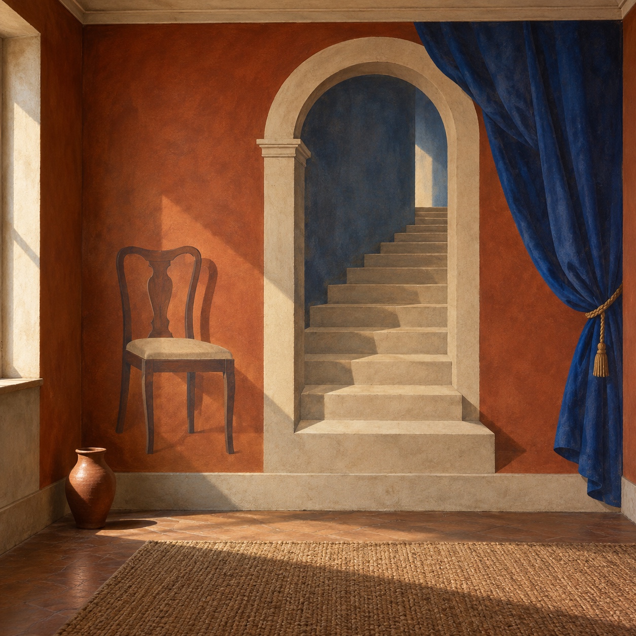
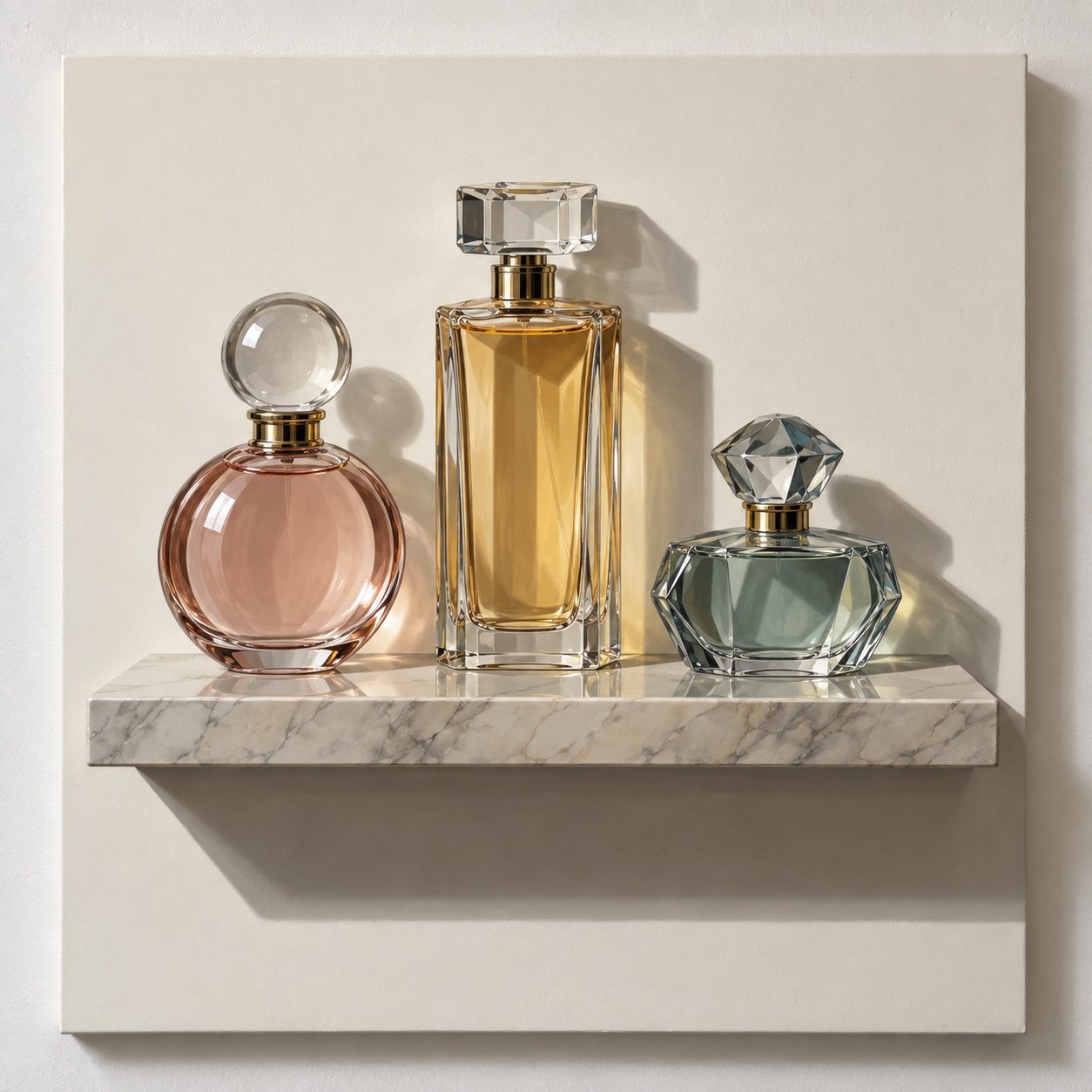
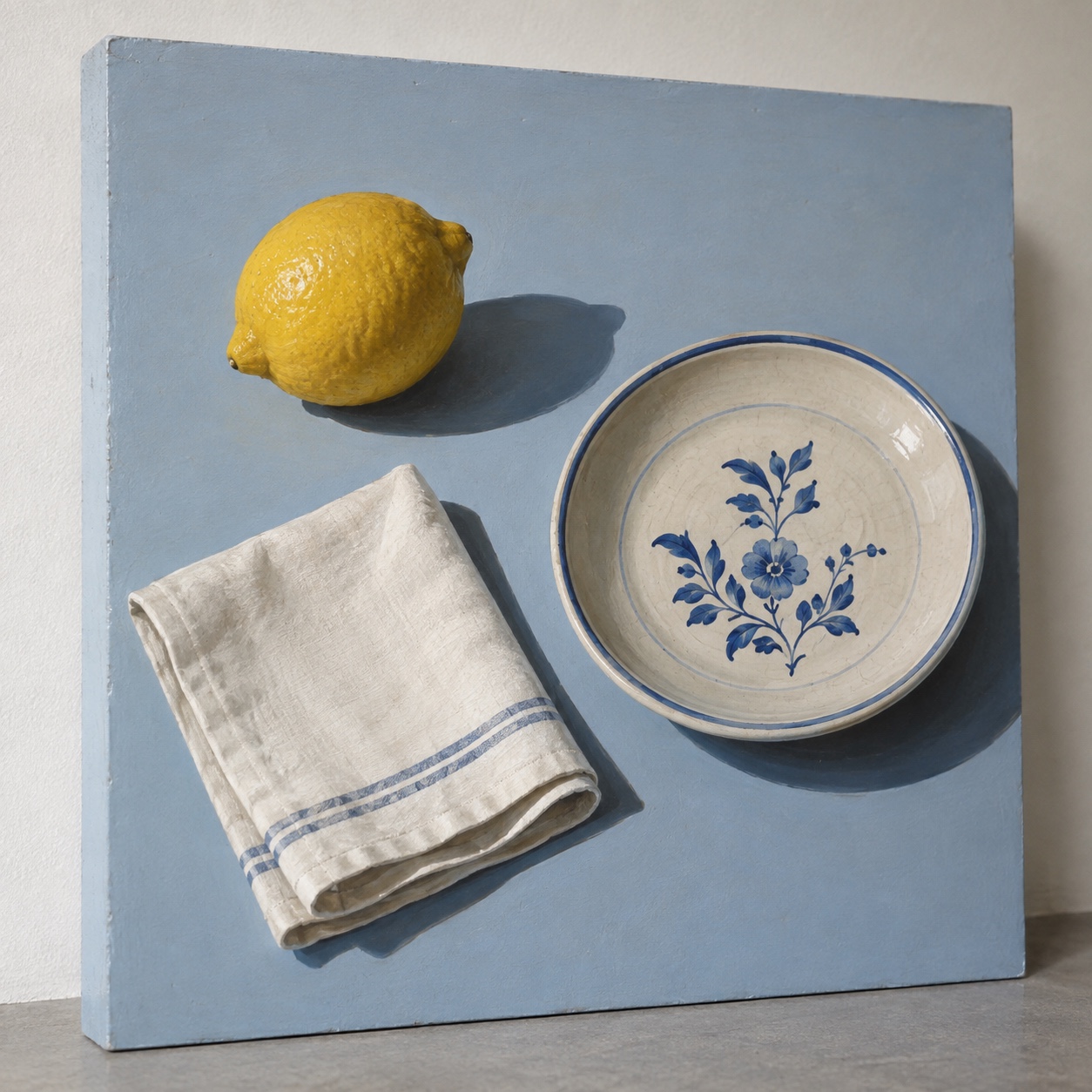
What it is, when it works, who it is for, and where it already exists.
Record 039-TL - when it works, who it is for, what it looks like
Where this aesthetic shows up in the real world · ↗ opens the source site
Where Trompe-l'œil came from, what makes it recognisable, and the fingerprint it leaves.
1600s to now; a fashion language from 1927 · Baroque painting, then Paris fashion
The trick is ancient: Pliny tells of grapes painted so well that birds pecked them, and the villas of Pompeii opened painted windows onto painted gardens. The name is French, to deceive the eye, and the form flourished in Baroque ceilings and Dutch still lifes, where a painted letter rack or a fly on the canvas tested how far a picture could go. Pere Borrell del Caso's Escaping Criticism, painted in 1874, is its manifesto: a boy climbing out of the frame.
Fashion made it a language. In her first collection in 1927 Elsa Schiaparelli knitted a sweater with a white bow that was only a picture of a bow, and Vogue called it a masterpiece; the illusion became her signature and passed into Surrealist fashion. After the war Piero Fornasetti painted whole rooms of false architecture onto furniture and plates, and the printed fold, the fake pocket and the painted button became recurring jokes in ready-to-wear.
It returned in the 2010s as craft's answer to the flat screen. Jonathan Anderson's twelve years at Loewe, from 2013, made the illusion a house signature, with trousers printed to look creased, shoes that appeared to be something else and photographic prints of garments on garments, and interiors followed with painted mouldings and fake doorways on plain walls. The current version is played straight and then admitted: the point is the double take.
“The image that pretends to be the thing, then admits it.
The visual DNA: what makes it recognisable
8-channel console with the fingerprint on its display. Save the card, or share the page

The definitive color scheme for this aesthetic
The colour of the styles sitting closest to this one
How to shoot it, how to prompt it, and how to board it.
How to shoot this aesthetic
"Shoot the illusion so it holds for a second: true scale, matched light, then the reveal"
Shot list
Lighting
Match the painted light exactly: one directional source at the angle the illusion assumes, so painted shadows and real shadows agree. Soft enough to hide brushwork, hard enough to make the fake cast a believable edge.
Drop this into Studio to generate in this aesthetic
Trompe-l'oeil aesthetic, an illusion played straight, a painted bow on a plain knitted sweater, printed folds on a flat garment, a painted doorway and mouldings on a plaster wall, painted shadows matched to a single light source, true scale, plaster white, shadow grey and painted wood with one object in a true colour, precise and witty, a small tell that gives the trick away, no cheap printed textures, no readable text
The record applied to your project. The record's kit is free; your brand, references and plates come with membership
01 · Hero application02 · Material and finish03 · Palette in context04 · Photography directionWhether to use it, what it costs to do properly, and where it stands right now.
Two written calls, seven meters, and when to walk away
Pick one thing worth faking and put it where the real thing would be, at true scale, with the light matched. Make it good enough to deceive and honest enough to be caught. Keep the palette of the real room or garment and let the fake carry the one strong colour. Printed brick, laminate marble and clip-art shadows are imitation, not illusion.
Right when the brand has craft and wit to show: fashion and knitwear, restaurants and shops, homeware and beauty. It rewards precision and restraint, and punishes the cheap fake.
A mural painter or a print run costs real money; a knitted illusion is a sampling problem.
Choosing what to fake, at what scale and where the reveal sits is the whole idea.
The illusion has to hold for a second, which means true scale, matched light and painterly skill.
A weak illusion reads as a cheap fake, and the joke only lands once per surface.
Fashion has made it a signature and interiors and retail are following with painted architecture.
Two thousand years of returns; each medium rediscovers the trick.
One well-made illusion carries a campaign, a room or a collection.
A Pro feature: origins, practitioners, and pitfalls
Neighbours, cross-references, blends, and the questions people ask.
Connected across the creative knowledge graph
Where it stands now, and what it costs you to use it
Trompe-l'œil is what fashion and interiors reach for when they want craft and wit in one gesture. Loewe made it a house language, high-street knitwear copied the painted bow, and restaurants and shops are painting mouldings they cannot afford to build. It works because the double take is a small pleasure people share.
Its failure mode is the cheap fake. A printed brick wall or a laminate marble that fools nobody is not trompe-l'œil, it is imitation. The work that lands is precise enough to deceive for a second and honest enough to be caught: the illusion is played straight, then admitted.
Mix Trompe-l'œil with any style in the library
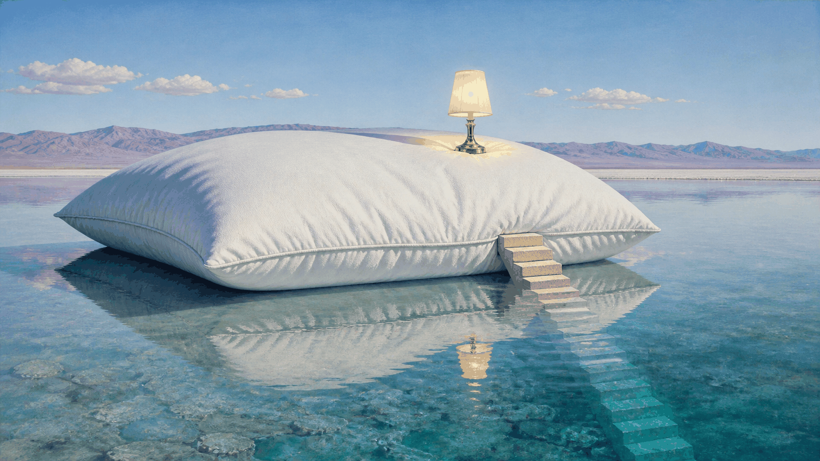 Trompe-l'œil 50%Surrealism 50%
Merged palette
#D8D1C6
#1A1A2E
#7F3F23
#E84393
#C2805F
Leads expressive, analog, nostalgic
Typography · from Trompe-l'œil
Lobster over Libre Baskerville
Materials
The calls this blend forces
These two disagree on 2 things, and a blend cannot average them: you pick a side. At this mix:
Structured or Chaotic? Trompe-l'œil is structured, Surrealism is chaotic. This mix lands chaotic.
Light or Dark? Trompe-l'œil is light, Surrealism is dark. This mix lands light.
Use it
Trompe-l'oeil aesthetic, an illusion played straight, a painted bow on a plain knitted sweater, printed folds on a flat garment, a painted doorway and mouldings on a plaster wall, painted shadows matched to a single light source, true scale, plaster white, shadow grey and painted wood with one object in a true colour, precise and witty, a small tell that gives the trick away, no cheap printed textures, no readable text (50%), infused with Surrealist art with dreamlike impossible juxtapositions, Salvador Dalí and René Magritte influence, hyperrealistic rendering of illogical scenes, melting or floating objects defying physical law, uncanny symbolic imagery, the unconscious mind made visible, color palette strictly #D8D1C6 #1A1A2E #7F3F23 #E84393 #C2805F, leaning structured over chaotic, light over dark, overall character: expressive, analog, nostalgic
French for deceive the eye: an image made to be mistaken for the thing itself, a painted window on a wall, a bow knitted into a sweater, a fold printed on a flat dress. It runs from Roman wall painting through Baroque ceilings to Schiaparelli, Fornasetti and Loewe.
No. Photorealism reproduces a photograph as a painting and wants to be seen as painting. Trompe-l'œil wants to be mistaken for the object for a moment, then caught: it is placed at true scale where the real thing would be, and the reveal is part of the work.
The eye reads the fake as real, the mind catches up, and the gap between the two is a small pleasure, like a magic trick explained. It signals craft, because a convincing illusion is hard, and wit, because the maker chose to play.
Paint or print at true scale, with the light source matched to the room or the garment, and keep to one illusion per surface. Build the reveal in, a wrong shadow or a bent edge, and choose objects worth faking. A cheap imitation of marble or brick fools nobody and is not the style.
Every style in the library is broken down like this one: the palette, the typography, the materials and the lineage.
Explore the style library →