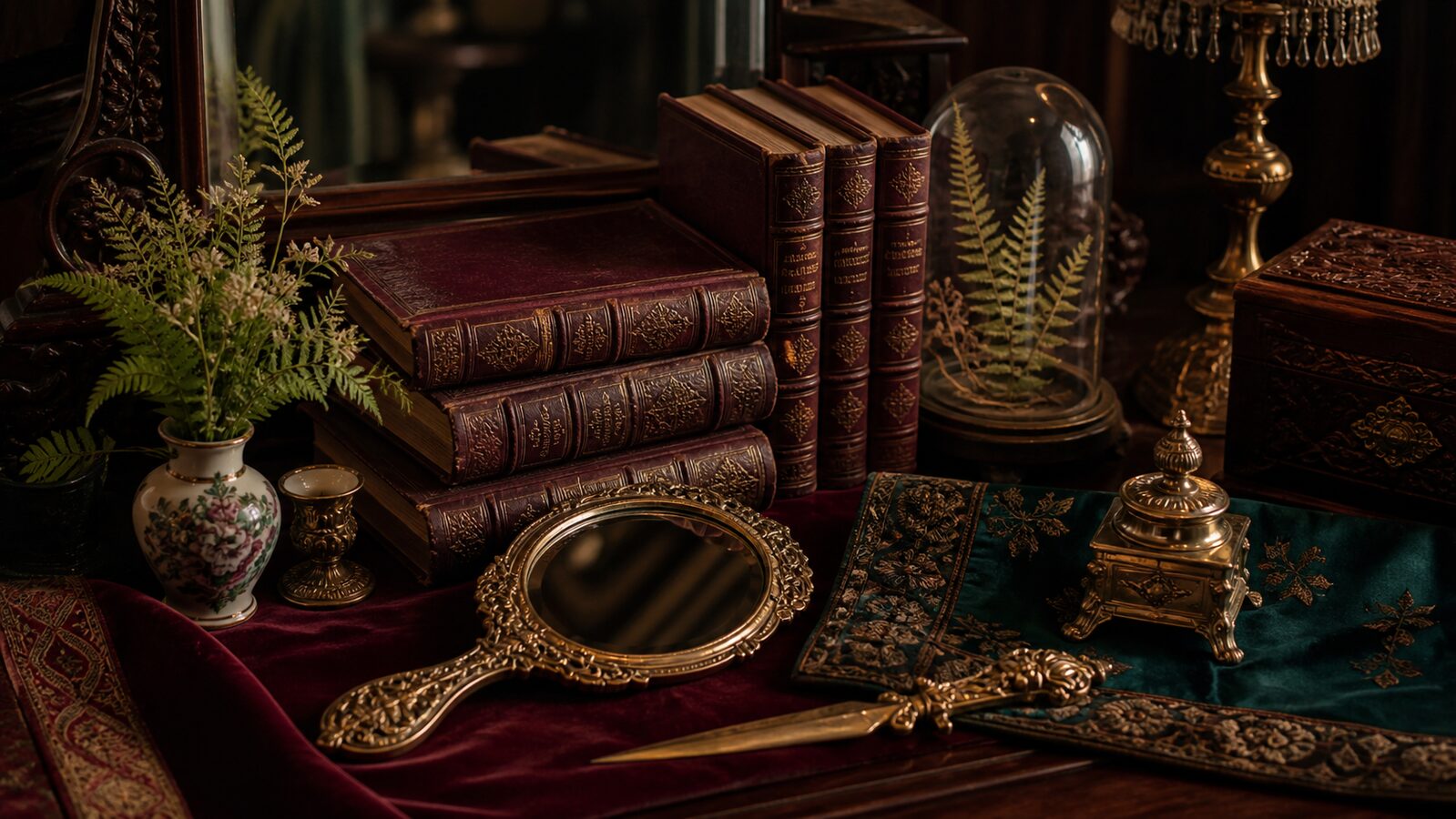
The emotional center of gravity here is warmth, creativity and approachability, pulled off-balance by a single pink accent that keeps the palette from reading as one-note. A wide value range gives it real contrast; it reads with depth rather than sitting flat, and the saturation sits in a comfortable middle register, present, not shouting.
Oxblood reads as compassion and warmth stripped of red's urgency, playful in high saturation, tender in low.
Bottle Green a deep pine-teal, almost black-green, depth and quiet sophistication.
Mourning Violet a near-black indigo, depth, focus, the color of late-night thought.
Tarnished Gilt signals warmth, approachability, and creative energy, friendlier than red, louder than yellow.
Foxed Paper a peach or apricot tint, all the friendliness of orange with none of the volume.
Dense nineteenth-century ornament: engraved detail, deep jewel colour and every surface earning its keep through decoration
Explore the full Victorian style guide