Victorian

Dense nineteenth-century ornament: engraved detail, deep jewel colour and every surface earning its keep through decoration

Compare Victorian with another style →See the Victorian typefaces →
Record041-VI
AestheticVictorian
ClassMaximal / Analog
StatusINGESTING
Victorian aesthetic archive image
Archive plate · Victorian

Source document

Registrar's index cards on the platen glass - captured by the scanner

Omoro Archive - Registrar's OfficeVictorianFILE 041-VI
When to use it
  • Heritage brands with a real nineteenth-century claim
  • Spirits, apothecary and tobacconist packaging
+2 more in the Style Guide
Perfect for
  • Distilleries and apothecary labels
  • Independent bookshops and presses
+2 more in the Style Guide
What it looks like
  • Engraved illustration and hand-cut ornament borders
  • Bottle green and oxblood with tarnished gold leaf
+2 more in the Style Guide
Omoro Style GuideAll 151 aesthetics, every field on this page, in one PDF.
Get the guide →

History, Victorian aesthetic history

1837-1901 · Britain and its empire

Victorian design is usually described as excessive, which is accurate and explains nothing. The cause was industrial: mechanised production made ornament cheap for the first time in history. Carving that had required a craftsman could be pressed, cast or printed in quantity, and a rising middle class bought decoration precisely because it had recently been the preserve of people who could pay for hands.

So density is the point rather than a failure of restraint. Every surface is worked because an unworked surface signalled that you could not afford otherwise. The colour followed the same logic: synthetic aniline dyes arrived in 1856, and the deep purples, greens and oxbloods that had been ruinously expensive became available, then immediately fashionable.

Wood engraving gave the period its graphic voice, capable of extraordinary tonal detail on the same press as the type. That is why Victorian layouts stack many typefaces in one lockup: the wood type catalogue was the palette, and using more of it demonstrated the printer's stock. Modernism spent the following century arguing against all of it, which is the clearest evidence of how total it was.
Visual markers, Victorian aesthetic visual markers

The visual DNA: what makes it recognisable

typography

See the fonts
  • Multiple faces stacked in one lockup, each line a different size and weight
  • Fat faces and slab serifs from wood type: Clarendon, Bodoni fat face and their relatives
  • Ornamental borders, rules and printer's flowers framing the block

grid

  • Centred, symmetrical and hierarchical: the important line is biggest and in the middle
  • Dense columns with rules between them, minimal margin
  • Every panel bordered: the frame is part of the composition

materials

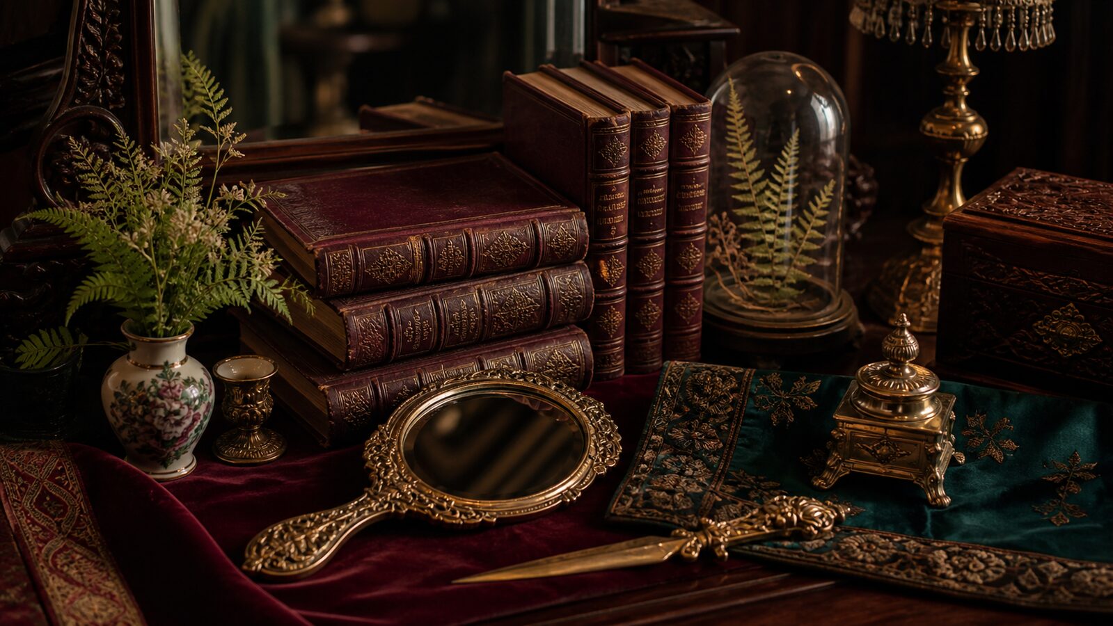
  • Dark polished mahogany and walnut, brass fittings, tarnished gilt
  • Damask, velvet and heavy brocade in aniline-dyed jewel tones
  • Etched and frosted glass, cast iron, marbled and foxed paper

motifs

  • Wood-engraved illustration with fine cross-hatched tone
  • Botanical and acanthus scrollwork filling any empty ground
  • Cameo portraits, cartouches and heavy ornamental initials

Aesthetic profile

8-channel console - dominant channels taped & circled by the registrar

Attribute Console - 041-VI 8 CH ACTIVEFIG. 1
CH01Minimal
MaximalR·90
CH02Analog
DigitalL·90
CH03Restrained
ExpressiveR·50
CH04Cool
WarmR·30
CH05Futuristic
NostalgicR·90
CH06Structured
ChaoticL·40
CH07Dark
LightL·50
CH08Organic
GeometricL·60

strongest channels circled - leans maximal, analog, nostalgic ✦

Profile card

Your aesthetic passport - share the fingerprint

Aesthetic Profile
Victorian
MaximalAnalogExpressiveWarmNostalgicStructuredDarkOrganic
MaximalAnalogNostalgic
omoro.io/styles/victorian

Color Palettes, Victorian color palettes and hex codes

The definitive color scheme for this aesthetic

Victorian
#7B3B52 · #1E3B32 · #2A2440 · #A98A4B · #E8DCC4
Gaslit interiors: deep jewel dyes, tarnished metal and the dark polish of nineteenth-century wood
Omoro Palette Pack575 curated palettes across every aesthetic, 5 export formats.
Get the palettes →

Mood Board

Join waitlist for access

Join the waitlist for full access

Join the waitlist
Creative Application Analysis

Victorian: where the language earns its place

Victorian is most effective when its visual decisions do useful work. Dense nineteenth-century ornament: engraved detail, deep jewel colour and every surface earning its keep through decoration

Best industries
Distilleries and apothecary labels
Independent bookshops and presses
Period drama and theatre identity
Luxury goods with a documented history
Real-world use
Heritage brands with a real nineteenth-century claim
Spirits, apothecary and tobacconist packaging
Theatre, opera and period publishing
Anything trading on provenance and craft
What it looks like
Engraved illustration and hand-cut ornament borders
Bottle green and oxblood with tarnished gold leaf
Fat-face and slab wood type stacked in dense lockups
Damask pattern, brass fittings and dark polished wood
Creative feasibility
Production costMedium

Budget goes into art direction and casting, not the toolkit.

Creative difficultyHigh

Anyone can spot the references. A real system out of them is the hard part.

Execution difficultyHigh

One wrong prop or one off color reads as costume instead of conviction.

Overall creative assessment

Victorian earns its keep when it gives a brand a standard of judgment, not just a finish. It falls apart the moment recognizable cues get collected without a point of view behind them. The tell is always proportion: what's shown, what's held back, and whether every choice belongs to the same world.

Strategic Recommendation

Should Victorian be the strategic choice?

Best for
Distilleries and apothecary labels
Independent bookshops and presses
Heritage brands with a real nineteenth-century claim
Spirits, apothecary and tobacconist packaging
Avoid if
Everyone needs to read the message instantlyA strong point of view asks for a second look. If the work has to land in one glance, that's the wrong ask of this language.
The team can't hold the standardOne inconsistent shoot, one off-brand asset, and the whole system reads as an accident, not a decision.
Risk of misuseHigh

The surface is easy to copy. What separates the real thing from a knockoff is the system underneath.

Contemporary prevalenceCommon

The ingredients are everywhere right now. A disciplined execution is still the minority.

LongevityEnduring

This holds up because it's built on composition and material, not a filter that ages out.

Brand investmentHigh

It only works if every touchpoint agrees. Cut a corner anywhere and the whole thing shows it.

Creative verdict

Use Victorian when the brand can back a real point of view and protect it through execution. Not when the goal is broad, neutral, or cheap to produce. The advantage is differentiation through judgment: the work reads as authored, not packaged. Average executions borrow the signals and lose the coherence. The best ones treat the visual language as a system of choices, including what they leave out.

Editorial Depth

Join waitlist for access

Common Misconception
Historical Context
Brands That Accidentally Use This Style
Brands That Perfectly Represent This Style
Psychological Effect

Join the waitlist for editorial depth

Join the waitlist

Related concepts

Connected across the creative knowledge graph

Cross-references

Steampunkthe speculative fiction built from its partsArt Nouveauthe movement that reacted against its densityGothicthe revival running through it

About this aesthetic

What defines the Victorian aesthetic?

Dense ornament on every available surface, deep jewel-toned colour from the new synthetic dyes, engraved illustration, and typographic lockups that stack many faces in a single centred hierarchy.

Why is Victorian design so ornate?

Industrial production made ornament cheap for the first time. Decoration that had needed a craftsman could be pressed or printed in quantity, and a rising middle class bought it precisely because it had so recently signalled wealth.

How is Victorian different from steampunk?

Victorian is the historical period and its actual output. Steampunk is a modern speculative genre that borrows Victorian materials and machinery and imagines technology the period never had, so it reads as fiction rather than as document.

Build with the victorian aesthetic

Omoro turns aesthetic references into on-brand visuals. Generate, compose and publish from one studio.

Join the waitlist