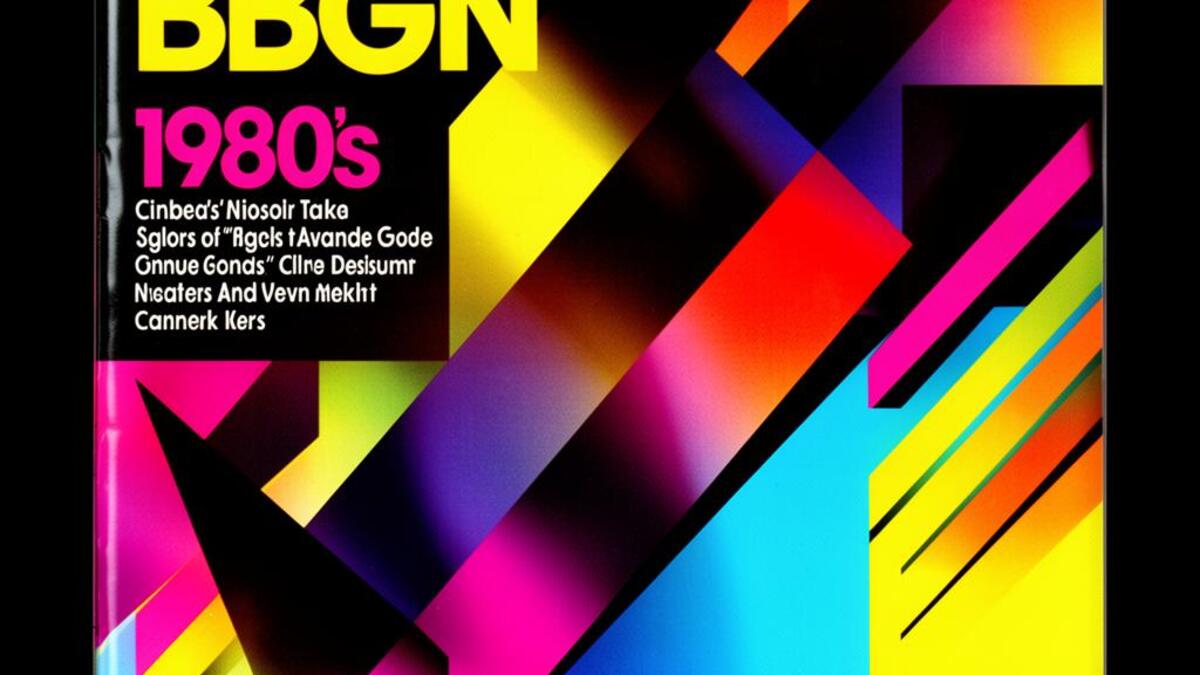
Registrar's index cards on the platen glass - captured by the scanner
1980–1992 · New York, Milan, Paris; luxury fashion and magazine publishing
The 1980s editorial aesthetic was built on the collision of money, power, and photography. Reagan-era excess translated directly into fashion imagery: models with shoulder-padded suits and severe hair stood against primary-color backdrops while photographers like Helmut Newton, Herb Ritts, and Irving Penn shot them with a high-contrast, almost sculptural approach to light. The decade's advertising budgets were enormous, and the results showed. Vogue, Bazaar, and Elle ran page-spreads that treated fashion as architecture.
Studio photography defined the look. Clean seamless backgrounds in red, cobalt, or white. Hard lighting from above and to one side. Models posed with architectural precision. The photographs were about control: every shadow placed, every highlight engineered. It was the opposite of the naturalistic, street-cast photography that would follow in the 1990s. In the 80s editorial world, the set, the clothes, and the body were all equally constructed.
The aesthetic carried into graphic design through condensed display typefaces, geometric layouts, and a palette that ran from primary color fields to high-contrast black and white. By the early 1990s it was already being dismantled by the raw, grungy approach of photographers like Corinne Day and art directors like David Carson. But the 80s editorial look never fully disappeared: it returned in advertising campaigns whenever a brand wanted to signal unambiguous luxury and executive-class authority.
The visual DNA: what makes it recognisable
- Condensed sans-serif display type
- Serif wordmarks in thin or ultra-bold weights
- Large scale type set tight to the image
- High-contrast logotypes with precise kerning
- Full-bleed studio photography
- Asymmetric layouts with dominant image mass
- Hard-edge color field backgrounds
- Minimal white space used for emphasis, not breathing room
- Power suit fabrics: wool, satin, structured linen
- Geometric jewelry: gold, chrome, oversized
- Seamless studio backdrops in primary and neutral tones
- High-gloss magazine stock printing
- Bold shoulders and structured silhouettes
- High-contrast studio lighting with deliberate shadow
- Geometric accessories as sculptural props
- Primary-color backgrounds: red, cobalt, white, black
8-channel console - dominant channels taped & circled by the registrar
Your aesthetic passport - share the fingerprint
4 color interpretations of this aesthetic
How to shoot this aesthetic
Join waitlist for access
Join the waitlist for full access
Join the waitlist80s Editorial: where the language earns its place
80s Editorial is most effective when its visual decisions do useful work. High-fashion power dressing with bold shoulders and saturated studio lighting
The style gives styling, proportion, and image sequencing a clear point of view rather than treating them as decoration.
It can turn atmosphere, material, and spatial pacing into evidence of a distinct experience before a visitor arrives.
It helps a physical or editorial environment feel authored, which raises attention and perceived care.
They recognize the references, proportion, and restraint that make the language feel intentional.
They respond to visible judgment because it reduces the feeling of interchangeable product.
A coherent aesthetic gives them a usable standard for choosing images, objects, and collaborators.
The cost comes from consistent art direction, suitable locations or materials, and time to edit the details that would otherwise undermine the premise.
The challenge is conceptual. It takes visual literacy and a real point of view to avoid borrowing surface cues without their original logic.
Lighting, casting, type, color, material, and retouching must agree. A single weak choice can make the work feel like an imitation.
80s Editorial creates its strongest advantage when it gives a brand a standard of judgment, not merely an attractive finish. It fails when recognizable cues are collected without a governing idea. The difference between average and exceptional execution is usually proportion: how much is shown, what is withheld, and whether every element belongs to the same world. The most capable teams pair an exacting art director with specialists who understand the medium, from photographer and stylist to set designer, editor, and typographer.
Should 80s Editorial be the strategic choice?
Surface imitation is easy. The language becomes generic when familiar cues replace proportion, specificity, and a coherent system.
Its visual ingredients appear regularly in contemporary work, but a rigorous execution remains distinguishable from a loose collection of references.
Its strongest principles depend on composition, material, and cultural literacy rather than a short-lived visual effect.
It asks for consistency across photography, typography, motion, environments, and the many details that make a brand feel believable.
80s Editorial deserves serious consideration from brands and institutions that can articulate a real point of view and protect it through execution. It is less suitable for work that needs immediate instructional clarity, broad visual neutrality, or low-cost production flexibility. Its greatest advantage is differentiation through judgment: it can make a product, place, or editorial proposition feel authored rather than merely packaged. Average executions borrow recognizable signals, then lose coherence when type, casting, copy, or materials fail to agree. Exceptional executions understand the visual language as a system of choices, including what not to show. The largest mistake is treating the style as a finish applied after strategy. Adopt it only when the product and organization can carry the same standard of care the imagery proposes.
Join waitlist for access
Join the waitlist for editorial depth
Join the waitlistConnected across the creative knowledge graph