Registrar's index cards on the platen glass - captured by the scanner
1857–present (haute couture); ongoing · Paris (haute couture); New York, Milan, London, Tokyo (additional centers)
Fashion design as a professional visual practice begins with Charles Frederick Worth, who in 1857 established the first haute couture house in Paris and invented the model of the fashion designer as creative author (rather than anonymous artisan). The major fashion houses that followed: Chanel, Dior, Balenciaga, Saint Laurent, Givenchy: each developed complete aesthetic systems: not just garments but the visual vocabulary, color range, silhouette language, and cultural references that constitute a recognizable 'house aesthetic.'
20th-century fashion history is a succession of aesthetic revolutions: Chanel's liberation of the female silhouette from Victorian restriction, Dior's New Look (1947) restoring waist and volume after wartime austerity, Balenciaga's architectural understanding of volume and structure, Yves Saint Laurent's integration of menswear vocabulary into womenswear, and the radical conceptualism of Japanese designers (Rei Kawakubo of Comme des Garçons, Yohji Yamamoto) who challenged Western fashion's fundamental assumptions about beauty, the body, and commercial purpose.
For visual design, fashion aesthetics provide: the complete systems thinking of major fashion houses (every element: typeface, photography style, campaign palette, store design, packaging: is controlled), runway photography and editorial fashion photography as distinct visual practices, and the seasonal color and silhouette forecasting that influences all consumer product design. Fashion is where aesthetics and commerce meet at the highest production value.
The visual DNA: what makes it recognisable
- House typography: each major fashion brand has a signature typeface system
- Luxury san-serif: Futura (Chanel), didone serif (Vogue), condensed gothic (Saint Laurent)
- Logo-centric communication: minimal text, maximum logo presence
- Campaign typography: the relationship between typeface and photography direction
- The editorial spread: two-page fashion layouts with precise relationship of image to type
- The lookbook: complete garment documentation in consistent photographic style
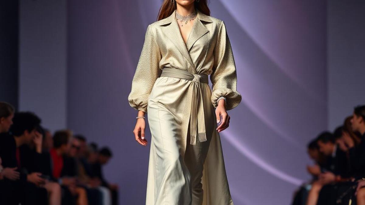
- Runway photography: the catwalk as controlled image-production environment
- Still life product photography: garment as sculpture against neutral ground
- No house palette: each fashion house has its own signature color register
- Neutral ground: #F5F2EE: the photography studio background that doesn't compete
- Black: #0A0A0A: the color shared by every major fashion house as primary
- Seasonal color: defined annually by Pantone and the major houses' collection choices
- Drape and fabric movement: the way cloth responds to gravity and body
- Silhouette: the exterior shape of the garment against a lit background
- Textile pattern and surface: print, weave, embroidery, hardware
- The model as visual carrier: figure, pose, and expression completing the garment's meaning
8-channel console - dominant channels taped & circled by the registrar
Your aesthetic passport - share the fingerprint
4 color interpretations of this aesthetic
How to shoot this aesthetic
Join waitlist for access
Join the waitlist for full access
Join the waitlistFashion Design: where the language earns its place
Fashion Design is most effective when its visual decisions do useful work. Clothing, accessories, and style that express identity and culture
The style gives styling, proportion, and image sequencing a clear point of view rather than treating them as decoration.
It can turn atmosphere, material, and spatial pacing into evidence of a distinct experience before a visitor arrives.
It helps a physical or editorial environment feel authored, which raises attention and perceived care.
They recognize the references, proportion, and restraint that make the language feel intentional.
They respond to visible judgment because it reduces the feeling of interchangeable product.
A coherent aesthetic gives them a usable standard for choosing images, objects, and collaborators.
The cost comes from consistent art direction, suitable locations or materials, and time to edit the details that would otherwise undermine the premise.
The challenge is conceptual. It takes visual literacy and a real point of view to avoid borrowing surface cues without their original logic.
Lighting, casting, type, color, material, and retouching must agree. A single weak choice can make the work feel like an imitation.
Fashion Design creates its strongest advantage when it gives a brand a standard of judgment, not merely an attractive finish. It fails when recognizable cues are collected without a governing idea. The difference between average and exceptional execution is usually proportion: how much is shown, what is withheld, and whether every element belongs to the same world. The most capable teams pair an exacting art director with specialists who understand the medium, from photographer and stylist to set designer, editor, and typographer.
Should Fashion Design be the strategic choice?
Surface imitation is easy. The language becomes generic when familiar cues replace proportion, specificity, and a coherent system.
Its visual ingredients appear regularly in contemporary work, but a rigorous execution remains distinguishable from a loose collection of references.
Its strongest principles depend on composition, material, and cultural literacy rather than a short-lived visual effect.
It asks for consistency across photography, typography, motion, environments, and the many details that make a brand feel believable.
Fashion Design deserves serious consideration from brands and institutions that can articulate a real point of view and protect it through execution. It is less suitable for work that needs immediate instructional clarity, broad visual neutrality, or low-cost production flexibility. Its greatest advantage is differentiation through judgment: it can make a product, place, or editorial proposition feel authored rather than merely packaged. Average executions borrow recognizable signals, then lose coherence when type, casting, copy, or materials fail to agree. Exceptional executions understand the visual language as a system of choices, including what not to show. The largest mistake is treating the style as a finish applied after strategy. Adopt it only when the product and organization can carry the same standard of care the imagery proposes.
Join waitlist for access
Join the waitlist for editorial depth
Join the waitlistConnected across the creative knowledge graph