Where Arte Povera came from, what makes it recognisable, and the fingerprint it leaves.
History, Arte Povera aesthetic history
1967-1972, with a long afterlife · Turin, Rome, Genoa and Milan
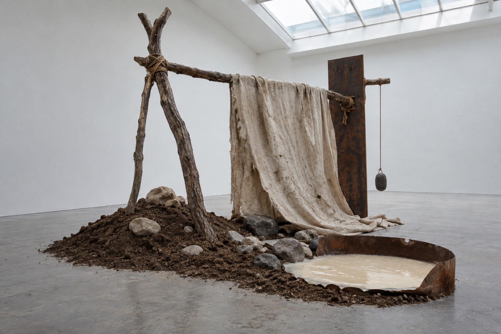
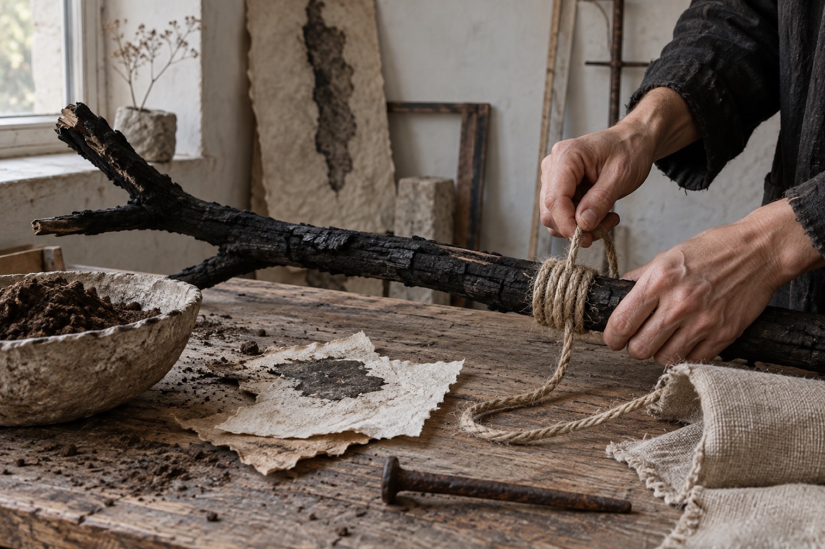
The critic Germano Celant named the movement in 1967 in an essay for Flash Art subtitled notes for a guerrilla war.The artists he grouped were already working: Michelangelo Pistoletto had piled a classical plaster Venus into a heap of rags that same year, Jannis Kounellis was bringing coal, wool and live animals into the gallery, and Mario Merz was about to build his first igloo from clay, glass and neon.Poor, in Celant's sense, did not mean cheap.It meant materials that had not been processed into art supplies, that still carried their origin, and that resisted the polish of the American minimalism and pop that filled the magazines.
The work depended on placement. Giovanni Anselmo bound a head of lettuce to a granite block with wire so that the sculpture would only hold together while the lettuce stayed fresh; the piece was a structure with a deadline. Giuseppe Penone carved back into a milled beam until the young tree inside it reappeared. Pier Paolo Calzolari froze frost onto lead. The gestures were simple and the arrangements were exact, and the meaning sat in the gap between the two: a coil of rope on a floor is nothing until it has been put somewhere on purpose.
Arte Povera dissolved as a group by the early 1970s but its method never went away.It runs through land art, through the material turn in contemporary sculpture, through a generation of exhibition designers who learned that a raw beam placed well outperforms a finished plinth.It is also the movement most often flattened into a look.Soil, rope and wax photographed like luxury goods is the opposite of what it proposed; the point was that the materials were allowed to remain themselves.
“
Poor materials, precise placement, and the gallery treated as a site rather than a frame.
Visual markers, Arte Povera aesthetic visual markers
How to shoot it, how to prompt it, and how to board it.
Photo Direction
How to shoot this aesthetic
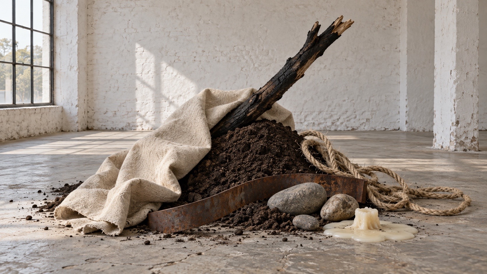
"Soil, rope and wax on a gallery floor, placed as carefully as a drawing"
Shot list
Wide shot of a white gallery room with a low mound of packed dark soil on the floor and a single coil of thick rope beside it, high side window light, nothing else
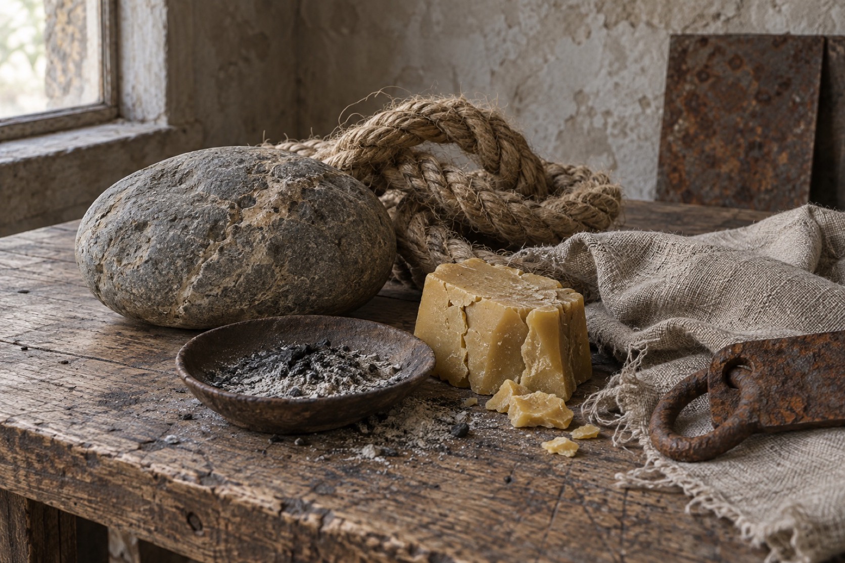
Close detail of a raw timber beam with a rag knotted around it, beeswax pooled and hardened on the wood, fibres visible
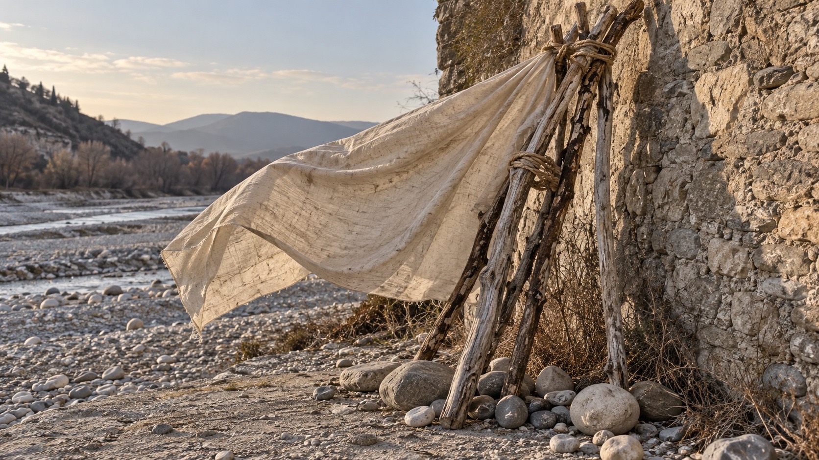
Medium shot of a cut branch leaning against a concrete wall, its shadow the only mark on the surface, a small handwritten paper label on the floor
Lighting
Natural light only, ideally from high windows so it falls across the floor and picks up texture. Overcast is better than sun. No reflectors, no polish, no rim light. The materials should look the way they look.
Drop this into Studio to generate in this aesthetic
Arte Povera installation, late 1960s Italian sculpture from poor materials, packed soil, coiled rope, raw timber, rags, beeswax, branches, oxidised iron and stone placed on a white gallery floor with exact care, natural light from high windows, handmade and temporary, materially honest, quiet, no polish, no luxury styling
Paste as-is, or append your own subject
Mood Board
A Pro feature: a board generated from the record
A generated board, with membership
Opening soon
04
The judgement
Whether to use it, what it costs to do properly, and where it stands right now.
Creative verdict, Arte Povera feasibility and strategic recommendation
Two written calls, seven meters, and when to walk away
Creative verdict
Should Arte Povera be the call?
7 meters
FIG. 2
Assessment
The work is in the placing, and the placing has to be visible. A coil of rope on a floor is nothing until it has been put somewhere on purpose, so the arrangement must read as decided, not dumped. Light it as it is and leave the floor empty. If a frame could pass as a rustic interiors spread, take things out until it cannot.
Verdict
Right when process and provenance are the story and the object can be allowed to remain itself. It is the most easily flattened movement in the library, because soil and rope photograph beautifully and beauty is the wrong outcome. The discipline is restraint in the photograph as much as in the sculpture, and a client who wants it styled wants something else.
Production cost
Low
Soil, rope, wax and found timber. Space and time cost more than material.
Creative difficulty
High
Placement is the entire idea. Without a reason for where each thing sits there is nothing.
Execution difficulty
Medium
Restraint in the photograph is harder than restraint in the sculpture.
Risk of misuse
High
Lit like a product, raw materials become the rustic interiors trend it opposed.
Prevalence
Emerging
Rising with the material turn in sculpture, ceramics and exhibition design.
Longevity
Enduring
Its method runs through fifty years of installation and set design.
Brand investment
Low
Poor materials by definition; the cost is time and the discipline to leave space.
Avoid if
The brief wants finish, polish or luxury
Poor materials lit like products become the trend the movement was against.
The work has to be permanent
Frost, lettuce, wax and branches were chosen because they change. Permanence is a different brief.
Omoro · Creative verdict · 020-AP
Editorial Depth
A Pro feature: origins, practitioners, and pitfalls
Editorial Depth · Restricted
Common Misconception
Historical Context
Brands That Accidentally Use This Style
Brands That Perfectly Represent This Style
Psychological Effect
RESTRICTED
The editorial depth, with membership
Opening soon
05
The index
Neighbours, cross-references, blends, and the questions people ask.
Related concepts
Connected across the creative knowledge graph
Cultural relevance, Arte Povera cultural relevance today
Where it stands now, and what it costs you to use it
Arte Povera gave contemporary practice its permission to work in raw material without apology, and it is the direct ancestor of the exhibition and set design that now favours a bare beam over a finished surface. Its influence is strongest wherever process and provenance are the story: ceramics, natural textiles, food, earth-built architecture.
Its failure mode is well known. The moment the materials are lit like products and arranged for a lifestyle spread, the work becomes the rustic interiors trend it was reacting against. The discipline is restraint in the photograph as much as in the sculpture: place it once, light it as it is, and leave the floor empty.
Packed soil #4A3B2A, oxidised iron #9C5A2E, beeswax #C9B98A
Concrete grey #8E8A82 and raw linen #E7E0D2 as the ground
Stone and clay: warm grey #9E9289, sand #C4B49A, pale stone #D8CFBE
Use it
Arte Povera installation, late 1960s Italian sculpture from poor materials, packed soil, coiled rope, raw timber, rags, beeswax, branches, oxidised iron and stone placed on a white gallery floor with exact care, natural light from high windows, handmade and temporary, materially honest, quiet, no polish, no luxury styling (50%), infused with Wabi-sabi aesthetic finding beauty in imperfection and impermanence, Japanese philosophy of transient rustic simplicity, muted earthy tonal quiet, color palette strictly #4A3B2A #9C5A2E #8B7355 #C9B98A #8E8A82, overall character: analog, organic, minimal
One-click generation opens with the studio
About this aesthetic
What is Arte Povera?+
An Italian movement from the late 1960s that made sculpture and installation from unprocessed materials such as soil, rope, rags, wax, branches and iron, placed in the gallery with deliberate precision and often designed to change or decay.
Why is it called poor art?+
The critic Germano Celant used poor to mean unprocessed rather than cheap: materials that had not been refined into art supplies and still carried where they came from, set against the polish of contemporary American minimalism and pop.
Who are the key Arte Povera artists?+
Jannis Kounellis, Mario Merz, Michelangelo Pistoletto, Giovanni Anselmo, Giuseppe Penone, Alighiero Boetti, Pier Paolo Calzolari, Luciano Fabro, Gilberto Zorio and Marisa Merz.
Build with the arte povera aesthetic
Every style in the library is broken down like this one: the palette, the typography, the materials and the lineage.