Registrar's index cards on the platen glass - captured by the scanner
Ancient–present · Universal; all human cultures; contemporary expanded field
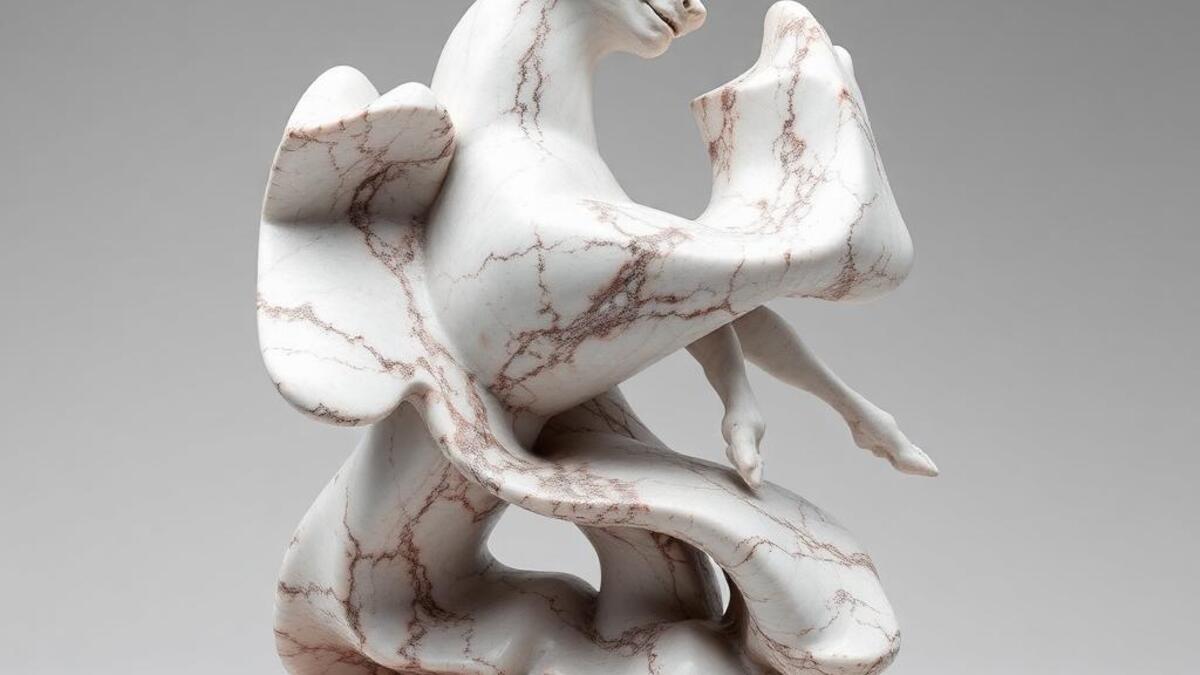
Sculpture is the art of three-dimensional form: objects that occupy space and must be experienced from multiple viewpoints to be fully understood. The technical traditions are ancient and global: stone carving (Egypt, Greece, India, Mesoamerica), bronze casting (China's Shang Dynasty, classical Mediterranean, West Africa's Benin bronzes), wood carving, ceramic modelling, and textile. The Western academic tradition focused on the human figure; other traditions developed their own primary forms.
The 20th century expanded sculpture's possibilities dramatically: Brancusi's reductive abstraction, Giacometti's existentialist figures, David Smith's welded steel, Richard Serra's massive Cor-Ten steel plates, Donald Judd's industrial minimalism, Louise Bourgeois's psychological installations, and Jeff Koons's reflective stainless steel all represent radically different ideas about what sculpture can be and do. Rosalind Krauss's 1979 essay 'Sculpture in the Expanded Field' named the problem: sculpture had expanded to include land art, installation, site-specific work, performance documentation, and architectural intervention.
For visual design, sculpture aesthetic provides: an understanding of form in space (three-dimensionality communicated through photography), material thinking (how bronze versus stone versus steel produces different meaning), and the specific visual grammar of sculptural documentation photography: the way materials catch light, the importance of scale indicators, and the role of context in meaning-making.
The visual DNA: what makes it recognisable
- Minimal type: sculpture is documented, not described: the image carries meaning
- Institutional labeling: artist, title, date, medium, dimensions: the museum card format
- Neutral sans-serifs that don't compete with the sculptural subject
- White gallery text: clean, informational, authoritative without decoration
- Documentary photography: the sculpture centered against neutral background
- Installation view: the sculpture in its spatial context
- Detail crop: surface texture, material quality, join or edge
- Multiple view: the same object from different angles communicating 3D form
- Marble white: #F2EFEB: the idealized sculpture material and its warm translucency
- Bronze: #8B7355, #9A8060: patinated cast metal
- Cor-Ten rust: #B85A28, #A84E20: weathering steel as Richard Serra uses it
- Gallery grey: #E0DCD8: the neutral ground of contemporary white cube presentation
- Material honesty: the surface that shows how it was made
- Shadow as form: the shadow a sculpture casts is part of the work
- Scale relationship: the object in relation to the human body
- Pedestal or no pedestal: the question of where sculpture ends and world begins
8-channel console - dominant channels taped & circled by the registrar
Your aesthetic passport - share the fingerprint
4 color interpretations of this aesthetic
How to shoot this aesthetic
Join waitlist for access
Join the waitlist for full access
Join the waitlistSculpture: where the language earns its place
Sculpture is most effective when its visual decisions do useful work. Three-dimensional art exploring form, space, and materiality
The style gives styling, proportion, and image sequencing a clear point of view rather than treating them as decoration.
It can turn atmosphere, material, and spatial pacing into evidence of a distinct experience before a visitor arrives.
It helps a physical or editorial environment feel authored, which raises attention and perceived care.
They recognize the references, proportion, and restraint that make the language feel intentional.
They respond to visible judgment because it reduces the feeling of interchangeable product.
A coherent aesthetic gives them a usable standard for choosing images, objects, and collaborators.
The cost comes from consistent art direction, suitable locations or materials, and time to edit the details that would otherwise undermine the premise.
The challenge is conceptual. It takes visual literacy and a real point of view to avoid borrowing surface cues without their original logic.
Lighting, casting, type, color, material, and retouching must agree. A single weak choice can make the work feel like an imitation.
Sculpture creates its strongest advantage when it gives a brand a standard of judgment, not merely an attractive finish. It fails when recognizable cues are collected without a governing idea. The difference between average and exceptional execution is usually proportion: how much is shown, what is withheld, and whether every element belongs to the same world. The most capable teams pair an exacting art director with specialists who understand the medium, from photographer and stylist to set designer, editor, and typographer.
Should Sculpture be the strategic choice?
Surface imitation is easy. The language becomes generic when familiar cues replace proportion, specificity, and a coherent system.
Its visual ingredients appear regularly in contemporary work, but a rigorous execution remains distinguishable from a loose collection of references.
Its strongest principles depend on composition, material, and cultural literacy rather than a short-lived visual effect.
It asks for consistency across photography, typography, motion, environments, and the many details that make a brand feel believable.
Sculpture deserves serious consideration from brands and institutions that can articulate a real point of view and protect it through execution. It is less suitable for work that needs immediate instructional clarity, broad visual neutrality, or low-cost production flexibility. Its greatest advantage is differentiation through judgment: it can make a product, place, or editorial proposition feel authored rather than merely packaged. Average executions borrow recognizable signals, then lose coherence when type, casting, copy, or materials fail to agree. Exceptional executions understand the visual language as a system of choices, including what not to show. The largest mistake is treating the style as a finish applied after strategy. Adopt it only when the product and organization can carry the same standard of care the imagery proposes.
Join waitlist for access
Join the waitlist for editorial depth
Join the waitlistConnected across the creative knowledge graph