When to use it
- Club nights, festivals and music releases
- Fashion and culture campaigns that want to feel underground
- Motion identities, loops and social content made to stop a scroll
- Posters where one word or one number carries the whole message
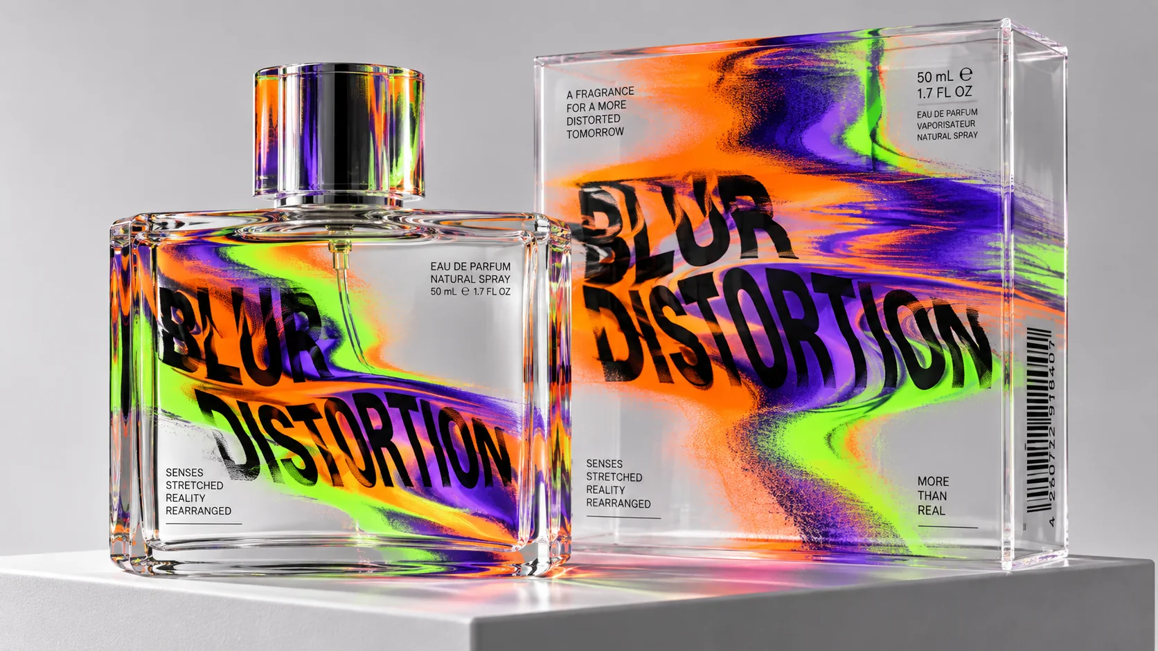
Letters and images smeared, warped and melted on purpose, trading legibility for motion, mood and a feeling you have to lean in to decode
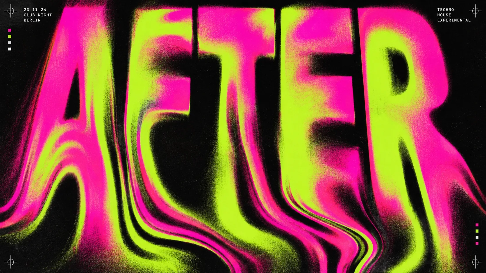
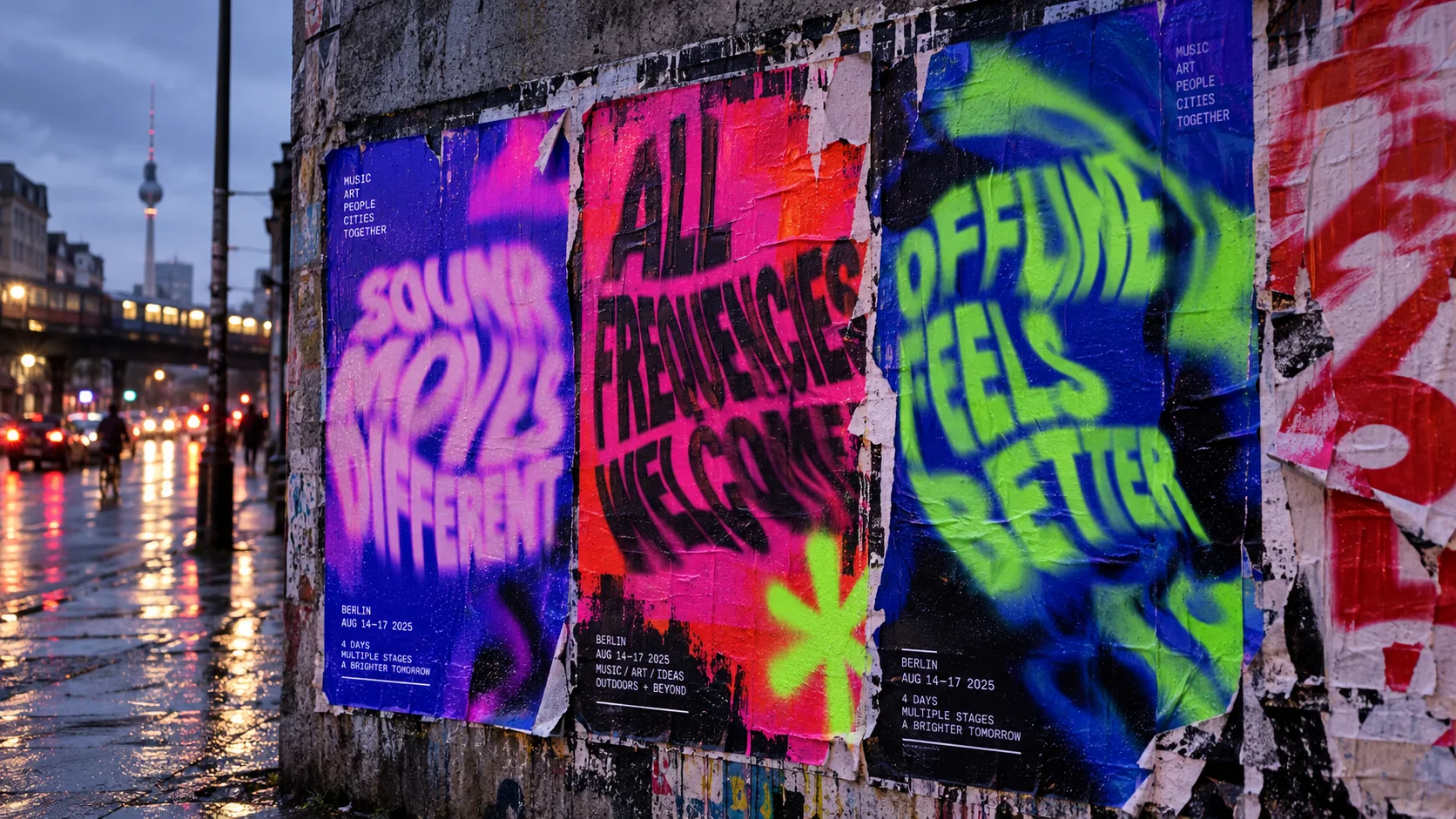
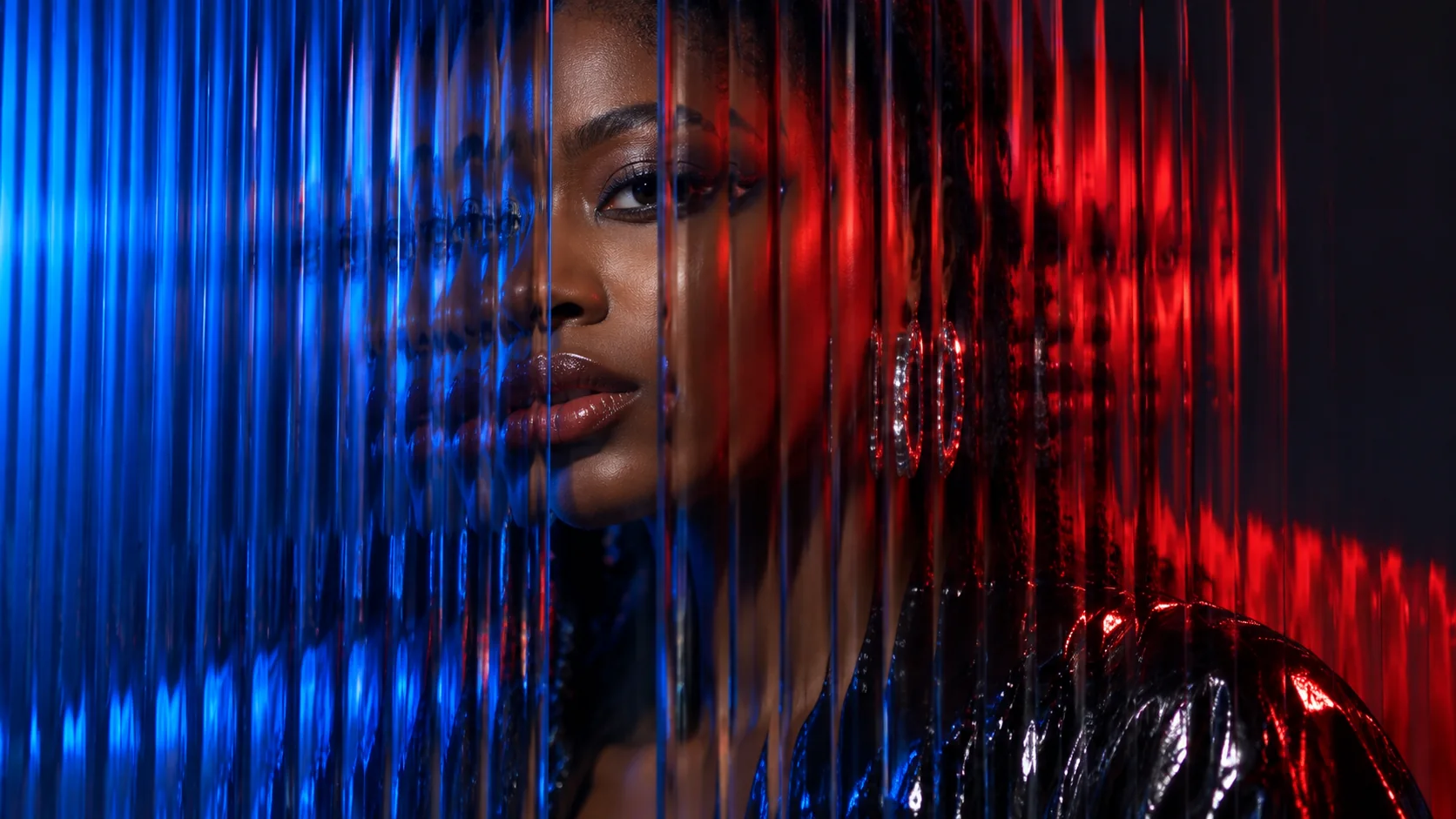
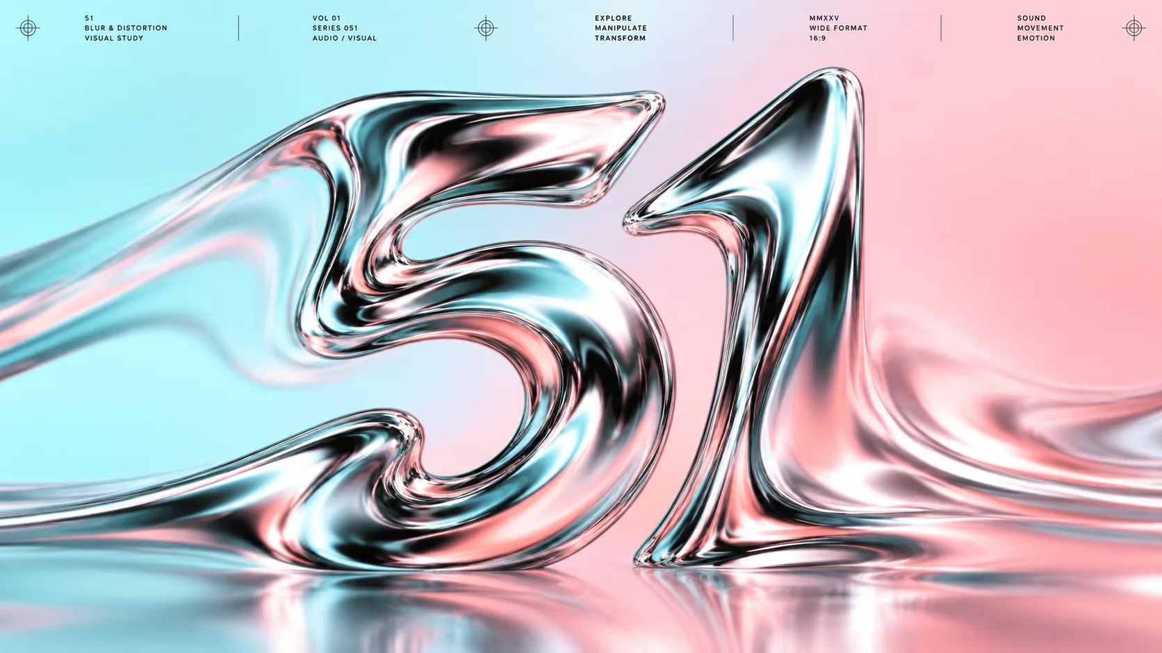
What it is, when it works, who it is for, and where it already exists.
Record 021-BD - when it works, who it is for, what it looks like
Where this aesthetic shows up in the real world · ↗ opens the source site
Where Blur & Distortion came from, what makes it recognisable, and the fingerprint it leaves.
1960s–present · Psychedelic posters, 1990s experimental typography and club culture
Designers have bent letters out of shape whenever the feeling mattered more than the reading. In the 1960s, poster artists in San Francisco such as Wes Wilson melted lettering to fill every corner of a Fillmore concert bill, so the words became a shape you felt before you could read them.
In the late 1980s and 1990s the computer and the photocopier made distortion a statement about type itself. Neville Brody's experimental FUSE project, from 1991, and David Carson's Ray Gun magazine pushed letterforms past legibility on purpose, stretching, layering and blurring them to carry the energy of the music they covered.
Today the tools are software: liquify filters, displacement maps, 3D and real-time motion. The look has returned through club flyers, festival identities and Instagram, where a smeared word stops a scroll. Designers pair the warp with one line of small, crisp type, so the blur reads as a choice and the information still gets through.
“Clarity isn't always the goal.
The visual DNA: what makes it recognisable
8-channel console with the fingerprint on its display. Save the card, or share the page
The definitive color scheme for this aesthetic
The colour of the styles sitting closest to this one
How to shoot it, how to prompt it, and how to board it.
How to shoot this aesthetic
"Make it move, then take away just enough focus"
Shot list
Lighting
Coloured practicals, neon, LED and strobes. Mix a slow shutter with a flash to get one sharp moment inside the blur. Let highlights bloom rather than clip cleanly.
Drop this into Studio to generate in this aesthetic
Blur and distortion graphic design: one bold word or number smeared, stretched and liquified until it is half legible, motion blur and soft focus, neon gradients bleeding through warped edges, hot magenta, acid lime and electric blue on black, a single line of small crisp type for contrast, visual noise and grain, hypnotic and restless
The whole record as a portable skill for Claude, ChatGPT, Gemini, image and video models, or a human brief
The whole record, compiled into a skill another system can work inside: lineage, axes, palettes, type, materials, photography, verdicts and a critique checklist. Nothing is generated; it is the dossier, restructured.
The record applied to your project. The record's kit is free; your brand, references and plates come with membership
01 · Hero application02 · Material and finish03 · Palette in context04 · Photography directionWhether to use it, what it costs to do properly, and where it stands right now.
Two written calls, seven meters, and when to walk away
Start with a heavy typeface set large, then warp it. Keep one line of small type perfectly sharp. Physical methods such as scanning while moving, or shooting through ribbed glass, give a less generic result than filters alone. Test the poster at thumbnail size: the shape should still read.
Right for music, nightlife, festivals and fashion, where mood and energy matter more than instant reading. Wrong for anything people must read quickly. Warp one element hard, keep the practical information crisp, and it reads as a choice rather than a mistake.
Liquify, displacement and blur tools are standard in design software.
Easy to start, hard to make distinctive; everyone has the same filters.
The balance between legible and lost takes judgement and many iterations.
Used without a crisp anchor it simply looks broken or unreadable, and it can hide the information people need.
A leading poster and club trend right now, spreading quickly through Instagram and trend reports.
The current wave will date, though distortion itself returns every decade or so.
Software tools do the work; the investment is in taste and restraint.
A Pro feature: origins, practitioners, and pitfalls
Neighbours, cross-references, blends, and the questions people ask.
Connected across the creative knowledge graph
Where it stands now, and what it costs you to use it
Blur and distortion is one of the most visible graphic trends in current poster, club and fashion work, a reaction against the clean, flat branding that dominated the 2010s.
It suggests memory, speed, intimacy or a digital breakdown without stating any of them. For music and culture brands, making the audience lean in to decode a word is part of the appeal.
Mix Blur & Distortion with any style in the library
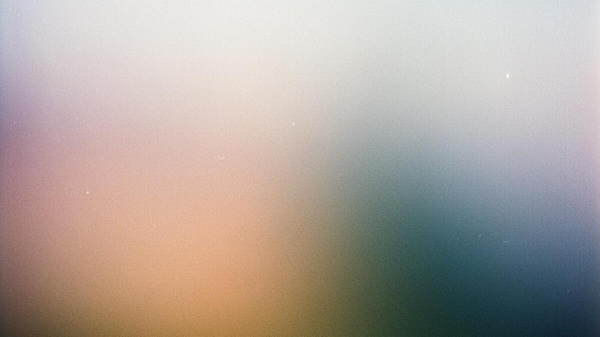 Blur & Distortion 50%Grainy Gradient Blur 50%
Merged palette
#0B0B0D
#1A1228
#E0206E
#C86BFF
#C8F03A
Leads organic, digital, chaotic
Typography · from Blur & Distortion
UnifrakturMaguntia over EB Garamond
Materials
The calls this blend forces
These two disagree on 3 things, and a blend cannot average them: you pick a side. At this mix:
Expressive or Restrained? Blur & Distortion is expressive, Grainy Gradient Blur is restrained. This mix lands expressive.
Maximal or Minimal? Blur & Distortion is maximal, Grainy Gradient Blur is minimal. This mix lands maximal.
Dark or Light? Blur & Distortion is dark, Grainy Gradient Blur is light. This mix lands light.
Use it
Blur and distortion graphic design: one bold word or number smeared, stretched and liquified until it is half legible, motion blur and soft focus, neon gradients bleeding through warped edges, hot magenta, acid lime and electric blue on black, a single line of small crisp type for contrast, visual noise and grain, hypnotic and restless (50%), infused with Grainy gradient blur aesthetic with soft out-of-focus color-field gradients, heavy analog film-grain texture overlaid, dreamy atmospheric depth, gentle diffused color transition, color palette strictly #0B0B0D #1A1228 #E0206E #C86BFF #C8F03A, leaning expressive over restrained, maximal over minimal, dark over light, overall character: organic, digital, chaotic
Set the word large in a heavy typeface, then warp it with a liquify or displacement tool, motion blur, or a physical method such as scanning while moving the paper or photographing it through ribbed glass. Keep a second, small line of type perfectly crisp, so the distortion reads as intentional.
It can be. Keep the essential information, such as dates, venue and prices, in clean, legible type at a readable size, and use the distortion for the headline or the mood image only. Always provide the same information as real text on the web.
Every style in the library is broken down like this one: the palette, the typography, the materials and the lineage.
Explore the style library →