Registrar's index cards on the platen glass - captured by the scanner
1966–1974; revivals ongoing · San Francisco, California; counterculture music scene
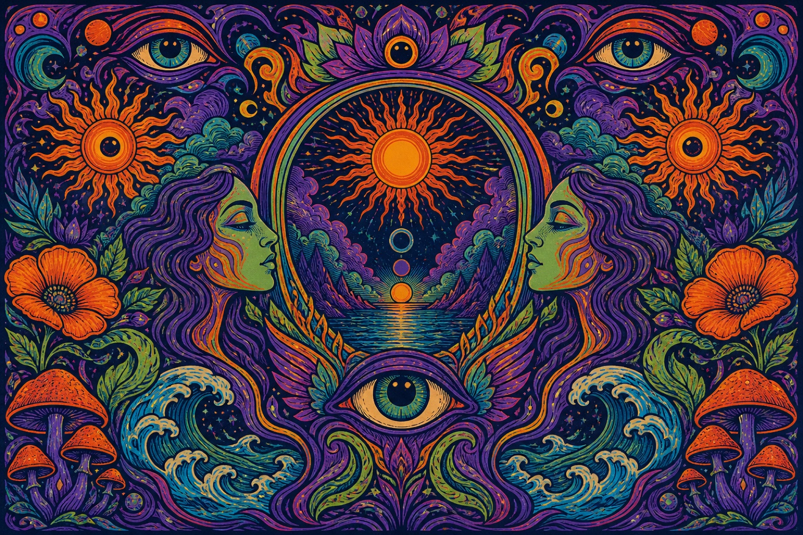
The psychedelic visual style emerged from the San Francisco counterculture music scene of 1966–1968, designed by a tight cluster of poster artists: Wes Wilson, Victor Moscoso, Rick Griffin, Alton Kelley, and Stanley Mouse: creating concert advertisements for the Fillmore Auditorium and Avalon Ballroom. Their work was directly informed by the visual experience of LSD, cannabis, and other psychedelics: the color amplification and pattern repetition that characterize altered perception, the sense of forms breathing and distorting at their edges, and the phenomenon of seeing text as pure visual form before recognizing it as language.
The visual vocabulary drew consciously from Art Nouveau (Wes Wilson derived his illegible-but-beautiful typography from the Viennese Secession letterforms of Alfred Roller), Victorian chromolithography, and Op Art. The color theory was deliberately anti-natural: complementary colors placed directly adjacent create a vibrating optical edge that mimics perceptual distortion. Yellow lettering on violet ground, red on cyan, orange on blue: combinations that cause the eye to literally oscillate.
The psychedelic aesthetic has seen multiple mainstream revivals: in early 1970s progressive rock album art, in 1990s rave and club culture visual design (a direct descendent with the addition of fractal computer graphics), and in the 2010s in fashion prints and graphic design that sought countercultural credentials. Its core visual moves: the distorted letterform, the complementary-color vibration, the all-over pattern: remain highly influential.
The visual DNA: what makes it recognisable
- Warped and distorted letterforms: type melting, flowing, or expanding at the edges
- Hard-to-read typography that rewards the time spent decoding it
- Type integrated into the illustration, letterforms becoming objects or vice versa
- Outlined letterforms with vibrating complementary color fills and strokes
- All-over composition: the picture plane filled edge-to-edge with pattern
- No clear hierarchy: everything at equal intensity, equal complexity
- Circular mandala compositions radiating from a central point
- Frame-within-frame: increasingly complex borders that create visual depth
- Vibrating complementary pairs: orange #FF6600 + blue #0033FF, green #00CC00 + magenta #CC00CC
- High-saturation across the entire palette: no neutral ground
- Black outline as the element that contains and defines the vibrating colors
- Fluorescent and day-glo pigment quality: yellow #FFFF00, orange #FF5C00, hot pink #FF0099
- Paisley patterns in psychedelic color combinations
- Mandala and fractal geometric patterns
- The 'third eye' and other Eastern spiritual iconography
- Flowers, mushrooms, and butterfly-wing patterns
8-channel console - dominant channels taped & circled by the registrar
Your aesthetic passport - share the fingerprint
4 color interpretations of this aesthetic
How to shoot this aesthetic
Join waitlist for access
Join the waitlist for full access
Join the waitlistPsychedelic: where the language earns its place
Psychedelic is most effective when its visual decisions do useful work. Mind-expanding visuals with kaleidoscopic patterns and consciousness exploration
The style gives styling, proportion, and image sequencing a clear point of view rather than treating them as decoration.
It can turn atmosphere, material, and spatial pacing into evidence of a distinct experience before a visitor arrives.
It helps a physical or editorial environment feel authored, which raises attention and perceived care.
They recognize the references, proportion, and restraint that make the language feel intentional.
They respond to visible judgment because it reduces the feeling of interchangeable product.
A coherent aesthetic gives them a usable standard for choosing images, objects, and collaborators.
The cost comes from consistent art direction, suitable locations or materials, and time to edit the details that would otherwise undermine the premise.
The challenge is conceptual. It takes visual literacy and a real point of view to avoid borrowing surface cues without their original logic.
Lighting, casting, type, color, material, and retouching must agree. A single weak choice can make the work feel like an imitation.
Psychedelic creates its strongest advantage when it gives a brand a standard of judgment, not merely an attractive finish. It fails when recognizable cues are collected without a governing idea. The difference between average and exceptional execution is usually proportion: how much is shown, what is withheld, and whether every element belongs to the same world. The most capable teams pair an exacting art director with specialists who understand the medium, from photographer and stylist to set designer, editor, and typographer.
Should Psychedelic be the strategic choice?
Surface imitation is easy. The language becomes generic when familiar cues replace proportion, specificity, and a coherent system.
Its visual ingredients appear regularly in contemporary work, but a rigorous execution remains distinguishable from a loose collection of references.
Its strongest principles depend on composition, material, and cultural literacy rather than a short-lived visual effect.
It asks for consistency across photography, typography, motion, environments, and the many details that make a brand feel believable.
Psychedelic deserves serious consideration from brands and institutions that can articulate a real point of view and protect it through execution. It is less suitable for work that needs immediate instructional clarity, broad visual neutrality, or low-cost production flexibility. Its greatest advantage is differentiation through judgment: it can make a product, place, or editorial proposition feel authored rather than merely packaged. Average executions borrow recognizable signals, then lose coherence when type, casting, copy, or materials fail to agree. Exceptional executions understand the visual language as a system of choices, including what not to show. The largest mistake is treating the style as a finish applied after strategy. Adopt it only when the product and organization can carry the same standard of care the imagery proposes.
Join waitlist for access
Join the waitlist for editorial depth
Join the waitlistConnected across the creative knowledge graph