typography
See the fonts- Humanist serifs with visible calligraphic origin, set warm rather than crisp
- Hand-lettering and brush scripts used sparingly as accent, never as the workhorse
- Generous leading and ragged setting: nothing tightly justified
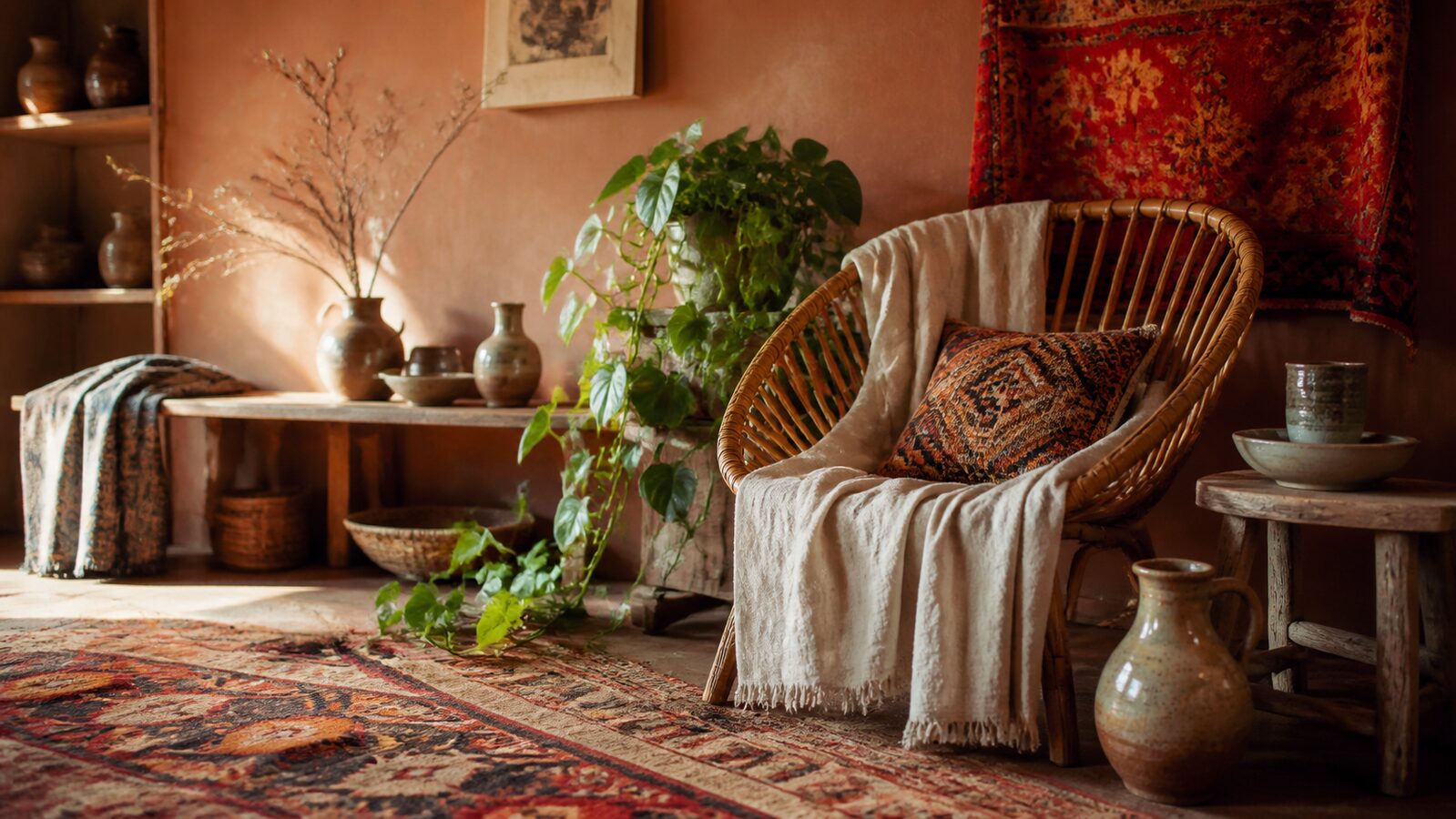
Layered pattern, warm earth pigment and handmade texture, collected over time rather than designed in one pass
Registrar's index cards on the platen glass - captured by the scanner
1840s-present · Paris, then global counterculture
Bohemianism began as a slur. Nineteenth-century Parisians used it for artists living in the cheap quarters, borrowing the name from a mistaken belief that the Romani had come from Bohemia. The people it described took it up as a badge, and the visual language followed the life: what you could afford, what you were given, and what you carried back from somewhere else.
That origin explains the grammar. Bohemian interiors are additive and unmatched by design, because they were genuinely assembled over time from different places. Pattern sits beside pattern without a rule reconciling them. The unifying force is not composition, it is pigment: everything has been dyed with something from the ground, so ochre, terracotta, indigo and madder agree even when the patterns argue.
The 1960s and 70s revival attached it to counterculture and travel, and the 2010s revival attached it to hospitality and wellness, where it now does most of its commercial work. The failure mode in both is the same: bought all at once, from one supplier, it stops reading as collected and starts reading as a set.
The visual DNA: what makes it recognisable
8-channel console - dominant channels taped & circled by the registrar
strongest channels circled - leans maximal, analog, warm ✦
Your aesthetic passport - share the fingerprint
The definitive color scheme for this aesthetic
Join waitlist for access
Join the waitlist for full access
Join the waitlistBohemian is most effective when its visual decisions do useful work. Layered pattern, warm earth pigment and handmade texture, collected over time rather than designed in one pass
Budget goes into art direction and casting, not the toolkit.
Anyone can spot the references. A real system out of them is the hard part.
One wrong prop or one off color reads as costume instead of conviction.
Bohemian earns its keep when it gives a brand a standard of judgment, not just a finish. It falls apart the moment recognizable cues get collected without a point of view behind them. The tell is always proportion: what's shown, what's held back, and whether every choice belongs to the same world.
The surface is easy to copy. What separates the real thing from a knockoff is the system underneath.
The ingredients are everywhere right now. A disciplined execution is still the minority.
This holds up because it's built on composition and material, not a filter that ages out.
It only works if every touchpoint agrees. Cut a corner anywhere and the whole thing shows it.
Use Bohemian when the brand can back a real point of view and protect it through execution. Not when the goal is broad, neutral, or cheap to produce. The advantage is differentiation through judgment: the work reads as authored, not packaged. Average executions borrow the signals and lose the coherence. The best ones treat the visual language as a system of choices, including what they leave out.
Join waitlist for access
Join the waitlist for editorial depth
Join the waitlistConnected across the creative knowledge graph
A layered, pattern-rich style built on earth pigment and handmade texture, organised so a space reads as collected over time rather than specified in one pass.
Cottagecore is pastoral, European and nostalgic for rural domesticity: florals, baking, soft light. Bohemian is urban and itinerant in origin, built from travel and trade, and reaches for global pattern and earth pigment rather than countryside sentiment.
Pigments you could historically dig or dye from the ground: terracotta, ochre, rust and olive, held together by an undyed neutral like raw linen so the layered patterns have somewhere to breathe.
Omoro turns aesthetic references into on-brand visuals. Generate, compose and publish from one studio.
Join the waitlist