Registrar's index cards on the platen glass - captured by the scanner
2017–present · Tumblr and Instagram; idealized British and French countryside
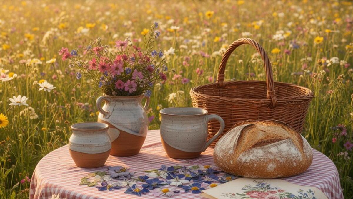
Cottagecore emerged as a recognizable aesthetic around 2017–2018 on Tumblr and Instagram before becoming one of the most-searched aesthetic terms of 2020 (when pandemic lockdowns made the fantasy of a pastoral escape particularly resonant). The aesthetic romanticizes pre-industrial rural life: the English countryside cottage, wild mushroom foraging, bread-baking, pressed flowers, linen clothing, and the unhurried rhythms of a life lived close to the land. Its literary forebears include 19th-century pastoral poetry, the novels of Thomas Hardy and George Eliot, and children's illustrations by Beatrix Potter and Kate Greenaway.
Cottagecore is deliberately soft and non-confrontational in tone. Unlike dark academia (which embraces mortality) or gothic (which embraces horror), cottagecore presents rural life as unambiguously gentle: sunny afternoons in meadows, jars of wild berry jam, honey bees, and rain on leaded windows. It functions partly as an anti-urban, anti-productivity counter-aesthetic: a fantasy of opting out of industrial-capitalist time and filling the hours with handcraft and seasonal attention.
The aesthetic has genuine political dimensions, intersecting with anti-capitalism, environmentalism, and (especially in its LGBTQ+ cottage witch variants) queer ruralism. But its dominant register is gentle aspiration rather than critique: the aesthetic of a Pinterest board rather than a manifesto.
The visual DNA: what makes it recognisable
- Handwritten scripts and calligraphy: pen-and-ink quality
- Old-style serifs: Garamond, Caslon: the typography of old recipe books
- Small, delicate type with lots of surrounding whitespace
- Botanical illustration labels: italic script with small decorative flourishes
- Centered or symmetrical: formal garden symmetry
- Flatlay composition: looking straight down at arranged objects on a surface
- Natural framing with plant material: flowers or vines as borders
- Soft-focus depth of field: the background always slightly blurred
- Warm cream and parchment: #F5EDD8, #E8D5B0, #D4B483
- Sage green: #7D9A6A, #8FAD77, #4F6B41
- Dusty rose and lavender: #D4847A, #C8B4D8
- Brown and warm ochre: #8B6445, #A67C52, #6B4423
- Wildflowers: pressed flowers, botanical illustrations, flower crowns
- Mushrooms, especially forager varieties: chanterelles, fly agaric
- Honeybees, moths, and butterflies
- Jars of preserves, beeswax candles, handmade pottery
8-channel console - dominant channels taped & circled by the registrar
Your aesthetic passport - share the fingerprint
4 color interpretations of this aesthetic
How to shoot this aesthetic
Join waitlist for access
Join the waitlist for full access
Join the waitlistCottagecore: where the language earns its place
Cottagecore is most effective when its visual decisions do useful work. Rural romanticism celebrating pastoral life, wildflowers, and handmade domesticity
The style gives styling, proportion, and image sequencing a clear point of view rather than treating them as decoration.
It can turn atmosphere, material, and spatial pacing into evidence of a distinct experience before a visitor arrives.
It helps a physical or editorial environment feel authored, which raises attention and perceived care.
They recognize the references, proportion, and restraint that make the language feel intentional.
They respond to visible judgment because it reduces the feeling of interchangeable product.
A coherent aesthetic gives them a usable standard for choosing images, objects, and collaborators.
The cost comes from consistent art direction, suitable locations or materials, and time to edit the details that would otherwise undermine the premise.
The challenge is conceptual. It takes visual literacy and a real point of view to avoid borrowing surface cues without their original logic.
Lighting, casting, type, color, material, and retouching must agree. A single weak choice can make the work feel like an imitation.
Cottagecore creates its strongest advantage when it gives a brand a standard of judgment, not merely an attractive finish. It fails when recognizable cues are collected without a governing idea. The difference between average and exceptional execution is usually proportion: how much is shown, what is withheld, and whether every element belongs to the same world. The most capable teams pair an exacting art director with specialists who understand the medium, from photographer and stylist to set designer, editor, and typographer.
Should Cottagecore be the strategic choice?
Surface imitation is easy. The language becomes generic when familiar cues replace proportion, specificity, and a coherent system.
Its visual ingredients appear regularly in contemporary work, but a rigorous execution remains distinguishable from a loose collection of references.
Its strongest principles depend on composition, material, and cultural literacy rather than a short-lived visual effect.
It asks for consistency across photography, typography, motion, environments, and the many details that make a brand feel believable.
Cottagecore deserves serious consideration from brands and institutions that can articulate a real point of view and protect it through execution. It is less suitable for work that needs immediate instructional clarity, broad visual neutrality, or low-cost production flexibility. Its greatest advantage is differentiation through judgment: it can make a product, place, or editorial proposition feel authored rather than merely packaged. Average executions borrow recognizable signals, then lose coherence when type, casting, copy, or materials fail to agree. Exceptional executions understand the visual language as a system of choices, including what not to show. The largest mistake is treating the style as a finish applied after strategy. Adopt it only when the product and organization can carry the same standard of care the imagery proposes.
Join waitlist for access
Join the waitlist for editorial depth
Join the waitlistConnected across the creative knowledge graph