When to use it
- Fashion-tech campaigns
- Wearable technology branding
- Clean futurism editorial
- AI and tech product launches
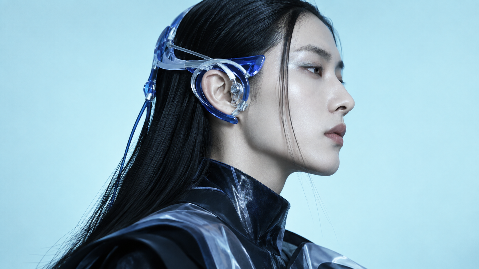
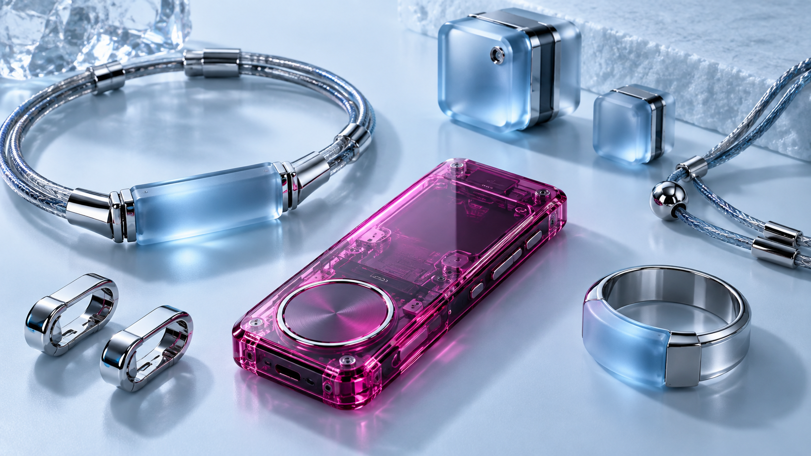
Translucent hardware and sculpted tech-wear in icy blue light: cyberpunk rebuilt as haute couture

What it is, when it works, who it is for, and where it already exists.
Record 022-C2 - when it works, who it is for, what it looks like
Where this aesthetic shows up in the real world · ↗ opens the source site
Where Cyberpunk 2.0 came from, what makes it recognisable, and the fingerprint it leaves.
2023–present · Fashion-tech convergence; K-pop visual identity; Y3K trend forecasting
Cyberpunk 2.0 is what happens when cyberpunk's visual language passes through fashion editorial and comes out the other side. The original aesthetic, born from Gibson and Scott in the early 1980s, was defined by rain, neon, and the anxiety of corporate dystopia. By the time Cyberpunk 2077 shipped in 2020, that look had hardened into a product: Night City as a branded environment. The generation that inherited cyberpunk wanted the silhouette without the apocalypse.
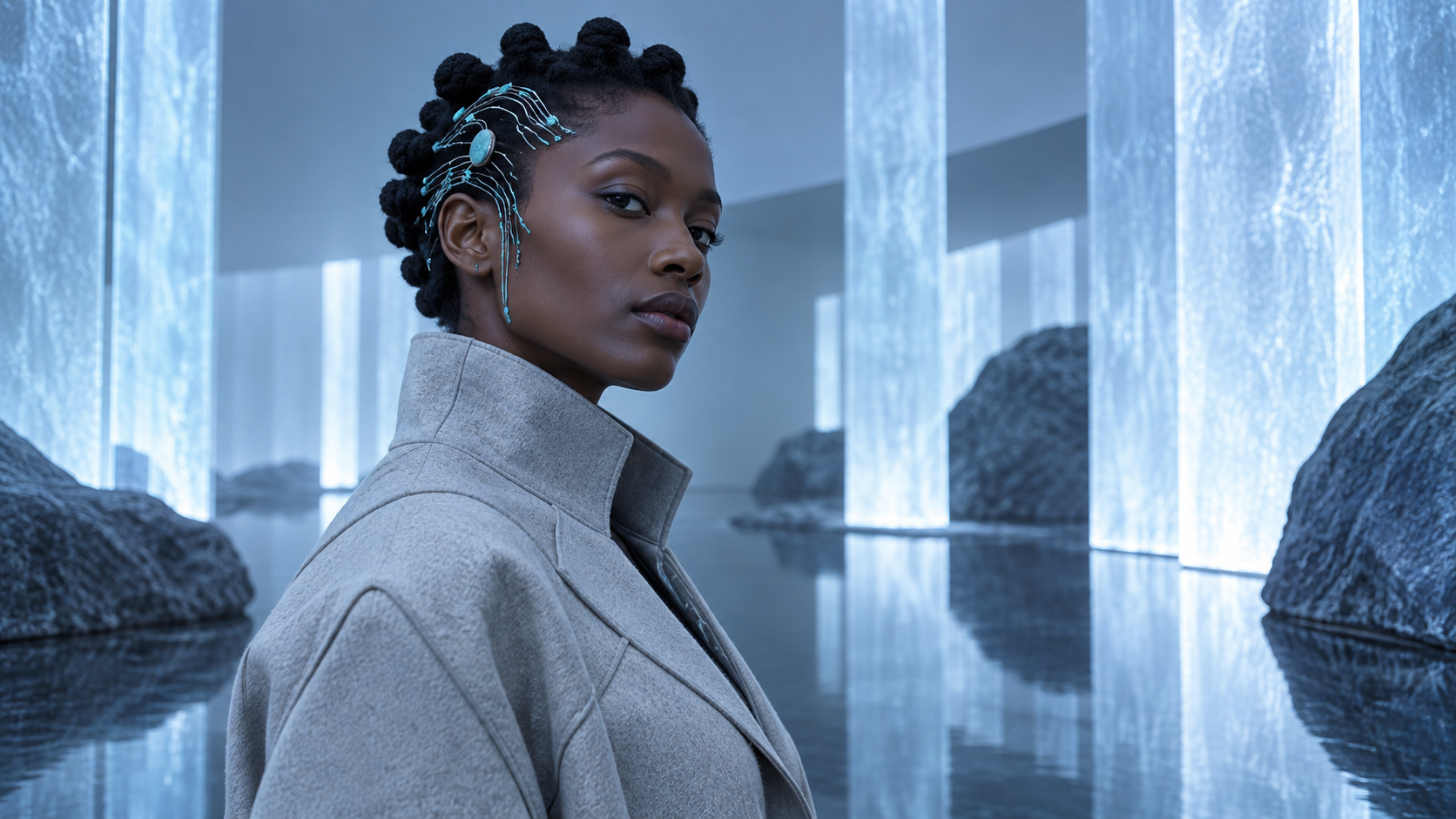
The shift crystallized around 2023 through three channels. K-pop campaigns, particularly from BLACKPINK and aespa, started placing performers in icy blue studio environments with translucent sculptural accessories rather than neon-soaked streets. Iris van Herpen's couture collections had been building a vocabulary of clear resin, laser-cut polymer, and body-mounted circuitry since the early 2010s, and by 2023 that vocabulary had filtered into commercial fashion through Coperni and Balenciaga. Simultaneously, AI image generation flooded social media with a 'clean cyberpunk' look: chrome surfaces, translucent materials, diffused light, no grime.
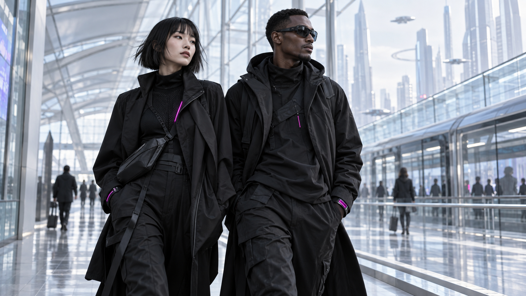
The resulting aesthetic keeps the core cyberpunk gesture, black technical fabric, body-mounted technology, urban futurism, but replaces every emotional register. Dark becomes light. Rain becomes ice. Street grit becomes studio precision. The neon spectrum collapses to a narrow icy-blue-to-magenta range. The body augmentation motif shifts from gritty implants to sculptural ornament: circuit-pattern hair accessories, translucent ear devices, chrome rings that read as jewellery first and tech second.
“Cyberpunk after the rain dried: the tech stayed, the grit left.
The visual DNA: what makes it recognisable
The colour of the styles sitting closest to this one
The record applied to your project. The record's kit is free; your brand, references and plates come with membership

Whether to use it, what it costs to do properly, and where it stands right now.
Two written calls, seven meters, and when to walk away
Cyberpunk 2.0 earns its keep when it gives a brand a standard of judgment, not just a finish. It falls apart the moment recognizable cues get collected without a point of view behind them. The tell is always proportion: what's shown, what's held back, and whether every choice belongs to the same world.
Use Cyberpunk 2.0 when the brand can back a real point of view and protect it through execution. Not when the goal is broad, neutral, or cheap to produce. The advantage is differentiation through judgment: the work reads as authored, not packaged. Average executions borrow the signals and lose the coherence. The best ones treat the visual language as a system of choices, including what they leave out.
Budget goes into art direction and casting, not the toolkit.
Anyone can spot the references. A real system out of them is the hard part.
One wrong prop or one off color reads as costume instead of conviction.
The surface is easy to copy. What separates the real thing from a knockoff is the system underneath.
The ingredients are everywhere right now. A disciplined execution is still the minority.
This holds up because it's built on composition and material, not a filter that ages out.
It only works if every touchpoint agrees. Cut a corner anywhere and the whole thing shows it.
A Pro feature: origins, practitioners, and pitfalls
Neighbours, cross-references, blends, and the questions people ask.
Connected across the creative knowledge graph
Where it stands now, and what it costs you to use it
Cyberpunk 2.0 is the aesthetic of tech products that want to be fashion objects. It is the visual register of the transparent Nothing Phone, of Apple Vision Pro marketing, of every AI startup landing page that replaced neon with frost. It works because it says 'future' without saying 'warning.'
The K-pop pipeline matters. When aespa or NewJeans shoot a concept in this register, the resulting Pinterest and TikTok cascade sets commercial expectations for what 'futuristic' looks like to a younger audience. That audience has no nostalgia for Blade Runner and no interest in dystopia as decoration.
The look is already self-aware about its own cleanliness. It knows the grit has been removed and treats that removal as a stylistic position rather than a loss. Whether that honesty survives contact with mainstream advertising is the open question.
Cyberpunk 2.0 takes the core gestures of cyberpunk, black tech-wear, body-mounted technology, urban futurism, and rebuilds them without the dystopian register. Icy blue light replaces neon rain. Translucent polymer and chrome replace corrugated metal. The mood is editorial and aspirational rather than gritty and anxious.
Classic cyberpunk is dark, wet, and chaotic: neon signs in the rain, crowded street markets, exposed wiring. Cyberpunk 2.0 is bright, cold, and composed: icy studio light, translucent accessories, clean glass architecture. The technology is the same; the emotional register is opposite.
Icy blue (#D0E4F0) as the ambient base. Translucent magenta-pink (#FF4081) for polymer devices and accent materials. Cobalt blue (#0055CC) for sculptural tech details. Polished chrome for hardware. Near-black (#1A1A2E) for clothing and leather.
Every style in the library is broken down like this one: the palette, the typography, the materials and the lineage.
Explore the style library →