Registrar's index cards on the platen glass - captured by the scanner
1984–present · Science fiction literature; cinematic roots in Hong Kong and Los Angeles
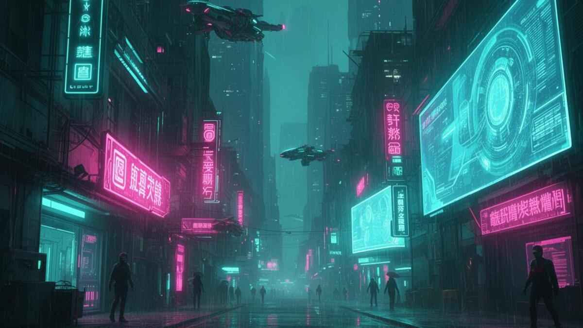
Cyberpunk emerged as a literary genre with William Gibson's 'Neuromancer' (1984), which coined the term 'cyberspace' and described a near-future world of corporate dystopia, body modification, and underground hackers. But the visual language crystallized in cinema: Ridley Scott's 'Blade Runner' (1982, before the genre was named) established the template: perpetual rain, neon kanji advertisements, flying cars above street-level squalor, and the architectural collision of high corporate towers and decaying urban infrastructure.
The aesthetic draws heavily from 1980s Hong Kong street photography and Japan's Akihabara electronics district: the density of commercial signage, the layering of old and new buildings, and the coexistence of extreme wealth and poverty in vertical megacities. The color palette comes directly from this source material: amber streetlight, neon blue and red from shop signs, acid rain reflections, and the blue-white flicker of CRT screens in dark rooms.
Cyberpunk entered mainstream visual culture through video games ('Deus Ex,' 'Cyberpunk 2020,' 'Cyberpunk 2077'), anime ('Akira' 1988, 'Ghost in the Shell' 1995), and fashion's 'techwear' movement in the 2010s. Its core tension: that advanced technology amplifies existing inequality rather than resolving it: has become more resonant, not less, as AI and surveillance capitalism have expanded.
The visual DNA: what makes it recognisable
- Condensed or extended sans-serifs: the type of road signs and warning systems
- Kanji or Han characters mixed into Latin text even in non-Japanese contexts
- Glitch treatments: RGB channel offset, scan-line interruption, pixel scatter
- Stencil type on industrial surfaces: military, governmental, corporate warnings
- Vertical compositional thrust: megacity towers dominate horizontal space
- Looking up or worm's-eye perspective from street level toward sky
- Layered depth: foreground grating or chain-link, middle crowd, background glowing towers
- Rain streak overlay: diagonal motion lines across the scene
- Near-black (#0D0A14) or dark navy as base sky/environment color
- Acid neon: cyan (#00FFFF), magenta (#FF00FF), amber (#FF9500), acid yellow (#CCFF00)
- Wet surfaces: reflective asphalt and puddles doubling every light source
- Industrial materials: corrugated metal, exposed conduit, chain-link fence
- Corporate hologram advertisements floating above crowded streets
- Augmented body parts: chrome eyes, neural jack ports, exoskeletal hands
- Dense vertical typography on building facades
- Hacker terminals with green-on-black code streams
8-channel console - dominant channels taped & circled by the registrar
Your aesthetic passport - share the fingerprint
4 color interpretations of this aesthetic
How to shoot this aesthetic
Join waitlist for access
Join the waitlist for full access
Join the waitlistCyberpunk: where the language earns its place
Cyberpunk is most effective when its visual decisions do useful work. High tech, low life: neon-drenched dystopia with rain-slick streets
The style gives styling, proportion, and image sequencing a clear point of view rather than treating them as decoration.
It can turn atmosphere, material, and spatial pacing into evidence of a distinct experience before a visitor arrives.
It helps a physical or editorial environment feel authored, which raises attention and perceived care.
They recognize the references, proportion, and restraint that make the language feel intentional.
They respond to visible judgment because it reduces the feeling of interchangeable product.
A coherent aesthetic gives them a usable standard for choosing images, objects, and collaborators.
The cost comes from consistent art direction, suitable locations or materials, and time to edit the details that would otherwise undermine the premise.
The challenge is conceptual. It takes visual literacy and a real point of view to avoid borrowing surface cues without their original logic.
Lighting, casting, type, color, material, and retouching must agree. A single weak choice can make the work feel like an imitation.
Cyberpunk creates its strongest advantage when it gives a brand a standard of judgment, not merely an attractive finish. It fails when recognizable cues are collected without a governing idea. The difference between average and exceptional execution is usually proportion: how much is shown, what is withheld, and whether every element belongs to the same world. The most capable teams pair an exacting art director with specialists who understand the medium, from photographer and stylist to set designer, editor, and typographer.
Should Cyberpunk be the strategic choice?
Surface imitation is easy. The language becomes generic when familiar cues replace proportion, specificity, and a coherent system.
Its visual ingredients appear regularly in contemporary work, but a rigorous execution remains distinguishable from a loose collection of references.
Its strongest principles depend on composition, material, and cultural literacy rather than a short-lived visual effect.
It asks for consistency across photography, typography, motion, environments, and the many details that make a brand feel believable.
Cyberpunk deserves serious consideration from brands and institutions that can articulate a real point of view and protect it through execution. It is less suitable for work that needs immediate instructional clarity, broad visual neutrality, or low-cost production flexibility. Its greatest advantage is differentiation through judgment: it can make a product, place, or editorial proposition feel authored rather than merely packaged. Average executions borrow recognizable signals, then lose coherence when type, casting, copy, or materials fail to agree. Exceptional executions understand the visual language as a system of choices, including what not to show. The largest mistake is treating the style as a finish applied after strategy. Adopt it only when the product and organization can carry the same standard of care the imagery proposes.
Join waitlist for access
Join the waitlist for editorial depth
Join the waitlistConnected across the creative knowledge graph