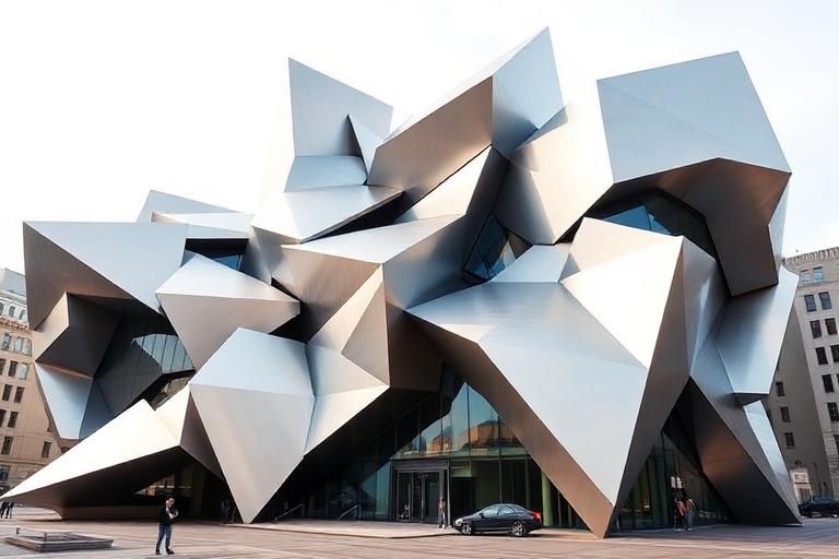
Deconstructivism

Fragmented forms and controlled chaos - Zaha Hadid's fluid violence, Frank Gehry's titanium collisions, Daniel Libeskind's angular grief

Compare Deconstructivism with another style →
Record023-DE
AestheticDeconstructivism
ClassExpressive / Chaotic
StatusINGESTING
Example of the Deconstructivism aesthetic
Archive platedeconstructivism
Source document

Registrar's index cards on the platen glass - captured by the scanner

Omoro Archive - Registrar's OfficeDeconstructivismFILE 023-DE
When to use it
  • Avant-garde brand identity and fashion editorial
  • Cultural and museum institution design
+2 more in the Style Guide
Perfect for
  • Contemporary art museums and cultural institutions
  • Experimental fashion and luxury brands
+2 more in the Style Guide
What it looks like
  • Zaha Hadid MAXXI Museum Rome flowing concrete
  • Frank Gehry Guggenheim Bilbao titanium skin
+2 more in the Style Guide
Omoro Style GuideAll 151 aesthetics, every field on this page, in one PDF.
Get the guide →
History

1982–present · Architecture (Peter Eisenman, Zaha Hadid, Frank Gehry); graphic design (David Carson, Rudy VanderLans)

Deconstructivism in architecture and design emerged in the early 1980s from philosophical work: primarily Jacques Derrida's deconstruction theory applied to built form. Architects including Peter Eisenman, Zaha Hadid, Frank Gehry, and Daniel Libeskind began designing buildings that deliberately disrupted the conventions of shelter: walls that lean, floors that tilt, structures that appear to be in the process of collapsing or fragmenting.

The 1988 Deconstructivist Architecture exhibition at MoMA (curated by Philip Johnson and Mark Wigley) codified the movement and made it globally visible. In graphic design, parallel impulses appeared in the work of Cranbrook Academy designers (Ed Fella, Jeffery Keedy), Emigre magazine, and David Carson: all applying deconstructive logic to typography: text fragmented across multiple columns, layered, displaced from its conventional reading position.

Contemporary deconstructivism persists in fashion (Comme des Garçons, Maison Margiela: garments with structural disruption built in), graphic design for art institutions and experimental music, and architecture's continued engagement with non-Euclidean form. It remains a challenging aesthetic: explicitly intellectual and deliberately uncomfortable: best used by practitioners who can defend the disruption as meaningful rather than arbitrary.

Visual markers

The visual DNA: what makes it recognisable

typography
  • Fragmented text: words split across multiple visual planes
  • Diagonal and rotated type that disrupts the normal horizontal reading axis
  • Overlapping layers of type at different scales and angles
  • Text that deliberately tests legibility: reading requires effort
grid
  • The disrupted grid: a visible grid structure with elements deliberately misaligned
  • Diagonal axes cutting across the composition at unexpected angles
  • Fragmented planes: image or color fields broken and reassembled displaced
  • No single visual hierarchy: multiple competing centers of attention
materials
  • Raw concrete: #948E84, #A09890: Brutalist material often paired with deconstructivist form
  • Steel grey: #5C6470, #6A7280
  • White: #F5F5F5: blank field that makes the disruptions visible
  • Black: #0F0F0F: the ink of the text that is being deconstructed
motifs
  • Fractured geometry: shapes broken and offset from themselves
  • Diagonal structural elements cutting across the composition
  • Overlapping transparent planes of information
  • Visual tension without resolution: disruption without return to order
Aesthetic profile

8-channel console - dominant channels taped & circled by the registrar

Attribute Console - 023-DE 8 CH ACTIVEFIG. 1
CH01Minimal
MaximalR·40
CH02Analog
DigitalL·10
CH03Restrained
ExpressiveR·70
CH04Cool
WarmL·30
CH05Futuristic
NostalgicR·20
CH06Structured
ChaoticR·70
CH07Dark
LightL·20
CH08Organic
GeometricR·40

strongest channels circled - leans expressive, chaotic, maximal ✦

Profile card

Your aesthetic passport - share the fingerprint

Aesthetic Profile
Deconstructivism
MaximalAnalogExpressiveCoolNostalgicChaoticDarkGeometric
ExpressiveChaoticMaximal
omoro.io/styles/deconstructivism
Color Palettes

4 color interpretations of this aesthetic

Deconstructivism
Fragmented form and the deliberate destabilization of structural certainty
Gehry Titanium
Bilbao's crumpled titanium: every panel a different angle
Libeskind Void
Jewish Museum Berlin: zinc skin slashed by absence
Coop Himmelb(l)au
Rooftop intervention: glass and steel erupting from a Vienna building
Mood Board

Join waitlist for access

Join the waitlist for full access

Join the waitlist
Creative Application Analysis

Deconstructivism: where the language earns its place

Deconstructivism is most effective when its visual decisions do useful work. Fragmented forms and controlled chaos - Zaha Hadid's fluid violence, Frank Gehry's titanium collisions, Daniel Libeskind's angular grief

Best industries
Fashion and editorialFIT 9/10

The style gives styling, proportion, and image sequencing a clear point of view rather than treating them as decoration.

Hospitality and real estateFIT 8/10

It can turn atmosphere, material, and spatial pacing into evidence of a distinct experience before a visitor arrives.

Culture and premium retailFIT 8/10

It helps a physical or editorial environment feel authored, which raises attention and perceived care.

Best audiences
Design-literate viewersFIT 9/10

They recognize the references, proportion, and restraint that make the language feel intentional.

Considered buyersFIT 8/10

They respond to visible judgment because it reduces the feeling of interchangeable product.

Creative decision makersFIT 8/10

A coherent aesthetic gives them a usable standard for choosing images, objects, and collaborators.

Best products
Flagship productsA singular object benefits when the visual system concentrates attention rather than dispersing it.
Editorial publicationsThe language can hold a sequence of stories together while leaving room for individual subjects.
Spatial and service experiencesIt extends naturally into materials, signage, lighting, and the rhythm of arrival.
Best campaign types
Brand or product launchA defined visual language gives the first encounter enough conviction to establish a durable frame.
Editorial campaignIt rewards a sequence of related images rather than a single isolated hero shot.
Concept film or lookbookMotion, casting, set detail, and typography can all carry the same underlying logic.
Creative feasibility
Production costMedium

The cost comes from consistent art direction, suitable locations or materials, and time to edit the details that would otherwise undermine the premise.

Creative difficultyHigh

The challenge is conceptual. It takes visual literacy and a real point of view to avoid borrowing surface cues without their original logic.

Execution difficultyHigh

Lighting, casting, type, color, material, and retouching must agree. A single weak choice can make the work feel like an imitation.

Overall creative assessment

Deconstructivism creates its strongest advantage when it gives a brand a standard of judgment, not merely an attractive finish. It fails when recognizable cues are collected without a governing idea. The difference between average and exceptional execution is usually proportion: how much is shown, what is withheld, and whether every element belongs to the same world. The most capable teams pair an exacting art director with specialists who understand the medium, from photographer and stylist to set designer, editor, and typographer.

Strategic Recommendation

Should Deconstructivism be the strategic choice?

Best for
A brand with a real point of viewThe aesthetic works when it can sharpen an existing position, not invent one in its place.
High-consideration launchesA controlled visual system helps make an object, place, or service feel intentional before its details are fully understood.
Editorial, spatial, and experiential workThese formats allow composition, material, pacing, and typography to reinforce one another.
Creative portfolios and institutionsA sustained visual language can demonstrate discernment and make a body of work feel coherent.
Avoid if
The message must be read instantly by everyoneAesthetic nuance can compete with direct instructional clarity when accessibility is the first requirement.
The brand cannot sustain production standardsInconsistent imagery, typography, or material choices expose the gap between the concept and the execution.
The product has no credible relationship to the visual promiseStyling cannot compensate for a story, object, or service that does not support it.
Risk of misuseHigh

Surface imitation is easy. The language becomes generic when familiar cues replace proportion, specificity, and a coherent system.

Contemporary prevalenceCommon

Its visual ingredients appear regularly in contemporary work, but a rigorous execution remains distinguishable from a loose collection of references.

LongevityEnduring

Its strongest principles depend on composition, material, and cultural literacy rather than a short-lived visual effect.

Brand investmentHigh

It asks for consistency across photography, typography, motion, environments, and the many details that make a brand feel believable.

Creative verdict

Deconstructivism deserves serious consideration from brands and institutions that can articulate a real point of view and protect it through execution. It is less suitable for work that needs immediate instructional clarity, broad visual neutrality, or low-cost production flexibility. Its greatest advantage is differentiation through judgment: it can make a product, place, or editorial proposition feel authored rather than merely packaged. Average executions borrow recognizable signals, then lose coherence when type, casting, copy, or materials fail to agree. Exceptional executions understand the visual language as a system of choices, including what not to show. The largest mistake is treating the style as a finish applied after strategy. Adopt it only when the product and organization can carry the same standard of care the imagery proposes.

Editorial Depth

Join waitlist for access

Common Misconception
Historical Context
Brands That Accidentally Use This Style
Brands That Perfectly Represent This Style
Psychological Effect

Join the waitlist for editorial depth

Join the waitlist
Related concepts

Connected across the creative knowledge graph

Cross-references
Brutalismdeconstructivism extends brutalism's honesty into structural disruptionNeubrutalismneubrutalism applies similar anti-refinement values to digital designPost-Modernismpostmodernism and deconstructivism emerge from the same theoretical momentGlitchglitch aesthetic applies deconstructive logic to digital systems
About this aesthetic
What is deconstructivism aesthetic?
Deconstructivism is a design aesthetic that deliberately disrupts structural expectations: fragmented planes, diagonal elements, overlapping visual layers, and compositions without conventional hierarchy. In architecture (Zaha Hadid, Frank Gehry, Daniel Libeskind) it means buildings that appear unstable. In graphic design (David Carson, Emigre magazine) it means typography that tests legibility. The disruption is philosophical: structure itself is the subject.
How is deconstructivism different from brutalism?
Brutalism celebrates structural honesty: materials exposed, structure visible, nothing hidden. Deconstructivism goes further: structure itself is disrupted and questioned. A brutalist building is raw and direct; a deconstructivist building makes you uncertain about which way is down. In graphic design, brutalist typography is bold and aggressive but legible; deconstructivist typography is legibility under attack.
Who are the key figures of deconstructivism?
Architecture: Peter Eisenman (House VI, Wexner Center), Zaha Hadid (Vitra Fire Station), Frank Gehry (Bilbao Guggenheim), Daniel Libeskind (Jewish Museum Berlin). Graphic design: David Carson (Ray Gun magazine), Ed Fella (Cranbrook), Rudy VanderLans and Zuzana Licko (Emigre magazine). Philosophy: Jacques Derrida (whose writing influenced the architectural theorists). The 1988 MoMA Deconstructivist Architecture exhibition made the movement internationally legible.

Build with the deconstructivism aesthetic

Omoro turns aesthetic references into on-brand visuals. Generate, compose and publish from one studio.

Join the waitlist