Registrar's index cards on the platen glass - captured by the scanner
2020–present · Web design, internet; roots in 1950s architectural Brutalism
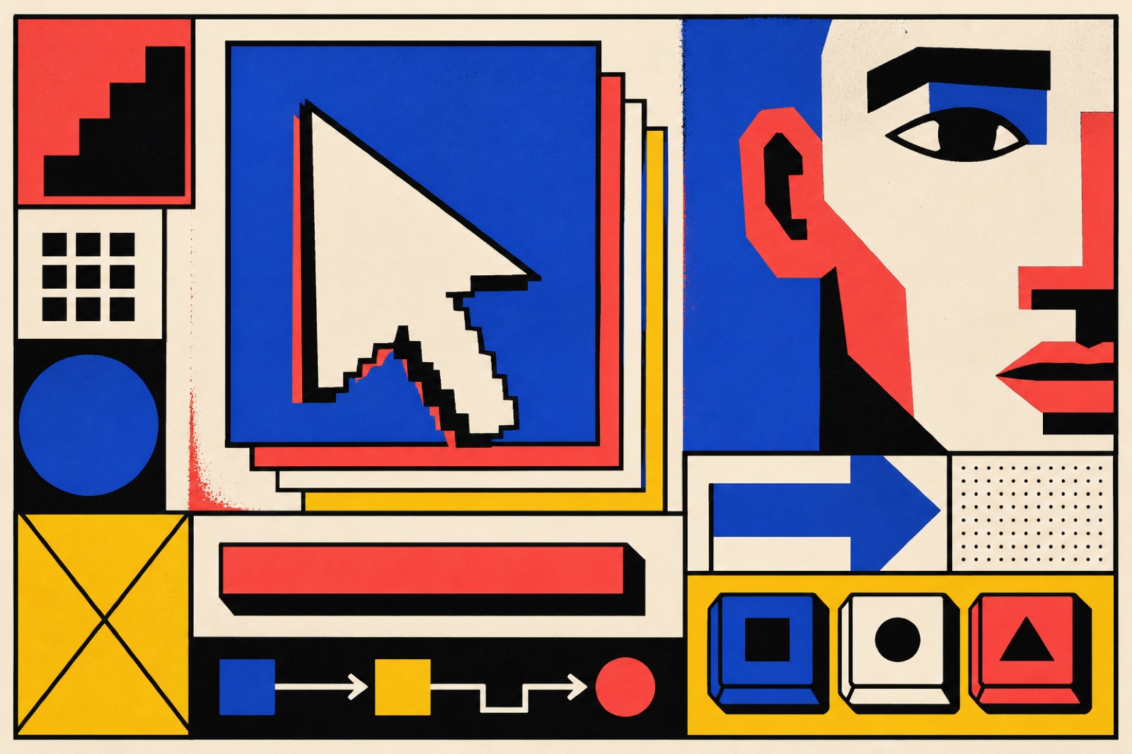
Neubrutalism (also styled 'New Brutalism' or 'Neo-Brutalism' in design contexts) emerged around 2020–2022 as a UI and graphic design aesthetic that rejected the refined, shadow-free design language of Google Material Design and Apple Human Interface Guidelines. Its signature: heavy black borders on UI elements, flat unmodulated background colors, and a deliberately crude drop-shadow offset in a solid color (not blurred, not gradient: just a solid black rectangle offset 3–5px). The overall effect is of a web browser rendering with CSS partially applied, or a print zine scanned at low resolution.
The architectural Brutalism of the 1950s–1970s (Le Corbusier's Unité d'Habitation, Paul Rudolph's Art + Architecture Building) is a loose ancestor: both share an honest-materials aesthetic that refuses to hide structure behind cladding. But neubrutalism's more immediate parents are flat design's backlash, the zine aesthetic of 1990s punk graphic design, and the anti-polish ethos of early internet web design. The Gumroad redesign (2021) and the Figma community around 2022 popularized the style for product design audiences.
Neubrutalism's appeal lies in its contrast to the homogenizing 'good taste' of Scandinavian-influenced startup design. Its ugliness is deliberate and communicative: 'we are not trying to hide anything,' 'we are not polished corporate,' 'we are raw and confident.' The style also solves an accessibility problem implicitly: black borders on white or pale-colored elements have very high contrast, and the flat drop-shadow makes click targets obvious.
The visual DNA: what makes it recognisable
- Bold, heavy sans-serifs: often system fonts or classic grotesques used without apology
- Uppercase type for headers, with normal weight body text: stark contrast
- Black type on colored backgrounds, or reverse (white on black)
- No typographic subtlety: size, weight, and contrast do the work, nothing else
- Explicit borders on all containers: no implied edges, everything boxed
- Offset drop-shadow: solid color (usually black), no blur, offset 4–6px diagonal
- Visible grid lines and dividers as design elements, not hidden infrastructure
- Dense information layouts: no generous whitespace, elements close together
- White (#FFFFFF) or near-white as primary background
- Bold accent colors: electric yellow (#F5E642), hot pink (#FF3B6A), lime (#A8FF3E), or acid orange (#FF6000)
- Black (#000000) for all borders, shadows, and text
- No gradients, no shadows, no blur: flatness is mandatory
- The 4px solid black border on everything: the defining structural element
- Offset box-shadow in black or a contrasting color
- Input fields that look like actual input fields (visible border, no rounded-corner softening)
- Sticker and badge elements with high-contrast stroke
8-channel console - dominant channels taped & circled by the registrar
Your aesthetic passport - share the fingerprint
5 color interpretations of this aesthetic
How to shoot this aesthetic
Join waitlist for access
Join the waitlist for full access
Join the waitlistNeubrutalism: where the language earns its place
Neubrutalism is most effective when its visual decisions do useful work. Raw, bold interfaces with heavy borders, stark shadows, and unapologetic contrast
The style gives styling, proportion, and image sequencing a clear point of view rather than treating them as decoration.
It can turn atmosphere, material, and spatial pacing into evidence of a distinct experience before a visitor arrives.
It helps a physical or editorial environment feel authored, which raises attention and perceived care.
They recognize the references, proportion, and restraint that make the language feel intentional.
They respond to visible judgment because it reduces the feeling of interchangeable product.
A coherent aesthetic gives them a usable standard for choosing images, objects, and collaborators.
The cost comes from consistent art direction, suitable locations or materials, and time to edit the details that would otherwise undermine the premise.
The challenge is conceptual. It takes visual literacy and a real point of view to avoid borrowing surface cues without their original logic.
Lighting, casting, type, color, material, and retouching must agree. A single weak choice can make the work feel like an imitation.
Neubrutalism creates its strongest advantage when it gives a brand a standard of judgment, not merely an attractive finish. It fails when recognizable cues are collected without a governing idea. The difference between average and exceptional execution is usually proportion: how much is shown, what is withheld, and whether every element belongs to the same world. The most capable teams pair an exacting art director with specialists who understand the medium, from photographer and stylist to set designer, editor, and typographer.
Should Neubrutalism be the strategic choice?
Surface imitation is easy. The language becomes generic when familiar cues replace proportion, specificity, and a coherent system.
Its visual ingredients appear regularly in contemporary work, but a rigorous execution remains distinguishable from a loose collection of references.
Its strongest principles depend on composition, material, and cultural literacy rather than a short-lived visual effect.
It asks for consistency across photography, typography, motion, environments, and the many details that make a brand feel believable.
Neubrutalism deserves serious consideration from brands and institutions that can articulate a real point of view and protect it through execution. It is less suitable for work that needs immediate instructional clarity, broad visual neutrality, or low-cost production flexibility. Its greatest advantage is differentiation through judgment: it can make a product, place, or editorial proposition feel authored rather than merely packaged. Average executions borrow recognizable signals, then lose coherence when type, casting, copy, or materials fail to agree. Exceptional executions understand the visual language as a system of choices, including what not to show. The largest mistake is treating the style as a finish applied after strategy. Adopt it only when the product and organization can carry the same standard of care the imagery proposes.
Join waitlist for access
Join the waitlist for editorial depth
Join the waitlistConnected across the creative knowledge graph