When to use it
- Launches, limited drops and anything that arrives in a box
- Book, album and report covers that have to feel finished
- Packaging for a product priced above its category
- Invitations, certificates and any object meant to be kept
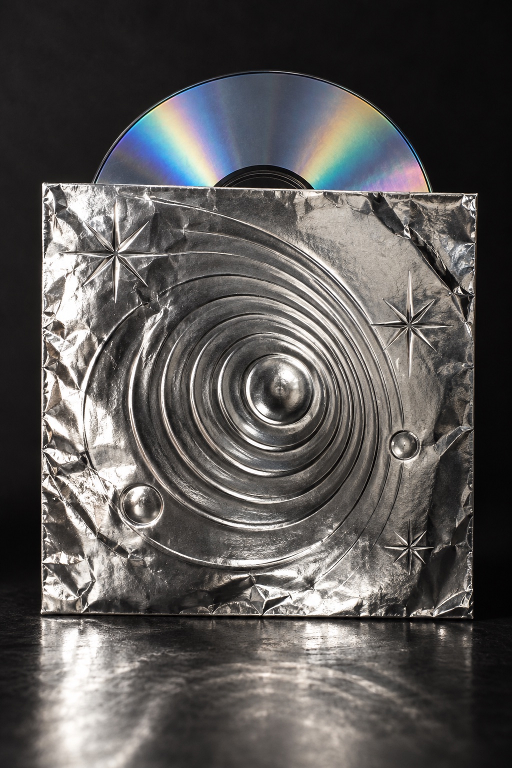
Words pressed into crumpled gold and silver leaf, read by their highlights rather than their colour: no ink, only light on a struck surface
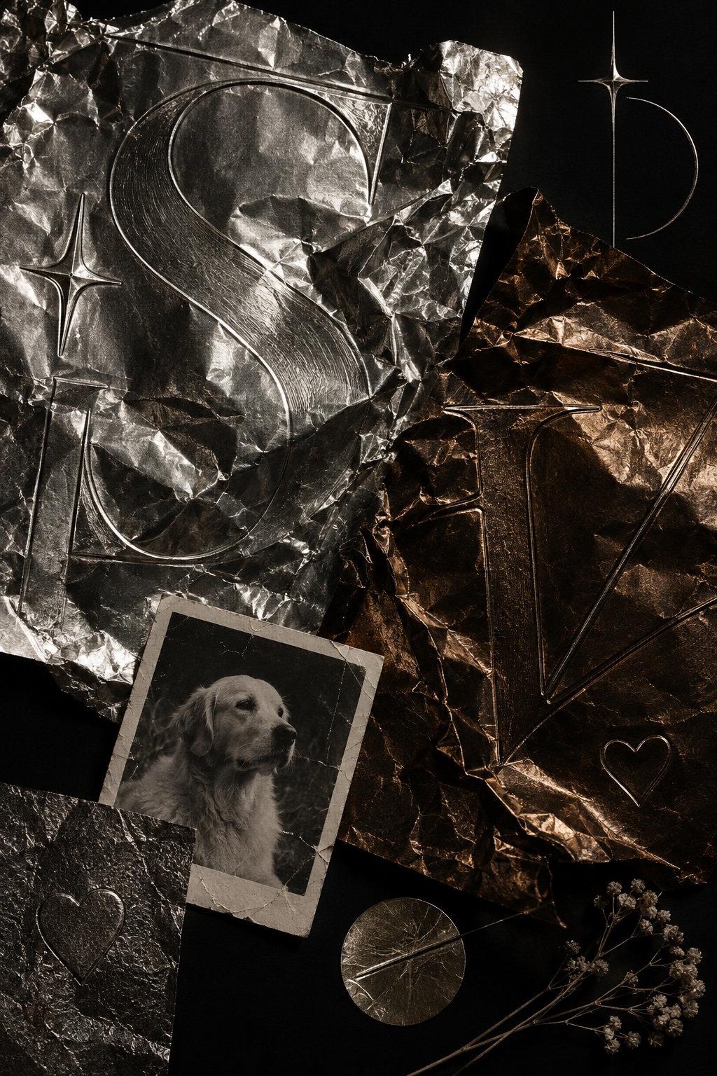
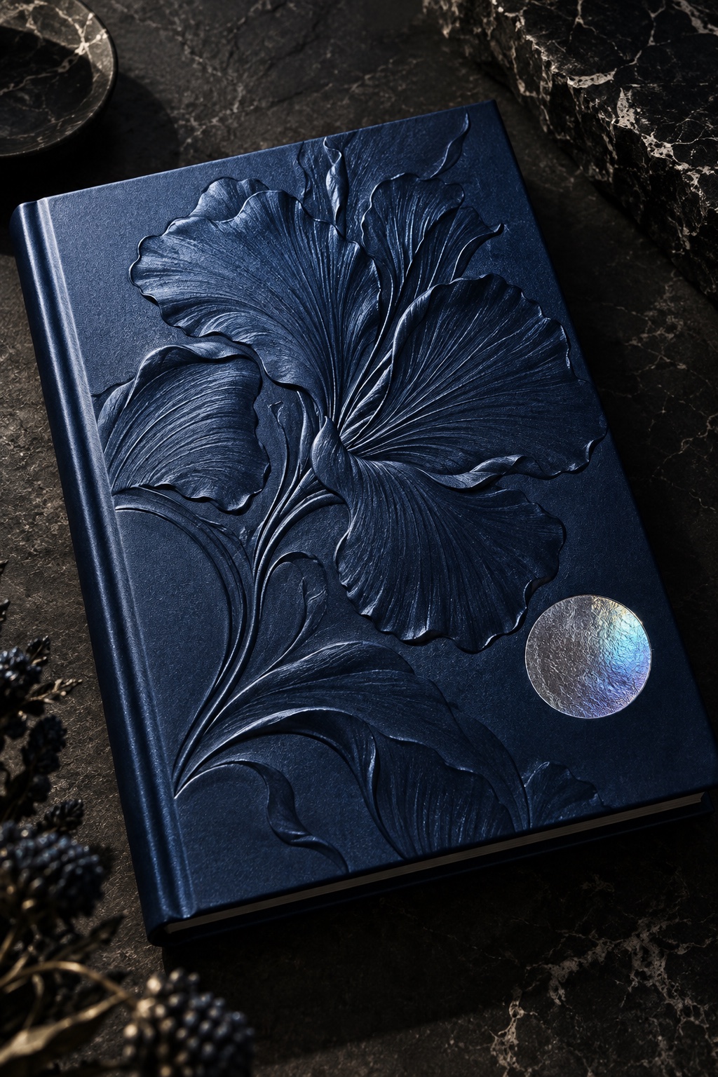

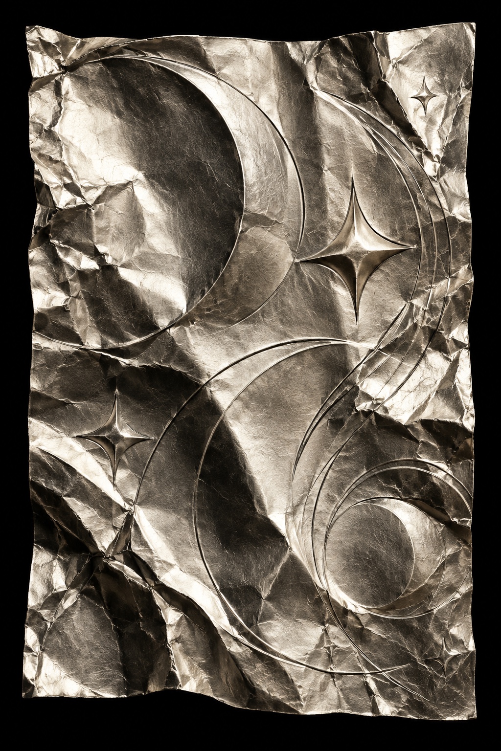
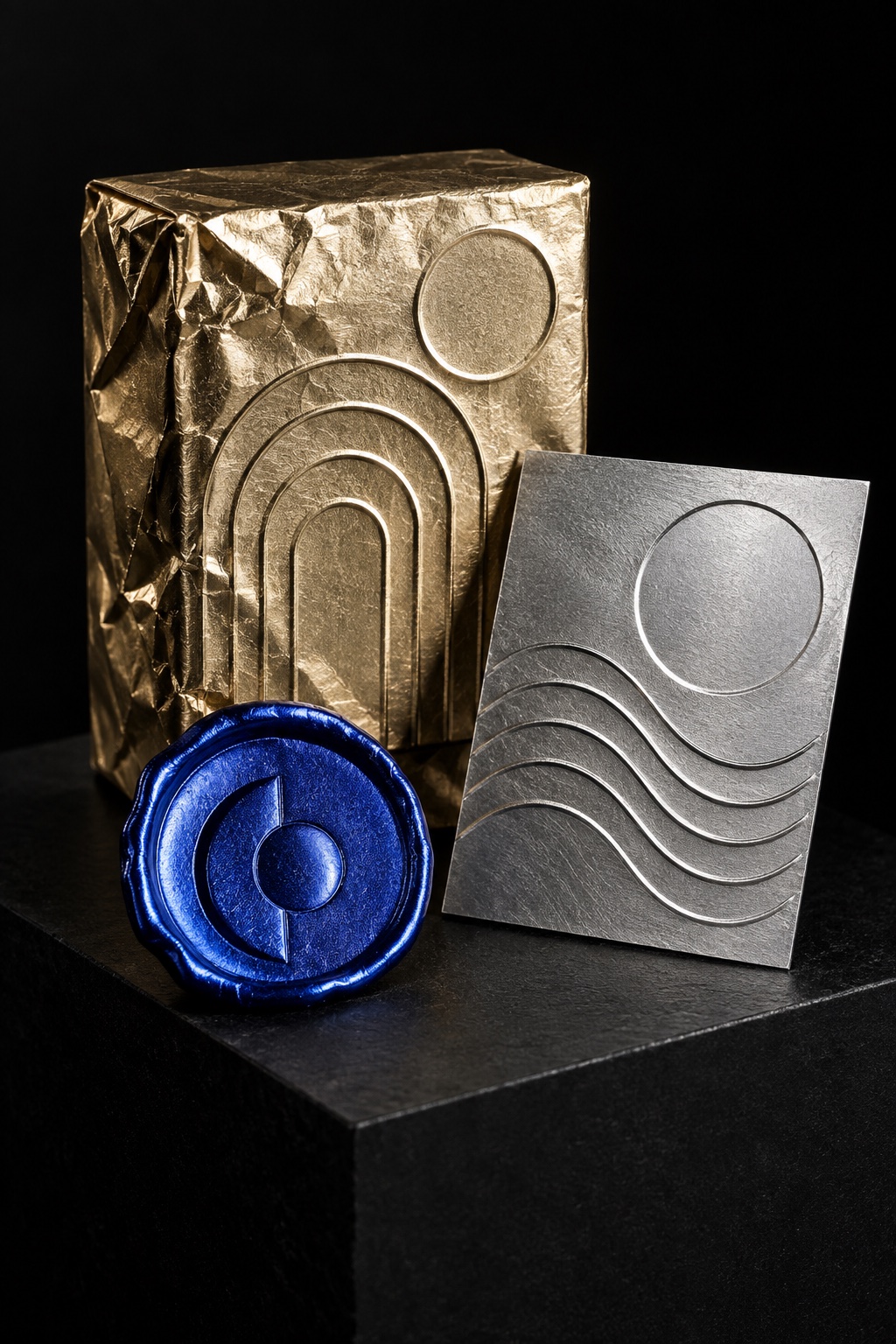
What it is, when it works, who it is for, and where it already exists.
Record 024-EF - when it works, who it is for, what it looks like
Where this aesthetic shows up in the real world · ↗ opens the source site
Where Embossed Foil came from, what makes it recognisable, and the fingerprint it leaves.
1892 to now; gold tooling on bindings from the fifteenth century · Bookbinding workshops, then the printing trade's hot-stamping and foil-blocking presses
Pressing a mark into a surface is older than printing it. Blind tooling, an impression made with a heated tool and no colour at all, runs back to Coptic bindings of the seventh and eighth centuries and stayed the European standard until the fifteenth, when gold tooling arrived from the Islamic world. The method is exacting: the leather is damped, the brass tool is heated until the moisture and the heat balance, and gold leaf is laid into the impression over glaire. Get the balance wrong and the leather shrinks.
The nineteenth century industrialised it. Hot stamping became the ordinary way to apply gold tooling and embossing to leather and paper in book printing, and the first hot-stamping patent was recorded in Germany by Ernst Oeser in 1892. From the 1950s the same method moved onto plastics, and by the end of the century foil blocking was standard on packaging, covers and security documents. Cold foil now lays the foil down inline on press, which is why a finish that once meant a bindery means a line item.
As a design language rather than a finish, its clearest statement is the White Album. In 1968 Richard Hamilton gave The Beatles a plain white sleeve with the band's name in Helvetica, crookedly blind embossed below the middle of the right-hand side, and a unique stamped serial number on every one of several million copies. No image, no colour, nothing printed: an object that had to be tilted to be read. The contemporary version adds the crumple, so that the metal breaks the light into facets and the word appears and disappears as it moves.
“No ink at all, only light falling on a surface that has been struck.
The visual DNA: what makes it recognisable
8-channel console with the fingerprint on its display. Save the card, or share the page

The definitive color scheme for this aesthetic
The colour of the styles sitting closest to this one
How to shoot it, how to prompt it, and how to board it.
How to shoot this aesthetic
"Nothing here is printed, so light the surface until the words appear"
Shot list
Lighting
One hard source, raking. Foil has no colour of its own and shows only what it reflects, so the room is what the picture is made of. Bring black card in to give the metal something dark to hold, and move the light rather than the camera until the type reads.
Drop this into Studio to generate in this aesthetic
Embossed foil, a short word or phrase pressed into crumpled metal leaf, raised and debossed letterforms in silver and gold foil, no ink and no colour beyond the metal, light read off the facets and creases of the foil, deep black shadows inside the emboss, a matte uncoated paper edge beside the mirror surface, macro detail under one hard raking source, a single line of type, expensive and restrained, no printed colour type, no readable extra text
The record applied to your project. The record's kit is free; your brand, references and plates come with membership
01 · Hero application02 · Material and finish03 · Palette in context04 · Photography directionWhether to use it, what it costs to do properly, and where it stands right now.
Two written calls, seven meters, and when to walk away
Specify it as a print job, not an effect. Choose the stock first: uncoated paper takes a deep emboss and coated board cracks at the fold. Type much below eight point, and any hairline serif, will fill or fall out of the die, so the word has to be short and the weight real. Photograph it under one hard raking source with black cards to give the metal something to reflect. A gold gradient with a bevel is the failure everyone recognises, because real foil goes black at the wrong angle and a gradient never does.
Right when the object will be held and priced above its category: launches, limited drops, book and album covers, beauty and spirits. It rewards one short word, a real die and hard light, and fails as a gradient.
Dies, foil and a finishing pass on press: cheap per unit, real as a setup.
The only decision is what deserves the foil, and the answer is almost always one word.
Depth, die and stock all have to agree, and photographing metal means lighting the room rather than the object.
Simulated with a gradient and a bevel it reads as a 2010s logo effect rather than a finished object.
Foil blocking runs through publishing, beauty and drinks packaging; the craft is ordinary, the restraint is not.
Gold tooling has signalled value on a binding since the fifteenth century, and hot stamping since 1892.
Dies and foil are a real print cost, paid once per design and cheap per unit after that.
A Pro feature: origins, practitioners, and pitfalls
Neighbours, cross-references, blends, and the questions people ask.
Connected across the creative knowledge graph
Where it stands now, and what it costs you to use it
Foil is the fastest signal of price a designer has. It is read before the words are, which is why launches, limited editions, spirits and beauty keep paying for it, and why a small brand that foils one line on an otherwise plain carton buys more perceived value than a large brand that prints gold everywhere.
Its failure mode is the gradient. A simulated foil always looks the same from every angle, and real foil does not: it goes black when the light is wrong, which is exactly what makes it convincing. On screen the style is almost meaningless, so the decision to use it is really a decision about whether the thing will be held.
Mix Embossed Foil with any style in the library
 Embossed Foil 50%Metallic Typography 50%
Merged palette
#C6982F
#1C1C1C
#C2C5C9
#7A5F14
#C0C0C0
Leads structured, geometric, minimal
Typography · from Embossed Foil
Caveat over Lora
Materials
The calls this blend forces
These two disagree on 2 things, and a blend cannot average them: you pick a side. At this mix:
Analog or Digital? Embossed Foil is analog, Metallic Typography is digital. This mix lands analog.
Restrained or Expressive? Embossed Foil is restrained, Metallic Typography is expressive. This mix lands restrained.
Use it
Embossed foil, a short word or phrase pressed into crumpled metal leaf, raised and debossed letterforms in silver and gold foil, no ink and no colour beyond the metal, light read off the facets and creases of the foil, deep black shadows inside the emboss, a matte uncoated paper edge beside the mirror surface, macro detail under one hard raking source, a single line of type, expensive and restrained, no printed colour type, no readable extra text (50%), infused with Metallic typography design with chromium or liquid gold letterforms as hero element, reflective mirror surfaces showing environmental reflections, beveled letterforms with sharp specular highlights, wide-tracking ultra-bold condensed type treated as sculptural object, color palette strictly #C6982F #1C1C1C #C2C5C9 #7A5F14 #C0C0C0, leaning analog over digital, restrained over expressive, overall character: structured, geometric, minimal
A print finish used as a style: type pressed into metal leaf so the letters are raised or debossed and read by their highlights rather than by colour. It covers hot foil stamping, where heated foil is transferred to the surface, and blind embossing, where the surface is struck with no colour at all.
Embossing raises the surface, debossing pushes it in, and both can be blind, meaning no colour is added. Foiling transfers a metallic or pigmented film onto the surface. The three are routinely combined, which is why a foiled word can also sit in a recess.
Blind tooling appears on Coptic bindings of the seventh and eighth centuries. Gold tooling reached Europe from the Islamic world in the fifteenth century and became the convention for fine bindings. The industrial version dates from the nineteenth century, with the first hot-stamping patent filed by Ernst Oeser in Germany in 1892.
Choose the stock first, because uncoated paper takes a deep emboss and coated board can crack at a fold. Keep the type short and heavy: fine hairlines and small sizes fill or fall out of the die. Then light it with one hard raking source and black cards nearby, because foil photographs whatever surrounds it.
Every style in the library is broken down like this one: the palette, the typography, the materials and the lineage.
Explore the style library →