Registrar's index cards on the platen glass - captured by the scanner
1890–1910 · Brussels, Paris, Vienna; spread globally
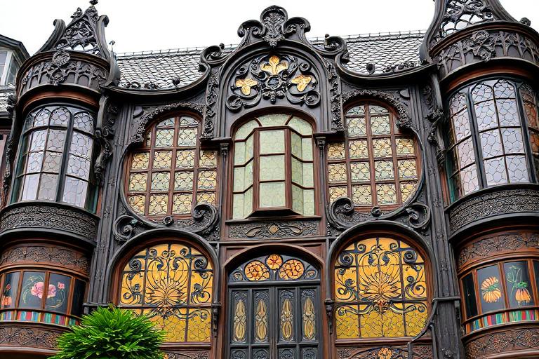
Art Nouveau emerged in the 1890s as a reaction against both the historicism of academic art and the utilitarian ugliness of industrial production. Its name comes from the 'Maison de l'Art Nouveau' gallery opened by Siegfried Bing in Paris in 1895. The movement sought a total integration of all the arts: architecture, interior design, furniture, glass, jewelry, typography, and graphic design: under a single aesthetic principle: the organic, sinuous line derived from natural forms. Leading practitioners included Alphonse Mucha in Paris, Victor Horta in Brussels, and the Vienna Secession (Klimt, Hoffmann, Moser) in Austria.
The visual vocabulary was explicitly biological. Structures grew and curved like vines, lily stems, dragonfly wings, and women's hair. In architecture, Victor Horta's buildings used iron structural columns designed to look like plant stems branching into floor joists. In graphic design, Mucha's posters showed women surrounded by elaborate floral halos and botanical borders, their hair flowing into the decorative frame. The female figure and the natural motif were fused into a single image of sensuous, organic beauty.
Art Nouveau's decline after 1910 was swift: the style was perceived as decadent and overwrought when compared to the crisp functionalism of the emerging modern movement. But its influence persisted in architecture (Antoni Gaudí's work in Barcelona continued through the 1920s) and in graphic design (the Arts and Crafts and Wiener Werkstätte movements carried its handcraft philosophy forward). Contemporary revivals appear in luxury branding, tattoo art, and any design context where organic, intricate pattern is required.
The visual DNA: what makes it recognisable
- Letterforms with organic curves: stems and serifs terminating in leaf or bud forms
- Arnold Böcklin, Eckmann, and similar turn-of-the-century ornamental display faces
- Hand-lettered type integrated into the illustration as part of the composition
- Italic or calligraphic scripts with long, flowing descenders
- No rigid grid: organic asymmetry, curves instead of right angles
- The decorative border as primary structural element: framing the central image
- Vertical format: tall poster proportions with a central figure and surrounding ornament
- Whiplash curves connecting disparate elements into a unified flowing composition
- Jewel tones: emerald #006B3C, sapphire #003580, amethyst #6B3FA0, ruby #8B0000
- Gold: #C9A84C, #B8860B: applied as line work, not fill
- Muted sage and olive: #7D9A6A, #4F6B41: natural botanical greens
- Cream and ivory: #F5EDD0, #EBE0C0: the ground of lithographic posters
- Whiplash curve: the long S-curve with a sudden reversal: the Art Nouveau signature
- Stylized botanical elements: irises, water lilies, poppies, dragonflies
- The female figure as central motif, hair flowing into ornamental border
- Stained glass geometric divisions within organic overall composition
8-channel console - dominant channels taped & circled by the registrar
Your aesthetic passport - share the fingerprint
4 color interpretations of this aesthetic
Join waitlist for access
Join the waitlist for full access
Join the waitlistArt Nouveau: where the language earns its place
Art Nouveau is most effective when its visual decisions do useful work. Organic sinuous curves, nature-inspired ornament, and the total art object - Gaudí's Sagrada Família, Victor Horta's iron staircases, Alphonse Mucha's poster women
The style gives styling, proportion, and image sequencing a clear point of view rather than treating them as decoration.
It can turn atmosphere, material, and spatial pacing into evidence of a distinct experience before a visitor arrives.
It helps a physical or editorial environment feel authored, which raises attention and perceived care.
They recognize the references, proportion, and restraint that make the language feel intentional.
They respond to visible judgment because it reduces the feeling of interchangeable product.
A coherent aesthetic gives them a usable standard for choosing images, objects, and collaborators.
The cost comes from consistent art direction, suitable locations or materials, and time to edit the details that would otherwise undermine the premise.
The challenge is conceptual. It takes visual literacy and a real point of view to avoid borrowing surface cues without their original logic.
Lighting, casting, type, color, material, and retouching must agree. A single weak choice can make the work feel like an imitation.
Art Nouveau creates its strongest advantage when it gives a brand a standard of judgment, not merely an attractive finish. It fails when recognizable cues are collected without a governing idea. The difference between average and exceptional execution is usually proportion: how much is shown, what is withheld, and whether every element belongs to the same world. The most capable teams pair an exacting art director with specialists who understand the medium, from photographer and stylist to set designer, editor, and typographer.
Should Art Nouveau be the strategic choice?
Surface imitation is easy. The language becomes generic when familiar cues replace proportion, specificity, and a coherent system.
Its visual ingredients appear regularly in contemporary work, but a rigorous execution remains distinguishable from a loose collection of references.
Its strongest principles depend on composition, material, and cultural literacy rather than a short-lived visual effect.
It asks for consistency across photography, typography, motion, environments, and the many details that make a brand feel believable.
Art Nouveau deserves serious consideration from brands and institutions that can articulate a real point of view and protect it through execution. It is less suitable for work that needs immediate instructional clarity, broad visual neutrality, or low-cost production flexibility. Its greatest advantage is differentiation through judgment: it can make a product, place, or editorial proposition feel authored rather than merely packaged. Average executions borrow recognizable signals, then lose coherence when type, casting, copy, or materials fail to agree. Exceptional executions understand the visual language as a system of choices, including what not to show. The largest mistake is treating the style as a finish applied after strategy. Adopt it only when the product and organization can carry the same standard of care the imagery proposes.
Join waitlist for access
Join the waitlist for editorial depth
Join the waitlistConnected across the creative knowledge graph