Registrar's index cards on the platen glass - captured by the scanner
1960s–present · Tokyo, Japan; synthesis of Japanese tradition and Western modernism
Japanese graphic design as a global influence emerged in the 1960s through the 1964 Tokyo Olympics visual identity (designed by Yusaku Kamekura and Masaru Katzumie), which synthesized Swiss grid methodology, Japanese proportional aesthetics, and the visual power of the rising sun motif into a work that stood as proof that East-West visual synthesis could produce something neither tradition could produce alone. The decade produced key figures: Ikko Tanaka, whose work fused traditional Japanese woodblock print composition with modern typography; Kazumasa Nagai, whose biological and geometric abstraction drew simultaneously from Buddhist iconography and Swiss constructivism; and Shigeo Fukuda, whose impossible object illusions became internationally recognized.
The underlying aesthetic principles of Japanese graphic design are distinct from their Western modernist influences. The concept of ma (間): the deliberate, meaningful use of empty space: produces white space that functions differently from Swiss negative space: it is not the absence of content but an active spatial element, the breathing room that gives adjacent elements their presence. The Japanese woodblock print tradition (ukiyo-e) contributed asymmetric composition, strong outline drawing, and the placing of dense pattern against flat empty ground.
Contemporary Japanese graphic design ranges from the global minimalist luxury branding (Muji's 'no-brand' aesthetic, designed by Kenya Hara and Ikko Tanaka, has been enormously influential on Western luxury minimal design) to the extreme maximalist energy of streetwear graphic design and magazine covers. Both ends of this spectrum maintain the specifically Japanese quality of controlled intensity: even the maximalist examples have a different quality of energy than Western maximalism.
The visual DNA: what makes it recognisable
- Japanese kanji and kana characters used as graphic form alongside Roman type
- Asymmetric type placement: deliberately off-center, following Japanese compositional tradition
- Clean sans-serif or traditional woodblock style letterforms
- Extreme size contrast between headline and body: the Japanese tradition of scalar drama
- Asymmetric composition: strong to one side, empty on the other: ma in practice
- Diagonal compositional lines (diagonal from corner to center)
- Strong ground-plane orientation: elements anchored at bottom, vast sky above
- Geometric or organic forms placed in isolation on vast white or single-color ground
- White: #FFFFFF as the primary: vast, active empty space
- Deep red: #CC0000, #B30000: the sun disc, the seal mark, the logo color
- Black: #0A0A0A: the ink of the woodblock print
- Indigo blue: #003D7A, #004A90: traditional Japanese textile color
- The circular form: sun disc, stamp seal, and zen circle (enso)
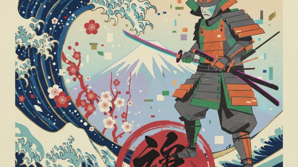
- Wave patterns derived from woodblock print (Hokusai's Great Wave tradition)
- Cherry blossom and botanical forms in geometric abstraction
- The diagonal compositional line that the eye follows into deep space
8-channel console - dominant channels taped & circled by the registrar
Your aesthetic passport - share the fingerprint
4 color interpretations of this aesthetic
Join waitlist for access
Join the waitlist for full access
Join the waitlistJapanese Graphic: where the language earns its place
Japanese Graphic is most effective when its visual decisions do useful work. Bold asymmetric layouts, kanji-roman typography collisions, and a design tradition that treats white space as active force
The style gives styling, proportion, and image sequencing a clear point of view rather than treating them as decoration.
It can turn atmosphere, material, and spatial pacing into evidence of a distinct experience before a visitor arrives.
It helps a physical or editorial environment feel authored, which raises attention and perceived care.
They recognize the references, proportion, and restraint that make the language feel intentional.
They respond to visible judgment because it reduces the feeling of interchangeable product.
A coherent aesthetic gives them a usable standard for choosing images, objects, and collaborators.
The cost comes from consistent art direction, suitable locations or materials, and time to edit the details that would otherwise undermine the premise.
The challenge is conceptual. It takes visual literacy and a real point of view to avoid borrowing surface cues without their original logic.
Lighting, casting, type, color, material, and retouching must agree. A single weak choice can make the work feel like an imitation.
Japanese Graphic creates its strongest advantage when it gives a brand a standard of judgment, not merely an attractive finish. It fails when recognizable cues are collected without a governing idea. The difference between average and exceptional execution is usually proportion: how much is shown, what is withheld, and whether every element belongs to the same world. The most capable teams pair an exacting art director with specialists who understand the medium, from photographer and stylist to set designer, editor, and typographer.
Should Japanese Graphic be the strategic choice?
Surface imitation is easy. The language becomes generic when familiar cues replace proportion, specificity, and a coherent system.
Its visual ingredients appear regularly in contemporary work, but a rigorous execution remains distinguishable from a loose collection of references.
Its strongest principles depend on composition, material, and cultural literacy rather than a short-lived visual effect.
It asks for consistency across photography, typography, motion, environments, and the many details that make a brand feel believable.
Japanese Graphic deserves serious consideration from brands and institutions that can articulate a real point of view and protect it through execution. It is less suitable for work that needs immediate instructional clarity, broad visual neutrality, or low-cost production flexibility. Its greatest advantage is differentiation through judgment: it can make a product, place, or editorial proposition feel authored rather than merely packaged. Average executions borrow recognizable signals, then lose coherence when type, casting, copy, or materials fail to agree. Exceptional executions understand the visual language as a system of choices, including what not to show. The largest mistake is treating the style as a finish applied after strategy. Adopt it only when the product and organization can carry the same standard of care the imagery proposes.
Join waitlist for access
Join the waitlist for editorial depth
Join the waitlistConnected across the creative knowledge graph