When to use it
- Characters and mascots that have to be loved at first sight
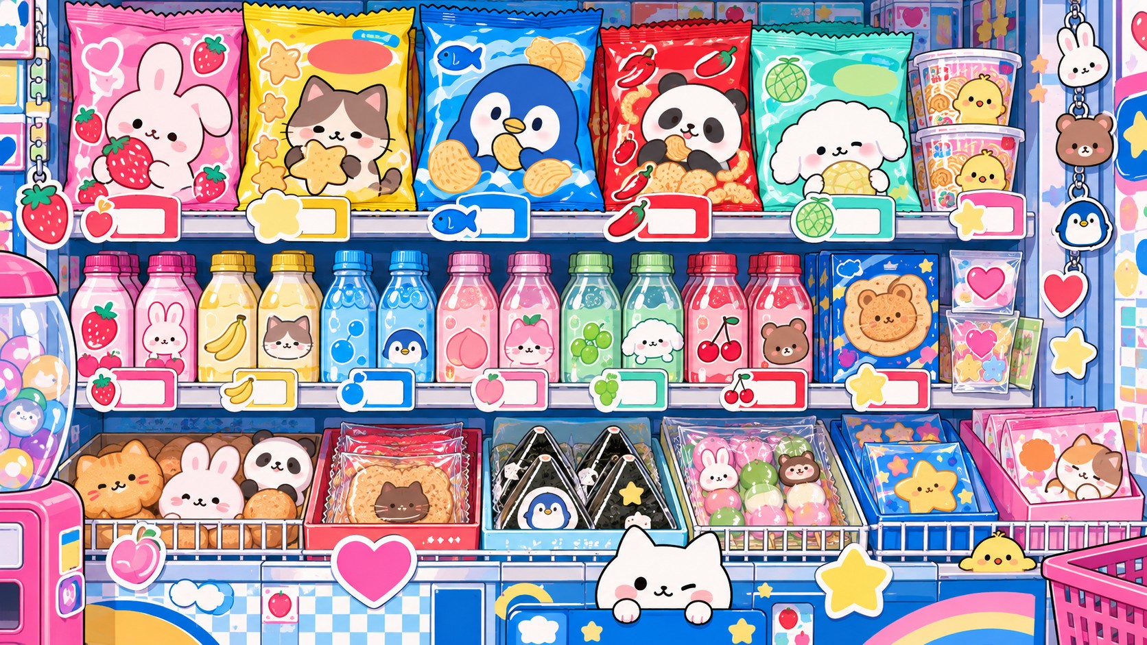
- Stationery, snacks, toys and gifts bought on impulse
- Apps and services that want to feel harmless and friendly
- Softening a difficult subject: banking, health, public safety
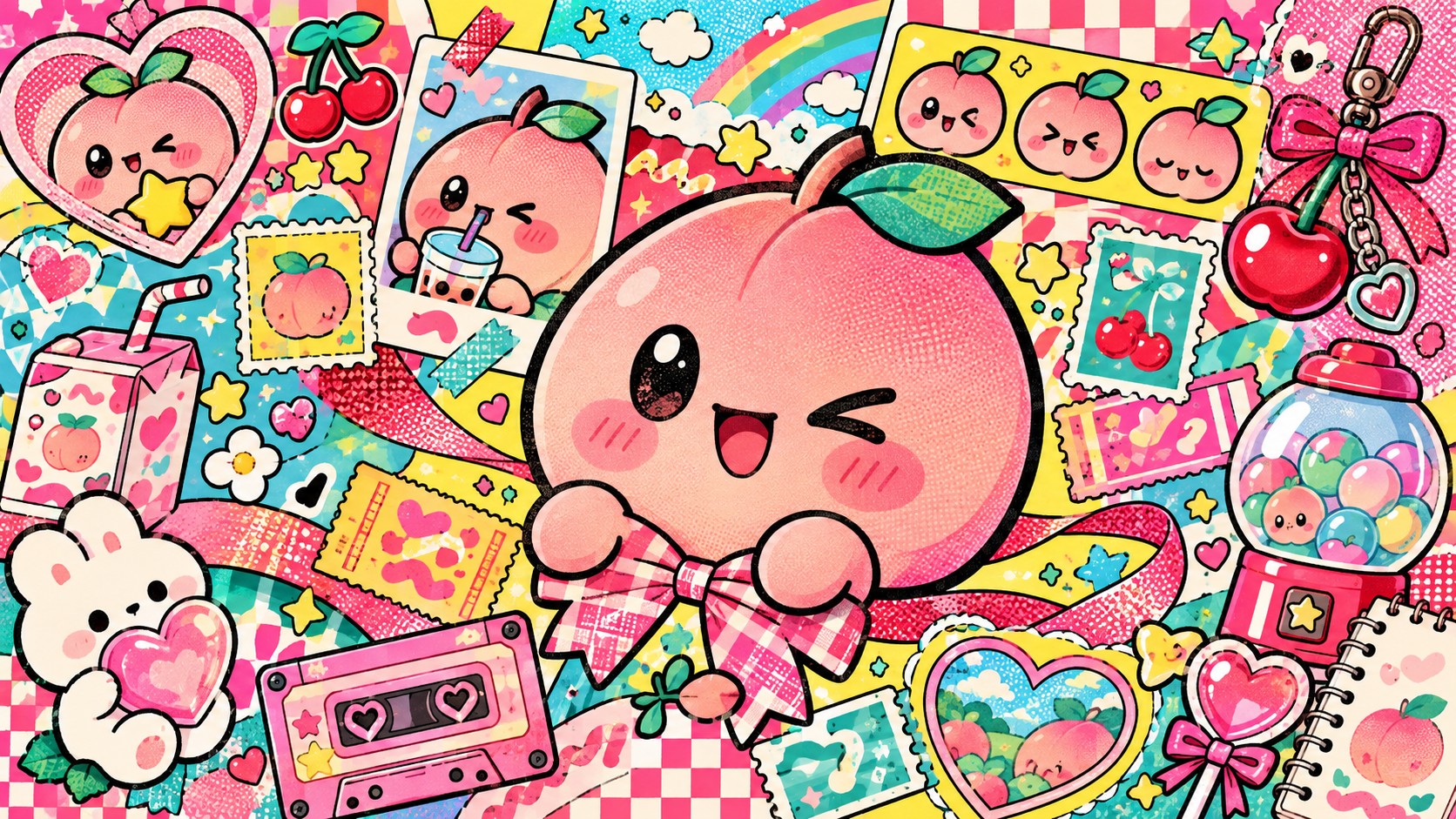
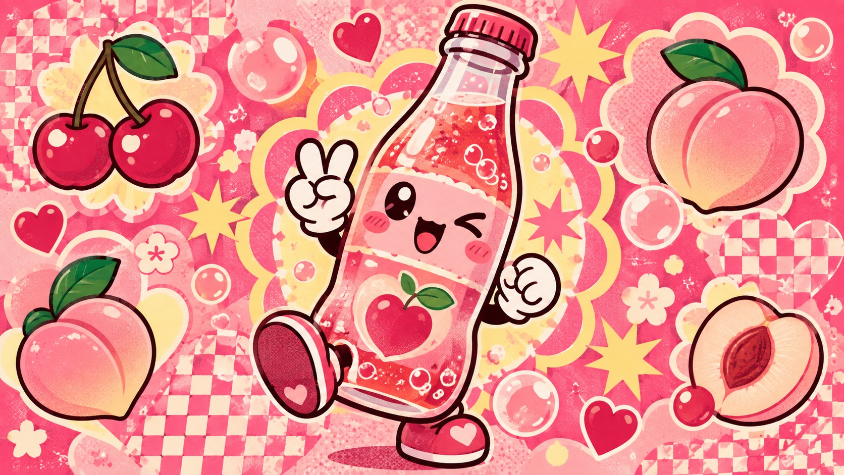
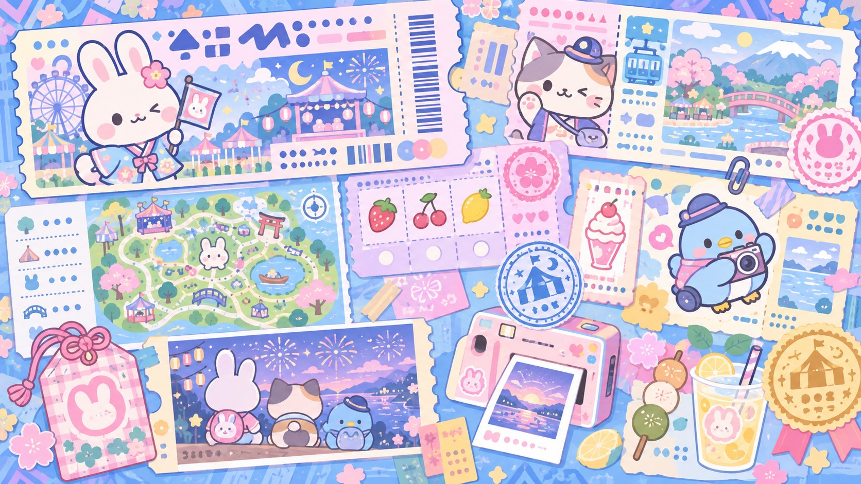
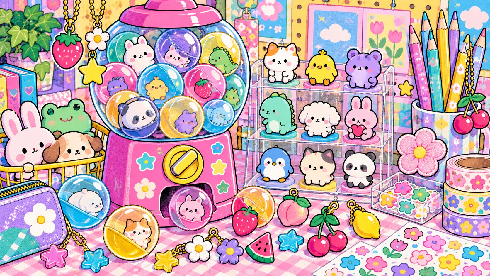
Japan's culture of cute as a design system: round forms, dot eyes, tiny mouths and pastel colour, with a face on everything
What it is, when it works, who it is for, and where it already exists.
Record 030-KA - when it works, who it is for, what it looks like
Where this aesthetic shows up in the real world · ↗ opens the source site
Where Kawaii came from, what makes it recognisable, and the fingerprint it leaves.
Early 1970s to now; illustration roots in the 1950s · Japanese girls' culture, stationery and character goods, industrialised by Sanrio and exported worldwide
Kawaii, usually translated as cute, became a design language through handwriting. In the early 1970s Japanese schoolgirls began writing in a rounded, childlike script decorated with hearts, stars and small faces, known as marui ji, round writing. Schools banned it for being hard to read. Magazines, comics and advertisers adopted it instead, recognising a generation that had chosen sweetness as a style. The illustrator Rune Naito had been drawing big-headed, baby-faced girls since the 1950s, and is often credited with giving the look its first form.
Sanrio turned it into an industry. The company had been selling small gifts decorated with strawberries and flowers when, in 1974, its designer Yuko Shimizu drew a white cat with a red bow and no mouth. Hello Kitty first appeared on a vinyl coin purse in 1975 and went on to become one of the highest-grossing media franchises ever created. The formula, a very simple character applied to a very large number of everyday objects, became known as fancy goods, and rivals such as San-X followed with characters like Tarepanda and, in 2003, Rilakkuma.
By the 1990s kawaii had left the stationery shop. It shaped Harajuku street fashion, the design of Pokémon and the Tamagotchi, and the emoji set created for Japanese mobile phones in 1999. Japanese public life adopted it wholesale: police forces, prefectures and tax offices have mascots, and Kumamon, created for Kumamoto in 2010, became a national star. The artist Takashi Murakami gave it a critical frame with his Superflat exhibition in 2000, arguing that the flat, cute surface of Japanese popular culture was a serious aesthetic with roots in the country's art history.
“Japan's culture of cute, turned into a design system.
The visual DNA: what makes it recognisable
8-channel console with the fingerprint on its display. Save the card, or share the page

The definitive color scheme for this aesthetic
The colour of the styles sitting closest to this one
How to shoot it, how to prompt it, and how to board it.
How to shoot this aesthetic
"Shoot it like a collection: many small things, evenly lit, on one soft colour"
Shot list
Lighting
Bright, soft and nearly shadowless. A large diffused source from above and in front, with fill from both sides. Hard shadows and moody contrast fight the style; it wants to look like a clean, sunny shop.
Drop this into Studio to generate in this aesthetic
Kawaii aesthetic, a simple round character with an oversized head, small dot eyes set wide and low, a tiny mouth or none, stubby limbs and no sharp corners, flat pastel colour in strawberry milk pink, melon soda green, ramune blue and custard yellow, one soft dark outline, small blush marks on the cheeks, tiny stars, hearts and sparkles around it, a face on an everyday object, clean vector illustration, sticker sheet and stationery styling, sweet and gentle, no realistic shading, no detailed anatomy, no readable text
The record applied to your project. The record's kit is free; your brand, references and plates come with membership
01 · Hero application02 · Material and finish03 · Palette in context04 · Photography directionWhether to use it, what it costs to do properly, and where it stands right now.
Two written calls, seven meters, and when to walk away
Design the character, not the decoration. Proportion does the work: a big head, low-set eyes placed wide apart, a tiny or missing mouth, and nothing sharp anywhere. Keep the palette to a few pastels and one dark outline. Do not add detail to make it better. Every extra line makes it older, and the blankness of the face is what lets people project onto it.
Right when being liked is the strategy: characters, snacks, stationery, apps and any service that has to feel harmless. It rewards restraint in the drawing and consistency across products, and fails when it is used to sugar-coat something that should be taken seriously.
Flat vector illustration and a small palette. Merchandise is where the money goes.
Cute is a precise craft: a millimetre between the eyes is the difference between adorable and unsettling.
The drawing is simple; keeping a character consistent across hundreds of products is the work.
Applied to serious or luxury products it reads as childish, and a badly proportioned face lands in uncanny territory.
Character goods, emoji, stickers and mascots have made it a global default for friendliness.
Fifty years old, still growing, and built on a response to baby-like features that does not go out of fashion.
The illustration is cheap; a character system and licensed products are a long commitment.
A Pro feature: origins, practitioners, and pitfalls
Neighbours, cross-references, blends, and the questions people ask.
Connected across the creative knowledge graph
Where it stands now, and what it costs you to use it
Kawaii works because of biology. Large heads, big low-set eyes and rounded bodies are the features of infants, and people respond to them with care, a reaction the ethologist Konrad Lorenz described in 1943 as the baby schema. Kawaii design applies that schema to everything. A character with almost no features is also easy to project onto: Hello Kitty has no mouth, Sanrio has said, so that she can share whatever the viewer is feeling.
Its failure mode is detail. Adding realistic shading, eyelashes, teeth or anatomy ages a character and tips it toward the uncanny. The discipline is subtraction: fewer lines, rounder corners, and spacing between the features measured as carefully as letter spacing.
Mix Kawaii with any style in the library
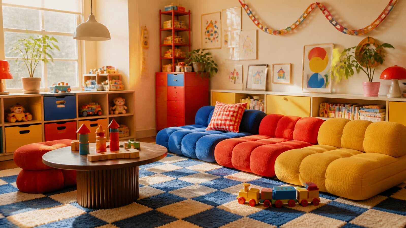 Kawaii 50%Kidcore 50%
Merged palette
#FFC2D9
#FF3333
#B8EBC6
#FF9900
#A8DDF5
Leads light, expressive, maximal
Typography · from Kawaii
Raleway over Merriweather
Materials
Use it
Kawaii aesthetic, a simple round character with an oversized head, small dot eyes set wide and low, a tiny mouth or none, stubby limbs and no sharp corners, flat pastel colour in strawberry milk pink, melon soda green, ramune blue and custard yellow, one soft dark outline, small blush marks on the cheeks, tiny stars, hearts and sparkles around it, a face on an everyday object, clean vector illustration, sticker sheet and stationery styling, sweet and gentle, no realistic shading, no detailed anatomy, no readable text (50%), infused with Kidcore aesthetic with 90s-2000s childhood nostalgia, Lisa Frank rainbow-and-glitter maximalism, playful chaotic joy, color palette strictly #FFC2D9 #FF3333 #B8EBC6 #FF9900 #A8DDF5, overall character: light, expressive, maximal
Kawaii is a Japanese word usually translated as cute, lovable or adorable. As an aesthetic it describes a style of rounded, simplified, pastel-coloured design, most often built around characters with big heads, dot eyes and tiny mouths.
From Japanese youth culture in the early 1970s, when schoolgirls adopted a round, decorated style of handwriting. Sanrio commercialised the look with Hello Kitty in 1974, and character goods, fashion, games and mascots spread it through Japan and then the world.
Proportion and simplicity: a large head on a small body, eyes set wide apart and low on the face, a very small mouth or none at all, short limbs and no sharp angles. Flat pastel colour, a soft outline and blush marks complete it.
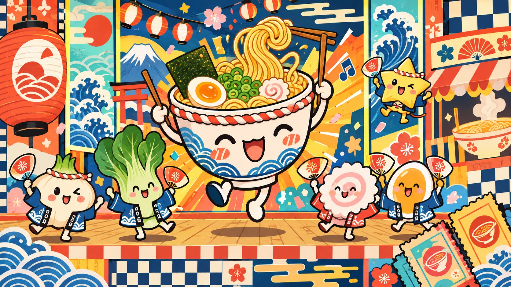
Kidcore is nostalgia for Western childhood of the 1980s and 1990s: primary colours, toys and cartoons, often loud and cluttered. Kawaii is a living Japanese design tradition built on gentleness, pastels and carefully simplified characters.
Every style in the library is broken down like this one: the palette, the typography, the materials and the lineage.
Explore the style library →