When to use it
- A single hero word that should feel alive
- Music artwork, tour posters and motion identities
- Beauty, fragrance and fashion launches that sell a sensation
- Tech or product reveals that want to feel fluid and new
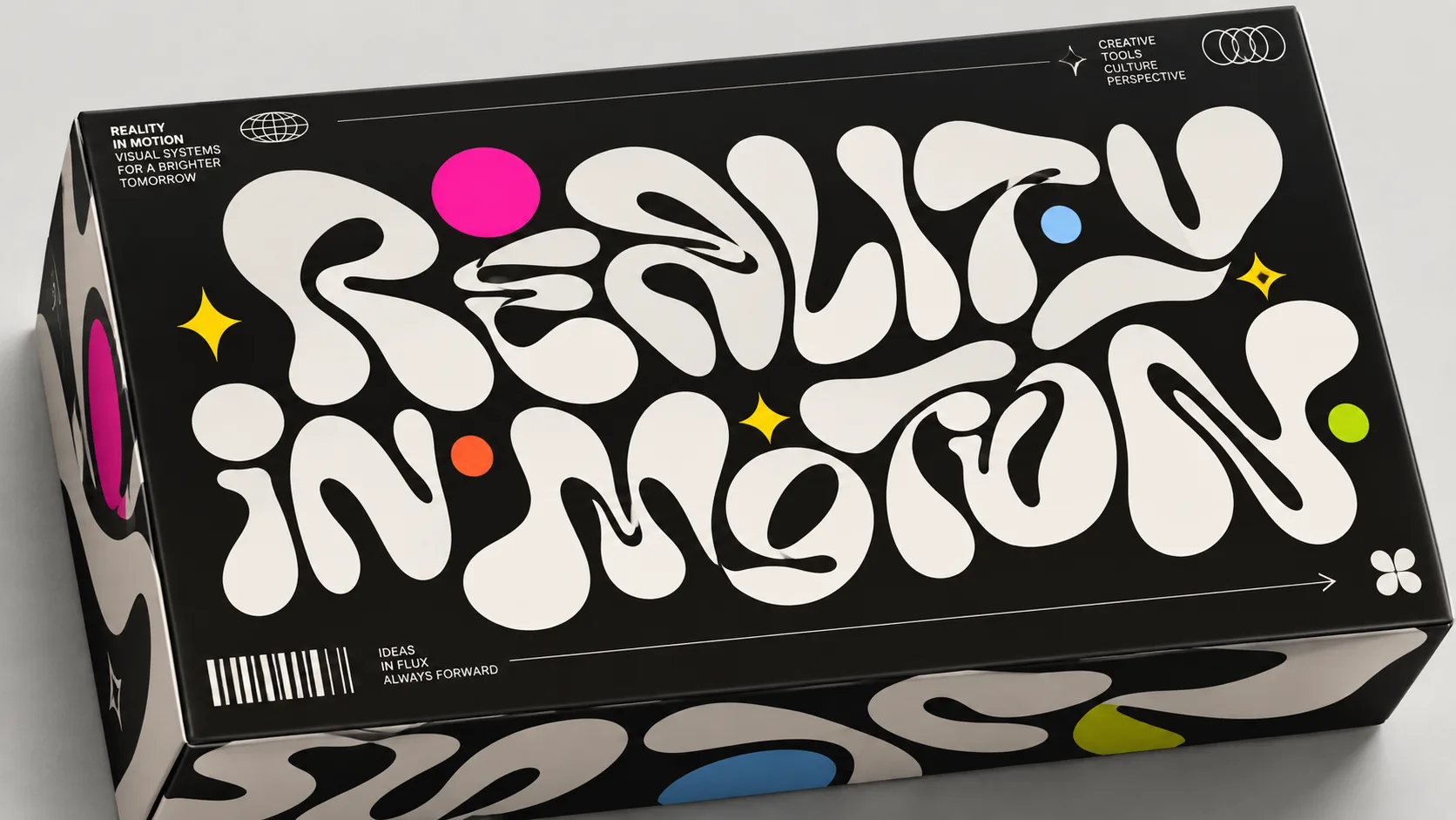
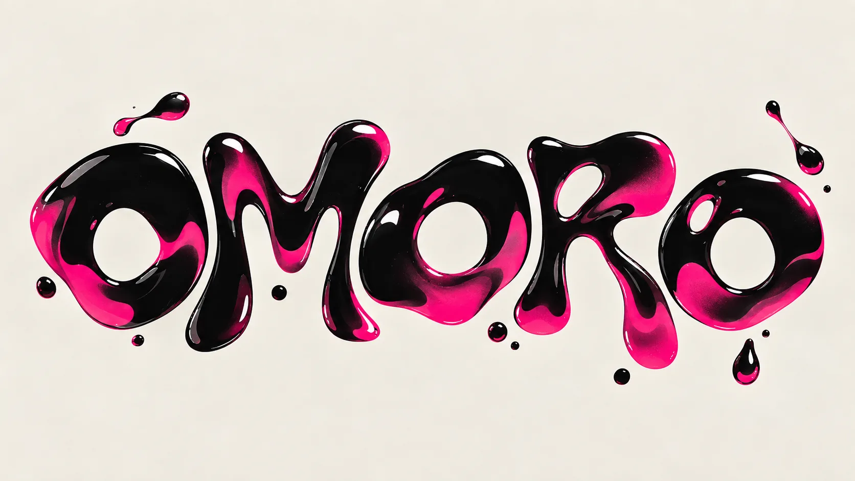
Letterforms that melt, drip, pour and morph like liquid chrome, glass or ink, from psychedelic posters to variable fonts and 3D fluid renders
What it is, when it works, who it is for, and where it already exists.
Record 031-LT - when it works, who it is for, what it looks like
Where this aesthetic shows up in the real world · ↗ opens the source site
Where Liquid Typography came from, what makes it recognisable, and the fingerprint it leaves.
1960s–present · Psychedelic posters, then variable fonts, 3D rendering and motion design
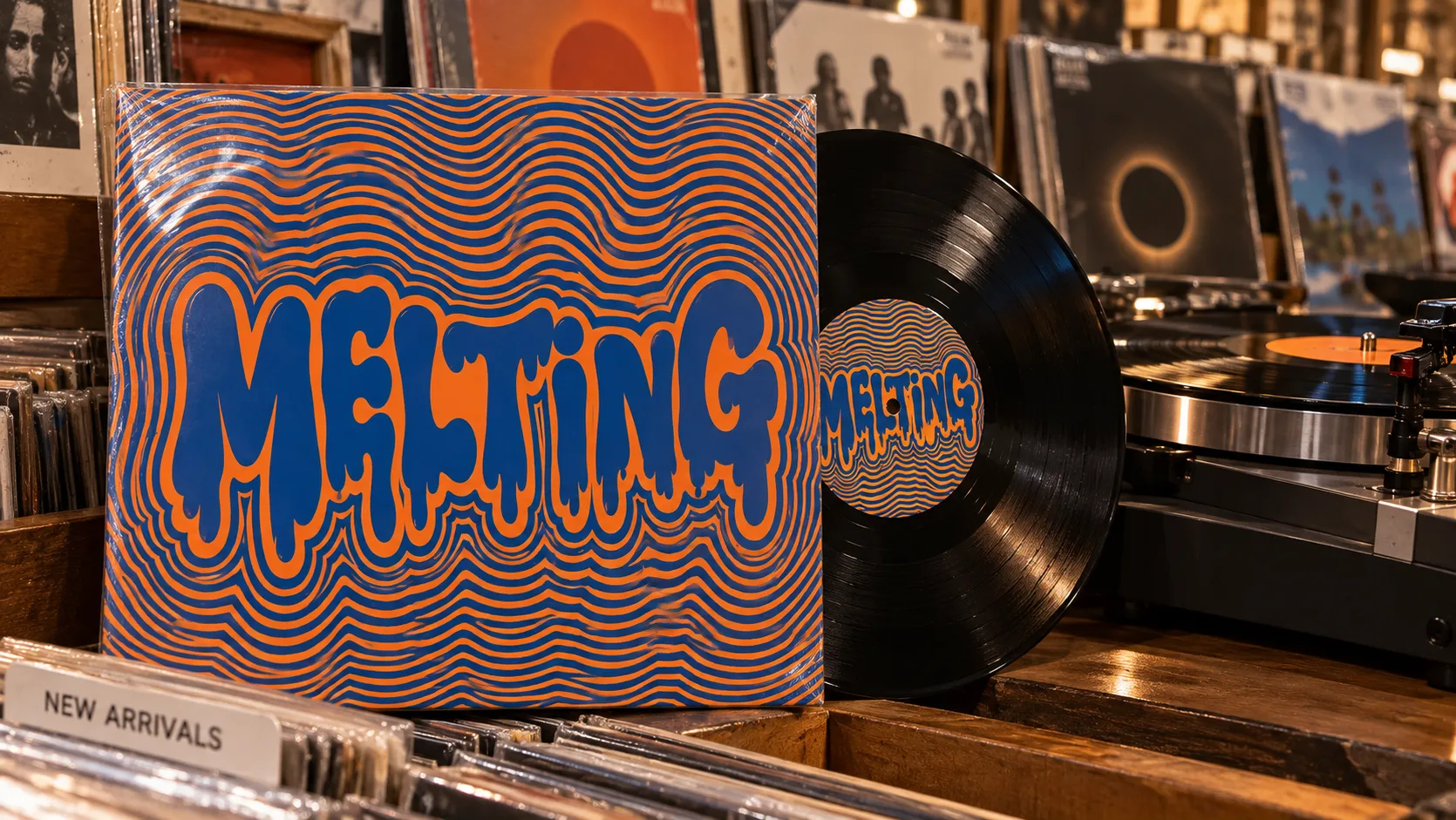
Letters were first made to flow on the concert posters of mid-1960s San Francisco. Wes Wilson, drawing for the Fillmore from 1966, bent his lettering until it filled whatever shape the poster gave it, borrowing the swelling forms of Alfred Roller's Vienna Secession posters from sixty years before. Victor Moscoso and others pushed it further, until a band's name read more like a liquid poured into the frame than a line of type.
Software gave the idea a second life. Chrome, gel and liquid-metal effects ran through late-1990s and Y2K graphics, and in 2016 Adobe, Apple, Google and Microsoft introduced variable fonts, a single font file that can slide continuously between weights, widths and shapes. Motion designers began animating words so they swelled, stretched and morphed rather than simply appearing.
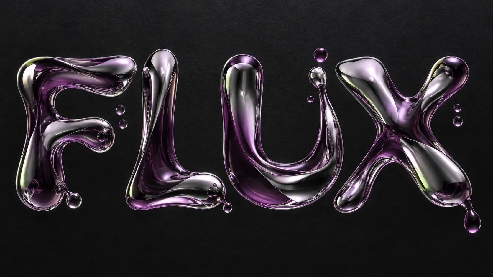
Since the late 2010s, 3D tools have let designers simulate type as an actual fluid: letters that drip, splash, pool and reflect, rendered in chrome, glass or ink. It now runs through music artwork, fashion and beauty campaigns, tech launches and motion identities, and image generators have made the melted word one of the most recognisable looks of the decade.
“Type that stops being solid.
The visual DNA: what makes it recognisable
8-channel console with the fingerprint on its display. Save the card, or share the page

Named in this style's material notes, one material the library documents
The definitive color scheme for this aesthetic
The colour of the styles sitting closest to this one
How to shoot it, how to prompt it, and how to board it.
How to shoot this aesthetic
"One word caught mid-flow, glossy or printed, with just enough left solid to read"
Shot list
Lighting
For rendered words: hard specular studio light on black, so every highlight reads as wet and the reflections carry colour. For print: warm, even natural light that shows ink and paper, as in a shop or on a desk.
Drop this into Studio to generate in this aesthetic
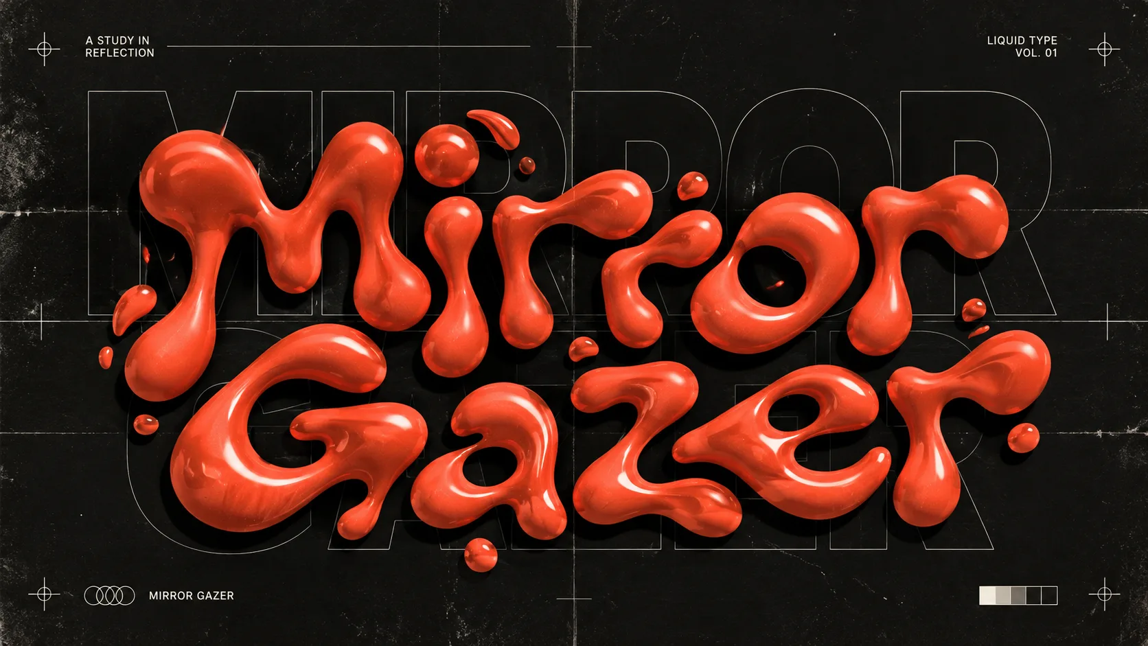
Liquid typography, one bold word whose letterforms swell, merge, drip and pool as if poured, either rendered as glossy liquid chrome, glass or molten colour with wet specular highlights and beads breaking off, or printed as swollen dripping lettering with ripple outlines, the letters still readable, a small crisp caption anchoring the melt, hot pink, molten coral and cobalt against void black, mercury highlights
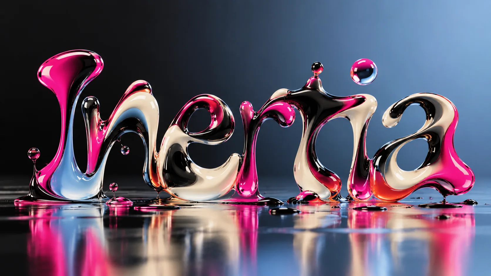
Photograph: a single word in glossy pink, black and ivory liquid chrome, dripping and pooling into its own reflection on a wet dark floor. Set in a plain pale studio. Shot wide, the whole scene with room around it, for rendered words: hard specular studio light on black, so every highlight reads as wet and the reflections carry colour. Keep surface-tension beads and a splash crown in the frame. Style: Liquid typography, one bold word whose letterforms swell, merge, drip and pool as if poured, either rendered as glossy liquid chrome, glass or molten colour with wet specular highlights and beads breaking off, or printed as swollen dripping lettering with ripple outlines, the letters still readable, a small crisp caption anchoring the melt, hot pink, molten coral and cobalt against void black, mercury highlights. Colour palette #0B0B10 #C9CED6 #E6197A #E95C3D #2A4BC4. People rarely appear; where they do, plain black or the palette's single colour, so nothing competes with the word. Composed for a 16:9 landscape frame. Photographic, not an illustration. Only the one word and its small caption, spelled exactly; no other text, no logos, no watermark.
The whole record as a portable skill for Claude, ChatGPT, Gemini, image and video models, or a human brief
The whole record, compiled into a skill another system can work inside: lineage, axes, palettes, type, materials, photography, verdicts and a critique checklist. Nothing is generated; it is the dossier, restructured.
The record applied to your project. The record's kit is free; your brand, references and plates come with membership
01 · Hero application02 · Material and finish03 · Palette in context04 · Photography directionWhether to use it, what it costs to do properly, and where it stands right now.
Two written calls, seven meters, and when to walk away
Pick one word and let it be the whole piece. Keep enough of each letter solid to read, and anchor it with one small line of crisp text. Chrome and glass need a dark ground and hard specular light; printed melts need flat colour and a clean edge to drip from.
Right for music, beauty, fashion and launches that sell a sensation. One melted hero word, a crisp line beside it, a dark ground. Keep it out of anything that has to be read quickly.
A convincing melt needs 3D fluid rendering or careful motion work; flat imitations look cheap quickly.
The skill is choosing how far to melt a word while it still reads.
Simulation, lighting and reflections have to be right, or it looks like a filter.
Melting every word, or melting a word past reading, turns it into wallpaper; image generators have made the lazy version everywhere.
Music artwork, beauty launches and motion identities are adopting it fast, but it is not yet a default.
Tied to current 3D and generative tools; the chrome-drip version will date, though fluid lettering itself keeps returning.
Good fluid renders and motion take specialist time; a still hero word is affordable.
A Pro feature: origins, practitioners, and pitfalls
Neighbours, cross-references, blends, and the questions people ask.
Connected across the creative knowledge graph
Where it stands now, and what it costs you to use it
Liquid type makes a word feel alive and physical at a time when most type lives on flat screens, which is why music, beauty and fashion reach for it to signal sensation and change.
It is a motion-era look first. It reads best animated or as a single hero word, and weakest anywhere type has to be read quickly.
Mix Liquid Typography with any style in the library, or see the pairs worth trying
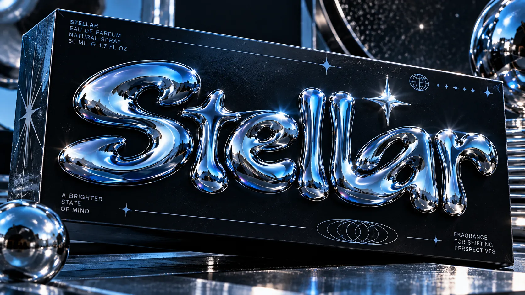 Liquid Typography 50%Metallic Typography 50%
Merged palette
#0B0B10
#0D0B0A
#C9CED6
#C9A064
#E6197A
Leads expressive, digital, dark
Typography · from Liquid Typography
Raleway over Merriweather
Materials
The calls this blend forces
These two disagree on 2 things, and a blend cannot average them: you pick a side. At this mix:
Organic or Geometric? Liquid Typography is organic, Metallic Typography is geometric. This mix lands organic.
Chaotic or Structured? Liquid Typography is chaotic, Metallic Typography is structured. This mix lands structured.
Use it
Liquid typography, one bold word whose letterforms swell, merge, drip and pool as if poured, either rendered as glossy liquid chrome, glass or molten colour with wet specular highlights and beads breaking off, or printed as swollen dripping lettering with ripple outlines, the letters still readable, a small crisp caption anchoring the melt, hot pink, molten coral and cobalt against void black, mercury highlights (50%), infused with Metallic typography, one word or short phrase in inflated chrome letters, swollen rounded bubble forms like blown mirror metal, every curve reflecting its surroundings with sharp star-glint highlights, gold, silver, rose or iridescent chrome, the word set big as the hero on a matte black ground, small clean widely tracked sans-serif captions around it, shown in place on packaging, a book, a poster, a billboard or a wall, color palette strictly #0B0B10 #0D0B0A #C9CED6 #C9A064 #E6197A, leaning organic over geometric, chaotic over structured, overall character: expressive, digital, dark
A style where letterforms behave like fluid rather than solid shapes: they melt, drip, pour, pool or morph into one another. It is usually rendered as chrome, glass, gel or ink, and used for single hero words, music artwork and motion.
Metallic typography is about a solid letter with a reflective finish, like chrome or gold foil. Liquid typography is about the letter losing its solidity: the chrome can be there, but the point is that the word is flowing, dripping or changing shape.
Every style in the library is broken down like this one: the palette, the typography, the materials and the lineage.
Explore the style library →