Registrar's index cards on the platen glass - captured by the scanner
1950s–present (LP cover tradition); ongoing · Recording industry; album cover design; music photography; concert poster tradition
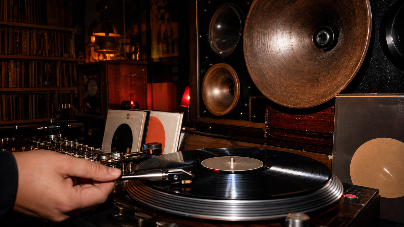
Music as a visual aesthetic encompasses the visual cultures that have developed around sound recording and performance: the album cover as 12-inch art object (Blue Note jazz covers, Beatles' Sgt. Pepper, Dark Side of the Moon), the concert poster tradition (Art Nouveau Fillmore posters, punk xerox flyers, rave graphics), music photography (Anton Corbijn's Joy Division photographs, Richard Avedon's Beatles cover), and the music video as visual art form.
Different musical genres developed distinct visual vocabularies: jazz's mid-century modern design (Bauhaus-influenced Blue Note graphics, Reid Miles's geometric layouts), rock's excess and theatricality (Yes album fantasy illustration, heavy metal's dark imagery), hip-hop's luxury and street documentation, electronic music's abstract and glitch aesthetics. Genre visual codes function as immediate signals: certain colors, typography, and image choices communicate genre before a note is heard.
The streaming era has compressed album art to a 300×300 pixel thumbnail, radically changing what music visual culture can do. Simultaneously, vinyl's revival has restored the 12-inch format as a premium object. Music visual culture continues to be one of the most vital sites of graphic design practice: partly because musicians and their creative directors have historically taken more risks than most commercial clients.
The visual DNA: what makes it recognisable
- Genre-coded type: each music genre has developed signature typographic conventions
- Artist name hierarchy: name typically larger than title on pop releases
- Photography-dominant covers often with minimal or no type
- Hand-lettered and illustrated covers signaling independent/folk values
- The square format: the LP cover's defining constraint and opportunity
- Photography full-bleed with type overlay as the dominant contemporary format
- Abstract or purely graphic covers (Blue Note) vs. photographic (pop/rock)
- Gatefold expansion: the LP cover that opens to double width
- No single palette: genre codes vary widely across the musical spectrum
- Black vinyl: #0A0A0A: the material ground from which all music visual culture emerges
- Blue Note blue: #1A3A6A: the mid-century jazz design tradition
- Neon spectrum: the full range, coded by genre and era
- The artist portrait: face or figure as primary subject
- Abstract visualizations of sound: waveforms, spectrums, geometric resonance
- Concert photography: the live moment as documentation and mythology
- LP sleeve detail: the physical object's material texture and weight
8-channel console - dominant channels taped & circled by the registrar
Your aesthetic passport - share the fingerprint
4 color interpretations of this aesthetic
How to shoot this aesthetic
Join waitlist for access
Join the waitlist for full access
Join the waitlistMusic: where the language earns its place
Music is most effective when its visual decisions do useful work. Visual design that captures the energy and identity of music
The style gives styling, proportion, and image sequencing a clear point of view rather than treating them as decoration.
It can turn atmosphere, material, and spatial pacing into evidence of a distinct experience before a visitor arrives.
It helps a physical or editorial environment feel authored, which raises attention and perceived care.
They recognize the references, proportion, and restraint that make the language feel intentional.
They respond to visible judgment because it reduces the feeling of interchangeable product.
A coherent aesthetic gives them a usable standard for choosing images, objects, and collaborators.
The cost comes from consistent art direction, suitable locations or materials, and time to edit the details that would otherwise undermine the premise.
The challenge is conceptual. It takes visual literacy and a real point of view to avoid borrowing surface cues without their original logic.
Lighting, casting, type, color, material, and retouching must agree. A single weak choice can make the work feel like an imitation.
Music creates its strongest advantage when it gives a brand a standard of judgment, not merely an attractive finish. It fails when recognizable cues are collected without a governing idea. The difference between average and exceptional execution is usually proportion: how much is shown, what is withheld, and whether every element belongs to the same world. The most capable teams pair an exacting art director with specialists who understand the medium, from photographer and stylist to set designer, editor, and typographer.
Should Music be the strategic choice?
Surface imitation is easy. The language becomes generic when familiar cues replace proportion, specificity, and a coherent system.
Its visual ingredients appear regularly in contemporary work, but a rigorous execution remains distinguishable from a loose collection of references.
Its strongest principles depend on composition, material, and cultural literacy rather than a short-lived visual effect.
It asks for consistency across photography, typography, motion, environments, and the many details that make a brand feel believable.
Music deserves serious consideration from brands and institutions that can articulate a real point of view and protect it through execution. It is less suitable for work that needs immediate instructional clarity, broad visual neutrality, or low-cost production flexibility. Its greatest advantage is differentiation through judgment: it can make a product, place, or editorial proposition feel authored rather than merely packaged. Average executions borrow recognizable signals, then lose coherence when type, casting, copy, or materials fail to agree. Exceptional executions understand the visual language as a system of choices, including what not to show. The largest mistake is treating the style as a finish applied after strategy. Adopt it only when the product and organization can carry the same standard of care the imagery proposes.
Join waitlist for access
Join the waitlist for editorial depth
Join the waitlistConnected across the creative knowledge graph